Walk through any warehouse, lab, or construction site and you will see the same small pictures repeating on doors, drums, and machine guards. Those pictures work because hazard pictogram colors and shapes carry meaning faster than a sentence ever will.
I have seen teams argue over wording on a label while a visitor walked right past the real warning because the sign blended into the wall. If you get the colors and geometry right, people react correctly even when they do not share a language.
International standards try to make that reaction predictable, so a triangle warning sign or a mandatory sign circle does not change meaning when a shipment crosses a border. The goal is simple, spot the sign, understand the message, and act safely.
Why color and shape matter more than text
Text is slow, and it fails first when conditions get rough, like low light, loud noise, or a worker wearing a face shield. A pictogram keeps working when you only get a half second glance.
Text also assumes literacy, attention, and time, which are three things you cannot count on during a task or an emergency. Even fluent readers will skip words when they are carrying a load, watching a moving vehicle, or trying to keep up with a line.
Color and shape are processed early by the brain, so they set expectations before a person reads any symbol detail. That is why hazard pictogram colors and shapes are standardized, because consistency trains reflexes.
Once those reflexes exist, people do not have to negotiate with themselves about what to do next. They see the category, they anticipate the type of message, and they are already leaning toward the right behavior.
People also bring baggage from road signs and consumer packaging, and standards often lean into that. A triangle warning sign feels like “pay attention” in many countries because drivers learned it on the street.
That familiarity is valuable because it reduces training load for contractors, visitors, and new hires. It also reduces the chance that a person will improvise a meaning based on local habits.
Color is not just a highlight, it is a message channel, and it competes with everything else in the environment. If your site uses bright brand colors everywhere, the safety palette has to be protected so it still stands out.
Shape adds redundancy, which is important for color vision deficiencies and for dirty or faded signs. A mandatory sign circle still reads as mandatory even if the blue is dulled by dust.
Text still matters, but it should confirm what the geometry already signaled. If the sign relies on a paragraph to explain itself, it is usually the wrong sign for the job.
When text is needed, it should be short, specific, and written in the words people actually use on that site. Long formal wording often hides the only verbs that matter, like “wear,” “keep out,” or “disconnect.”
Another reason to lead with pictograms is that tasks change faster than signage programs do. A good category sign can keep people safe even when the exact process behind the door has been updated.
In practice, the best sign is the one that works when someone is tired, rushed, or distracted. If it only works when someone stops and studies it, it is not doing real safety work.
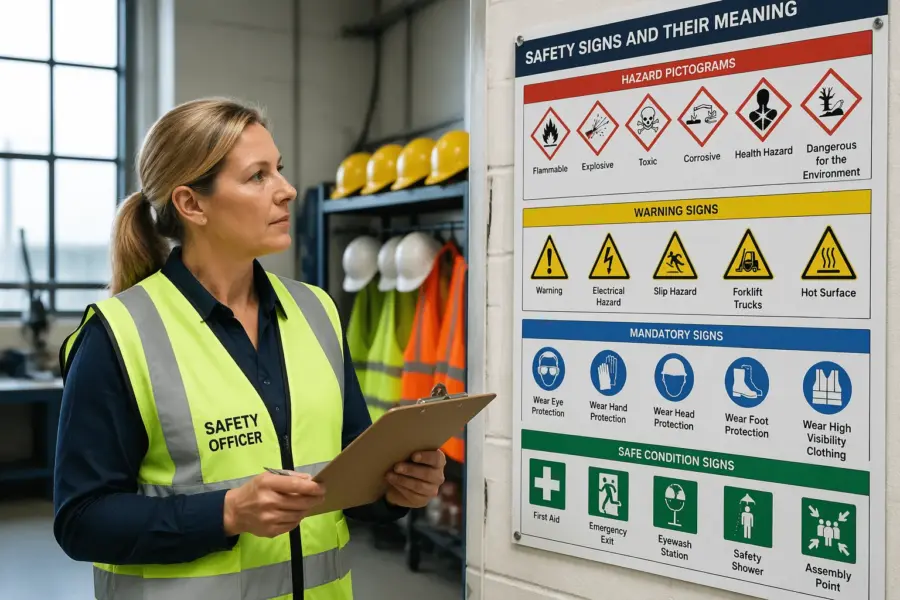
The core sign shapes and what you should expect from each
Most safety sign systems use a small set of shapes because too many shapes slow recognition. When you see a familiar outline, you should already know the category before you interpret the icon.
That category cue is what lets a person scan a corridor quickly and still catch the one message that matters. If every sign is a rectangle with a different icon, people have to read icons one by one.
The triangle warning sign is the classic “hazard ahead” container, used for risks like electrical shock, forklifts, or hot surfaces. Its job is to tell you to pause and assess before you move closer.
A good warning triangle does not try to prescribe a full procedure, it just flags that the area has a risk that can hurt you. The action it triggers is attention, not compliance with a checklist.
Warning triangles work best when they are paired with a clear hazard icon that matches what people will actually see. If the icon is abstract or unfamiliar, the triangle still helps, but it cannot do all the work alone.
A mandatory sign circle communicates a required action, such as “wear eye protection” or “use hearing protection.” People sometimes treat these as suggestions, so the circle needs strong placement at the decision point, like the entrance to a grinding bay.
Mandatory signs also need a clear boundary for where the requirement starts and ends. If the rule applies only inside a room, the circle belongs at the threshold, not on the back wall.
Prohibition signs are often circular as well, usually with a diagonal bar, and they are about stopping a behavior rather than starting one. A “no smoking” symbol works because it is direct, familiar, and hard to reinterpret.
Prohibition signs should be used sparingly, because too many “no” messages can create visual clutter and resistance. If everything is prohibited, people stop noticing which prohibition matters most.
Rectangles and squares usually carry information, and safe condition signs often live there, pointing to exits, first aid, eyewash, or refuge areas. If you mix categories, like putting a warning pictogram inside a safe condition layout, you create hesitation at the worst time.
Safe condition signs should feel calm and directional, because they are used when someone needs a way out or a way to help. If they look like warnings, people may avoid them instead of following them.
Fire equipment signs often use rectangular formats too, but they carry a different urgency and are usually tied to red. The important part is that the layout stays consistent so people can locate extinguishers and alarms quickly.
Some sites also use hazard diamonds for chemicals, and those shapes have their own rules and expectations. The key is to keep each system in its lane so the shape cues do not fight each other.
When you design a sign set, think like a user walking at normal speed with a task on their mind. The shape should tell them what kind of message it is before they even focus their eyes.
If you are tempted to invent a new shape for a special hazard, it is usually better to solve it with placement, size, or a supplementary panel. Custom shapes feel clever to designers and confusing to everyone else.
Standard color meanings and visibility basics
Color meanings are not decoration, they are part of the code, and they should stay stable across a site. If every department picks its own palette, workers stop trusting what their eyes tell them.
Consistency matters even more on large campuses where people move between buildings and contractors rotate between projects. A visitor should not have to relearn what blue means every time they cross a parking lot.
Many systems map red to prohibition or fire equipment, yellow or amber to warning, blue to mandatory actions, and green to safe condition signs. The exact shades vary by standard and material, but the contrast relationships matter more than the paint chip name.
When people say “make it brighter,” they often mean “make it higher contrast,” which is a different problem. A saturated color on a similarly saturated background can still vanish at a distance.
Red is powerful, but it is easy to overuse, especially in facilities with lots of emergency equipment and lots of prohibited behaviors. If every door has red on it, the fire extinguisher sign loses its advantage.
Yellow and amber are effective for warnings, but they can become muddy under sodium lighting or in dusty environments. That is why the symbol and border treatment are just as important as the fill color.
Blue mandatory signs can look “quiet” compared to red and yellow, so they need good placement and a clean background. A mandatory sign circle hidden among machine stickers is an easy miss.
Green safe condition signs should be treated like a navigation system, not like decoration. If you repaint a corridor, you should check that the green still pops and that arrows are still unambiguous.
Black and white are often the workhorses for symbol clarity, borders, and supporting labels. They also help when you need a sign that is neutral, like equipment identification or directional information that is not safety critical.
Visibility basics also include size, viewing distance, and the speed of the person approaching the sign. A pedestrian can read smaller details than a forklift operator moving through an aisle.
Lighting changes the entire palette, and many facilities have mixed lighting zones that people move through quickly. A sign that looks fine under office LEDs can look washed out under skylight glare.
Surface finish matters too, because glossy signs can reflect light and hide the symbol at certain angles. Matte finishes often read better in harsh industrial lighting even if they look less “premium.”
| Color | Typical meaning | Common examples |
|---|---|---|
| Red | Prohibition or fire response | No smoking, fire extinguisher location |
| Yellow or amber | Warning of a hazard | Forklift traffic, overhead load risk |
| Blue | Mandatory action | Wear hard hat, mandatory sign circle for PPE |
| Green | Safe condition or emergency escape | Exit route, first aid, eyewash station |
| Black and white | General information or symbol contrast | Directional arrows, equipment labels |
If you are standardizing a site, document your chosen colors and how they will be reproduced across print, vinyl, and painted signs. Without that, every replacement order becomes a new interpretation.
It also helps to train supervisors on the meaning of the colors so they do not request “a green warning sign” by accident. Small language slips like that lead to real-world confusion.
Finally, remember that color is only one channel, so do not depend on it alone. Shape, icon design, and placement are what keep the message intact when color quality drops.
How contrast and background affect readability
Good signs win on contrast, not on size alone, because a big sign can still disappear on a busy wall. If the background is noisy, the pictogram needs a clean border and enough quiet space around it.
That quiet space is not wasted space, it is what lets the eye lock onto the message. When a sign is crammed with icons and text, the viewer has to work to find the important part.
Think about where the sign lives, like corrugated metal, chain link, stacked pallets, or a glossy machine panel. A warning triangle on a yellow machine guard is a classic mistake, because the symbol and the background compete.
Even a perfect sign can fail if it is mounted on a surface that is always in shadow or always catching glare. The same sign can read differently at 7 a.m. and 3 p.m. depending on sun angle.
Edges matter because the eye uses boundaries to separate objects from backgrounds. A clear border can rescue a sign that would otherwise blend into painted steel or patterned wall panels.
Fonts and line weights are part of contrast too, especially on supplementary panels. Thin strokes can disappear when a sign is viewed at an angle or through scratched safety glasses.
Retroreflective materials can help in vehicle yards and dim corridors, but they can also glare under strong LEDs if the viewing angle is wrong. You should test a sample sign at the actual mounting height and lighting, not at a desk.
Testing should include motion, because people rarely stand still to read a sign in a working area. A sign that is readable when you stop may be unreadable when you walk past it at normal speed.
Weathering changes everything, especially outdoors where UV fades reds and yellows faster than people expect. If you cannot commit to inspection and replacement cycles, choose more durable substrates and inks from the start.
Grime is another kind of weathering, and it hits low-mounted signs and door signs especially hard. If a sign sits where forklifts kick up dust, plan for cleaning or move the sign higher.
Moisture and temperature swings can also curl vinyl edges and create shadows that distort the symbol. A warped sign can turn a crisp icon into something that looks like a different pictogram.
If you use transparent guards or windows over signs, check for fogging, scratches, and reflections. Protective covers can extend sign life, but they can also reduce legibility if the surface gets damaged.
One practical trick is to take a photo of the sign from the approach path and then view it at small size on a phone. If the message is not obvious in the thumbnail, it will not be obvious in real life either.
Another trick is to compare your sign against the most visually loud thing near it, like a product poster or a bright machine label. If the safety sign loses that competition, it needs a redesign or a better location.
How to avoid mixed messages between symbol, color, and placement
The most common failure I see is a correct pictogram used in the wrong context, like a mandatory sign circle posted where the decision has already been made. If the worker has to backtrack to comply, the sign becomes background noise.
Another common failure is stacking too many categories together, like a warning, a prohibition, and a safe condition arrow all on one small panel. People can only act on one primary message at a time, so the sign should lead with what matters most.
Placement should match the moment of choice, such as before the doorway, at the start of a lane, or on the approach to a machine. A triangle warning sign mounted behind a guardrail after the hazard does not warn anybody.
The moment of choice is not always where the hazard is, it is where a person can still change their behavior. If the only safe action is to turn back, the sign needs to be far enough upstream to make that realistic.
Color must agree with the category of message, because people trust the color first and the icon second. If you print a prohibition symbol on a green panel, you will confuse visitors who learned green equals safe condition signs.
Mixing can also happen when departments create their own templates, like a blue header bar on every sign regardless of meaning. A consistent brand look is fine, but it cannot override the safety code.
Keep clusters readable by grouping related messages and separating different categories with space or a clear header panel. When every sign is stacked into one poster, workers learn to ignore the whole wall.
If you must cluster, put the highest priority message at eye level and closest to the approach path. Lower priority details can sit below, but they should not compete for attention with the main category cue.
Orientation matters too, because a sign that faces the wrong direction is invisible until you are already past it. In vehicle areas, signs should face the driver’s line of travel, not the pedestrian walkway.
Mounting height should match the audience, since pedestrians and vehicle operators have different sightlines. A sign placed for a standing person may be blocked by pallets for someone seated in a forklift.
Do not forget the role of physical controls, because a sign cannot compensate for a missing guard or a broken interlock. If people keep ignoring a warning, it may be because the process design is forcing them into the hazard zone.
Finally, keep the message stable over time, because frequent changes train people to stop believing the signage. If a door is labeled “restricted” but is often propped open for convenience, the sign becomes a joke.
When a pictogram needs a supplementary panel (and when it doesn’t)
A pictogram can be enough when the hazard and the required behavior are obvious, like a hard hat symbol at a construction gate. It can also be enough when the standard symbol already implies the action, like a “no entry” mark on a restricted door.
It is also enough when the consequence is immediate and familiar, like a high voltage warning on an electrical cabinet. In those cases the pictogram is doing what it was designed to do, trigger caution without negotiation.
You need a supplementary panel when the risk depends on local conditions, like a chemical line that sometimes carries steam and sometimes carries caustic solution. The pictogram can warn, but the panel can state the specific hazard, temperature range, or PPE requirement for that spot.
Local conditions include timing, like a door that is safe most of the day but becomes a hazard during a cleaning cycle. A panel can clarify the condition, such as “during washdown” or “when alarm sounds.”
Supplementary text is also useful when the consequence is not obvious, such as “automatic start” on a conveyor that looks idle. Without that extra line, people assume the equipment is safe because it is quiet.
Stored energy is another case where a panel earns its keep, because the hazard can remain after power is off. A simple line like “pressure remains after shutdown” can prevent a very predictable mistake.
Panels help when you need to specify a limit, like a maximum load, maximum occupancy, or a required clearance. The pictogram can set the category, but the number is what makes the instruction actionable.
They also help when the site has multiple similar hazards that require different behaviors, like two adjacent rooms where one needs respirators and the other only needs safety glasses. Without a panel, people generalize and pick the easiest rule.
Do not use a panel to patch a weak symbol choice, because that creates a sign that must be read to be understood. If you keep writing long notes under a symbol, pick a clearer pictogram or split the message into a warning sign plus a mandatory sign circle nearby.
When you do add text, keep it short enough to be read at walking speed. If you cannot say it in one line, consider whether the message belongs in training, a procedure, or a physical control instead.
Language choice matters too, because a multilingual site can turn one short line into five lines quickly. In that case, a better icon or a second sign might be more effective than a crowded panel.
Supplementary panels should also be maintained, because they often contain the details that change first. If the process changes and the panel does not, the sign becomes a source of misinformation.
- Use a panel for variable hazards, like changing chemicals or shifting voltages
- Use a panel for non obvious consequences, like automatic start or stored energy
- Use a panel for site specific limits, like maximum load or speed
- Skip the panel when the standard pictogram already implies the action
- Skip the panel if it forces long sentences that people will not read
A good rule is that the pictogram should still make sense if the panel is covered by a hand or a clipboard. The panel should refine the message, not create it from scratch.
Another rule is to avoid mixing multiple instructions into one panel, because people will pick the easiest part and ignore the rest. If you need two behaviors, it is often cleaner to use two signs.
Quick checks you can do to confirm a sign is clear
Start with the five second test, stand where a person first encounters the hazard and glance at the sign without squinting. If you cannot name the category instantly, the hazard pictogram colors and shapes are not doing their job.
Do that test at normal walking speed, because stopping to evaluate a sign is not how most people move through a site. If you have to pause, the sign is asking for too much attention.
Next, do the distance test by walking backward until the symbol details blur, then step forward until the icon snaps into meaning. That distance should be longer than the real approach distance people have in that area.
If the sign only becomes clear when you are already inside the hazard zone, it is not a warning, it is a commentary. In that case you either need a larger sign, a better icon, or a new location.
Ask someone new to the area what they think the sign requires, and listen for hesitation or invented rules. If they say “I guess it means,” you probably have a contrast problem, a placement problem, or the wrong shape category.
It helps to ask two questions instead of one, what is the hazard and what action should you take. If they can name the hazard but not the action, you may need a mandatory sign circle nearby.
Finally, check the sign under real conditions, like with a forklift mast in the way, a door open, or a queue of pallets blocking the line of sight. A perfect sign that is always hidden is the same as no sign at all.
Check it at the times the area is busiest, because clutter and traffic change sightlines. A sign that is visible during a quiet walk-through can vanish during shift change.
Also check it after routine cleaning or maintenance, because signs are often removed and reinstalled poorly. A sign that is reattached crooked or too low can lose its shape cue.
Take note of what people do, not what they say, because behavior is the real test. If workers consistently take the wrong action, the sign is not communicating, even if everyone claims it is “fine.”
Review near-miss reports and informal complaints, because they often point to confusing intersections and blind corners. Those are the places where a clear warning triangle or direction sign can prevent repeat incidents.
When you update signs, document what changed and why, so you can learn from it next time. Sign programs improve fastest when they are treated like a feedback loop instead of a one-time purchase.
Common confusion points in warehouses and logistics yards
Logistics sites pile hazards on top of each other, pedestrian routes, powered industrial trucks, overhead doors, and mixed lighting. That is why a clean triangle warning sign at a crossing often beats a complex poster full of tiny icons.
Crossings are especially tricky because everyone assumes the other party will yield. A warning sign is helpful, but it should be paired with layout choices like mirrors, barriers, and clear sightlines.
Floor markings and wall signs also fight each other when they disagree, like a green exit arrow pointing one way and a taped floor line pointing another. Pick one primary wayfinding method for safe condition signs and keep it consistent.
When floor tape is the primary method, it needs maintenance, because worn tape turns into a vague stain quickly. When wall signs are the primary method, they must be placed where pallets and racks do not hide them.
Temporary hazards create their own mess, because people hang homemade signs on straps, cones, or shrink wrap. If you need temporary signs often, stock standardized panels and stands so the hazard pictogram colors and shapes stay correct.
Temporary signs should also have a removal habit, because nothing becomes permanent faster than a “temporary” warning. Old temporary signs teach people that warnings can be ignored.
Yards add distance and weather, so small labels fail fast on gates and fences. Use larger formats, tougher materials, and mounting that keeps the sign flat so the symbol does not warp in wind.
Vehicle speeds change the whole readability problem, because drivers have less time to interpret details. In those areas, the shape and color category cues are doing most of the work.
Another yard issue is dust and exhaust film, which dulls contrast and makes white areas look gray. If you cannot clean signs regularly, choose designs that stay legible when slightly dirty.
Warehouses also have constant layout changes, and signs get left behind when racks move. A sign that points to a first aid station that no longer exists is worse than no sign, because it sends people the wrong way.
Loading docks are a special case because the hazard changes with the door status and trailer position. Signs need to be placed so they are visible when the door is open and when it is closed.
Noise and hearing protection zones are another common confusion point because the boundary is not visible. A mandatory sign circle at the entrance and a repeat sign inside the zone can help people comply without guessing.
Finally, do not underestimate visitor behavior, because they are the least trained and the most likely to wander. Clear sign categories and strong placement are what keep visitors out of forklift lanes and restricted areas.
How standards stay consistent across borders and suppliers
Global supply chains depend on suppliers using the same visual language, especially on packaging, containers, and site signage. When a contractor arrives from another country, they should still recognize a warning triangle and a mandatory sign circle without retraining.
This matters most in high-turnover environments where you cannot assume deep site orientation. The sign has to work for the person who is on day one and still learning where the restrooms are.
Many organizations align workplace signs with ISO style pictograms, while chemical labels often follow GHS rules for hazard diamonds. The smart move is to plan how these systems will sit together, so workers do not see competing shapes that mean different things in different contexts.
That planning includes deciding where each system is allowed, such as GHS diamonds on containers and ISO signs on doors and equipment. When the boundaries are clear, people learn faster and make fewer assumptions.
Standards also influence symbol design details, like line thickness, pictogram style, and border rules. Small deviations can make a symbol look unofficial, which reduces trust even if the message is technically correct.
Procurement matters more than people admit, because a cheap print run can shift colors and weaken contrast. If you specify performance requirements like color tolerance, durability, and minimum symbol size, you avoid a lot of rework.
It also helps to specify adhesive performance and temperature limits, because signs fail in predictable ways on cold metal, textured plastics, or painted masonry. A sign that peels at the corners quickly becomes a snag and then a missing sign.
Supplier catalogs can be misleading because images on screens do not show real-world contrast or reflectivity. You should request samples or proof prints for critical signs, especially for outdoor and high-traffic placements.
Audits should look at the whole chain, from sign design to installation to maintenance logs. A site can have perfect standards on paper and still fail because signs fade, peel, or get moved during a layout change.
Audits should also check for drift, where departments slowly introduce nonstandard signs for convenience. Drift is common when teams order quick labels online without a central review.
Training should match the standards too, because people need to hear the same category language that the signs use. If training calls everything a “warning” but the signs separate warning, mandatory, and safe condition, workers get mixed signals.
Contractor management is another pressure point, because contractors bring their own sign habits and sometimes their own stock. A simple site rule about approved sign types can prevent a lot of visual chaos.
Finally, consistency is not just about compliance, it is about speed. The more consistent the system, the less time people spend interpreting and the more time they spend acting safely.
Conclusion
Clear safety communication depends on predictable hazard pictogram colors and shapes, because people act on what they recognize first. When you respect the meaning of a triangle warning sign, a mandatory sign circle, and safe condition signs, you reduce hesitation and wrong turns.
The best sites treat signs like equipment, they specify them well, place them where decisions happen, and replace them when they degrade. If you do those basics, the symbols keep their promise even when the workplace gets loud, busy, and multilingual.
If you want a practical takeaway, focus on category clarity, contrast, and placement before you worry about clever wording. When those three are solid, the text becomes a helpful backup instead of the only way the sign works.
Over time, a consistent sign system becomes part of the site’s culture, because people stop debating what a sign means and start responding automatically. That is the real value of standards, fewer surprises and fewer seconds lost when seconds matter.


