Most workplaces have more safety pictograms than anyone realizes until something goes wrong. When a contractor walks into a plant and ignores a warning symbol, you find out fast whether your signs communicate or just decorate the wall.
Auditing safety pictograms is the unglamorous work that prevents those moments. It forces you to look at every symbol the way a new hire, a visitor, or a tired night shift operator sees it.
I have seen sites with excellent procedures and terrible pictograms, and the mismatch creates risk. A good audit closes that gap by checking clarity, consistency, and real-world visibility instead of assuming the standard binder fixes everything.
This checklist is written for people who actually walk the floor, not for someone building a slide deck. You can use it in a warehouse, a lab, a construction staging area, or a mixed-use logistics hub with forklifts, pedestrians, and visitors sharing space.
What a pictogram audit should achieve
An audit should tell you whether each pictogram communicates the right action in two seconds or less. If a person has to stop and decode it, the sign failed even if it is technically correct.
The point is not to prove you own signs, but to prove the signs work when attention is limited. In the real world, people are carrying loads, watching traffic, and thinking about production, so the symbol has to cut through that.
Your audit should also prove pictogram compliance with the standards you claim to follow, such as ISO 7010 or ANSI Z535, plus any local code requirements. When an incident happens, documentation that shows a rational review cycle matters more than a vague statement that you “inspect signage.”
Compliance is also about being consistent enough that outside responders recognize what you mean. Fire crews, paramedics, and mutual aid teams should not have to learn your internal icon set during an emergency.
A third goal is to reduce message clutter by removing duplicates and contradictions. Too many warnings in one line of sight train people to ignore all of them, which is the opposite of safety communication.
Clutter also shows up as over-signing, where every minor rule becomes a sign and the real hazards blend in. A good audit gives you permission to remove noise so the remaining symbols have weight.
Finally, treat the audit as a visibility assessment of the environment, not a desk review of sign artwork. Lighting, glare, dust, racking changes, and seasonal traffic patterns can make a perfect pictogram useless.
That visibility lens should include human factors like fatigue, PPE restrictions, and time pressure. If goggles fog, earplugs reduce communication, or face shields narrow peripheral vision, your pictograms have to compensate by being simpler and better placed.
A strong audit also creates a shared language across departments, which is harder than it sounds. When operations, maintenance, and EHS agree on what each symbol means and where it belongs, you reduce the informal workarounds that lead to incidents.
Prepare your audit map: zones, routes, and high-risk points
Start with a simple map that matches how people move, not how the org chart looks. Break the site into zones like receiving, battery charging, chemical storage, machine cells, mezzanines, and office corridors.
If the site is large, do not try to cover everything in one pass and pretend you were thorough. Split the map into manageable chunks and schedule the walk so you can actually observe work instead of sprinting past it.
Then draw the real routes, including pedestrian shortcuts, forklift aisles, and contractor access paths. If you only audit the official walkways, you miss the places where people actually take risks.
Include vertical routes too, like stairs to mezzanines, ladder access points, and lift platforms used for maintenance. A lot of pictogram failures happen at transitions where people change posture, speed, or attention.
Mark high-risk points where decisions happen fast, like blind corners, dock edges, emergency exits, eyewash stations, and lockout points. These locations deserve extra scrutiny during auditing safety pictograms because confusion there has immediate consequences.
Add any place where visitors get lost, because confusion creates wandering and wandering creates exposure. If the only wayfinding is a small arrow behind a rack, you will see people walking into equipment zones while they search for the office.
Before you walk, decide what “good” looks like for the site so the team scores signs the same way. A short scoring rubric keeps the audit from turning into personal preference, especially when multiple departments own different sign types.
Define what counts as a sign location, because some hazards need repeats and some do not. If you do not set that expectation, one auditor will mark a single sign as sufficient while another expects a sign at every approach angle.
Bring the right tools so you do not rely on memory at the end of the day. A phone camera, a tape measure, a simple lux meter app, and a printed zone list are enough to make the audit repeatable.
Plan to capture the user viewpoint, not the sign close-up, because context is the whole problem. A photo that shows the sign buried among labels and posters is more useful than a perfect shot of the pictogram alone.
Check for clarity: legibility, contrast, and symbol accuracy
Clarity starts with what a person can read at the distance where the decision happens, not at arm’s length. If a forklift operator needs the message at 20 feet, test it at 20 feet while the truck is moving at normal speed.
Do not assume your own eyes are the benchmark, because you already know what the sign is supposed to say. Ask someone unfamiliar with the area to interpret the symbol quickly, and you will learn which pictograms are doing real work.
Check the background behind the sign, because contrast is not just ink on substrate. A yellow warning symbol mounted on a yellow painted guardrail is technically present and practically invisible.
Look for visual competition like production boards, motivational posters, and product marketing that steals attention. When everything is bright and urgent, nothing feels urgent, so your critical symbols need a clean field.
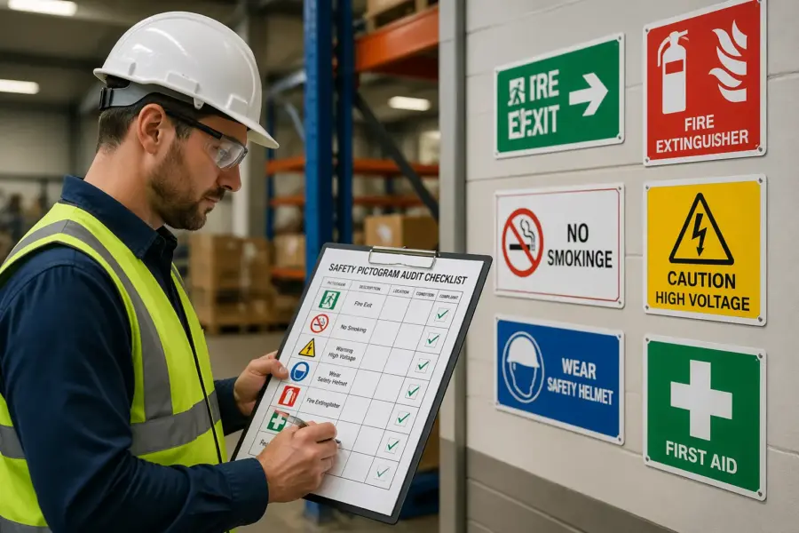
Symbol accuracy is where many sites drift over time, especially after someone prints a “close enough” icon from the internet. Use the table below to spot common clarity failures quickly and record what you found for later corrective action.
Accuracy also includes the directionality of symbols, like arrows, running-man egress icons, and hand placement warnings. A flipped or rotated pictogram can suggest the wrong motion, which is a small error that becomes a big one during stress.
Pay attention to combined messages, because stacking multiple meanings into one sign often reduces clarity. If you need three behaviors, it is usually better to separate them into a clear hierarchy rather than forcing one crowded panel.
Test legibility under the conditions that matter, including low light, glare from open dock doors, and dust in the air. A symbol that works in a bright conference room can fail completely in a dim mechanical space.
Do not forget that PPE changes perception, especially face shields and tinted safety glasses. If a symbol relies on fine detail, it may disappear when someone is wearing the exact protection you require.
| Clarity check | What to look for on site | Typical fix |
|---|---|---|
| Minimum viewing distance | Text too small for the approach distance | Increase sign size or move sign closer to decision point |
| Contrast and glare | Overhead LEDs wash out white backgrounds or glossy laminate | Switch to matte finish or adjust placement away from reflections |
| ISO/ANSI symbol match | Homegrown icon differs from the standard pictogram shape | Replace with approved artwork from the correct standard set |
| Language support | Text-only instruction where multiple languages are used | Add standardized pictogram plus short, plain-language text |
| Action clarity | Symbol suggests the wrong behavior, like PPE optional | Change to mandatory sign format and correct symbol |
When you record issues, note the exact failure mode, like “legible only within 5 feet” or “glare from north-facing door at 3 p.m.” Specific notes lead to specific fixes, and vague notes lead to rework.
Also record what the user is supposed to do, because some signs are clear but not actionable. A hazard symbol without an instruction can be technically correct and still useless when people need a decision.
Check for consistency: color, shapes, and message hierarchy
Consistency is what makes a site readable, because people learn the system and then react without thinking. When one area uses ISO green safe condition signs and another uses a random shade of teal, you add friction at the worst time.
Consistency also prevents the slow drift that happens when different departments order their own signs. If maintenance buys one style, EHS buys another, and production prints their own, you end up with three dialects of safety communication.
Audit the shape language, because triangles, circles, and rectangles carry meaning in most standards. If a mandatory PPE message shows up in a triangle in one building and a blue circle in another, you have trained people to distrust the code.
Look for inconsistent use of headers and signal words, especially in ANSI-style formats. If “DANGER” appears on minor pinch points and “CAUTION” appears on high-energy equipment, people will not calibrate their response correctly.
Message hierarchy matters when you stack signs, which happens near machine cells and loading docks. Put the life safety message first, then the hazard warning, then the instruction, or people will read the easiest line and miss the one that keeps them alive.
Hierarchy also applies across a space, not just on one post, because people scan an area for meaning. If every post has five signs, the scanning process breaks and people stop trying to sort the priorities.
Look for mixed systems caused by growth, acquisitions, or a long relationship with several sign vendors. Pictogram compliance is easier when you standardize a single library of approved symbols and lock it down like any other controlled document.
Standardization should include materials and finishes, because a matte rigid sign behaves differently than a glossy label. If half the site uses reflective signs and half does not, night shift conditions will not be consistent even if the artwork matches.
Check for consistency in mounting height and lateral placement, because people learn where to look. When emergency information is sometimes at eye level and sometimes near the floor, you waste time during evacuations and response.
Finally, check consistency between training and signage, because the two should reinforce each other. If your onboarding slides show one symbol and the floor uses another, you have created a translation problem you did not need.
Check placement and viewing angles during real work
Placement problems rarely show up during a quiet walk-through, so watch the area during normal operations. A warning sign that is perfectly visible at 9 a.m. can disappear behind staged pallets by noon.
Time of day matters more than people expect, especially near dock doors and skylights. A sign can be readable in the morning and washed out in the afternoon when sun angle hits it directly.
Stand where the user stands, including seated forklift height and crouched maintenance positions. If you have to crane your neck or turn your body away from the hazard to read the sign, placement is wrong.
Also stand where a visitor stands, because visitors hesitate and look around more than trained operators. If the first thing a visitor sees is a cluster of technical warnings with no direction, you are setting up confusion at the entrance.
Do a quick visibility assessment for each sign by checking approach direction, speed, and competing visual noise like digital displays or bright product labels. Warehouses with high bay racking often need overhead repeats because aisle-end signs vanish once a lift truck enters the row.
Consider the decision point carefully, because many signs are mounted where it was convenient, not where it was useful. If the choice is “turn left or right,” the sign needs to be before the turn, not after it.
Check for occlusion caused by open equipment doors, curtains, and temporary barriers. A lockout pictogram hidden behind a propped-open panel is not a control, it is a decoration.
Pay attention to multilingual environments and hearing protection zones where verbal cues fail. In those areas, pictograms must carry more of the message, so poor placement becomes a bigger issue than it would in a quiet office corridor.
Look at how people actually approach the hazard, because approach is not always straight on. If the normal approach is diagonal, the sign needs to face that angle or be repeated so it is readable without stopping.
Check the relationship between the sign and the hazard, because distance can dilute meaning. A “hot surface” pictogram mounted ten feet away from the hot surface invites people to ignore it when they get closer and do not see a reminder.
When you find a placement issue, note whether relocation is possible or whether you need a second sign. Sometimes the best fix is not moving the sign, but adding a repeat at the exact point where hands and feet go.
Check for physical condition: fading, damage, and obstruction
This part is basic, but sites still skip it, then wonder why nobody follows the signs. Sign condition inspection should treat pictograms like any other safety control that degrades with UV, chemicals, abrasion, and cleaning routines.
Condition is not only about readability, but also about credibility, because people judge professionalism fast. A peeling emergency exit sign tells workers that details do not matter here, and that attitude spreads.
Look for fading that changes meaning, like a red prohibition circle that turns pink or a yellow warning background that looks beige. If the color is off, you cannot assume people interpret it correctly, especially visitors who rely on color more than text.
Check for chemical staining and residue, which can blur symbols even when the ink is intact. Battery charging areas and chemical storage rooms are common places where signs slowly turn cloudy and nobody notices until they are unreadable.
Check edges, corners, and mounting hardware, because damaged mounts lead to rotated signs and odd angles. A sign that tilts down can create glare and shadow, which makes legibility worse even if the print itself looks fine.
Look for improvised repairs like tape, zip ties, and bent brackets, because these usually indicate a recurring impact problem. If lift trucks keep clipping a sign post, the fix might be bollards or relocation, not another replacement sign.
Obstruction is the silent killer, because the sign still exists on paper and in audits that never leave the office. If shrink wrap, conduit, open doors, or seasonal displays block a sign, treat it as missing and record it that way.
Obstruction also includes clutter placed in front of floor markings and low-mounted symbols. If a spill kit pictogram is behind stacked totes, it will not help anyone during a spill.
Check whether dirt and dust build up faster in certain zones, because that tells you where materials need to change. A sign that is fine in an office corridor may need a different substrate or protective cover in a grinding area.
Document condition issues with a photo that shows both the sign and the surrounding environment. That context helps maintenance understand whether the problem is cleaning frequency, impact exposure, or just end-of-life aging.
Run a quick checklist for each sign you touch
When you are deep in an audit, you can lose consistency unless you force a repeatable sequence. A short per-sign checklist keeps auditing safety pictograms from turning into a scavenger hunt of random observations.
The checklist should be fast enough that you can apply it hundreds of times without cutting corners. If it takes five minutes per sign, people will stop using it and start guessing.
Use the list below as a minimum, and add site-specific checks like ATEX markings or food safety requirements where needed. Keep it short enough that the team actually uses it, because long forms get pencil-whipped.
As you go, assign a simple status like pass, needs repair, needs replacement, or needs relocation. That small discipline makes it easier to turn field notes into a work order list without debate.
- Correct standard symbol and meaning
- Readable at required distance
- Proper color and shape category
- Mounted at the correct height and angle
- No glare, shadow, or background clutter
- No fading, peeling, cracks, or missing fasteners
- Not blocked by stock, doors, or equipment
When you mark a sign as failing, capture why in a single line so it can be acted on. Notes like “blocked by staged pallets daily” or “wrong symbol for mandatory hearing protection” are actionable without a meeting.
Do not forget to check adjacent signs, because problems often come in clusters. If one sign is faded, the rest on that wall were probably installed at the same time and are close behind.
Use the checklist to spot missing signs as well, because absence is part of the system. If your map says there should be an eyewash pictogram at a station and there is none, log it like any other failure.
If you can, capture the sign ID or location code so replacements go to the right spot. A simple naming convention like “Dock-03-AisleEnd” saves hours when multiple identical doors exist.
Verify pictogram compliance with standards and local rules
Decide which standards govern your site, then audit against that list instead of mixing rules on the fly. Many organizations claim ISO 7010 but still buy ANSI-style headers, which creates a hybrid system that confuses users.
Make the standards choice explicit in your audit form, because auditors should not have to guess what “correct” means. If you operate across regions, you may need a primary standard plus a documented set of exceptions.
Check whether your jurisdiction or customer contracts require specific formats for fire safety, egress, chemical hazards, or transportation areas. A logistics site serving multiple clients may need harmonized symbols at dock doors, especially when drivers come from different countries.
Pay attention to regulated markings that are easy to overlook, like extinguisher identification, exit route marking, and hazardous material storage labeling. These are the signs that get scrutinized after an incident, even if they are ignored during normal operations.
Do not ignore internal rules, because corporate standards often specify fonts, mounting heights, and reflective materials for low-light areas. If you do not enforce your own standard, vendors will fill the gap with whatever they stock.
Internal rules should also cover when to use text, because text can either clarify or overload. A good internal standard limits text to short, plain instructions that support the pictogram instead of competing with it.
When you find a noncompliant sign, write down the exact mismatch, not a vague note like “wrong sign.” Good notes make replacement easy, and they prevent the same error from returning during the next purchasing cycle.
Include the standard reference if you can, because that ends arguments quickly. Even a simple note like “ISO 7010 requires blue mandatory symbol for PPE” helps purchasing and vendors deliver the right item.
Also verify that the sign’s meaning matches the actual rule in that location, because compliance is not just about artwork. If the area no longer requires gloves but the pictogram still says gloves are mandatory, you have created a credibility problem.
Finally, check that the sign supports the control strategy, not replaces it. A pictogram can remind people to wear PPE, but it cannot compensate for missing guarding, poor traffic control, or inadequate training.
Fix and track: prioritizing updates and documenting changes
After the walk, sort findings into a short list of actions that actually reduce risk, then a longer list of nice-to-have improvements. If everything is urgent, nothing gets done, and the audit becomes a yearly ritual with no impact.
Use a simple risk lens that combines likelihood and severity, and do not overcomplicate it. A missing egress sign in a crowded area is a different class of problem than a slightly scuffed instructional pictogram in a controlled room.
Prioritize based on exposure and consequence, so a missing machine guarding warning near an operator station beats a scuffed label in a locked electrical room. Tie each fix to a due date, an owner, and a verification step, because “replace sign” is not complete until you confirm placement and readability.
Make sure the owner is the person who can actually get the work done, not just the person who cares the most. If the fix requires a purchase order, assign it to someone who can initiate purchasing and track delivery.
Track changes with photos taken from the user viewpoint before and after, and store them with the audit record. This is also where you prove sign condition inspection happened, because photos show fading, obstruction, and lighting issues better than text notes.
When you take after photos, take them at the same time of day and from the same approach angle if possible. That makes it obvious whether you actually solved the glare or distance problem instead of just installing something new.
Update your master sign register so purchasing and maintenance stop reintroducing old designs. If you do not control the source files and part numbers, pictogram compliance will drift again within a year.
Include vendor, material type, and installation date in that register, because it helps you predict replacement cycles. If a certain substrate fails every 18 months in a washdown area, you can stop buying it and save time.
Close the loop by spot-checking completed fixes in the field, because paperwork completion is not the same as field success. A sign installed two feet too high is still a failed control even if the work order is closed.
Use the audit results to adjust your standard, not just your inventory. If the same issue appears repeatedly, like signs being blocked by staging, the fix might be a rule about keeping certain zones clear rather than more signage.
Build a repeatable audit cadence that survives staff turnover
Audit cycles fail when they live in one person’s head, then that person changes roles. Write the cadence into your EHS calendar, and tie it to events that change signage fast, like layout changes, new equipment installs, and seasonal staffing spikes.
Make the cadence realistic, because a schedule that is never met becomes background noise. A quarterly walk of high-risk zones and an annual full-site review is often more sustainable than promising monthly full coverage.
Use a small team with different eyes, such as EHS, maintenance, operations, and a supervisor who knows the shortcuts people take. A mixed team catches issues like poor placement near a pallet wrapper that an office-based reviewer would never notice.
Rotate one or two members each cycle so knowledge spreads instead of concentrating. That rotation also helps prevent normalization, where the same people stop noticing the same problems.
Set a baseline frequency, then add targeted audits after incidents, near misses, or customer complaints. A visibility assessment after a lighting retrofit is smart, because new fixtures often create glare exactly where you mounted glossy signs years ago.
Targeted audits are also useful after process changes, like adding a new chemical, changing a traffic pattern, or moving a battery charging station. Those changes can make existing pictograms misleading even if the signs are in perfect condition.
Keep your scoring simple and trend it over time, because trends drive budget conversations. When you can show that 30 percent of dock-area signs fail legibility at distance, replacement stops looking like “new signage” and starts looking like risk reduction.
Use the trend data to focus training as well, because some failures are interpretation problems rather than print problems. If multiple people misread a symbol, you may need a different pictogram or a short reinforcement in toolbox talks.
Store audit records where the next person will actually find them, not on a personal drive. A shared location with a clear naming convention turns the audit into a system instead of a hero effort.
Finally, build the audit into change management so signage gets reviewed before the ribbon cutting. It is cheaper and cleaner to place the right pictograms during installation than to retrofit them after people have already formed habits.
Conclusion
Auditing safety pictograms works when you treat it as field work that tests real communication, not as a paperwork exercise. Clarity, consistency, and physical condition are the three levers that decide whether people react correctly under pressure.
The best audits are honest about what people actually see and do, even when that conflicts with the official layout. If your pictograms only work in perfect conditions, they will not work when you need them most.
If you run a disciplined map-based walk, do honest sign condition inspection, and document fixes with photos, your site gets easier to navigate and safer to operate. The payoff is fewer wrong turns, fewer missed hazards, and a cleaner story when you need to prove pictogram compliance to auditors, customers, or investigators.
Over time, the audit becomes a maintenance routine rather than a special project, and that is the goal. When signage stays readable and consistent, it supports training, reinforces procedures, and reduces the number of decisions people have to make the hard way.


