Cold storage warehouses punish signage in ways most facilities never see. If your wayfinding signage for cold storage warehouses fails, people do not just get annoyed, they get lost in a place where time and temperature both cost money.
I have walked freezers where every aisle looks the same after six months of frost, scuffs, and pallet impacts. The fix is rarely a single better sign, it is a system that assumes cold, moisture, and abuse will keep coming.
Good wayfinding in refrigerated spaces starts with accepting the physics of condensation and the reality of fast paced picking. Cold room signs need to stay readable at a glance, stick to cold surfaces, and survive cleaning that would ruin office labels.
This article covers the basics that make signs last, from low temperature label materials to condensation resistant signage layouts. The goal is simple, keep people moving safely and keep product in the right temperature zone.
What cold storage conditions do to signs and markings
Cold rooms create constant cycles of contraction and expansion that slowly peel corners and split laminates. A sign that looks perfect at install can start curling after a few door openings if the material and adhesive were picked for room temperature.
Those temperature swings also change the stiffness of plastics, so panels that were flat at 70°F can warp just enough to create stress at fasteners. When that stress concentrates at corners, the first crack often starts where nobody looks until it fails.
Condensation is the quiet destroyer because it creeps under edges and attacks inks and adhesives. When warm humid air hits a freezer wall, you get a thin water layer that turns many labels into temporary stickers.
That same moisture can freeze and thaw repeatedly near doors, which is brutal on edge seals and can cause micro lifting that spreads. Once water gets behind a label, it does not need much time to turn a clean edge into a dirt trap.
Frost adds its own problems because it hides fine detail and makes glossy surfaces scatter light. Even well printed cold room signs can look washed out when a thin ice film builds up over the face.
Frost also changes color perception, so a subtle gray on white that looked modern in a proof becomes invisible in the field. If your design relies on thin outlines or low contrast backgrounds, frost will erase the logic of the sign.
Mechanical damage is routine, not rare, because pallets scrape posts, reach trucks bump rails, and shrink wrap drags across panels. If your wayfinding signage for cold storage warehouses sits at forklift height without protection, it will get sanded down one hit at a time.
Even pedestrian traffic is harsher in cold rooms because gloves catch edges and people lean on walls while they wait for doors to cycle. A sign that would last years in an ambient warehouse can be destroyed in months when it lives in a choke point.
Chemicals finish the job, especially quats, peracetic acid blends, and alkaline degreasers used in food environments. If the graphic system cannot handle repeated wipe downs, you end up replacing signs right when the warehouse is busiest.
Some facilities also use hot water or steam in adjacent areas, and the temperature shock at the door can accelerate failure on nearby panels. If you see bubbling, whitening, or ink smear, it is often chemistry plus heat, not just cold.
Air movement matters too, because evaporator fans can blast signs with ice crystals and airborne debris. A label mounted near an evaporator discharge will age faster than the same label installed ten feet away.
Finally, the floor itself becomes part of the signage problem because wet surfaces reflect light and hide contrasts. When operators are focused on traction, they will not spend extra seconds decoding a sign that should have been obvious.
Choosing materials and adhesives that hold up
Start by deciding whether the sign is a rigid panel, a magnetic placard, or a pressure sensitive label, because each behaves differently in the cold. For fixed wayfinding, rigid PVC, polycarbonate, and aluminum composite panels usually outlast thin films in traffic areas.
Rigid panels also give you the option to mechanically fasten instead of relying on adhesive, which can be a lifesaver on textured freezer walls. If you can combine fasteners with a perimeter seal, you reduce the chance of moisture creeping behind the face.
For labels, pick low temperature label materials designed to stay flexible instead of turning brittle. Cast vinyl and certain polyester films handle freezer temperatures better than economy calendared vinyl that shrinks and cracks.
Polyester is often the quiet workhorse for barcode and location labels because it resists tearing when someone grabs it with gloves. If scanning is part of the workflow, choose a face stock that stays flat so the barcode does not distort under frost.
Adhesive choice matters more than most buyers want to admit, and the data sheet fine print is where projects fail. Look for freezer grade acrylic adhesives with a stated application temperature and service temperature that match your operation.
The key detail is that “service temperature” only tells you what happens after the adhesive has already bonded. If the label never wets out during install, the best service rating in the world will not stop edge lift.
If you apply labels inside the freezer, you need products that bond at low application temperatures, not just survive them afterward. If you can stage installation in a temperate anteroom, you can use more options and get better wet out on rough walls.
Surface prep becomes a full process in cold storage because walls can have invisible frost and oily residue from equipment. A fast wipe with the wrong cleaner can leave a film that kills adhesion even if the label is technically “freezer grade.”
Consider the substrate as much as the label, because stainless, powder coat, galvanized steel, and insulated panel skins all behave differently. Textured coatings and orange peel finishes reduce contact area, so you may need a thicker adhesive or a different mounting method.
Lamination is worth the cost when cleaning is frequent or when pallet rub is common. A matte overlaminate can also reduce glare from high bay LEDs, which helps readability when the floor is wet and reflective.
Overlaminate also protects against ink abrasion from gloves and jacket zippers, which is more common than people think in tight aisles. If you have to choose, protect the information layer first, because a pretty panel with missing numbers is still a failure.
Magnetic placards can be useful on racking and steel doors, but they need a plan for frost and cleaning. If moisture gets between the magnet and the metal, it can freeze and create a gap that makes the placard slide or fall.
When you need removable signage, consider rigid hang tags or clip-on rack signs that do not depend on a perfect surface. A mechanical attachment can be more reliable than adhesive when the environment is actively trying to unstick everything.
Finally, think about supply chain and lead time, because specialized low temperature label materials are not always stocked locally. If you standardize on one or two proven constructions, you can keep spares and avoid emergency substitutions that fail in a month.
Designing for visibility: fogging, frost, and low light
Design rules that work in a dry warehouse break down in a freezer because the air itself blocks contrast. Condensation resistant signage uses big type, thick strokes, and strong contrast that stays readable when the viewer’s glasses or visor fogs.
Fogging is not just an entry problem, because people move between zones and open cases all shift long. If the sign requires a clean, sharp view to decode, it will fail at the exact moment a picker is trying to move fast.
Assume the reader is moving, wearing PPE, and looking through a misted face shield. That means fewer words, higher x height fonts, and a layout that still makes sense when the edges blur.
It also means you should avoid clever typography and condensed fonts, because they collapse into noise when viewed through haze. A plain, bold sans serif with generous spacing will outperform a “brand” font every time in a freezer aisle.
Contrast is not just black on white, it is also how the sign separates from its background. If your walls are white insulated panels and your sign is white, you need a strong border or color block so the sign reads as an object.
Reflective elements can help, but only if you test them under your actual lighting and viewing angles. Some reflective films create hotspots that look bright head on and disappear from the side, which is a problem in wide cross aisles.
Keep the information hierarchy simple so the first thing people see is the thing they need to decide. Aisle number, zone, and direction should dominate, while secondary details like “No Staging” or “Keep Clear” should not compete with navigation.
Numbers often work better than names because they are shorter and easier to confirm over radio. If you use names, keep them short and avoid similar words that sound alike in a loud room with fans running.
When you must include barcodes or QR codes, give them enough quiet space so frost does not turn them into a smudged square. A code placed too close to the edge will be the first thing damaged by scraping and the first thing hidden by ice.
Directional arrows should be unmistakable and consistent, because operators do not have time to interpret styles. Pick one arrow shape, one stroke weight, and one placement rule, then enforce it across every sign family.
| Visibility problem | What causes it in cold rooms | Design fix that works |
|---|---|---|
| Fogged eyewear at entry | Warm humid air meets cold lenses | Use short labels, large numerals, and simple arrows |
| Frost film on sign face | Moisture freezes on cold surfaces | Increase contrast, avoid thin lines, choose matte finishes |
| Low light in deep aisles | Fixtures spaced wide, lamps blocked by racks | Use reflective sheeting or high contrast color blocks |
| Glare from LEDs on wet floors | Specular reflection and glossy laminates | Matte laminate and angled mounting to reduce glare |
| Snow effect from ice crystals | Airborne ice scatters light | Bold pictograms and fewer details per sign |
The table is a starting point, but the real test is a walk through with the people who actually pick and drive. If they squint, slow down, or miss a turn, the design needs to get simpler and louder.
Do not forget that low light is sometimes self-inflicted, because burned out fixtures stay burned out longer in hard to access aisles. A good signage system assumes imperfect lighting and still works when one row of lamps is out.
Finally, remember that readability includes distance, because drivers need to see the next decision point early. If your aisle marker is readable only when you are already at the opening, it is too small for the pace of the operation.
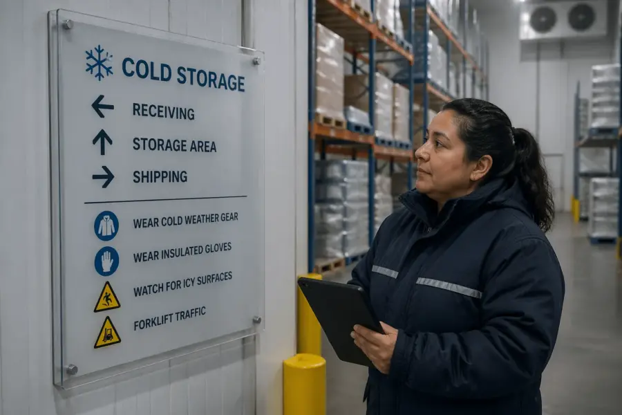
Placing signs where doors, curtains, and pallets won’t block them
Placement is where expensive signs still fail, because a perfect panel hidden behind a strip curtain is useless. Walk the main routes during peak receiving and picking, then mark every spot where pallets queue and block sightlines.
Do that walk at multiple times, because the warehouse looks different when inbound is heavy versus when outbound is heavy. A corner that is clear at 9 a.m. can be a wall of staged product at 3 p.m.
Mount primary wayfinding signs before decision points, not at them, because drivers need time to react on slick floors. In practice that means aisle identifiers and zone markers belong at the cross aisle entry, not halfway down the run.
Think in terms of “preview” and “confirmation,” where the preview sign tells you what is coming and the confirmation sign tells you that you arrived. This reduces last second braking and the awkward three point turn that blocks traffic in a cold aisle.
Doors and curtains create a repeating blind spot, especially when they hang low and sway. Put cold room signs on the approach side and add a repeat marker inside the room where it stays visible after the curtain closes behind the operator.
On high traffic doors, consider mounting on adjacent walls rather than the door itself, because door panels get slammed and scraped. A sign that flexes with the door will fatigue faster than a sign anchored to a stable surface.
Height is a tradeoff between visibility and damage, and forklift masts win most arguments. If you can, mount overhead or on rack end caps above impact height, then add smaller confirmation labels at eye level for pedestrians.
Overhead signs need clearance planning, because loads vary and mast heights change with different equipment. If you mount too low, the first tall pallet will remove your sign and maybe the hardware holding it.
Protective rails, bollards, and rack end guards are part of the signage plan, not separate projects. If a sign is important enough to install, it is important enough to keep from being hit every week.
Do not ignore the view from a seated position because many operators read signs while driving. Aisle numbers that look fine standing still can disappear behind load backrests when you sit in a reach truck.
Test placement by sitting in the equipment and driving the actual approach path at normal speed. If you have to crane your neck or look around a mast, the sign needs to move or get duplicated.
Also consider pedestrian routes, because many cold storage facilities have mixed traffic even when they try not to. Pedestrians tend to follow walls and corners, which are exactly where signs get scuffed and where visibility is worst.
End cap signage is usually the highest value real estate because it is visible from multiple directions. If you standardize end cap layouts, you can make navigation feel predictable even when the building is a maze.
Finally, avoid placing critical signs where they will be covered by seasonal build ups like empty pallet stacks, slip sheets, or dunnage bins. If a location becomes a storage habit, your sign will lose the fight every time.
Using color and symbols to differentiate temperature zones
Color coding is the fastest way to tell people where they are, but only if you keep it consistent across the whole building. Pick a small palette for ambient, chilled, frozen, and deep freeze, then use it everywhere on headers, arrows, and location IDs.
Consistency includes the small stuff, like whether the color is a background band, a border, or a text color. If blue means frozen, it should not be a blue border on one sign and blue text on another, because people learn patterns, not intentions.
Symbols help when workers speak different languages or when fog makes text hard to read. A snowflake icon for frozen, a thermometer for chilled, and a simple box or pallet symbol for staging can reduce radio calls and wrong turns.
Icons should be bold and simple, because detailed illustrations turn into gray blobs under frost. If you need to explain an icon with text, the icon is not doing its job.
Be careful with red and green because they already carry safety meanings, and some workers have color vision deficiencies. If you use red for deep freeze, pair it with a distinct shape or pattern, like a red band with diagonal stripes.
Patterns are underrated in cold storage because they survive poor lighting better than subtle color differences. A striped header, a dotted border, or a split color block can give you redundancy when color alone is not enough.
Zone colors should connect to operational rules, not just aesthetics, so people trust the system. If a blue header always means 0°F storage, then blue must also appear on dock door placards, rack labels, and pick lists for that zone.
This is where many facilities lose the plot, because the WMS naming scheme and the physical signage drift apart over time. If you align naming, color, and symbol, you reduce training time for new hires and seasonal workers.
When you standardize symbols, match them to existing safety and logistics symbology where possible to reduce training time. Your wayfinding signage for cold storage warehouses should feel familiar to anyone who has worked in food distribution, not like a custom art project.
Color can also support compliance by making temperature boundaries obvious, especially when doors are open and zones blend visually. A clear zone marker at every entry point makes it harder for product to drift into the wrong environment.
Use color to reinforce pick path logic, like one color for primary travel aisles and another for restricted or one way aisles. If you already use floor tape or painted lines, match the signage palette so the building speaks one language.
Do not forget visitors and maintenance staff, because they are the ones most likely to get lost and the least likely to ask. A simple color and symbol system can guide a contractor to the right mechanical room without a radio call.
Finally, document the palette with actual color values and print standards, because “blue” can drift across vendors and reorders. If you want the system to survive years of expansion, you need a reference that outlives the original project team.
Maintenance routines: cleaning without destroying graphics
Cleaning is where many condensation resistant signage claims get tested, because crews wipe fast and use strong chemistry. If you do not set a routine and approved products list, you will get random solvents, abrasive pads, and pressure washer overspray.
Sanitation teams are measured on speed and results, not on preserving your graphics, so you have to make the right behavior easy. If the approved cleaner is not available, they will use whatever is closest and move on.
Write a simple rule for crews, wipe, do not scrub, and use microfiber with a compatible sanitizer dilution. If a sign needs scraping to look clean, the material choice was wrong or the location is collecting frost and needs a relocation.
Give crews a visual example of what “damage” looks like, like lifted corners, cloudy laminate, and missing print. If they can spot the early signs of failure, they can report it before a sign becomes unreadable.
Inspection should be routine, not a special project, because small failures spread fast in cold conditions. A tiny edge lift becomes a full peel when moisture freezes behind it and the next wipe catches the corner.
Build signage checks into existing walks, like safety inspections, GMP audits, or battery change routes. If someone already walks every aisle weekly, add “sign condition” to the checklist and make it measurable.
Replacement needs to be fast, because a missing aisle marker is a productivity problem immediately. If replacements require a purchase order and a two week wait, people will improvise with tape and paper and the system will degrade.
Train supervisors to treat signage like racking labels and scan guns, meaning it is operational equipment. When a sign fails, the cost is not the sign, it is the extra travel, wrong picks, and near misses.
- Post an approved cleaner and dilution chart at the sanitation station
- Use microfiber cloths, not green abrasive pads
- Rinse chemical residue on panels near foamers
- Inspect edges and corners weekly for lifting
- Replace damaged rack labels in the same shift they are found
- Keep spare cold room signs and labels in a temperate storage cabinet
That spare cabinet matters more than it sounds, because adhesives and films stored in a freezer can be harder to apply cleanly. If your spare labels are warm and flat, your emergency repair becomes a five minute job instead of a recurring problem.
Also keep a small installation kit with the right squeegee, edge roller, and surface prep wipes, because the wrong tools create bubbles and weak edges. A rushed install in the cold will fail unless the process is simple and repeatable.
When pressure washing is unavoidable, set boundaries for distance and angle around signage, especially on rack end panels. A pressure washer can force water behind edges and start the failure that shows up a week later.
Finally, track recurring damage locations, because they point to traffic design issues, not signage issues. If the same end cap sign gets destroyed monthly, you likely need a guard rail, a relocated travel path, or a different mounting height.
Updating wayfinding when product mix and zones change
Cold storage operations change constantly, and signage that stays static becomes wrong faster than most managers expect. When a frozen SKU set grows, aisles get reassigned, and the old wayfinding signage for cold storage warehouses starts sending people to the wrong door.
Even small changes like adding a new value added area or moving returns can break a pick path that used to be obvious. If the building layout changes but the signs do not, people will rely on memory and new hires will struggle.
Plan for change by using modular sign components, like snap frames for zone maps and replaceable inserts for aisle IDs. For rack labels, choose templates that let you swap location codes without redesigning the whole visual system.
Modularity also helps with damage, because you can replace the information layer without replacing the whole panel. If the base stays mounted and aligned, updates become cleaner and less disruptive to operations.
Do not let temporary paper signs become permanent, because they fall off and train people to ignore markings. If you need a temporary marker, use freezer rated labels or magnetic placards that look intentional and match your color rules.
Temporary signage should still follow your hierarchy, meaning it should look like a cousin of the permanent system. When temporary signs look sloppy, people assume the information is unreliable and stop trusting the whole wayfinding set.
Version control matters, even for signs, because mixed generations create confusion. Put a small print code or install date on the bottom edge so supervisors can spot outdated cold room signs during audits.
You can also keep a simple sign register with location, sign type, and last update, which helps when multiple shifts handle changes. Without a register, two teams can “fix” the same area differently and create contradictions overnight.
When zones change, update the digital side too, like WMS location naming, pick path maps, and dock door assignments. If the handheld says “FZ-12” but the rack says “F-12,” operators will pick one and ignore the other.
Alignment between physical and digital labels is also critical for cycle counts and audits, because discrepancies waste time and create false inventory errors. If you standardize a naming convention, enforce it in both the WMS and the print templates.
Communicate changes with a short changeover window, because signage updates that drag on create a mixed reality on the floor. If you cannot update everything at once, prioritize entry points and primary decision signs first.
Finally, treat expansions and seasonal overflow as planned events, not surprises, because they happen every year. If you prebuild an overflow signage kit with zone markers and aisle IDs, you can deploy it fast without breaking the system.
Conclusion
Cold storage is unforgiving, so signage has to be engineered like equipment, not treated like office décor. The best wayfinding signage for cold storage warehouses uses freezer grade materials, adhesives that bond in the real install conditions, and designs built for fog and frost.
Durability is not a single spec, it is the combination of material, adhesive, print protection, and placement that survives daily abuse. When those pieces work together, the signs stop being fragile and start being dependable.
When you get the basics right, cold room signs stop being a constant replacement item and start acting like stable infrastructure. Pair durable low temperature label materials with smart placement and consistent zone colors, and your condensation resistant signage will keep working long after the first winter rush.
The payoff shows up in fewer wrong turns, fewer wrong picks, and fewer near misses at blind corners. In a facility where minutes matter and temperature is always on the clock, clear wayfinding is one of the simplest upgrades you can make stick.