One cracked corner on a shipped item can wipe out your margin, trigger a return, and annoy a customer who did nothing wrong. A clear marking system fixes part of that problem by telling every handler exactly what the package can and cannot tolerate.
Handling symbols for fragile items work best when they are consistent, easy to spot, and backed up by smart packaging. If your box says “Fragile” but the inside lets the product rattle, the symbols become background noise.
Most shipping damage happens during ordinary moves like drops from waist height, quick slides across a dock, or a heavy carton set down hard on top. The goal is to reduce those routine hits by using the right pictograms, placed where people actually look.
It also helps to remember that shipping is a chain of small decisions made by different people who never meet each other. Your markings are one of the few ways to communicate across that chain without a phone call or special handling fee.
When markings are done well, they reduce ambiguity and speed up correct handling, which is exactly what busy facilities need. When they are done poorly, they add clutter and create false confidence that the packaging cannot support.
What “fragile” means in handling terms (not just product terms)
In handling terms, “fragile” means the item has a low tolerance for shock, vibration, compression, or puncture during normal transport. A ceramic mug is fragile, but so is a calibrated sensor, a glass vial, or a laptop with a stressed screen edge.
Handlers do not see your product, they see a carton that has to survive conveyors, pallet jacks, and stacked trailers. If the package fails under typical forces, the shipment is fragile even if the product feels sturdy in your hand.
Think in measurable events like a 24 inch drop, a tip over off a conveyor, or a clamp truck squeeze at the warehouse. Those are the moments your packaging has to manage, and your markings should warn about the ones that matter most.
A “fragile” callout is also about orientation and stability, because many products break when handled correctly but in the wrong direction. That is why a fragile label symbol alone is weaker than a set that includes a this side up symbol and sometimes a do not stack symbol.
Fragility also includes tolerance for repeated small impacts, not just one big drop. A product that survives a single hit might still fail after hours of vibration in a delivery van or a long ride on a belt sorter.
Compression is a quiet killer because it does not look dramatic until you open the box. If your item can crack, warp, or de-calibrate under steady load, it is fragile even if it never gets dropped.
Puncture risk is another handling reality, especially around forklifts, pallet corners, and sharp-edged freight. A thin outer carton and a dense product can create a situation where one poke becomes a direct hit to the item.
Some products are fragile because of their finish, not their structure, like glossy coated parts, painted enclosures, and polished stone. In those cases, the damage is cosmetic but still expensive because customers judge quality by what they see first.
Liquids and semi-liquids have their own fragility profile because caps loosen, seals creep, and internal pressure changes with temperature. A bottle that never breaks can still arrive as a sticky mess if it is stored on its side for a day.
Electronics add sensitivity to electrostatic discharge and micro-cracks that show up later as intermittent failures. That is why fragile handling is sometimes about preventing invisible damage that becomes a warranty claim weeks after delivery.
It helps to define your shipment as fragile based on the weakest link, not the average strength of the contents. If one component fails at a lower force than the rest, your markings and packaging should be designed around that component.
Finally, remember that “fragile” is relative to the shipping environment you choose. A product might be fine on a palletized LTL shipment but fragile in a small-parcel network with automated sorters and frequent drops.
Key pictograms that protect fragile shipments
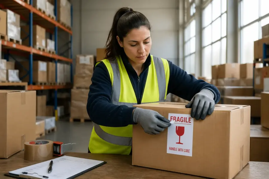
The classic fragile label symbol is the broken glass icon, and it works because it is fast to read from several feet away. Use it when shock or impact is the main risk, like glassware, labware, framed prints, and thin stone samples.
The this side up symbol, usually two vertical arrows, is the one I trust most for preventing avoidable damage. It tells a forklift driver and a sorter the same thing, keep the product in its designed orientation during lifts, slides, and stacking.
The do not stack symbol is the blunt tool for stopping top load damage, and it matters for items with weak lids or sensitive internals. If your product cannot take another carton on top, you need that pictogram and you need packaging that makes stacking inconvenient.
Other useful handling symbols for fragile items include “keep dry,” “temperature limits,” and “do not clamp” for certain warehouse equipment. Choose symbols based on real failure modes you have seen, not on a wish list of warnings that nobody will follow.
The broken glass icon works best when it is large and isolated, because the human eye catches simple shapes faster than text. If you pair it with the word “Fragile,” keep the typography bold and avoid long sentences that become unreadable at speed.
Orientation arrows should be treated like directional signage, not decoration. If you print arrows on a box that can be opened from either side, you are creating confusion that makes the symbol less trustworthy.
The do not stack symbol is most effective when combined with a visible physical cue like a taller box profile, corner posts, or a cap that prevents flat stacking. If the carton still looks like a perfect base for another carton, the symbol fights an uphill battle.
Keep dry matters even for products that are not ruined by water, because wet cartons lose strength and collapse under load. A damp box can turn a non-fragile item into a fragile shipment simply by weakening the structure around it.
Temperature limits are often ignored unless the shipper also controls the service level and timing. If you need temperature protection, the symbol should be a reminder of a plan you already built, not a hope that the network will behave differently.
Do not clamp is important for items shipped in large cartons that might be moved by clamp trucks, especially in appliance and furniture flows. If clamping will crush the product, the symbol can prevent the wrong equipment choice at the dock.
Some shippers also use “do not use hooks” when straps and hooks are common in their lanes. That symbol is niche, but it can prevent punctures and tears that look like mishandling even when the handler thought they were doing the right thing.
If your product is sensitive to static, an ESD symbol on the inner packaging can help during unpacking and returns processing. It will not change carrier behavior much, but it can protect you from damage caused after the box arrives at a facility.
For mixed cartons with multiple items, pictograms should reflect the most sensitive item inside. A box with one fragile component and nine sturdy ones still needs the fragile story, because one broken part can ruin the entire order.
Consistency matters across your product line because handlers learn patterns. If every carton you ship uses the same icon size, placement, and color, the meaning becomes faster to recognize and harder to ignore.
How to pair pictograms with packaging choices (cushioning and bracing)
Symbols change behavior only a little, packaging changes outcomes a lot, so pair the two like a system. When you use handling symbols for fragile items, build the inside to survive at least one bad day, because bad days happen every day in shipping.
Match cushioning to the product and the route, because a small parcel network is not the same as a dedicated freight lane. Foam end caps, molded pulp, inflatable air pillows, and corrugated inserts all work, but only when they stop movement and spread impact across a larger area.
The first packaging rule is immobilization, because movement turns every bump into a collision. If the product can slide, rotate, or bounce, the outer carton becomes a drum and the contents take repeated hits.
The second rule is clearance, because fragile items should not touch the outer walls. A hard corner impact on the carton should be absorbed by cushioning before it reaches the product.
Cushioning is not just about thickness, it is about the right density for the weight and shape of the item. Too soft and the product bottoms out, too firm and the impact transmits straight through.
Bracing is what keeps orientation symbols honest, because arrows without internal keying are just a suggestion. If the product can be packed upside down or sideways without resistance, someone eventually will do it.
For tall or top-heavy items, add lateral support so the product cannot tip inside the carton. Tip-over inside the box can crack corners, stress mounts, and shear off delicate protrusions.
For flat fragile items like framed art or glass panels, edge protection matters more than face padding. A strong edge guard and corner blocks can prevent the most common break pattern, which is a corner hit that sends a crack across the surface.
Double boxing is useful when the outer carton is likely to take hits that would overwhelm a single layer of cushioning. It works best when there is meaningful space between the inner and outer box, not just two boxes touching each other.
Void fill should be treated as a structural element, not a decorative one. A handful of loose paper in a big box often settles during transit and leaves the product free to move.
Tape and closure choices also support your symbols, especially for keep dry and do not stack situations. A strong H-tape seal and reinforced seams can prevent the box from popping open under load or moisture exposure.
Outer carton selection should be based on weight, dimensions, and expected stacking, not just cost per unit. A fragile marking on a weak carton tells handlers you know it might fail, which is not the message you want to send.
If you ship heavy fragile items, consider adding corner posts or a corrugated frame that carries compression loads. That way the box can be stacked without transferring force into the product cavity.
For liquids, use secondary containment like a sealed bag and absorbent material, even when the bottle seems robust. A small leak can ruin labels, weaken corrugate, and lead to a total loss due to contamination.
For temperature-sensitive items, insulation and refrigerant packs need to be sized for worst-case delays, not best-case delivery. The temperature symbol should be a cue for a validated packout, not a substitute for one.
Testing is the bridge between symbols and reality, because it shows whether your packout matches the warnings you print. A simple series of controlled drops and compression checks can reveal weak points faster than a month of customer complaints.
| Pictogram | Main risk it addresses | Packaging pairing that makes it believable |
|---|---|---|
| Fragile label symbol (broken glass) | Shock and impact from drops or knocks | Foam or molded pulp that suspends the item and prevents contact with outer walls |
| This side up symbol (two arrows) | Orientation sensitive parts and liquid migration | Internal bracing that keys the product into one direction and blocks rotation |
| Do not stack symbol | Top load compression and crushing | Stronger outer carton, corner posts, or an overpack that resists compression |
| Keep dry (umbrella) | Moisture damage during transfer and storage | Poly bag, sealed liner, desiccant, and taped seams on the outer carton |
| Temperature limits | Heat or cold exposure that ruins materials | Insulated shipper, phase change packs, and route planning that avoids weekend holds |
When you build packaging that supports the pictograms, you also make training easier for your own team. Packers can see a direct link between the symbol set and the insert kit they are supposed to use.
That link matters because many damage issues start at the pack station with substitutions and shortcuts. If the right insert is missing and someone improvises, the symbols on the box will not save the shipment.
Best placement for fragile-related symbols on different box styles
Placement is where many shippers waste good symbols, because a tiny icon hidden under tape does nothing. Put the fragile label symbol and the this side up symbol on at least two adjacent sides, so one is visible no matter how the carton sits.
On regular slotted cartons, put arrows near the top edge on the long side panels, not down by the bottom where pallets and straps cover them. Keep a clear border around the pictogram so it does not blend into barcodes, branding, or handling notes.
On die cut mailers and bookfolds, handlers usually see the largest face first, so place your symbols on that face and one side panel. If the box opens like a clamshell, mark the correct upright position based on how the product sits inside, not based on how the box looks on a table.
For overpacks and double boxing, mark the outermost carton only, because that is what handlers touch. If you reuse cartons, remove or cover old markings, since conflicting arrows and old do not stack symbol prints train people to ignore everything.
Think about the most common viewing angles in your carrier’s flow, because that is where symbols earn their keep. In many parcel networks, cartons ride with one long face outward, so side-panel placement often beats top-panel placement.
Top-panel symbols can help during manual handling, but they disappear when cartons are stacked close together. If you only place arrows on the top, you are betting that nobody will ever stack or strap the shipment.
On long boxes, place arrows closer to the center of the panel, because corners are where labels, tape, and scuffs accumulate. A symbol that gets rubbed off or covered by a carrier label may as well not exist.
On small cartons, avoid shrinking symbols to fit a crowded design. If the box is too small for readable pictograms, consider using a larger outer label or a simple two-color sticker that stands out.
For poly mailers or flexible packaging, pictograms have limited value because the package does not hold a stable orientation. If you must ship fragile items in flexible packs, the real solution is an internal rigid mailer or a switch to a box.
For tubes and round containers, arrows should be repeated around the circumference so one set is visible from any approach. A single arrow on a tube is easy to miss when the package rolls or gets rotated in a bin.
If you use corner labels or L-shaped stickers, place them where they wrap from a main face to a side face. That wrap increases visibility and makes it harder for a single carrier label to cover the entire marking.
Leave space for carrier documentation, because carriers will place labels where they need them, not where you prefer. A reserved “label zone” can prevent your symbols from being buried under tracking and hazmat paperwork.
Color contrast matters as much as placement, especially in dim warehouses and dirty trailers. A black icon on a dark printed box may look stylish, but it is functionally invisible after a few scuffs.
If you print directly on cartons, confirm that the ink does not smear when exposed to moisture or abrasion. A crisp symbol at pack-out that turns into a gray blur at delivery does not protect anything.
When you use stickers, choose an adhesive that holds through cold, dust, and handling. A fragile label symbol stuck to a dusty carton that peels off in transit is worse than no label because it suggests inconsistency.
Finally, treat placement as part of your pack instructions, not an afterthought. If your team applies labels wherever there is room, you will end up with random results and random damage patterns.
Common failure points: when symbols get ignored
Symbols get ignored when the package shape screams “stack me,” like a perfect cube with no warning tape and no load rating. If you print a do not stack symbol on a box that looks identical to every other carton on a pallet, you are asking for disappointment.
They also get ignored when the symbols conflict with operations, like arrows that disagree with the shipping label orientation. In a busy facility, the label wins because it is scanned, so align your this side up symbol with how the label is applied.
Overlabeling is another failure point, because too many icons read like noise and people tune out. Pick the two or three that match your real risks, then make them large enough to see at a glance.
The last failure is credibility, because handlers learn fast which cartons can take abuse and which cannot. If your handling symbols for fragile items show up on boxes that still arrive fine after rough handling, people stop believing the next one that truly needs care.
Another reason symbols get ignored is time pressure, because speed is often the top metric on a dock. If a handler has five seconds to move a carton, they will default to the fastest safe move, not the most delicate one.
Symbols also lose power when they are inconsistent across shipments from the same shipper. If one of your boxes has arrows and another does not, the team handling them will not know which one truly matters.
Dirty or damaged cartons are a practical problem, because scuffs and stretch wrap can hide markings. If your boxes travel on open pallets or in mixed freight, expect abrasion and plan for it with larger prints.
Mixed messaging is common when marketing and operations both add elements to the same panel. A big logo, a barcode, a QR code, and five handling icons compete, and the human brain picks the one tied to the task at hand.
Some symbols are ignored because they are used as a generic “be careful” request rather than a specific handling instruction. When everything is marked fragile, nothing is fragile, and that is a pattern many facilities learn quickly.
Do not stack is especially vulnerable because stacking is a space-management tool, not a preference. If your shipment enters a system designed to cube out trailers, a flat-topped carton will be stacked unless you provide an alternative.
Arrows can be ignored when the internal packaging does not punish incorrect orientation. If the product arrives fine even when upside down, the symbol becomes optional in the eyes of the handler.
Small-parcel automation is another reality, because many touches are machine touches. A symbol cannot stop a high-speed slide or a drop from a diverter, so your packaging must be engineered for those events.
Returns processing can also create damage that looks like outbound mishandling. If customers open the box and re-pack it without the original bracing, the fragile symbols remain but the protection is gone.
Even within one carrier, different hubs have different practices, staffing, and equipment. If your damage spikes in one region, it may be a handling pattern that your symbols cannot overcome without packaging changes.
Finally, symbols get ignored when they are printed in the wrong language context or with unclear iconography. Standard pictograms reduce that risk, but only if you avoid custom art that looks clever and reads poorly.
A simple checklist before you ship
Before you print a thousand cartons, run a quick reality check using one packed sample and a harsh mindset. You are looking for the easy ways the product can move, tilt, or get crushed even when the outer box looks perfect.
Use the checklist to connect markings to physical protection, because that is where damage prevention lives. If you cannot explain what packaging feature supports each symbol, you probably chose the symbol out of habit.
Start by watching someone else pack the item without coaching, because that reveals where your process is unclear. If two packers create two different packouts, your markings and packaging will not perform consistently.
Do a simple shake test and listen for clicks, slides, and dull thuds that suggest contact with the outer wall. If you hear movement, you have a packaging problem that no fragile label symbol can solve.
Check the corners and edges of the outer carton, because that is where impact energy concentrates. If the box corners crush easily by hand, they will crush harder on a conveyor or under a stacked load.
Confirm that the arrows match the internal orientation, then confirm that the packout makes it hard to pack the item wrong. The goal is to remove choice, not to rely on memory.
Review your carrier label placement as part of the design, because labels are often applied by software default. If the label routinely covers your symbols, you need to change the layout or the label zone.
Look at your damage history by SKU and by lane, because patterns tell you what to prioritize. A product that only breaks in winter might need keep dry or temperature limits more than an extra fragile icon.
If you can, run a small pilot shipment and inspect cartons at arrival, not just the product. Crushed corners, torn seams, and scuffed panels are early warnings that your packaging is operating too close to the edge.
Take photos of the packed sample and make them part of the work instruction, because words are interpreted differently by different people. A clear photo of correct cushioning and bracing reduces variation immediately.
Finally, decide what success looks like, because “less damage” is vague and hard to manage. A target like “under 1% damage rate” or “zero corner breaks” gives you something to measure after changes.
- Fragile label symbol printed on two adjacent sides
- This side up symbol aligned with shipping label orientation
- Do not stack symbol used only when top load will break the item
- Item immobilized, no rattle when shaken firmly
- Minimum 2 inches of cushioning on all impact faces, where practical
- Outer carton grade matches weight and route
- Old markings removed on reused cartons
If one checklist item fails, treat it as a design issue, not a small exception. Shipping systems punish exceptions because they get repeated at scale.
When you update the packout, update the symbols at the same time so the message stays accurate. A mismatched symbol set is how credibility erodes over time.
Conclusion
A clear marking system works when it is consistent, readable, and backed up by packaging that earns the warning. Handling symbols for fragile items should tell a simple story: what can break, what direction matters, and what loads are unacceptable.
Use the fragile label symbol for shock risk, the this side up symbol for orientation, and the do not stack symbol when compression will ruin the shipment. Place them where handlers can see them fast, then test one packed box like you expect it to be treated poorly.
If you do those basics, you will still see damage sometimes, but it will be the rare exception instead of the weekly pattern. The payoff is fewer claims, fewer angry emails, and fewer hours spent arguing about who dropped what.
The real win is that good markings and good packaging scale together, so every additional shipment benefits from the same discipline. Once your system is consistent, you can improve it with small tweaks instead of emergency redesigns.
When you treat pictograms as operational tools rather than decoration, you make life easier for packers, carriers, and customers. That is the kind of boring reliability that quietly protects margins and keeps buyers coming back.


