Warehouses run on motion, and motion turns risky fast when people cannot read the space at a glance. Wayfinding symbols for warehouses give every worker the same map, even when the layout changes and the shift is loud.
I have walked sites where the only navigation system was tribal knowledge and a few fading arrows taped to a post. That setup always breaks down during peak, when temps are busy, visitors are lost, and forklifts keep moving anyway.
Good symbols reduce wrong turns, near misses, and those awkward standoffs at blind corners where nobody wants to back up. They also make training easier because new hires can follow warehouse signage symbols instead of memorizing verbal directions.
This guide focuses on practical choices, not theory, so you can standardize icons, place them where eyes already go, and keep them maintained. If you already use floor marking symbols and aisle identification signs, you will get more value by making the whole system read like one language.
A good wayfinding system also protects productivity, because every wrong turn is wasted travel and wasted attention. When the building is readable, people spend their mental energy on picking accurately instead of decoding where they are.
It is easy to underestimate how much navigation affects morale, especially for new hires who do not want to look lost. Clear wayfinding symbols for warehouses let them move with confidence and ask fewer “where is it” questions.
What wayfinding means in a warehouse setting
Wayfinding in a warehouse is the set of cues that helps people and vehicles choose the right path without stopping to ask. It includes symbols, text, numbers, colors, and even the way aisles and crossings are shaped.
The difference between wayfinding and basic safety posting is intent. A “wear PPE” sign tells you a rule, while wayfinding symbols for warehouses tell you where you are, where you can go, and what conflicts to expect.
Warehouses have mixed traffic, and that is where wayfinding either works or fails. A picker on foot reads the building at eye level, but a lift driver reads farther ahead, so symbols must support both viewpoints.
Wayfinding also has to survive stress, because people make navigation errors when they are rushing or carrying bulky loads. If a symbol needs a long look or a second guess, it is already too slow for a live aisle.
In practice, wayfinding is a workflow tool that sits on top of your layout and your processes. If your processes change but your symbols do not, you end up teaching people to ignore the building.
It also has to handle different levels of familiarity, from a ten year lift driver to a day-one temp who has never seen your racking pattern. The system should work for both without forcing either one to stop.
Warehouse wayfinding is not just about getting to a destination, it is about choosing the safest path to get there. A symbol that keeps pedestrians out of a pinch point can be more valuable than a symbol that points to the breakroom.
You also have to think in three dimensions, because warehouses are tall and the view is often blocked. Hanging signs, rack end signs, and floor marking symbols each solve a different visibility problem.
Another warehouse-specific issue is noise, because you cannot rely on verbal warnings to correct a wrong move. When the building is loud, the building has to do more of the talking.
Finally, wayfinding is a shared language that should not change from one department to another. If receiving uses one set of arrows and picking uses another, the building feels inconsistent and people hesitate.
Common warehouse wayfinding symbols and what they communicate
Start with the symbols that prevent collisions, because those are the ones that save you from the worst day. Common examples are pedestrian crossing, forklift route, no pedestrians, stop, yield, and one way arrows.
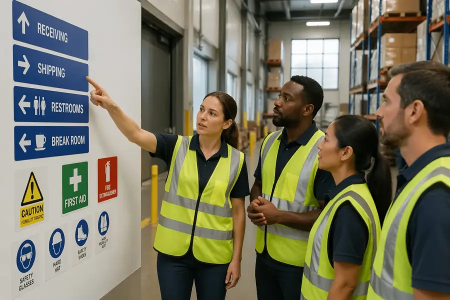
Next come destination and service symbols that cut down on wandering. Think shipping, receiving, returns, battery charging, first aid, eyewash, fire extinguisher, spill kit, and emergency exit indicators.
Then you have operational navigation symbols that keep work flowing. These include staging lane identifiers, putaway zones, pick module entry points, and dock door numbers that match the WMS location logic.
Many sites also need restriction symbols to protect special areas. Use clear icons for authorized personnel only, no pallet jack, low clearance, and speed limit, and keep them consistent with your other warehouse signage symbols.
Pedestrian symbols should communicate both permission and priority, because “walk here” is different from “walk here and expect vehicles.” If you have shared aisles, add a shared path symbol and reinforce it with floor markings that show where feet belong.
Forklift route symbols work best when they imply direction, not just presence. A forklift icon with an arrow tells a driver what to do, while a forklift icon alone often turns into a vague warning that people ignore.
Stop and yield symbols need to match your local driving expectations, because different facilities treat them differently. If you want full stops at crossings, do not use a yield symbol just because it feels less aggressive.
One way arrows are deceptively important, because they reduce head-on conflicts and simplify scanning for hazards. If you have narrow aisles, a one way system can be the difference between smooth flow and constant backing up.
Destination symbols should be paired with a consistent naming convention, because “Shipping” and “Outbound” are not the same word to everyone. If you use both terms in conversation, pick one for signage and stick to it.
Emergency and service symbols should follow familiar standards so people recognize them under stress. When someone is looking for an eyewash station, they should not have to learn your custom icon first.
Operational symbols like staging lanes need to be tied to real behavior, not just labels. If a lane says “Staging 3” but people still stage wherever there is space, the symbol becomes decoration instead of control.
Restriction symbols need to be unambiguous, because “authorized personnel” can mean different things depending on the shift. If a zone is truly limited, add a short text line that clarifies who is allowed, such as “Maintenance only” or “Battery room staff only.”
Do not forget support spaces like restrooms, breakrooms, and time clocks, because lost people tend to drift into traffic. A simple set of facility symbols can keep visitors and new hires from wandering across dock lanes.
Finally, use consistent symbols for hazards that repeat across the building, like low clearance, pinch points, and overhead doors. When the same risk looks the same everywhere, people learn faster and react sooner.
Choosing the right symbol style for fast recognition
Symbol style is a speed decision, because workers read icons in a fraction of a second while moving. If you mix different icon families, stroke weights, and perspectives, the brain spends extra time decoding what it is seeing.
I prefer simple silhouettes with strong contrast and minimal interior detail, because they stay readable when printed small or viewed through scratched safety glasses. Avoid clever illustrations, since they look fun in a mockup and turn muddy on a dusty wall.
Consistency is more important than novelty, because people learn a system by repetition. When the same arrow shape and the same forklift icon show up everywhere, the message becomes automatic.
Think about viewing distance and approach speed, because a dock worker walking can read smaller signs than a driver moving with a load. If you want a symbol to be read at 40 feet, design it like it will be seen at 80 feet.
Use negative space carefully, because icons with thin gaps fill in when they get dirty or scuffed. A pedestrian icon with clear legs and arms will survive grime better than a detailed stick figure.
Text can support symbols, but it should not carry the full message. If your sign only works when someone reads a sentence, it is not a wayfinding symbol, it is a memo.
Color can help recognition, but do not rely on color alone to differentiate meanings. In real warehouses, lighting varies, color fades, and some workers have color vision differences.
Directional systems should use one arrow language, because arrow styles communicate attitude and urgency. Mixing chevrons, thin arrows, and block arrows in the same corridor makes the route feel improvised.
Frames and shapes matter too, because people associate circles, triangles, and rectangles with different types of messages. If you use a red circle for “prohibited,” do not use the same circle for a friendly “go this way” cue.
When you need custom symbols, base them on familiar forms so they still feel obvious. A battery charging icon that looks like a phone charger might make sense in an office, but a warehouse needs a clear industrial battery cue.
Before you commit, print a test sheet at actual size and tape it up where it will live. If it looks great on a screen but weak on a wall, you just saved yourself a costly reprint.
| Symbol style choice | Best use in warehouses | Common mistake to avoid |
|---|---|---|
| Solid silhouette pictograms | Fast hazard recognition at crossings and docks | Adding tiny details that disappear at distance |
| ISO-like safety icons with frames | Emergency equipment, exits, mandatory PPE areas | Mixing multiple frame shapes for the same message |
| Arrow and chevron systems | One way aisles, route guidance, detours during projects | Using arrows without a destination label or zone code |
| Alphanumeric location coding | Aisle identification signs and rack bay navigation | Skipping leading zeros and creating look-alike codes |
Placement rules: where symbols work best (aisles, docks, crossings)
Placement is where good design either pays off or gets ignored. Put symbols where a person naturally looks before a decision point, not where there happened to be a clean patch of wall.
In aisles, mount aisle identification signs at the ends of each aisle and repeat them high enough to clear stored product and equipment. If you use rack labels only at eye level, they vanish behind pallets and seasonal overflow.
At docks, place door numbers and traffic flow arrows so drivers can line up early, before they commit to a turn. Add pedestrian exclusion symbols at dock edges where office staff tend to wander during tours.
At crossings, treat symbols like stoplights, they must appear before the crossing, at the crossing, and after it. A single stop sign at the corner is not enough when a forklift mast blocks the view on approach.
Use the “decision distance” rule, which means the sign should appear far enough ahead that a person can react smoothly. If a driver has to brake hard to obey a one way sign, the sign is placed too late.
Mounting height should match the audience, because pedestrians and drivers scan different bands of the environment. Hanging blades and overhead signs help drivers, while wall signs near entrances help walkers.
Repeat critical symbols after turns, because people lose context when they change direction. A one way sign at the aisle mouth is good, but a reinforcement arrow halfway down the aisle prevents accidental wrong-way entry from cross aisles.
At blind corners, use advance warning symbols that show what is coming, not just what is there. A “forklift crossing ahead” symbol placed ten feet before the corner gives people time to slow down.
At pedestrian doors that open into traffic, place a symbol on the door and a symbol across the aisle. That pairing catches both the person exiting and the driver approaching.
At docks, avoid placing important symbols where trailers, dock plates, or stacked pallets will block them. If the sign disappears whenever a door is active, it is not doing its job during the highest-risk moments.
For staging and queue lanes, place identifiers at the entry and then repeat them at intervals. People often enter a lane correctly and then drift into the wrong slot when they cannot see the label anymore.
Use lighting as part of placement, because a perfect sign in a dark corner is effectively invisible. If you cannot improve the lighting, use higher contrast materials and consider reflective surfaces where appropriate.
Finally, avoid “sign islands” where everything is clustered on one post. Spread cues along the path so people can confirm they are still on the right route without stopping.
Integrating symbols with floor markings and color coding
Symbols work best when the floor tells the same story as the walls. If your floor marking symbols show a pedestrian lane, the wall signs should repeat the pedestrian icon and keep the arrow direction consistent.
Color coding is powerful, but it turns into noise when every team adds its own shade. Pick a small palette, document it, and link each color to a rule, such as yellow for caution zones and green for safe routes.
Floor arrows should match the turning radius and sightlines of the equipment that uses them. A tight arrow that implies a sharp turn encourages drivers to cut corners, which is how toes and rack uprights get clipped.
Where the floor gets abused, use redundant cues so the message survives wear. A wall mounted one way symbol plus a hanging aisle blade plus a floor arrow gives you three chances to be understood.
Start by defining what the floor is responsible for, because it cannot carry every message. I like the floor to handle lanes, crossings, stop points, and keep-out boxes, while walls handle destinations and rules.
Use the same icon on the floor and on the wall when the meaning is identical. If the floor shows a pedestrian symbol but the wall shows a generic “walk” icon, workers will wonder if they mean different things.
Keep line widths and patterns consistent, because people learn what a dashed line means versus a solid line. If one area uses dashed lines for “do not enter” and another uses them for “optional path,” you create hesitation.
At crossings, pair a floor stop bar with a stop symbol so there is no ambiguity about where to stop. When drivers stop in different places, the crossing becomes unpredictable for pedestrians.
Color should support contrast with the floor, not fight it. A light gray concrete floor can wash out pale colors, so test samples under your actual lighting before you commit.
Use zone colors sparingly and tie them to navigation, such as “Blue Zone” for a pick module or “Orange Zone” for returns. When a supervisor says “go to Orange,” the building should make that statement true.
Make sure your color coding does not conflict with safety colors already in use, especially for fire equipment and emergency exits. If everything is red, then nothing feels urgent.
When you have to run temporary routes, use a temporary color or pattern that is clearly different from permanent markings. That way, when the project ends, people do not keep following the detour out of habit.
Finally, document the system with a simple legend posted in break areas and near entrances. A one page reference helps new hires connect floor marking symbols to the rules behind them.
Testing comprehension with real users on the floor
You cannot assume everyone reads symbols the same way, especially in multilingual crews and temp heavy seasons. The fastest test is to show a draft set of warehouse signage symbols to ten workers and ask what each one means in their own words.
Do the test in the actual environment, because context changes perception. A forklift icon next to a dock door may read as “forklift parking” to one person and “forklift traffic only” to another.
Time matters, so measure it instead of guessing. If a worker takes more than two seconds to interpret a symbol at a glance, you should simplify the icon or add a short label.
Watch for polite agreement, because people often nod even when they are unsure. I like to ask, “What action would you take when you see this,” because behavior is what wayfinding symbols for warehouses must drive.
Include people from different roles, because a reach truck driver and a packer may interpret the same sign differently. A good sample includes drivers, pedestrians, supervisors, maintenance, and at least a couple of brand new hires.
Run the test in motion when you can, because standing still makes everything seem easier. A symbol that is obvious during a conference room review can fail when someone is walking with a carton in their arms.
Ask participants to point, not just talk, because pointing reveals what they noticed first. If they point to the wrong arrow or miss the icon entirely, you have a placement or contrast problem.
Pay attention to language, because workers will often invent a name for a symbol. If they all call a symbol “no walking” when you meant “yield to forklifts,” the design is steering them the wrong way.
Test comprehension across shifts, because lighting and congestion change the experience. A sign that works on first shift may get lost in glare or shadows on third shift.
Use quick A/B comparisons when you are stuck between two designs. Put both versions up for a day and see which one produces fewer questions and fewer wrong turns.
Do not ignore near-miss feedback, because it often points to a symbol that is being misread. If two people describe the same confusion at a crossing, you have a clear target for improvement.
Once you finalize the set, train to the symbols with photos from your own facility. People learn faster when the examples look like the exact aisles they walk every day.
Re-test after major changes, because comprehension is not a one-time event. The best systems stay readable even as the building evolves, but you only know that if you check.
Maintenance and change control as layouts evolve
A warehouse changes constantly, and signage fails when nobody owns the updates. Assign a role that approves new aisle identification signs, retires old ones, and keeps a master map that matches the floor.
Maintenance is not glamorous, but it is where safety programs quietly win or lose. Replace damaged signs quickly, clean high dust areas on a schedule, and repaint floor marking symbols before they fade into a gray blur.
Change control should cover temporary projects like racking reconfigurations, mezzanine work, or seasonal overflow. If you add a detour arrow for two weeks, set a removal date, because temporary signage becomes permanent clutter.
Keep the digital side aligned too, since WMS location codes often drive how people navigate. When location naming changes, update the physical aisle identification signs at the same time or you will create a split brain system.
Create a simple sign inventory, even if it is just a spreadsheet with photos and locations. When something breaks, you can reorder the exact sign instead of improvising a replacement that looks different.
Build inspections into existing routines, like safety walks or 5S audits. If you wait for someone to complain, the sign has already failed for weeks.
Floor markings need a lifecycle plan, because traffic, pallet drag, and cleaning chemicals will wear them down. If you know a crossing lasts six months, schedule repainting at five months instead of hoping it makes it to a year.
When you add new equipment types, review your symbols for fit. A facility that adds autonomous mobile robots or new order pickers may need updated route symbols and clearer separation rules.
Standardize materials where possible, because mixed sign substrates age differently. If half your signs fade and half stay bright, the system looks inconsistent and people stop trusting it.
Control who can post signs, because well-meaning supervisors often add homemade notices that conflict with the system. Give people a fast way to request a sign so they do not feel forced to DIY it.
When you remove an aisle or renumber zones, remove the old cues completely. Leaving a ghost sign in place is worse than having no sign, because it actively misleads people who are trying to do the right thing.
Keep a small stock of common signs and floor marking symbols for quick repairs. Waiting two weeks for a replacement stop sign is how small issues turn into normalized risk.
Finally, treat wayfinding updates like any other operational change and communicate them at shift start. A two minute briefing about a new one way aisle prevents hours of confusion and a lot of close calls.
Standardizing aisle identification so people stop asking for directions
Aisle identification sounds simple until you inherit five naming schemes from past supervisors. Standardize on one pattern, such as Aisle 01 to 40 with Bay and Level conventions, and print it on every aisle blade and rack end.
Make the format readable at speed, with big characters and a predictable layout. If you put the aisle letter on top on some signs and on the bottom on others, you force people to hunt for the data.
Include direction cues when the building has mirrored sections or multiple pick modules. A simple “North” arrow on the sign face prevents the classic error where a new hire walks the correct aisle number in the wrong zone.
Match aisle identification signs to scanner workflows when possible. If the handheld screen shows “B-12-03,” your physical labels should show the same structure, not a local nickname like “Back Wall B12.”
Decide what level of precision belongs on overhead signs versus rack labels. Overhead blades should get people to the right aisle quickly, while rack labels handle the exact bay and level once they arrive.
Use leading zeros if you have more than nine aisles or bays, because 2 and 12 look similar at a glance. Aisle 02 and Aisle 12 are easier to distinguish than Aisle 2 and Aisle 12 when someone is moving fast.
Keep typography simple and bold, because fancy fonts reduce legibility in industrial lighting. A clean sans-serif with strong contrast will outperform a stylized font every time.
When you have multiple levels or mezzanines, label the vertical movement points clearly. Stairs, lifts, and access gates should tell people what zone and what level they are entering before they commit.
Use consistent zone naming across maps, WMS screens, and spoken directions. If supervisors say “Zone 3” but the signs say “Module C,” you will keep getting questions no matter how big the letters are.
Place aisle identification signs so they are visible from the main travel corridors, not just from inside the aisle. If a driver has to enter the aisle to confirm the number, you have already created unnecessary traffic.
Add endcap markers that show aisle number plus travel direction when you run one way aisles. A simple arrow next to “Aisle 14” prevents wrong-way entry that forces backing out under pressure.
For large buildings, consider adding a secondary reference like a grid or quadrant label. Aisle 22 in the North-East quadrant is easier to find than Aisle 22 with no other context.
Finally, audit your system by asking a new hire to find five random locations without help. If they can do that quickly, your aisle identification signs are doing their job.
Avoiding symbol overload and sign clutter
Too many signs create the same outcome as too few, people tune them out. If every post has six icons, the urgent messages blend into the background.
Prioritize decision points and conflict points, then remove anything that repeats without adding new information. You can keep a safety poster area for policy reminders and leave the travel paths for wayfinding symbols for warehouses.
Use progressive disclosure, which means you show only what a person needs right now. For example, post a general “Shipping” arrow at the main corridor, then switch to dock door numbers only when the worker reaches the dock lane.
Clutter also comes from inconsistent sizes and mounting heights that look improvised. Pick two or three standard sign sizes, document where each size belongs, and stick to it even when you are in a hurry.
Audit your signs by walking a route and counting how many messages hit you in ten seconds. If you cannot remember the last three signs you passed, you are asking workers to do something impossible.
Remove outdated signs aggressively, because old messages create distrust. When workers see one wrong sign, they start questioning the ones that are correct.
Combine messages when they share the same action, but do not stack unrelated rules. A crossing can have a clear stop message and a clear pedestrian message, but it should not also be the place you post a reminder about time clock policy.
Use whitespace and spacing as part of the design, because crowded layouts feel like noise. A single bold symbol with room to breathe is easier to read than a collage of icons.
Be careful with temporary paper notices, because they multiply fast and never match the system. If something is important enough to post, it is important enough to produce in your standard format.
Think about sightlines, because clutter often happens where people stop and gather. Break areas and time clock corridors can handle informational posters, while travel corridors should stay clean and directive.
Use repetition strategically instead of everywhere. Repeating a symbol every 30 feet in a straight corridor is overkill, but repeating it after each turn is usually helpful.
When in doubt, choose fewer messages and stronger placement. A small number of well-placed warehouse signage symbols will outperform a wall full of reminders.
Finally, train supervisors to protect the system, because clutter usually starts with good intentions. If leaders treat signs as controlled tools, the floor will stay readable.
Quick checklist for a warehouse wayfinding rollout
A rollout goes smoother when you treat it like an operational change, not a print order. Walk the building with supervisors, lift drivers, and pickers, then mark decision points where people hesitate or collide.
Order signs and floor materials in batches so the system looks intentional on day one. If you install half the warehouse signage symbols now and “get to the rest later,” later usually means never.
Before installation, confirm your location codes and aisle naming so you do not print mistakes at scale. A single wrong aisle number can ripple into training confusion and WMS workarounds.
Plan the install sequence so the building never loses its cues mid-change. If you are replacing aisle blades, install the new ones before you remove the old ones so navigation stays intact.
Coordinate with operations so you are not installing signs during the busiest hours. A rushed install leads to crooked placement, missing hardware, and signs that end up blocked by stored product.
Take photos of each installed sign and store them with the master map. That photo record becomes your baseline for audits and makes it easier to spot what changed.
Build a short training moment into shift start the first week. Even the best wayfinding symbols for warehouses work faster when people know the system is new and worth paying attention to.
After launch, track a few simple indicators like wrong picks due to location confusion and near-miss reports at crossings. If the numbers improve, you can justify expanding the system and keeping it maintained.
- Map pedestrian routes and lift routes on one plan
- Standardize icon set and arrow style before printing
- Define color meanings and publish a one page legend
- Install aisle identification signs at every aisle end
- Repaint floor marking symbols at crossings and stop points
- Run a ten person comprehension test on draft symbols
- Assign an owner for updates, repairs, and audits
Keep the checklist visible during the project, because wayfinding work is easy to partially finish and then forget. A simple punch list with dates keeps the rollout from turning into permanent “in progress.”
Once the basics are in, do a follow-up walk with the same group you started with. If they can move through the building without stopping, the rollout is doing what it should.
Conclusion
Wayfinding symbols for warehouses work when they are consistent, placed before decisions, and backed up by floor cues that match. If you treat symbols like a system instead of random signs, people move with fewer surprises and fewer close calls.
The best time to fix navigation is before peak, when you can still walk the routes and watch where confusion happens. Start with crossings, docks, and aisle identification signs, then tighten the rest until your warehouse signage symbols read the same way everywhere.
When the system is working, you will hear it in what people stop saying. Fewer “where is that” questions and fewer shouted warnings at corners are both signs that the building is finally readable.
Keep it alive with audits and change control, because a warehouse that evolves without updating symbols will drift back into tribal knowledge. If you maintain the language, the floor stays safer and the operation stays faster.