Walk through any busy facility and you will see a mix of homemade labels, faded stickers, and signs that mean different things to different people. That confusion is exactly where injuries, wrong turns, and slow evacuations start.
ISO 7010 safety signs for facilities fix that problem by using standardized symbols that look the same across sites, vendors, and countries. When a contractor, visitor, or new hire can read the sign instantly, you cut down on hesitation and bad decisions.
I have seen plants spend real money on equipment and training, then sabotage it with inconsistent signage taped to doors and pipes. A clean, standard sign system is boring in the best way, it keeps people moving and keeps supervisors out of preventable incident reports.
What ISO 7010 is and why consistent symbols matter
ISO 7010 is an international standard that defines safety sign symbols for hazards, mandatory actions, prohibitions, safe conditions, and fire equipment. The point is simple, the same picture should trigger the same response whether you are in a warehouse in Ohio or a lab in Singapore.
Facilities get messy fast, because different departments buy signs from different catalogs and each vendor has its own icon style. ISO 7010 safety signs for facilities keep the visual language consistent, which matters most when someone is stressed or moving fast.
Consistency also protects you during audits and investigations, because you can show that your symbol choices follow a recognized standard instead of personal preference. When a safety manager can point to a standard, arguments about what a sign “should have meant” get a lot shorter.
The other benefit is training efficiency, because a single sign system scales across buildings and job roles. Once people learn the core shapes and colors, they can decode new signs without a long orientation lecture.
Standard symbols also reduce language friction, which is a real issue in facilities with multilingual teams and rotating contractors. A clear pictogram does not care whether the reader speaks English, Spanish, or Polish.
That matters during emergencies, because people do not translate under pressure, they react. If the sign system is consistent, the reaction is faster and closer to what you intended.
ISO 7010 is not about making your building look like a textbook, it is about making your controls visible. If a guard, a lockout point, or a PPE rule is real, it should have a sign that communicates it the same way every time.
It also helps with contractor management, because contractors move between sites and expect familiar cues. When your signs match what they have seen elsewhere, you spend less time arguing about “your way” versus “their way.”
Even visitors benefit, because visitors are the ones most likely to wander into the wrong hallway or open the wrong door. A standardized sign at the decision point keeps them from becoming a distraction for operations.
There is also a quiet professionalism to a facility that uses a standard and sticks to it. When people see consistent signage, they assume the rest of the safety program is equally consistent.
Understanding sign categories by shape and color
Most people remember the icon, but the shape and color carry just as much meaning. ISO 7010 uses consistent geometry so your brain can classify a sign before you even process the pictogram.
Prohibition signs are round with a red border and diagonal slash, and they tell people to stop doing something. If you let a “no entry” message show up as a yellow triangle, you train people to ignore the category cues.
Mandatory action signs are round and blue, and they tell people what they must do, like wear hearing protection or use eye protection. In real facilities, these are the signs that get watered down with extra text and tiny icons, so keep them bold and simple.
Warning symbol shapes are triangular with a yellow background and black border, and they point to a hazard that needs attention. If you are choosing between a warning and a prohibition, ask whether you are describing a hazard that exists or a behavior you want to stop.
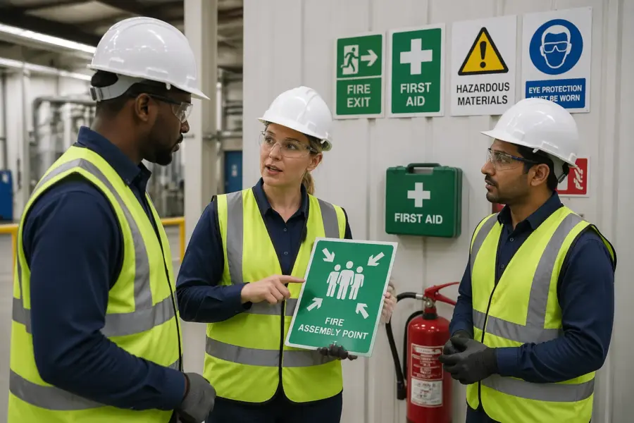
Safe condition signs are typically green, and they point to safety equipment, escape routes, or first aid. People rely on green signs when something is already going wrong, so they should be placed like navigation, not decoration.
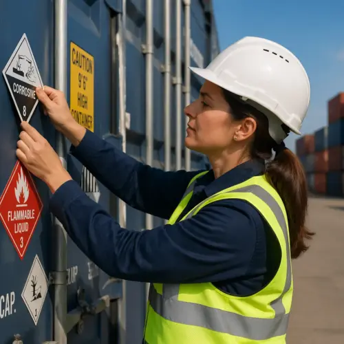
Fire safety signs are red, and they identify fire equipment like extinguishers, hoses, and alarm points. If you bury a red fire sign behind a poster or a pallet, you are gambling with response time.
One reason the shapes matter is that you can see them in your peripheral vision. A red circle slash at the edge of your view still reads as “stop,” even before you see the exact symbol inside it.
Color consistency also helps in low light or smoky conditions where details drop out. In those moments, the broad category cue is what people can still recognize.
Be careful with background colors on walls and equipment, because a sign can disappear if it blends in. A blue mandatory sign on a blue machine guard looks clean on paper and invisible in practice.
Try to avoid mixing category messages on one sign face, because it forces the reader to decide which rule is dominant. If you need both a mandatory action and a prohibition, it is usually clearer to separate them and place them in a logical sequence.
When you standardize categories, you also standardize expectations, and that reduces friction between departments. People stop debating the sign and start following the rule, which is the whole point.
Choosing the right symbols for common facility areas
Picking ISO 7010 safety signs for facilities gets easier when you think in zones, like entry points, production lines, maintenance rooms, and emergency equipment locations. Each zone has repeatable hazards, which means you can standardize sign sets and stop reinventing the wheel.
Start with what people do there, then match the sign category, because the same hazard can need different messages depending on the behavior you want. A battery charging room might need a warning for corrosive substances, a prohibition for open flames, and a mandatory action sign for eye protection.
Entry points are where you set expectations, so do not waste that space on vague reminders. If the whole building requires safety glasses, make that mandatory action sign unavoidable at the main entrance and at the shop floor access doors.
Production lines usually need a mix of warnings and mandatory actions, because the hazards are known and the controls are specific. If hearing protection is required only in certain cells, mark the boundary clearly so people do not guess where the rule starts.
Maintenance rooms are where you see the most improvised signage, because the hazards change with the job. That is exactly why you want standardized symbols for lockout, authorized access, and PPE, so a temporary job does not create a permanent mess.
Labs and quality rooms often need clean, minimal signs that still communicate strong rules. A simple prohibition for food and drink and a mandatory action for eye protection can prevent the casual behavior that leads to contamination or exposure.
In offices and common areas, the biggest wins are usually safe condition and fire safety signs. People forget that visitors and office staff may be the ones evacuating first, so exits and assembly information should be obvious.
Outdoor areas need extra thought because weather and distance change how people see and trust signs. If a yard gate is exposed to sun and rain, choose materials and mounting that keep the sign readable for years, not months.
Do not ignore small rooms like pump closets, compressor rooms, and IT closets, because those are where unauthorized entry happens. A clear prohibition sign and an authorized access message are cheap compared to the downtime from someone flipping the wrong switch.
When you are unsure, walk the area with someone who has never been there and watch where they hesitate. The hesitation points are where the sign should live, and the symbol should answer the question they are silently asking.
| Facility area | Common ISO 7010 sign category | Practical example of what to post |
|---|---|---|
| Loading dock and yard gates | Warning and prohibition | Warning for moving vehicles, prohibition for unauthorized entry |
| Electrical rooms and panels | Warning and prohibition | Warning for electrical hazard, prohibition for access by unauthorized persons |
| Chemical storage and mixing | Warning and mandatory action | Warning for toxic or corrosive substances, mandatory eye and hand protection |
| Machine guarding zones | Warning and mandatory action | Warning for crushing hazard, mandatory hearing protection where required |
| Fire equipment points | Fire safety and safe condition | Fire extinguisher location sign, emergency exit direction sign |
Use the table as a starting point, then adjust based on your actual risk assessment and incident history. If your near misses cluster around a specific doorway or aisle, that area deserves a stronger and clearer sign set.
Try to standardize not only the symbols, but also the combinations you use in common situations. When people see the same pairing of warning plus mandatory PPE at multiple stations, they learn the pattern and comply faster.
Placement and viewing distance: making signs easy to notice
A perfect symbol fails if nobody sees it, and bad placement is the most common reason signs get ignored. Put signs where the decision happens, not where a wall happens to be empty.
For doors and controlled areas, place the sign on the approach side at eye level, so a person reads it before reaching for the handle. For aisle hazards, mount signs where sightlines stay clear above pallets, racking beams, and parked equipment.
Viewing distance drives size, so do not guess, measure typical approach distances and pick a sign format that stays legible. If a forklift operator needs to react from 30 feet away, a small label on a post is basically decoration.
Lighting matters more than people admit, because glare, shadows, and flicker make even good signs disappear. If you have high bay LEDs or skylights, check the sign at the same time of day when traffic is highest and adjust angle or location.
Think about the speed of the reader, because pedestrians, pallet jack operators, and forklift drivers do not have the same time budget. A driver moving with a load needs earlier warning and larger graphics than someone walking slowly with empty hands.
Mounting height should match the environment, and “eye level” changes when people are seated in equipment. If operators spend the day in forklifts, place key traffic and hazard signs where they are visible from that seated viewpoint.
Avoid placing signs on doors that are often left open, because an open door hides the message when you need it most. In those cases, mount the sign on the wall next to the opening and repeat it if the approach angle changes.
Do not let signs compete with visual noise like posters, KPI boards, and random notices. If everything is bright and urgent, nothing is urgent, and safety signs end up blending into the background.
Check for physical obstructions that change throughout the day, like staged pallets, trash bins, and carts. The sign that is visible during a tidy morning walkthrough can be completely blocked during peak production.
For emergency equipment, place a sign that can be seen from multiple angles, not just straight on. If someone is searching for an extinguisher, they are scanning while moving, so give them a chance to spot it early.
When you finish placement, test it like a user, not like an installer. Walk the route at normal speed and see what you actually notice without stopping, because that is how the sign will be experienced in real life.
Combining text with symbols without reducing clarity
Symbols should carry the message on their own, but text can help when you need site specific detail like a room name, a hazard source, or a contact number. The trick is keeping the text from competing with the pictogram.
Use short, plain wording that matches the sign category, so a prohibition reads like “No smoking” and a mandatory action reads like “Wear face shield.” Long sentences invite people to skim, then they miss the one word that mattered.
Keep typography consistent across the facility, because random fonts and sizes make a sign system look unofficial. If you need bilingual text, keep both languages tight and balanced, and avoid shrinking the symbol to make room.
Do not use text to fix a wrong symbol choice, because people will follow the shape and color cue first. If a blue mandatory action sign says “Do not enter,” you have already lost the moment someone is in a hurry.
Text works best as a clarifier, not as the primary message, and that is a discipline you have to enforce. If the symbol does not make sense without the sentence, you likely chose the wrong symbol or you are trying to say too much.
When you add location details, keep them specific and operational, like “Acid storage” instead of “Chemical room.” People act faster when the label matches what they call the area in daily conversation.
For contact information, keep it limited to what someone can use in the moment, like a control room extension or emergency number. A list of names and departments turns into clutter and gets outdated quickly.
Be careful with humor or casual language, because it undermines the authority of the sign system. A safety sign is not a meme, and the moment it feels optional, compliance drops.
If you need to reference a procedure, consider pointing to a posted instruction sheet nearby rather than cramming steps onto the sign. The sign should trigger the right behavior, and the instruction sheet can handle the details.
When you standardize text, you also standardize enforcement, because supervisors are not interpreting different phrases. “Authorized personnel only” should mean the same thing on every door, not five variations that invite debate.
Finally, check readability from the same distance you expect the symbol to be recognized. If the text cannot be read until someone is already inside the hazard zone, it is not serving its purpose.
Maintaining signs over time: fading, damage, and updates
Sign maintenance is not glamorous, but faded red borders and scratched pictograms quietly break your whole system. If a prohibition sign looks pink and washed out, people read it as optional.
Build signage checks into routine inspections, especially in areas with UV exposure, chemical vapors, washdown, or abrasion from traffic. A quarterly walk with a simple checklist beats a big replacement scramble right before an audit.
When processes change, update signs the same day you change the workflow, because old signs keep training people the wrong way. If you move a chemical cabinet or change a PPE requirement, the sign should change with it.
Keep a small stock of your most used categories, like mandatory action signs for eye and hearing protection and prohibition signs for no smoking and no entry. Waiting two weeks for shipping is how temporary paper signs become permanent.
Material choice is part of maintenance, because a cheap sign in a harsh area becomes a recurring cost. If a washdown zone eats adhesive labels, switch to rigid signs with sealed edges and proper mounting hardware.
Cleaning practices matter too, because some solvents will haze plastic faces and strip inks. If housekeeping uses strong chemicals, make sure they know which products are safe for sign surfaces.
Watch for damage from impact, especially on posts near corners and dock doors. A sign that is bent or cracked is not just ugly, it signals that the rule is not being taken seriously.
Keep a simple sign register that records what you installed, where it is, and when it was last replaced. You do not need fancy software to get value, you just need a way to avoid guessing.
When you replace signs, replace them like for like, not with whatever is on the truck that day. If you allow substitutions, you slowly drift away from standardization without noticing.
Temporary signs have a place during shutdowns and construction, but they need an expiration date. If a temporary hazard becomes permanent, upgrade the sign to a durable ISO 7010 format and remove the paper.
Use incident reports and near miss notes as a trigger for signage review, because they often reveal confusion points. If someone says they did not see the sign, treat that as a system problem and verify placement, size, and contrast.
Building a facility sign plan that scales across buildings
A sign plan is a map of decisions, not a shopping list, and it keeps your site from turning into a patchwork. If you run multiple buildings, a shared plan keeps the same hazard labeled the same way everywhere.
Start by listing your standard hazards and controls, then assign the ISO 7010 symbol and category you will use every time. This is where you lock in shapes and colors, so warning symbol shapes stay consistent and mandatory action signs do not drift into custom designs.
Define who owns changes, because signage without ownership always degrades. I prefer giving safety the final say on symbol selection and giving maintenance the authority to replace damaged signs immediately.
Document exceptions, because some areas need more specificity, like confined spaces, radiation zones, or specialized lab hazards. When you write down the exception and the reason, you stop the slow creep of “special cases” that are really just preferences.
Standardize mounting methods as well, because a consistent look makes signs easier to spot and harder to ignore. If one building uses adhesive labels and another uses framed placards, people subconsciously treat them as different levels of importance.
Create a basic sign hierarchy so people know what to look at first at a busy entrance. In most cases, the mandatory PPE sign and the prohibition sign should be more prominent than a secondary informational label.
Plan for expansion by defining sign templates and sizes you will keep using. If every new project invents a new sign format, your facility will look consistent for about six months and then drift.
Include contractors in the plan by specifying what they must post during construction and what must be removed at closeout. If you do not manage this, you end up with outdated “construction access” signs that confuse people for years.
Align the plan with your training materials, because signs and training should reinforce each other. If your orientation slide shows one icon and the floor uses another, you are teaching people that standards are optional.
Budget for signage like you budget for PPE, because it is part of the control system, not a cosmetic upgrade. The cost is predictable when you plan it, and painful when you ignore it until everything is faded.
Finally, treat the sign plan as a living document with version control. When you update a symbol choice or a facility rule, record it so every building stays aligned instead of drifting into local variations.
Avoiding common mistakes with mandatory, prohibition, and warning signs
The most common mistake is using the wrong category, like posting a warning triangle where you really need a prohibition sign. People treat warnings as “be careful,” while prohibitions read as “do not do this,” and that difference shows up in behavior.
Another mistake is stacking too many symbols in one place until they blur together. If a doorway has six signs, the only message most people absorb is that the area is annoying.
Do not invent your own pictograms when an ISO 7010 symbol already exists, because custom art breaks recognition across contractors and temps. If you must add a site specific icon, keep it secondary and never replace the standardized safety symbol.
Watch for inconsistent meaning, like using a red circle slash to mean “not required” on a PPE board. Red slash means prohibited, and using it for anything else trains people to mistrust the system.
A subtle mistake is using a warning sign as a substitute for guarding or access control. A triangle that says “moving parts” does not protect someone who can still reach into a hazard zone.
Another common issue is placing a sign after the hazard, which happens when people install signs while standing inside the area. If the first time someone sees the message is after they crossed the line, the sign is not doing its job.
Facilities also overuse “general warning” symbols because they feel safe and flexible. General warnings are fine as a header, but the real value comes from specific hazards and specific required actions.
Be careful with mixed messages at shared doors, like a door that is both an emergency exit and a restricted access point. If you do not design that sign set carefully, you end up discouraging people from using an exit when they need it.
Do not let departments create their own versions of mandatory action signs to match local preferences. If one area uses a face shield icon that looks different from the rest of the plant, you have created a second language.
Finally, avoid relying on memory by keeping sign choices documented and easy to reference. When people can quickly confirm the correct symbol, they stop improvising, and improvisation is where inconsistency begins.
Creating clear labels for logistics, storage, and traffic flow areas
Logistics areas move fast, and the hazards are often about vehicles, visibility, and right of way rather than machines. ISO 7010 safety signs for facilities help here because they reduce the need for long text that drivers will never read.
Use warning signs where pedestrians cross forklift lanes, and place them before the crossing so people have time to slow down. Pair that with floor markings and mirrors where sightlines are blocked, because signage alone cannot fix a blind corner.
For storage, label restrictions at the point of use, like maximum stack height, flammable storage rules, or “keep clear” zones for electrical panels. If the rule lives only on a binder in an office, it does not exist on the warehouse floor.
Traffic flow signs work best when you treat them like road signage, consistent placement, consistent meaning, and minimal clutter. When every aisle has a different style of arrow, people stop trusting arrows entirely.
At dock doors, combine vehicle warnings with clear pedestrian boundaries, because that is where near misses cluster. A warning sign is helpful, but a clearly marked no-walk zone backed by a prohibition sign is usually stronger.
Use safe condition signs to mark first aid kits and AEDs in warehouse areas, because those locations are not always obvious. In a large building, the difference between “somewhere by the office” and a visible green sign is minutes.
For racking aisles, keep signs aligned with the direction of travel so drivers can read them without twisting. If a sign is mounted perpendicular to the aisle, it becomes a blur as equipment passes.
Label battery charging and LPG cylinder areas clearly, because those hazards involve both chemical and ignition risks. A prohibition for open flames and a warning for corrosive or explosive atmospheres can prevent casual shortcuts.
Do not forget exterior traffic routes, especially where trucks and employee vehicles mix. A warning sign at a gate is fine, but you also need consistent internal cues so drivers do not improvise routes.
Keep storage labels durable and easy to clean, because dusty or torn labels become unreadable quickly. If you cannot keep a label readable, upgrade the material or move it to a protected mounting point.
When you standardize logistics signage, you also improve throughput, because people stop stopping to interpret. Less hesitation at intersections and doors means fewer jams, fewer close calls, and fewer frustrated operators.
Quick checklist for auditing ISO 7010 signage on site
A good audit is practical, you walk the routes people actually take and you check what they see at decision points. Focus on entrances, intersections, high risk rooms, and emergency equipment, because that is where sign clarity matters most.
When you audit, look for category errors, poor placement, and damage first, because those are the fastest fixes with the biggest payoff. After that, you can tighten consistency, like making sure mandatory action signs share the same size and mounting height.
It helps to audit with two perspectives, one person who knows the site and one person who does not. The person who is new will spot confusing doors and unclear messages that veterans have learned to ignore.
Audit during normal operations, not during a quiet window when everything is staged neatly. A sign that is visible at 7 a.m. might be blocked by staged pallets at 10 a.m.
Take photos and record exact locations, because “near the dock” is not a location when you have five docks. A simple photo log makes it easier to assign fixes and verify that they were completed.
Look for conflicts between posted signs and actual practice, because that is where credibility dies. If a sign says hearing protection is mandatory but nobody wears it and nobody enforces it, the sign becomes background noise.
- Match sign category to message, mandatory, prohibition, warning, safe condition
- Confirm warning symbol shapes are triangles with correct color scheme
- Verify mandatory action signs are blue circles and easy to spot
- Remove duplicate or conflicting signs at the same doorway
- Check visibility from normal approach distance and traffic speed
- Replace faded, cracked, or chemically stained sign faces
- Confirm emergency exits and fire equipment signs are unobstructed
After the walkthrough, prioritize fixes that reduce immediate risk, like missing exit direction signs or unclear restricted access doors. Then schedule the cosmetic consistency work, because that is what keeps the system strong over time.
Close the loop by telling supervisors what changed and why, so they can reinforce it on the floor. If people see signs change without explanation, they assume it is just another random facility project.
Conclusion
ISO 7010 safety signs for facilities work because they make safety communication predictable, and predictability is what people rely on when something goes wrong. If you commit to standard categories, correct shapes, and clean placement, you will see fewer near misses caused by confusion.
Keep your system tight, use mandatory action signs and prohibition signs where they belong, and treat warning symbol shapes as a language you do not get to rewrite. When you maintain signs like any other safety control, your facility stops arguing with itself and starts communicating clearly.
The payoff is not just compliance, it is speed, because people spend less time interpreting and more time acting correctly. In a busy facility, seconds matter, and good signage quietly gives those seconds back.
If you want a practical next step, pick one high traffic route and standardize every sign on it end to end. Once that route feels clean and consistent, scaling the same approach across buildings becomes much easier.