Freight containers move fast through ports, rail yards, and warehouses, so the markings on their sides have to communicate faster than a radio call. When a handler can read the container at a distance, fewer bad lifts, drops, and misroutes happen.
Most incidents I see blamed on “rough handling” start with sloppy labeling, faded paint, or symbols placed where nobody can see them. ISO container placard symbols give crews a shared visual language that works across accents, noise, and shift changes.
This article focuses on ISO container placard symbols and the practical details that decide whether they work in the real world. You will see how container marking choices, placard placement, and cargo handling symbols tie directly to safe lifting and clean documentation.
What placards and container marks communicate at a distance
At 30 meters, nobody is reading tiny text, they are scanning for shapes, color blocks, and a few big numbers. The whole point of ISO container placard symbols is to make the first decision, lift, stack, segregate, or hold, without a long pause.
Container marking works best when it answers three questions quickly: what is inside, how should I handle it, and where does it belong next. When those answers are unclear, people rely on habit, and habit is where mistakes hide.
Distance communication matters most in busy places like a container terminal apron, where a top handler operator sees the side panel for seconds. A clear set of cargo handling symbols can prevent a lift from the wrong corner casting or a stack that crushes lighter freight.
Placards also act as a cross check for the paperwork, because the box and the documents should tell the same story. When the placard says one thing and the booking says another, treat that mismatch as a stop sign, not a minor paperwork issue.
In practice, the first read is usually made while equipment is already moving, not while it is parked and waiting. That is why high contrast and clean edges matter more than clever design details.
Color is doing heavy work in container yards, because it lets the brain classify risk before it processes text. If your red warning block looks pink after sun exposure, you have weakened the signal that tells people to slow down.
Large numbers like gross mass and container ID do not just help planners, they help operators avoid mismatches when multiple similar boxes sit in the same bay. When those numbers are smeared or partially covered, the operator may grab the right slot but the wrong unit.
Symbols also reduce the need for shouted instructions, which is a safety win in itself. The less a crew has to rely on voice communication around engines and wind, the fewer assumptions get baked into the move.
Another distance problem is angle, because a container is rarely viewed straight on in the yard. A placard that is readable head-on but distorted by corrugations at an angle is not doing its job.
Think about night operations as well, because reflective sheeting and placement near lighting can change what is visible. A symbol that disappears in shadows might as well not exist when the night shift is trying to hit a cutoff.
Finally, distance communication is about reducing choices, not adding them. If you cover a door with five different stickers, the handler has to decide which one matters most, and that hesitation causes errors.
Common container symbols: weight, lifting, and handling warnings
Weight markings are the first thing a crane crew cares about, because they drive equipment choice and lift planning. If the gross mass is missing, illegible, or inconsistent with the verified gross mass record, you are setting up the operation for a bad day.
Lifting symbols matter because containers are strong in specific ways, and weak in others. Corner castings are designed for standardized lifting, while side panels and roof sheets are not forgiving when someone improvises with hooks.
Common cargo handling symbols include “center of gravity,” “do not clamp,” “forklift here,” and “do not stack” warnings used on units and overpacks inside the container. Even when the container itself stays standard, internal handling marks guide the team that unloads the freight at the consignee site.
Orientation marks like “this side up” seem basic, yet they still get ignored when they are small or placed near grime lines. If you want orientation respected, print it large, repeat it, and keep it away from corrugations that distort the graphic.
Gross weight is not just a compliance detail, it is a stacking decision in the yard. When the weight block is unreadable, the box may end up on top of a lighter unit or in a position that exceeds a rack limit.
Payload and tare markings matter too, because they help people sanity-check what they are being asked to move. If the declared cargo seems to exceed payload, that is a cue to stop and verify rather than forcing a lift.
Center of gravity marks are often treated like packaging-only information, but they affect container unloading safety in a big way. A heavy machine sitting forward and high can change how a forklift or ramp behaves the moment the doors open.
“Do not clamp” is one of the most ignored symbols because clamp trucks are common and fast. If you ship goods that will be handled by clamp equipment, you need that symbol to be obvious and repeated on the unit loads.
“Sling here” and “lift here” markings are only useful when they match the real reinforcement points on the cargo. If the mark is generic but the crate is not, you are inviting a sling to crush the wrong edge.
Temperature-related marks show up less on the container exterior, but they matter on the freight and paperwork. When a carton says “keep from freezing” and the container shows no related handling cues, the risk gets missed during a cold layover.
Another common warning is “keep dry,” which sounds like a warehouse concern until you see a container staged with doors cracked in the rain. If the symbol is visible on the first row of cargo, the unload team is more likely to stop and protect the freight.
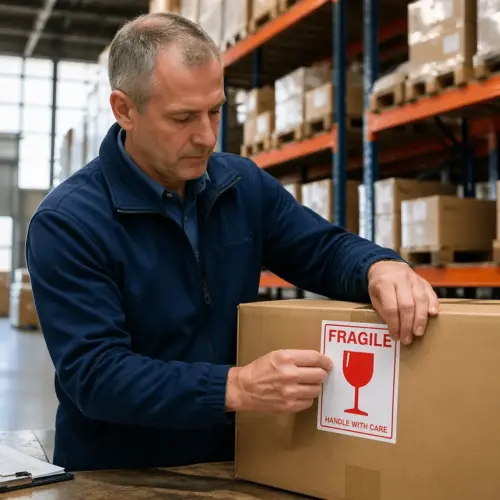
Even simple marks like “fragile” can reduce damage when they are used correctly and not spammed on every box. If everything is labeled fragile, nothing is, and crews stop treating the word as meaningful.
When you use handling symbols, make sure the icon style is recognizable and not stylized into something that looks like a brand logo. A symbol should look like a command, not like marketing.
Placement zones on containers and why they matter
Placard placement is where good intentions go to die, because a symbol can be correct and still useless if a twist lock, bumper, or lashing bar blocks it. Treat the container like a working machine with blind spots, not like a flat billboard.
Most terminals train operators to look in predictable zones on the side and end panels, so keep your container marking consistent with that habit. Repetition across both sides and the rear doors helps when one face is against a stack or pressed to a railcar.
Placement also has to survive the way containers are actually handled, including grabs, clamps, and contact with spreaders. If you place a label where a machine regularly rubs, you are creating a scheduled failure.
Door hardware creates its own set of problems because it moves, swings, and gets slammed. A placard that sits too close to locking bars can get shredded even if it looks fine during packing.
Side panel corrugations can distort symbols, especially circles and diagonal stripes that rely on clean geometry. If you must place a placard on corrugation, choose a size that spans multiple ribs so the symbol still reads as intended.
Another placement issue is the grime band, which forms naturally near the bottom rail and around forklift traffic zones. If you place critical marks low, they will be the first to disappear under dust, road film, and salt.
Think about how the container will be stacked, because the front end can be hidden for long periods in a tight bay. That is why side and door placement is usually the most reliable for day-to-day visibility.
On rail moves, some angles are almost always blocked by well cars and adjacent units. If your only clear hazard marking is on the front end, it may never be seen until the box is already at the next terminal.
Interior placement is often overlooked, but it is where the consignee’s crew makes their first safety decision. If the first visible face after opening the doors has no handling cues, the unload starts blind.
When you place internal unit load marks, make sure they are not covered by stretch wrap seams or corner boards. If the icon is split across a wrap overlap, it becomes visual noise instead of instruction.
| Container face | Recommended placement zone | Common placement mistake |
|---|---|---|
| Side panel | Mid height, forward third, clear of lashing points | Placed behind grime band near the bottom rail |
| Door end | On each door leaf, upper half, mirrored left and right | Placed across door seam so it tears when opened |
| Front end | Upper left quadrant, away from ID number block | Hidden by stacked containers in tight bays |
| Top (where used) | Near front corners for crane visibility | Printed too small to read from a spreader |
| Interior (unit load marks) | On the first visible face after opening doors | Covered by stretch wrap or dunnage boards |
Use the table as a baseline, then adjust for the reality of your lanes and equipment. A depot that uses side clamps will punish side-panel labels more than a depot that uses spreaders for everything.
When in doubt, walk the container with the operator’s viewpoint in mind, including the height of the cab and the angle of approach. If you cannot see the symbol from where the machine actually sits, it is in the wrong place.
Do not place critical marks where they compete with the container ID block, because operators need both pieces of information quickly. If the hazard placard blends into a cluster of numbers and letters, it will get missed.
Also avoid placing placards across rivets, weld seams, or patches, because those edges invite peeling. A flat, intact paint surface is a better long-term home for any symbol.
If you have to use temporary placards, plan where the old adhesive will be cleaned later. A container covered in ghosted glue stains becomes harder to label correctly on the next trip.
Durability requirements: weather, salt, and abrasion resistance
A placard that looks perfect in the office can fail in a week on a container that lives on deck in salt spray. If your ISO container placard symbols fade or peel, crews stop trusting the markings and start trusting guesswork.
UV exposure is a slow destroyer, especially for reds and oranges that carry warning meaning. Choose inks and substrates rated for outdoor marine use, and do not accept “indoor durable” language from a vendor.
Abrasion is the daily problem, because containers rub against chains, yard equipment, and other boxes. Laminated labels, protected paint systems, and recessed placement away from scrape paths keep container marking readable through multiple voyages.
Adhesive performance matters as much as print quality, since a curled corner turns into a ripped label after one windy rail move. If the container surface is chalky, oily, or wet when you apply the placard, expect early failure and plan for rework.
Salt is not just water, it is a corrosion accelerator that creeps under edges and lifts films. Even a high-quality label can fail if the steel beneath is rusting and flaking at the perimeter.
Temperature swings matter because containers cycle from sun-heated decks to cold nights and refrigerated yards. A label that cannot flex with that movement will crack or shrink, and the symbol will distort.
Pressure washing is another durability test that people forget to plan for. If a placard cannot survive routine depot cleaning, it will not survive a real service life.
Painted stencils can be more durable than labels, but only if the paint system is compatible with the container coating and properly cured. A rushed stencil job that chalks off is worse than a good label because it leaves a misleading shadow.
When you buy labels, ask for performance data that matches your environment, not generic marketing claims. A vendor should be able to talk about UV hours, salt fog testing, and expected outdoor lifespan.
Edge sealing is a small step that can extend life when labels are exposed to constant spray and abrasion. If your lanes include open-deck ocean exposure, that extra protection is usually worth it.
Surface prep is the cheapest durability upgrade you can buy, because clean metal and stable paint give adhesives a fair chance. A quick wipe that leaves oil behind is not prep, it is just moving the problem around.
Do not ignore the role of container repairs, because patches and repainting can change adhesion and color contrast. If a container comes back with fresh paint, treat it like a new substrate and test before you commit to a full run of placards.
Durability also includes legibility under dirt, so choose designs that tolerate partial masking. A symbol that still reads when 20% is dirty is more useful than a delicate icon that fails with a thin film of dust.
Coordinating container marks with shipping documents and labels
Paperwork and markings must match, because compliance checks often start by comparing what is on the box to what is on the dangerous goods declaration or packing list. When they disagree, the shipment can get held, stripped, or reworked at the worst possible time.
Start with the container number and seal number, since those identifiers connect the physical unit to the bill of lading and terminal records. If a seal is changed after inspection, update the documents and update any related labels that reference it.
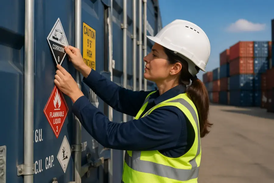
For regulated cargo, make sure hazard class placards, limited quantity marks, and any marine pollutant marks line up with the declared UN number and packing group. I have seen shippers reuse old placards on a returned container, and it creates a false hazard signal that wastes hours.
Coordinate internal cargo handling symbols with the packing plan, because the unload team uses those marks to decide which unit loads come out first. If you mark “do not stack” on cartons but then show a stacked diagram in the load plan, nobody knows which instruction to follow.
Document alignment is not only about compliance, it is about preventing re-handling. If a terminal has to stop and verify a mismatch, your container may be shifted to an inspection area and handled more than planned.
Make sure the hazard communication on the container matches the mode, because road, rail, and ocean rules can differ in how they expect information displayed. A shipment that is fine at the factory gate can become non-compliant at the port if the marks are incomplete for marine carriage.
Keep a clean version history of labels and placards, especially if you print in-house. When a regulator asks why a symbol looks different than expected, you want to show a controlled template, not a one-off edit.
When you use overpacks or mixed loads, be careful about which marks apply to which unit. A single hazard label on the wrong pallet can cause the whole container to be treated as a different class during segregation.
Verified Gross Mass is a common friction point because the number can change after rework or repacking. If you update VGM, you should also verify that any weight markings on the container or paperwork do not contradict the update.
Do not let carrier booking systems become the only source of truth, because they are often filled by copying previous shipments. The physical placard is what the yard sees, so it must reflect the actual load, not the last one that used the same container.
Language differences are another reason to rely on standardized symbols and codes. A correctly applied UN number and class placard is clearer than a translated description that may not be read or may be mistranslated.
Finally, coordinate with your consignee and forwarder on what they expect to see at arrival. If the receiving team is trained to look for specific cargo handling symbols, matching that expectation reduces unloading delays.
Using ISO container placard symbols to reduce handling disputes
Damage claims often turn into arguments about who handled the freight wrong, and clear symbols change that conversation. When ISO container placard symbols and other container marking details are correct and dated with inspection photos, you can prove what the handlers were told.
Disputes also shrink when you use standardized cargo handling symbols instead of custom icons that look clever but confuse a night shift crew. A symbol that needs explanation is a bad symbol, especially when the yard is loud and time is tight.
Consistency matters across shipments, because carriers and terminals notice patterns and build expectations around them. If your company places placards in a stable zone on every container, operators learn where to look and stop hunting across corrugations.
When you change a symbol set or label supplier, run both versions in parallel for a short period and brief your partners. A sudden swap in color tone or icon style can cause misreads, even if the underlying meaning stays the same.
Disputes often come down to whether the handler had a fair chance to do the right thing. If the placard was missing, covered, or contradictory, the argument shifts away from handling and toward shipper control.
Clear marks also help you separate container damage from cargo damage in a claim file. When the exterior shows impact and the internal handling symbols were correct, you can narrow the likely point of failure faster.
Photos are not just evidence, they are a training tool when you review an incident. A team that can see exactly how a placard was placed will stop repeating the same placement mistake.
Standardized symbols reduce the temptation for verbal shortcuts like “it’s fine, it’s just normal cargo.” When the box carries a clear warning, it is harder for someone to wave it through without thinking.
Another dispute reducer is using the same symbol logic on internal packaging as on external marks. If the container says one thing and the first pallet says another, the handler will choose whichever is convenient in the moment.
When you have sensitive cargo, add process discipline rather than adding more stickers. A small set of high-trust marks supported by checklists is better than a wall of labels that nobody believes.
Carriers also respond better when you speak in the same visual language they use for segregation and stowage. If your placarding is clean and standard, you are less likely to be treated as a problem shipper during peak season.
In my experience, the best dispute prevention is making the correct action the easy action. When the symbol is visible and unambiguous, the operator does not have to guess, and guessing is what creates claim stories.
Placard placement workflow that crews can repeat
A repeatable workflow beats a clever one, because labeling is usually done under time pressure near cutoff. Build a simple sequence for placard placement that starts with surface prep and ends with a quick photo record.
Assign one person to own the container marking decision for each load, because shared ownership often means nobody checks the last detail. When the same role checks the documents, prints the placards, and verifies placement, error rates drop fast.
Workflow also means having the right materials at the point of work, not locked in an office. If crews have to hunt for labels or cleaning wipes, they will skip steps to save time.
Standardize your templates and keep them controlled, because ad hoc printing leads to size drift and color drift. A placard that is 10% smaller than the standard is often the difference between readable and ignored.
Surface prep should be treated as a defined task with a minimum standard, not a casual wipe. If the cloth comes away dirty, keep cleaning until it does not, because dirt is an adhesive failure in progress.
Build in a pause after application to let adhesive wet out before the container is moved. If you apply and immediately send the box into wind and vibration, you are stress-testing the label before it has bonded.
Use a simple two-person verification when possible, because fresh eyes catch obvious conflicts. One person applies and one person checks visibility, orientation, and document match.
Make sure the workflow includes removing obsolete placards when a container is reused. Leaving old marks in place is one of the fastest ways to create a false hazard signal.
Include a rule for damaged surfaces, because labels do not stick well to rust, flaking paint, or oily patches. If the surface is bad, either move the placard to a better zone or repair the surface before labeling.
- Confirm declared cargo and any hazard class needs
- Verify container ID number and current CSC plate status
- Clean and dry the placement zone before applying labels
- Apply placards on both sides and the door end where required
- Check visibility around lashing points, rails, and door hardware
- Photograph each placard and the seal after application
- Log placard batch or print date for traceability
If you want crews to follow the workflow, make it short enough to fit real operations. A seven-step list that is always followed beats a twenty-step list that is ignored.
Traceability is not just for audits, it is for troubleshooting when a batch fails early. If you can tie a peeling problem to one print run or one supplier lot, you can fix the root cause instead of blaming “the weather.”
Photographs should be taken from a distance that matches how an operator sees the container. Close-up photos are fine for detail, but they do not prove that the symbol was visible from the cab.
Keep the workflow aligned with your cutoff schedule so it does not become the last-minute task that gets rushed. If labeling is always done at the end, it will always be done poorly.
Inspection tips: what to check before dispatch and after arrival
Before dispatch, inspect the container like a handler would, walking the perimeter and scanning for missing or conflicting marks. If you need to stand close to read a symbol, it is too small or too dirty for real operations.
Check that placards are intact, flat, and not peeling at the corners, because peeling labels catch on straps and tear off. Also confirm that the container marking is not hidden by temporary stickers, security tape, or repair patches.
After arrival, repeat the scan and compare against departure photos, since that is how you spot tampering or rough contact. If a placard is missing on arrival, document the scrape marks and hardware contact points that explain how it came off.
Do not ignore small mismatches like a faded orientation arrow or a partially obscured gross weight block, because those issues compound on the next leg. A quick relabel at the receiving dock is cheaper than a lift incident at the next terminal.
Include the door area in every inspection because it is where people stand and where damage is often first noticed. If the door-end placards are torn or smeared, assume the container has had rough contact during handling.
Look for conflicting old marks, especially on leased or reused equipment. A faded hazard placard from a prior load can trigger segregation requirements even when the current cargo is benign.
Check visibility under realistic conditions, including glare, shadows, and dirt. A mark that looks fine in bright noon sun may disappear under sodium lights at night.
Inspect the integrity of the label edges and corners with a quick fingertip check. If an edge lifts easily, it will not survive the next wind blast or pressure wash.
Make sure the container ID and any key marks are not obstructed by chassis parts or railcar structures for the planned move. If the planned transport mode blocks the only visible face, add redundancy before dispatch.
After arrival, ask the receiving team whether the marks matched what they expected from the documents. That feedback loop catches systemic issues faster than waiting for a claim.
If you find repeated placard loss in the same zone, treat it as a design problem, not a worker problem. Move the placement or upgrade the material so the system fits the environment.
Finally, keep inspection records simple and consistent so they actually get used. A short checklist with photo links beats a long report that nobody reads until something goes wrong.
Conclusion
Clear ISO container placard symbols work because they tell crews what they need to know from a distance, under pressure, and across languages. When you treat container marking and placard placement as part of the load plan, handling gets safer and claims get easier to resolve.
Focus on visibility, durability, and document alignment, then back it up with photos and a repeatable inspection routine. If you do those basics well, cargo handling symbols stop being decoration and start preventing real mistakes.
The payoff is not theoretical, because every avoided mislift and every avoided hold saves time, money, and trust. When the yard can read your container instantly, your freight moves like it is supposed to move.
If you want a simple standard to aim for, make every critical mark readable at a glance and durable for the full trip. When you hit that standard consistently, the container itself becomes a reliable part of your safety system.