Shipping fragile goods across borders is where good intentions go to die, because the person handling your box might not read your language. International handling labels for fragile items exist to bridge that gap, but only if you choose the right symbols and place them where people actually see them.
I have watched perfectly packed products arrive cracked because the outside message was vague, tiny, or buried under tape. If you want fewer claims and fewer awkward emails, treat labels as part of the protection system, not decoration.
This matters most when your shipment changes hands several times, like factory to forwarder, forwarder to airline, airline to last mile carrier. Each transfer is a new chance for someone to set the carton down hard, stack it wrong, or drag it across a dock.
People also handle differently when they are rushed, and international shipments are almost always rushed somewhere along the chain. The label is your only voice when you are not there, so it needs to be simple, loud, and repeatable.
Fragile is not a special service level, and no carrier contract magically upgrades your box because you used a sticker. Your goal is to reduce preventable mistakes by making the correct handling choice the easiest one.
What “fragile” needs to communicate across languages
The word “fragile” is only useful when the handler understands it, and that is a big assumption in international freight. Symbols work because they compress the message into something a busy warehouse worker can process in half a second.
A good fragile marking tells people what can go wrong, like breakage, chipping, or internal misalignment. It also tells them what to do instead, like keep upright, protect from impact, or do not clamp.
Across languages, the most reliable communication is a simple pictogram paired with a short instruction in the local language of origin and destination. If you only pick one language, choose English, but do not rely on text alone for international handling labels for fragile items.
Clarity beats drama every time, so avoid cute icons or marketing graphics that look like branding. Handlers are trained on standard logistics symbology, and anything that looks unfamiliar gets ignored or misread.
What you really want is a handler to understand the failure mode without thinking, because thinking is the first thing that disappears in a noisy dock. If the item is glass, show glass, and if it must stay upright, show arrows and keep the message consistent.
International shipments also move through facilities where the primary language changes mid-route, like a hub in a third country. A symbol that survives that transition is worth more than a paragraph of instructions nobody has time to translate.
Be specific when you can, because “fragile” alone is vague and people interpret it differently. “Fragile: ceramic” or “fragile: precision instrument” gives context without turning the label into a novel.
Some items are fragile in one direction and sturdy in another, like a framed panel that can take face pressure but not edge impact. Your label should guide the safe direction, not just warn that something might break.
It also helps to communicate what not to do, because many damage events come from a single wrong tool choice. “Do not clamp” and “no hooks” are universal ideas that translate well when paired with the right pictograms.
Finally, remember that the receiver is part of the audience too, not just the carrier. A clear label helps the receiving team decide whether to sign, inspect, or reject when a pallet shows up looking tired.
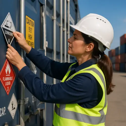
Standard symbols that signal fragility and care requirements
The classic glass symbol, the broken wineglass pictogram, is the most recognized fragility cue in global transport. It works because it is blunt, literal, and already tied to common handling training.
Pair the glass symbol with orientation marks when orientation matters, because many fragile products fail when they are turned sideways rather than dropped. “This way up” arrows and an “upright only” message reduce the odds that someone flips a carton to make it fit.
Use “do not stack” or a stacking limit symbol when compression is the risk, like for thin wall cartons, framed glass, or instrument cases. If stacking is allowed but limited, show a maximum number of cartons or a maximum load in kilograms so the rule is measurable.
For goods that hate punctures, add “do not use hooks” and “do not clamp” markings, because forklifts and clamp trucks are common in ports and cross docks. A fragile label that ignores handling equipment is a half message, and half messages fail in real warehouses.
Standard symbols also help you avoid the “translation lottery,” where your text gets interpreted differently by different people. When the symbol is familiar, the handler’s muscle memory does the work for you.
“Keep dry” is another symbol that pairs well with fragile goods, because wet cartons lose strength and collapse under normal stacking pressure. Even if the product is sealed, a soaked box invites rough handling because it feels disposable.
Temperature symbols matter when fragility changes with climate, like plastics that become brittle in cold lanes or adhesives that soften in heat. If temperature limits exist, put them on the outside so nobody leaves the pallet in the sun “just for an hour.”
Center of gravity markings can be useful on tall, narrow crates that tip easily, because tipping often looks like “mystery damage” when the outside seems fine. A simple center-of-gravity icon tells a forklift driver where the load will fight back.
If you ship crates, consider adding “lift here” points and fork pocket markings so the load is picked up correctly. A fragile crate can be destroyed by a perfect forklift driver who simply lifted at the wrong location.
Be careful with “handle with care” text because it is too generic to change behavior on its own. It works best as a supporting phrase next to a symbol that gives a concrete instruction.
One more practical rule is to avoid mixing symbol standards on the same shipment, because it looks messy and unplanned. Consistent icon style and placement makes the message feel official instead of optional.
When to add shock or tilt indicators (and how to place them)
Shock indicator labels and tilt indicators make sense when damage is expensive, hard to prove, or likely to be disputed by a carrier. They do not prevent rough handling by magic, but they change behavior when people know a mishandling event will be visible.
Add indicators when a product can survive normal vibration but fails from a single drop, like lab optics, medical devices, or certain ceramics. They also help when you ship to a receiver that blames the shipper by default, because the indicator gives you a time stamped clue.
Indicators are most useful when you set expectations with the receiver ahead of time, because a triggered label is only evidence if someone agrees it matters. If the receiver has a policy to document and quarantine on trigger, you get cleaner claims and fewer arguments.
Do not treat indicators as a substitute for cushioning, because they are not protection and they do not reduce g-force. Think of them as a behavior and documentation tool that works best on top of solid packaging.
Choose the sensitivity carefully, because an overly sensitive shock indicator will trigger during normal handling and train everyone to ignore it. If you are not sure, run a pilot lane and compare trigger rates with actual product condition.
Tilt indicators are especially helpful for items with fluids, compressors, or internal suspensions that settle incorrectly when laid down. If the product manual already says “keep upright,” the indicator makes that instruction enforceable at receiving.
Placement is about visibility and survivability, so avoid corners that get crushed or rubbed away by other freight. A high, flat panel near the top edge tends to stay readable while still catching attention.
Use two adjacent sides for shock indicators because pallets get rotated and handlers approach from different angles. If only one side has the indicator, you are betting on luck that the “right” side faces outward every time.
When you use a “tip n tell plus” style label that requires acknowledgment, make sure the receiver knows what to do at delivery. A label that needs a signature but arrives without instructions becomes another ignored sticker.
Humidity indicator cards are a different category because they usually live inside the barrier bag, not on the carton. They are still part of the handling label system because they turn invisible environmental exposure into something the receiver can verify.
| Indicator type | Use it when | Placement rule |
|---|---|---|
| Shock indicator labels | Drop or impact damage is the main failure mode | Place near the top corner, on two adjacent sides |
| Tilt indicator | Product must stay upright to protect internal parts or fluids | Place high on the carton, aligned with “this way up” arrows |
| Tip n tell plus label | You need receiver acknowledgment at delivery | Place next to the shipping label, not on the bottom |
| Humidity indicator card | Moisture exposure can ruin electronics, paper, or reagents | Place inside the bag or inner pack, visible on opening |
If you are shipping multiple cartons in one overpack, put indicators on the overpack and on at least one inner carton. Overpacks get removed fast at receiving, and you do not want the evidence to vanish with the outer wrap.
Do not hide indicators behind a document pouch or a customs packet, because those are often slapped on at the last minute. The indicator should be the first thing a receiver sees, not the thing they discover after signing.
Also remember that indicators can create friction if your receiver treats every trigger as an automatic rejection. Align on a process that allows inspection and documentation instead of a reflexive refusal that strands freight in a terminal.
When you get a trigger, treat it as a signal to improve the lane, not just a claim tool. A pattern of triggers at one hub often points to a specific transfer point where your packaging needs reinforcement.
Packaging + labeling: making the message match the protection
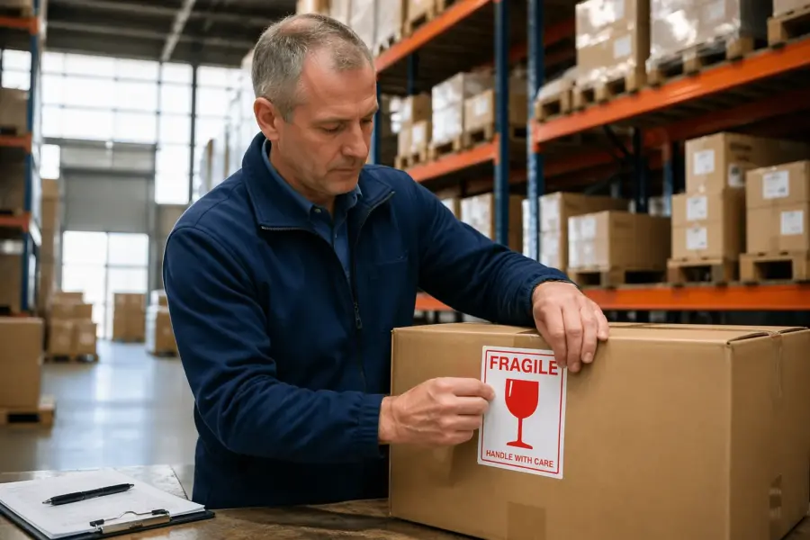
A fragile sticker on a weak carton is basically an apology note, and carriers treat it that way. If you want the label to mean something, build packaging that can survive the handling you are asking people to avoid.
Start with the product, then choose cushioning that matches its failure mode, like foam for shock, corner blocks for glass edges, or suspension packs for delicate assemblies. When you claim “protect from impact” on the outside, the inside needs enough clearance and energy absorption to back it up.
Double boxing is boring but effective for many fragile items, especially for retail parcel networks that involve chutes and automated sorters. The outer box takes the hits, while the inner pack keeps the product centered and away from corners.
Seal like you expect rain and dust, because ports, tarmacs, and open docks are messy places. When tape fails and flaps open, your international handling labels for fragile items disappear right when the carton needs them most.
The label should never promise what the packaging cannot deliver, because that gap is where claims and customer anger live. If your pack cannot tolerate stacking, do not ship it in a form factor that invites stacking without reinforcement.
Match the carton strength to the distribution environment, because export lanes often involve longer dwell times and more re-handling. A box that survives a domestic two-day parcel route might collapse after a month in mixed freight.
Void fill is not cushioning, and that confusion causes a lot of “it was packed well” stories that end in broken parts. If the product can move inside the box, it can build momentum and break itself even when the outside looks fine.
Corner protection deserves extra attention because corners are the first point of contact in drops and slides. If you label “fragile,” assume the carton will still hit a corner at some point and design for that reality.
For heavy fragile items, consider a crate or a reinforced base so the load can be handled with equipment without squeezing the product area. A thick foam cradle is great, but it fails if the base flexes and transfers shock directly into the item.
Internal blocking and bracing matters when the product has long levers or protrusions, like handles, valves, or lenses. A small internal shift can turn a normal vibration event into a crack at a mounting point.
Labeling should reflect the actual safe handling method, like “team lift” or “use pallet jack,” when weight and fragility combine. If one person tries to muscle a heavy fragile box, the drop risk goes up even if everyone means well.
When you use an overpack, put the same handling symbols on the inner pack so the message survives unpacking. Receivers often break down pallets and move cartons internally, and damage can happen after delivery if the inner boxes look generic.
If you ship spare parts or accessories in the same carton as the main fragile item, keep them from becoming projectiles. A loose metal bracket can do more damage inside a box than a short drop outside.
Finally, test your packaging with the labels in place, because labels can change how people grab and orient a box. If the only “clean” area is the one you labeled, you might accidentally invite someone to pick it up in a risky way.
Choosing label materials that survive real shipping conditions
Paper labels can look fine at pack out and then turn into pulp after a humid ocean leg or a rainy last mile delivery. For exports, I prefer synthetic facestock or laminated labels that keep the glass symbol readable even after abrasion.
Adhesive matters as much as the face material, because dusty cartons and cold warehouses kill weak glue. If you ship in winter lanes or refrigerated freight, test the label on cold corrugate and check it after 24 hours.
Ink choice is another quiet failure point, since thermal printed icons can fade with heat or smear with moisture. If the symbol is safety critical, use durable printing or pre printed labels with high contrast graphics.
Do not shrink your symbols to make the box look tidy, because small labels vanish in a sea of barcodes and routing stickers. A handler at a distance sees shape and contrast first, not your careful typography.
Scuff resistance matters because cartons rub against each other in containers, trailers, and sortation equipment. If the label turns into a gray blur, it might as well not exist.
Consider how the label behaves under stretch wrap, because wrap tension can wrinkle thin labels and distort symbols. A slightly thicker facestock or a laminated finish helps the icon stay crisp under pressure.
Some export cartons use waxed or coated surfaces, and not every adhesive bonds well to them. If you are using coated boxes, ask for an adhesive rated for low surface energy materials or run a simple peel test in-house.
Surface prep is underrated, because a label applied over dust, starch, or loose fibers will fail even with good adhesive. A quick wipe on the application area can be the difference between a label that lasts and one that curls in transit.
If your cartons are reused, old tape residue and torn fibers create a rough surface that eats labels. In that case, dedicate a clean labeling zone on the carton or use a label panel designed for reapplication.
UV exposure is real for freight that sits on open docks or rides in vehicles with sunlight exposure, especially in hot climates. A UV-stable ink keeps red “fragile” graphics from turning pink and looking unofficial.
Waterproof does not always mean oil-resistant, and some warehouses have oily dust that smears inks. If you ship to industrial sites, choose materials that resist smudging when handled with gloves.
It is also worth standardizing label sizes so your team does not improvise with whatever fits. Consistent size makes placement consistent, and consistency is what makes handlers trust the message.
When you print labels in-house, keep an eye on contrast, because faint gray icons disappear on brown corrugate. Black on white, or black on high-visibility backgrounds, is usually the safest choice for fast recognition.
Label placement strategies for multi-box and palletized loads
Placement is where most fragile labeling programs fall apart, because people slap one sticker on the top and call it done. On a pallet, the top face might be covered by stretch wrap, and on a mixed load, the top might never face a human.
For individual cartons, place the glass symbol on at least two adjacent sides, at eye level, and away from seams and hand holes. If you use shock indicator labels, keep them unobstructed so the receiver can inspect them without cutting wrap.
On pallets, think in terms of approach angles, because a forklift driver sees only the outer faces. If the fragile markings are on inner cartons facing the pallet center, they are decorative and nothing more.
Stretch wrap can hide labels, so either leave a clear window or apply labels after wrapping on the outside of the wrap. If you label the wrap, remember that wrap can be replaced mid-route, so duplicate critical markings on cartons too.
For multi-box shipments, label each carton as if it will be separated, because it probably will be. A “set” that arrives split across two days still needs correct handling on both days.
If you use corner boards or edge protectors, do not place labels where the protector will cover them. It is common to see a perfect fragile icon hidden under a corner board that was added later at palletizing.
Keep labels away from strapping paths, because straps and buckles can tear labels or make them unreadable. A label under a strap also invites someone to cut through it when they unstrap the pallet.
When cartons are long, place labels on the long side panels because those are the faces most likely to be visible in storage and transit. Short-end-only labeling disappears when cartons are loaded tight.
Orientation arrows should be placed on multiple sides and aligned correctly, because misaligned arrows create confusion and reduce trust. If arrows point different directions on different faces, the handler assumes the shipper did not check.
Do not place fragile symbols on areas that will be covered by carrier labels, because carrier labels multiply quickly on international shipments. Leave a dedicated “carrier label zone” so your handling symbols stay visible.
If you ship in returnable totes or reusable cases, mark the case itself and the inner pack. Reusables get scuffed and relabeled over time, so redundancy keeps the message alive.
- Two adjacent sides labeled, not just the top
- Eye level placement on the long side panel
- Keep symbols off box seams and tape paths
- Duplicate labels on inner cartons for overpacks
- Corner placement for indicators, not the center
- Leave a clear inspection window in stretch wrap
For export pallets, add a pallet-level label that repeats the key symbols, because pallet moves are where a lot of damage starts. A big symbol on the outside of the wrap can influence how the whole unit is handled.
If the shipment includes mixed SKUs with different requirements, separate them physically and label accordingly. A pallet that mixes “do not stack” cartons with stackable cartons invites someone to treat everything as stackable.
Finally, audit placement at the end of pack out, because the last person to touch the shipment can undo earlier good work. A quick final check catches labels applied upside down, covered by tape, or placed on a panel that will face inward.
Avoiding common mistakes that make fragile labels useless
The fastest way to waste money is to cover your fragile symbols with clear tape, stretch wrap glare, or documents in a pouch. People do not hunt for warnings, and they will not peel back plastic to see what you meant.
Another mistake is mixing messages, like a glass symbol next to “stack 6 high” because someone reused an old carton. Conflicting instructions train handlers to ignore all of it, because they assume the shipper did not care enough to be consistent.
Avoid placing labels on the bottom panel, because forklifts, pallets, and conveyor beds will scrape them off. If the label must be on the top, add duplicates on the sides so the message survives normal handling.
Do not rely on color alone, because some facilities print in black only and some workers have limited color vision. Shape based symbols like the glass symbol and clear arrows remain readable in monochrome and low light.
One common failure is using too many labels, which creates visual noise and makes the important ones blend in. If everything is highlighted, nothing is highlighted, so pick the few instructions that actually matter.
Another mistake is placing fragile labels on damaged or patched cartons, because the surface is uneven and the label peels. A peeling label looks like old news, and people treat it like old news.
Some shippers place the glass symbol near the barcode cluster, and then carriers cover it with routing stickers. Give your fragile symbols their own clean real estate so they do not get buried under operational paperwork.
Using low-contrast printing is a quiet killer, especially red text on brown corrugate that turns into mud under warehouse lighting. If the symbol cannot be recognized from a few meters away, it is too subtle for real handling.
Do not assume that “FRAGILE” in all caps is universal, because it is not, and even when it is understood it is still vague. A standard pictogram plus one clear instruction beats a big word every time.
Another problem is labels that are applied crooked or upside down, which sounds minor but signals carelessness. When the label looks careless, the handling often becomes careless too.
Avoid putting labels on removable panels like tear strips or easy-open flaps that get ripped off at receiving. If the label disappears during opening, the receiver loses the ability to document condition before unpacking.
Reusing cartons with old hazard or handling labels is also risky, because it creates confusion and can trigger compliance issues. Strip old labels or fully cover them so the current instructions are the only instructions.
Finally, do not skip training at pack-out, because label quality is a process problem, not a sticker problem. A simple work instruction with photos of correct placement prevents most of the mistakes above.
Handover tips: getting carriers and receivers to notice the labels
Labels work better when you back them up at handover, especially for high value fragile goods. A quick callout to the driver or pickup team takes ten seconds and can prevent a painful drop at the tailgate.
For LTL freight, put handling notes on the bill of lading, and make sure they match the carton symbols. When the paperwork says “protect from impact” and the packaging looks serious, the dock crew tends to treat it as a real requirement.
At receiving, train staff to inspect shock indicator labels and tilt indicators before they sign delivery paperwork. If the indicator is triggered, they should photograph it on the pallet, then open the shipment with a witness and document the condition.
Receivers also need a place to store the evidence, because loose indicators and torn labels disappear fast. A simple intake checklist and a shared folder for photos does more for claims success than arguing after the fact.
It helps to tell the receiver in advance what labels and indicators to expect, especially if they have never seen your packaging before. A one-page receiving guide can prevent a triggered indicator from being ignored or thrown away.
Ask carriers what their terminals actually follow, because some networks have standard handling rules and some do not. When you understand their reality, you can design labels that align with how freight is moved.
If you ship high value items, consider adding a packing list note that instructs “inspect before signing” in simple language. That small reminder can save you when a pallet arrives with crushed corners but the receiver is in a hurry.
For parcel shipments, add delivery instructions in the carrier system when possible, because the driver may never notice side labels. A “do not leave at door if damaged” note can trigger a more careful handoff.
When you have recurring lanes, track damage incidents by route and by hub, not just by product. Labels and packaging can be perfect, but a single rough transfer point can dominate your loss rate.
Encourage receivers to keep outer packaging until the product is inspected and accepted, because claims often require photos of the carton. If the box goes into the dumpster immediately, you lose context even when the damage is real.
When a shipment arrives intact, treat that as data too, because it validates your label and packaging choices. A quick note from receiving that “labels were visible and indicators normal” helps you keep standards from drifting.
Finally, make it easy for your own team to respond fast when something goes wrong, because speed matters in claims. If you can request photos, serial numbers, and indicator status in one message, you reduce the back-and-forth that kills momentum.
Conclusion
International handling labels for fragile items work when they say one clear thing, use standard symbols, and show up where hands and eyes actually go. The glass symbol, shock indicator labels, and clear “protect from impact” instructions are practical tools, but only when packaging and placement support them.
If you want a simple rule, treat every transfer point like the only one that matters, because any one of them can break the product. Build the pack to survive, then label it like you expect strangers to handle it fast and under pressure.
When you do this well, labels stop being wishful thinking and start acting like a real control in your shipping process. You will still see damage sometimes, but you will see less of the avoidable, preventable kind that comes from confusion.
The goal is not to make your carton look important, but to make the correct handling choice obvious in any warehouse, in any country, on any shift. If the message is standard, durable, and placed correctly, it will still be speaking for you long after the shipment leaves your hands.