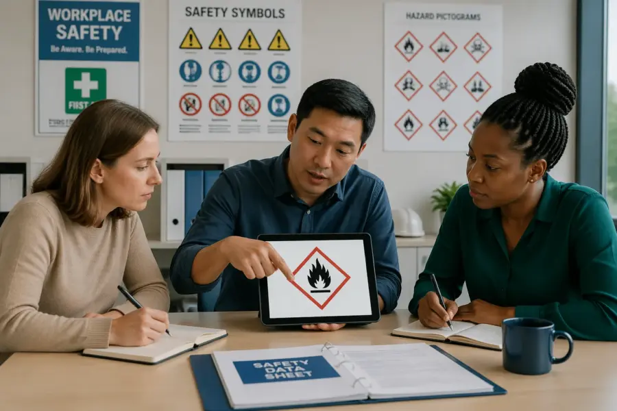
Most people think they know what a safety sign means until they are in a loud warehouse with a forklift coming around the corner. That is when symbol recognition stops being a nice-to-have and starts being the difference between moving safely and getting hurt.
This guide is safety pictograms explained in plain English, with the kind of details that matter on real shop floors and in shipping areas. If you work around pallets, chemicals, machinery, or loading docks, you need to read a pictogram fast and trust what you read.
Pictograms exist because words fail in busy, multilingual workplaces and because people skim when they are tired. When you learn how shapes, colors, and icons work together, the pictogram meaning becomes hard to miss.
What a safety pictogram is (and why it’s used)
A safety pictogram is a standardized graphic symbol that communicates a hazard, required action, prohibition, or emergency resource. It is built to be understood at a glance, even when the reader does not share the same language as the sign maker.
In facilities, pictograms show up on workplace safety signs, labels, equipment panels, and training posters. In logistics, they also appear on packages and containers to warn carriers and receivers about handling and storage risks.
People ignore long text blocks, especially when they are moving, wearing gloves, or looking through safety glasses. A clean icon with a strong border and clear color cue cuts through that noise.
Standardization matters because a custom icon can look clever but fail under pressure. When a site uses established systems like ISO-style symbols or GHS hazard pictograms, workers can transfer knowledge from one job to the next.
Think of a pictogram as a compressed instruction that survives bad conditions like dust, vibration, and distance. If you can only spare a half second of attention, the symbol still has to land.
It is also a backup when the environment makes reading hard, like steam near a washdown area or glare near a dock door. In those moments, the pictogram does the heavy lifting while the text plays support.
Another reason pictograms are used is consistency across shifts and contractors. A temp worker may not know your local jargon, but they can still recognize a hard hat symbol or an emergency exit icon.
They also reduce the temptation to “interpret” a message, because the symbol is meant to be direct. A clear prohibition sign leaves less room for someone to argue that they thought it was optional.
In shipping, pictograms protect more than the person touching the package. They also protect the product and the facility, because one wrong storage choice can turn a small leak into a cleanup and a shutdown.
When you hear people complain about “too many signs,” the real issue is usually sign quality and relevance. Good pictograms are not noise, they are decision points made visible.
The basic parts of a pictogram: shape, color, and icon
Every good pictogram uses a short visual grammar, and the first word in that grammar is shape. Circles, triangles, squares, and diamonds each push your brain toward a different kind of message.
Color is the second word, and it is the part people notice first even if they do not realize it. Red usually signals prohibition or fire equipment, yellow warns of hazards, blue tells you a required action, and green points to safe conditions like exits or first aid.
The icon is the final word, and it carries the specific instruction or hazard. A helmet silhouette means head protection, a lightning bolt means electrical risk, and a hand with a slash means do not touch.
When these parts disagree, confusion follows fast. If you put a “wear hearing protection” icon inside a warning triangle, the pictogram meaning becomes muddy and workers start guessing.
Shape works because it can be recognized from farther away than the icon details. In a long aisle, you may only see a triangle or a circle at first, and that early cue tells you how to behave as you approach.
Color works because it triggers a learned response before the brain processes fine detail. That is why faded colors are not a cosmetic problem, they are a communication failure.
The icon has to be simple enough to survive quick glances and partial obstruction. If an icon needs artistic shading or tiny lines to make sense, it will not hold up on a busy floor.
Border thickness and contrast matter more than people expect, especially on older walls or corrugated doors. A strong border helps the symbol pop even when the background is visually messy.
Negative space is part of the design, because it keeps the icon from turning into a blob at distance. When a pictogram is crammed with detail, workers stop trusting what they think they saw.
Text can support a pictogram, but it should not be required to decode it. If the icon only makes sense after you read the caption, the icon is not doing its job.
Consistency is what makes the grammar learnable, so one blue circle should always mean “do this.” When a facility improvises with colors, the entire sign system becomes a guessing game.
Even the direction an icon faces can matter, like arrows for travel paths or doors for exits. If arrows point the wrong way, people will follow them, because the brain assumes the sign is the authority.
Common categories you’ll see in facilities and shipping areas
Most sites use a handful of repeating categories, and once you spot them you can read new signs quicker. The categories map to real decisions like “stop,” “do this,” “watch out,” or “go here in an emergency.”
Shipping areas add their own layer because packages move across companies and borders. That is why handling marks, orientation arrows, and hazard diamonds show up next to workplace safety signs near docks and staging lanes.
Warning hazards are the ones people tend to notice, but they are also the ones people get numb to. If every doorway has a yellow triangle, workers stop scanning for the specific hazard and just keep walking.
Mandatory action signs are where you build habits, because they tell you what must happen every time. The best ones are placed before the exposure starts, not halfway into the noisy or dusty area.
Prohibition signs are common around ignition sources, machine guarding, and restricted zones. They work best when the forbidden action is realistic, like “no phones” at a battery charging area where people actually want to check messages.
Emergency and safe condition signs are not just for visitors, they are for regular staff on a bad day. Under stress, people revert to what is obvious, so the green signs need to be obvious from multiple angles.
Fire equipment signs get ignored until the moment they matter, which is why they have to be clean and unobstructed. If a pallet stack hides an extinguisher pictogram, the sign is lying about access.
Transport hazard pictograms are a different category because they follow the product, not the building. A chemical drum can move from receiving to storage to production, and the diamond stays the same the whole way.
Facilities also use directional and informational symbols that are not hazards but still prevent accidents. A simple “pedestrian route” pictogram can keep people out of forklift lanes when the floor is busy.
You will also see machine-specific pictograms on control panels, especially on imported equipment. Those symbols often communicate start, stop, lockout points, pinch hazards, and hot surfaces without any words.
In shipping, handling symbols like “this side up” and “keep dry” are about preventing damage, but they also prevent unsafe improvisation. When a box collapses because it was stored wrong, people end up lifting awkwardly and getting hurt.
The categories are useful because they let you triage your attention. A red prohibition sign should interrupt you, while a green safe condition sign should guide you without debate.
| Category | Typical shape and color | What it tells you to do |
|---|---|---|
| Warning hazard | Yellow triangle with black border | Slow down, look for the specific hazard before proceeding |
| Mandatory action | Blue circle with white icon | Perform the required PPE or behavior every time |
| Prohibition | Red circle with diagonal slash | Stop the forbidden action, even if it seems convenient |
| Emergency and safe condition | Green square or rectangle with white icon | Move toward exits, first aid, eyewash, or safety shower |
| Fire equipment | Red square or rectangle with white icon | Locate extinguishers, hoses, alarms, or fire blankets |
| Transport hazard (GHS) | Red diamond with black icon on white | Handle and store based on the chemical hazard shown |
When you build a sign plan, it helps to map these categories to the flow of work. Receiving, storage, staging, and shipping each have predictable hazards, so the pictograms should feel expected rather than random.
If a category is missing, people fill the gap with assumptions. For example, a dock without clear pedestrian warnings tends to become a shared space by default, which is where close calls start.
How standards shape pictogram design across borders
If you have ever worked at two plants that used different sign styles, you know how fast habits can break. International standards push sites toward consistent symbol recognition so a visitor or new hire does not need a full tour to stay safe.
ISO 7010 is one of the big references for public and workplace safety signs, and many facilities borrow its look even when they are not legally required to. For chemicals, GHS pictograms on labels and SDSs help align hazard communication between suppliers, carriers, and end users.
OSHA rules in the United States focus on outcomes like clear communication and durable posting, while ANSI Z535 influences the format many American sites use. In practice, you will see a mix, and the best programs teach workers the shared logic instead of brand loyalty to one system.
When a site imports equipment, the panel labels might come with European-style symbols while the wall signs follow ANSI layouts. That mix is fine if the shapes and colors stay consistent and the training calls out any exceptions.
Standards are not just about aesthetics, they are about reducing interpretation. When a symbol is tested and standardized, it is more likely to be recognized correctly by a tired worker at the end of a shift.
They also help purchasing teams avoid buying cheap signs that look right but fail in use. A sign that fades in six months or peels in a washdown area is not compliant in the practical sense, even if it was compliant on day one.
One of the biggest cross-border issues is color expectation, because some regions historically used different palettes. That is why relying on both shape and color together is safer than relying on color alone.
Another issue is symbol variants that are “close enough” but not identical, like different versions of the same PPE icon. When workers move between sites, those small differences can slow recognition just enough to matter.
GHS is a good example of a standard that travels with the product, even when local workplace signage looks different. A red diamond on a drum means the same thing in receiving, in a truck trailer, and in a storage cage.
ANSI-style signs often include signal words like DANGER, WARNING, or CAUTION, which can help when there is time to read. The pictogram still matters because in many situations there is not time to read the header.
Standards also influence size and viewing distance guidance, which is where many facilities underperform. If a sign is too small for the approach speed of the area, it does not matter how correct the symbol is.
The practical goal is not to win a standards debate, it is to make sure the message survives real conditions. If your workforce includes contractors, drivers, and visitors, standardization is a force multiplier.
How to interpret a pictogram in 10 seconds
The fastest way to read a sign is to treat it like a three step scan, starting with the border and background. Your brain can identify “warning,” “mandatory,” or “safe condition” before you even focus on the icon.
Second, lock onto the icon and name it in simple words like “corrosive,” “forklift,” “eye protection,” or “no smoking.” If you cannot name it quickly, that is a sign problem, not a worker problem.
Third, connect the message to the location you are standing in, because context prevents dumb mistakes. A “hearing protection” symbol at a compressor room door is clear, but the same symbol on a quiet hallway wall makes people tune it out.
When you teach safety pictograms explained to new staff, time them during training and make it a game. If a person needs thirty seconds to decode a sign, you should assume they will miss it during a real shift.
The ten-second rule is generous, because many decisions happen in two seconds or less. The point is to build a reflex that starts with category recognition, not with reading every detail.
Start by asking yourself what kind of message it is, because that sets your posture. A prohibition sign means stop and rethink, while a safe condition sign means you can move with purpose.
Then look for the hazard or action noun in the icon, like “chemical,” “crush,” “cut,” or “fall.” Once you name the noun, the required behavior usually becomes obvious.
Finally, check for any nearby cues that confirm the message, like floor markings, barriers, or the equipment in front of you. When the environment and the pictogram disagree, that is a flag to slow down and ask.
In chemical areas, the pictogram is a starting point, not the whole story. A flame symbol tells you flammable, but it does not tell you the ignition sources in that room or the storage limits on that shelf.
In traffic areas, the pictogram should trigger a head check, not a blind step forward. A pedestrian crossing symbol is a reminder to look both ways, because forklifts do not stop like cars.
If you are unsure, default to the safer interpretation and get clarification. The worst habit is pretending you understood because you do not want to look new.
Over time, you want workers to recognize the category from peripheral vision. That is how symbol recognition becomes real, because it works even when attention is split.
Where pictograms should be placed for best visibility
Placement is where many safety programs fall apart, because a perfect sign in a bad spot is just wall art. Put the pictogram where the decision happens, like at a doorway, before a pinch point, or at the start of a marked pedestrian route.
Mount signs at a consistent height and keep them out of visual clutter like posters, tool shadow boards, and random memos. If you have to search for the sign, the sign is already losing.
Lighting and line of sight matter more than people admit, especially in racking aisles and dock wells. A glossy sign that catches glare from LED fixtures can kill symbol recognition at the worst moment.
In shipping areas, place handling and hazard pictograms where they stay visible after stretch wrap and banding. If the label disappears under a corner guard or a pallet tag, the next handler will rely on guesswork.
Think about approach speed when you choose placement, because people read differently at walking pace versus forklift pace. A sign that works for pedestrians may be useless for a driver who sees it for one second.
Put the first warning early enough to allow a change in behavior, not right at the hazard. If the sign is located at the edge of the pinch point, it is basically an accident report waiting to happen.
Avoid placing signs on doors that are usually open, because the message disappears when the door swings. If the hazard is still present when the door is open, the sign needs a second location.
Do not assume people will look up, especially in pick areas where eyes are on labels and slots. If the decision is made at waist height, the pictogram should be near that line of sight.
In wet or dusty environments, choose materials and mounting methods that survive cleaning. A sign that curls at the corners or gets coated in grime stops being a sign and becomes background texture.
For emergency equipment, consider visibility during a power loss or smoke condition. Photoluminescent or well-lit green exit and first aid pictograms can be the difference between order and panic.
At docks, remember that trailers change the visual landscape every hour. A sign that is visible when the bay is empty might be blocked when a trailer is backed in, so you may need redundant placement.
On packages, place duplicate labels on adjacent sides when possible, because one side will end up against a wall or another pallet. You are trying to keep the pictogram visible no matter how the load is staged.
Finally, keep signs close to the hazard but not inside the hazard zone where people cannot safely stop to read. The best placement gives a warning with enough time and space to act.
Quick checks supervisors can use during walkarounds
When I walk a facility, I look for the same failures over and over, and they are easy to spot once you know them. A walkaround checklist beats a once-a-year sign audit that nobody remembers.
The goal is simple, keep workplace safety signs readable, relevant, and consistent with the hazards people actually face. If the sign program drifts away from reality, workers stop trusting it.
Start with relevance, because an outdated pictogram is worse than no pictogram. If the sign warns about a machine that was removed two years ago, people learn to ignore the whole wall.
Then check for conflict, like a mandatory PPE symbol posted next to a note that says “optional.” Mixed messages create loopholes, and loopholes become habits.
Look for physical damage that changes the icon, like scratches that remove the diagonal slash from a prohibition sign. A damaged sign can flip the meaning without anyone noticing.
Check if the pictogram is being blocked by normal work, not just by unusual clutter. If the sign is behind a parked cart that is always there, it is not really posted.
Pay attention to areas where people transition between tasks, like from office to floor or from storage to production. Those are the spots where PPE and traffic pictograms need to be crisp and unavoidable.
Ask one or two workers what a sign means while you are standing there. If experienced staff cannot explain the pictogram meaning in one sentence, the sign is not doing its job.
Also verify that the sign matches the current control strategy, not a past one. If a process now requires face shields but the sign still shows safety glasses, the symbol is training people wrong.
- Signs placed at the point of decision
- Unobstructed view from normal approach paths
- Correct shape and color for the message type
- Icons that match the current process and equipment
- No faded print, peeling corners, or glare hotspots
- Consistent use of the same symbol for the same hazard
- Labels on packages remain visible after wrapping and strapping
If you find repeat issues, treat them like process problems, not individual mistakes. A sign that keeps getting blocked may need a new location, not another reminder email.
Document fixes with photos so the next walkaround can confirm the improvement. That simple feedback loop keeps the sign program alive instead of turning it into a binder on a shelf.
Typical misunderstandings and how you can avoid them
The most common misunderstanding is treating the icon as the whole message and ignoring the shape and color. That is how people confuse a warning triangle with a mandatory instruction and take the wrong action.
Another frequent issue is assuming a symbol is universal when it is not, especially with homegrown icons. If your site invents a custom “authorized personnel only” graphic, visitors may read it as “office area” or “PPE station.”
Chemical pictograms get misread all the time, and the “corrosion” symbol is a classic example because it looks like liquid and metal without context. Train people to connect GHS symbols to the SDS and to the actual controls, like gloves, face shields, and ventilation.
People also overgeneralize, like seeing a forklift warning and assuming forklifts have the right of way everywhere. Pair the pictogram with floor markings and traffic rules so the message stays specific and enforceable.
One misunderstanding is thinking a warning sign means the hazard is controlled. A yellow triangle does not mean the area is safe, it means you are responsible for adjusting your behavior.
Another is treating mandatory PPE pictograms as a suggestion based on comfort. If the blue circle says hearing protection, it is not a volume-based decision you make in the moment.
Some people misread prohibition signs when the diagonal slash is thin or partially covered. That is why clean printing and good contrast are not optional details.
Emergency symbols also get misunderstood when people assume the nearest exit is the one they used to enter. In an actual incident, you may need to follow the green pictograms to a different route than your routine.
Handling pictograms on packages get ignored because they are seen as “shipping stuff” instead of safety information. When a box says heavy or team lift, ignoring it turns into back injuries and dropped loads.
Another problem is symbol overload, where too many pictograms are stacked together with no hierarchy. If five icons compete for attention, workers will pick the one they like and miss the one that matters.
You can avoid most misunderstandings by standardizing your symbol set and removing anything that is not used. A smaller set of clear pictograms beats a huge library that nobody remembers.
It also helps to align pictograms with physical controls like guards, rails, and marked lanes. When the environment supports the message, people stop debating the meaning and start complying.
Training for symbol recognition that sticks on the job
Most training fails because it is too abstract, with slides full of tiny icons and no real context. Put trainees in the actual areas, point at the signs they will see daily, and ask them to explain the pictogram meaning out loud.
Use short drills, like “name the category, name the icon, name the action,” and keep score so people pay attention. It sounds basic, but it mirrors how the brain reads signs during a busy shift.
Refreshers work best when they target recent mistakes or near misses instead of recycling the same poster every quarter. If someone drove a pallet jack into a pedestrian lane, review the exact signs and floor symbols that were ignored.
Make supervisors responsible for coaching in the moment, because that is when habits change. A quick correction at a doorway does more than a long lecture in a conference room.
Training should include the “why” behind the pictogram, not just the definition. When people understand the injury or loss scenario it prevents, compliance stops feeling like a rule made up by someone upstairs.
Use real photos from your facility alongside the standard symbols. Workers remember the sign better when they remember the exact corner, doorway, or machine it is tied to.
Include contractors and drivers in the training plan, because they interact with your hazards too. A visitor with the wrong assumptions can trigger the same incident as an employee.
Build symbol recognition into onboarding checklists so it is not optional. If someone cannot identify your key pictograms, they should not be cleared to work alone in high-traffic or high-hazard areas.
Keep training sessions short and frequent rather than long and rare. Ten minutes of focused practice beats an hour of lecture that people forget by the next shift.
Test comprehension with quick scenario questions instead of trivia. Ask, “You see this symbol at this door, what do you do before you enter,” and listen for the action, not just the name.
When you update a process, update the signs and retrain immediately. Nothing breaks trust faster than telling people to follow signs that no longer match the job.
Recognize good behavior in the moment, especially when someone stops a coworker from missing a sign. That kind of peer correction is what makes pictograms part of the culture instead of part of the wallpaper.
Finally, treat confusion as data, because it points to weak design or poor placement. If multiple people misread the same symbol, fix the system instead of blaming the person.
Conclusion
Safety pictograms explained well come down to one idea, the sign must tell the truth fast. When shape, color, and icon line up, workers can act in seconds without stopping their work.
If you manage a facility or shipping area, treat pictograms like part of the process design, not decoration. Audit placement, keep symbols consistent, and train for symbol recognition until it becomes automatic.
When you do that, workplace safety signs stop blending into the background and start doing their job. Clear pictogram meaning is one of the cheapest safety upgrades you can make, and it pays back every shift.
The win is not just fewer incidents, it is smoother work because people hesitate less and argue less. When the signs are clear and trusted, the floor runs with fewer surprises.
Take the time to remove outdated symbols, replace damaged ones, and simplify anything that requires explanation. The best sign is the one that never needs a meeting to interpret.


