People judge a facility by its signs faster than they judge the flooring or the paint. If visitors miss a turn because a sign was hard to read, they blame the building, not the sign.
Wayfinding sign design for readability is mostly about removing friction at speed. The best sign is the one you can read while walking, carrying a bag, and thinking about something else.
Readable wayfinding is not a style preference, it is a safety and logistics requirement in airports, hospitals, warehouses, campuses, and transit hubs. When a sign fails, the result is crowding, late deliveries, missed appointments, and avoidable stress.
This article focuses on the parts designers can control, sign typography, high contrast signage, and pictogram sizing, plus the layout rules that make information land quickly. I will also point out where teams usually cut corners and then pay for it during installation.
Readability basics: how people scan signs while moving
Most people do not read a sign the way they read a page, they hunt for a single cue. They glance, confirm, and move, and the whole interaction can be under a second in a corridor.
In that short window, the viewer is not trying to learn, they are trying to decide. If the sign makes them decode a layout or interpret a clever phrase, they will slow down or stop.
Eyes lock onto big shapes first, then short words, then details like room ranges or gate numbers. If your layout forces a full sentence before the destination name, you already lost the race.
That is why the first line has to behave like a headline, not a caption. The fastest systems treat every sign as a set of answers, not as a narrative.
Movement changes everything because the viewer’s head and body are bouncing and turning. A sign that reads fine in a conference room review can fall apart when it is mounted above a busy doorway.
People also approach from different angles, and the first view is often a partial view. If the key word is pushed to the far edge or split across lines, the sign becomes a puzzle at the exact moment it should be obvious.
Good wayfinding sign design for readability uses predictable patterns so the brain stops working so hard. When every sign in a system puts the destination first and the arrow in the same spot, people start navigating on autopilot.
Autopilot is not laziness, it is efficiency, and it reduces collisions in tight spaces. A predictable system also helps staff who give directions, because they can reference the sign language without explaining it.
Decision points need the cleanest signs because that is where people slow down and create conflicts. Put the clearest information at intersections, elevator lobbies, and security exits, not deep down the hallway where it is too late.
At a decision point, the sign is competing with doors, people, and noise, so the message has to be shorter and stronger. If you need more detail, use a secondary sign after the turn as confirmation instead of cramming everything into the first panel.
Another scanning reality is that people trust the first thing that looks official. If your wayfinding sign looks like a poster or a piece of decor, visitors will ignore it and keep searching for something that feels like guidance.
Stress changes reading behavior, and many environments are stressful by default. In hospitals and airports, people are already late or worried, so they skim harder and tolerate less ambiguity.
Even when the message is correct, a sign can fail if it is placed too early or too late. The best systems repeat key destinations at a rhythm that matches walking time, so the user never feels abandoned.
Finally, remember that not everyone has the same vision, language skills, or confidence in the space. Readability basics are accessibility basics, and the same choices that help older eyes also help everyone moving fast.
Choosing fonts and letter sizes for distance viewing
Start with a sans serif font that has open counters and distinct letterforms, because “I,” “l,” and “1” confusion is common in medical and logistics settings. For sign typography, I trust families like Frutiger, Helvetica, Clearview, and Source Sans because they hold up under less than perfect lighting.
What matters is not the name of the font, but how it behaves when it is big, far away, and slightly blurred by motion. Look for a generous x-height, clear punctuation, and numerals that do not collapse into each other.
Decorative fonts do not belong on wayfinding because they add personality at the cost of recognition. If a brand team insists on a custom face, test it on a real sign panel at real size before it becomes expensive.
Brand can still show up through color, materials, and the overall sign family, so you do not need a quirky typeface to feel unique. The more complex the building, the more conservative the typography should be.
Letter height has to match the viewing distance, not the designer’s sense of balance on a screen. A practical rule many teams use is about 1 inch of uppercase letter height for every 10 feet of viewing distance, then adjust for speed and clutter.
That rule is a starting point, not a guarantee, because contrast, lighting, and background noise change the effective distance. If the sign is competing with storefronts, vending machines, or digital screens, increase the size even if the corridor is not long.
Speed matters more than people admit, because a sign seen from a moving cart or a fast walking commuter needs larger type than the same sign in a quiet gallery. If you have long corridors, treat them like roads and size type for the farthest useful read.
Think about approach time, because a user needs enough seconds to see, process, and act on the instruction. If they only notice the sign when they are already at the doorway, the sign is technically readable but practically useless.
Line length and spacing can rescue a tight sign, but they cannot fix undersized text. Keep tracking neutral, increase leading slightly for stacked destinations, and avoid squeezing letters to make copy fit.
Condensed fonts are tempting because they fit more words, but they usually reduce legibility at distance. If you must use a condensed cut, compensate with larger size and more generous spacing around the message block.
Use mixed case for destination words, because the word shape helps recognition at a glance. Reserve all caps for short labels like “EXIT” or for codes that already read as codes, like “A12.”
All caps also creates a uniform rectangle that slows scanning, especially for longer destination names. Mixed case is not about style, it is about giving the eye more landmarks to grab.
Numbers deserve special attention because they are often the real payload, like room ranges, gates, docks, and levels. Choose numeral styles that clearly separate 0 from O and 5 from S, and avoid fonts with quirky 1s that look like lowercase L.
Do not forget punctuation and separators, because hyphens, en dashes, and bullets can disappear at distance. If a room range matters, make the separator sturdy and spaced so it reads as structure, not as a smudge.
Finally, keep the type system small, because too many weights and styles create visual noise. A readable family usually needs one weight for primary destinations and one for secondary info, with consistent rules for when each appears.
Contrast and color pairings that stay legible
High contrast signage is about luminance contrast first and color second, and those are not the same thing. Red on green can look “contrasty” to a designer and still blur for a color blind viewer or under sodium vapor lighting.
Luminance contrast is what survives when the environment changes, like when lights dim at night or daylight floods in from a window wall. If you convert your sign to grayscale and it turns into mush, it is not a safe contrast choice.
I prefer dark text on a light matte background for interior wayfinding because it resists glare and reads like print. Light text on a dark background can work, but it needs careful stroke weight and it shows dirt and scratches faster in public spaces.
Dark backgrounds also make small text feel smaller, which is a psychological effect designers underestimate. If you want the drama of a dark panel, keep the message short and the type larger than you think you need.
Color should be doing a job, not just decorating the wall. Use color to separate zones, identify services, or reinforce safety conventions, and keep the palette tight so users can learn it quickly.
When color is used as the only indicator, it becomes a problem for anyone with color vision deficiencies or in low light. Pair color cues with text labels, consistent placement, and, when appropriate, distinctive pictograms.
Materials change contrast more than most brand guides admit. A white vinyl on a brushed aluminum panel is not the same as white paint on a matte composite, and the reflections can erase your letterforms.
Ambient light color also shifts perception, especially in older buildings with mixed lamp types. A neutral gray background can turn greenish under fluorescent fixtures and make your carefully chosen text color feel weaker.
Contrast has to be evaluated at the actual viewing angle, not straight on. If a sign is above eye level, the viewer is looking up, and that angle can turn a glossy surface into a bright wash.
Another quiet contrast killer is patterned backgrounds, including subtle textures and gradients. Even tasteful patterns add noise behind the letters, and noise is the enemy of fast scanning.
Accessibility standards are a useful floor, but they are not the finish line for wayfinding. A sign can technically meet a contrast ratio and still be hard to read when you add motion, distance, and competing visual clutter.
| Pairing | Where it works best | Notes for readability |
|---|---|---|
| Black on white | Hospitals, offices, schools | Strong luminance contrast, watch glare on glossy white |
| White on dark blue | Transit, airports, large venues | Good distance reading, use heavier font weights |
| Black on yellow | Safety, industrial, temporary routing | Excellent attention capture, can fatigue the eye if overused |
| White on green | Exits and egress guidance | Common convention, keep green dark enough for contrast |
| Dark gray on off white | Premium interiors with low visual noise | Looks subtle, fails quickly if light levels drop |
These pairings work because they are familiar and they survive bad conditions better than trendy palettes. Familiarity matters because people trust conventions when they are stressed, especially around exits and transport.
If you want to introduce a brand color, use it as an accent band or a header field rather than as the text color. That lets you keep the letters in a proven high contrast combination while still making the system feel owned.
Also consider how the sign looks when it is worn, because public environments are abrasive. A slightly scuffed panel should still read, which is another reason to avoid low-contrast elegance that only works when pristine.
Finally, remember that contrast is not just foreground and background, it is also between information groups. If everything is bold and everything is bright, nothing stands out, and the user loses the hierarchy.
Layout rules: headings, arrows, symbols, and white space
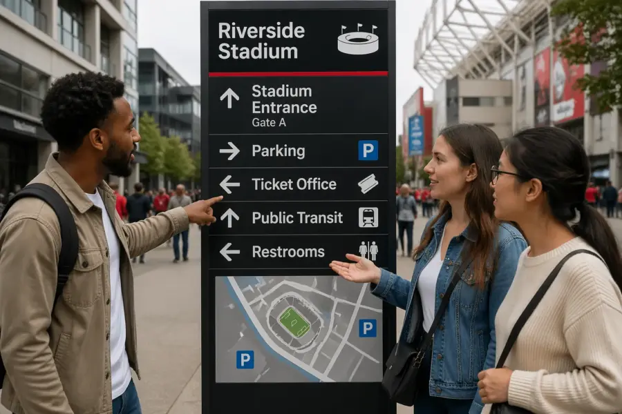
Layout is where readable systems separate from pretty posters. A sign needs a clear hierarchy, with the biggest element answering “where do I go” and smaller elements handling confirmation details.
Hierarchy is not just size, it is also placement and grouping. If you group unrelated destinations together or scatter related info across the panel, the user has to do sorting work that the layout should have done.
Put the destination name first, then the arrow, then secondary info like floor or room range, because people scan in chunks. If you bury the destination under a building name or a slogan, you force extra eye movements.
When you have multiple destinations, order them by user priority, not by internal politics. The most common destinations should be easiest to spot, and the rare ones can live lower in the stack.
Arrows need consistent style and consistent meaning, and that means you cannot redraw them per sign. Use one arrow set, keep stroke weight stable, and define what “up,” “left,” and “right” mean for your mounting locations.
Arrow meaning is especially tricky in stairwells, ramps, and multi-level lobbies where “up” might mean “continue forward to elevators.” If the building has these conditions, document arrow rules with diagrams so installers and future designers do not improvise.
Pictogram sizing should follow the same logic as type size, since symbols are read from a distance too. If the icon sits next to a 2 inch cap height destination line, the pictogram should have similar visual weight so neither one looks like an afterthought.
Symbols also need consistent stroke style, corner radius, and fill behavior, or they will look like they came from different systems. A mismatched icon set is a subtle readability problem because it reduces trust and slows recognition.
White space is not wasted space, it is the thing that keeps information from turning into a gray block. Give arrows and symbols breathing room, and do not let borders or background patterns crowd the message.
When a sign feels cramped, the usual cause is too much copy, not too much white space. Edit the message before you shrink the margins, because margins are what keep the sign readable at a glance.
Alignment is your quiet enforcer, because it makes scanning predictable across a sign family. Pick a grid, stick to it, and keep left edges and baselines consistent so the system feels like one voice.
A grid also helps when translations expand, because you already know where the text can grow and where it cannot. Without a grid, every language version becomes a redesign, and consistency evaporates.
Keep the number of destinations per panel under control, because lists become unreadable faster than designers expect. If a directory sign needs twenty items, treat it as a directory with a different reading mode, not as a wayfinding blade with a tiny font.
Use dividers sparingly and only when they clarify grouping, because extra lines can look like extra instructions. A simple gap is often more readable than a rule line, especially when the sign is viewed from an angle.
Pay attention to line breaks, because a bad break can change meaning or hide the keyword. If the destination name is two words, keep it together when possible, and do not strand a single short word on its own line.
Finally, treat the sign edge as part of the composition, because people see the whole panel before they read the text. A clean frame and consistent proportions make the sign recognizable as guidance even before the words resolve.
Designing for real conditions: glare, dust, and low light
Most readability failures come from real conditions, not from bad taste. Glare from skylights, reflections off polished floors, and headlight spill in parking garages can erase contrast in seconds.
Glare is not just a daytime issue, because bright point sources at night can be worse. A single downlight aimed the wrong way can turn a sign into a bright rectangle with invisible letters.
Choose matte finishes when you can, because gloss turns a sign into a mirror at the worst angles. If a client wants glossy for cleaning, push for a tested anti glare laminate and check it under the actual fixtures.
Cleaning requirements are real, especially in healthcare, but readability is also hygiene because it reduces wandering and crowding. If the finish choice makes the sign unreadable, it is not a functional solution no matter how wipeable it is.
Dust and grime are predictable in logistics and industrial sites, so design like the sign will be dirty. Thin strokes, light gray type, and low contrast palettes look “clean” on day one and look unreadable by month three.
Think about where dirt accumulates, like lower edges, corners, and around fasteners. If your key information sits right where grime collects, the environment will eventually edit your message for you.
Low light changes apparent stroke weight, and light text on dark backgrounds can bloom if the illumination is uneven. For backlit signs, avoid super thin fonts and avoid tight counters that fill in when the panel ages.
Backlit signs also need careful diffuser choices, because hot spots can distort letterforms. A sign that looks evenly lit in a shop can look patchy after installation if the light box depth is too shallow.
Temperature and UV exposure matter outdoors because fading is not evenly distributed across colors. Blues and reds can shift, so use proven exterior grade pigments and keep a maintenance plan that includes replacement cycles.
Outdoor readability also depends on weather, because rain and condensation change surface reflectivity. If a sign is near sprinklers or exposed to fog, test the finish so it does not turn glossy when wet.
If the environment is loud visually, like a retail concourse or a busy terminal, simplify the sign even more. Wayfinding sign design for readability often means saying less, then placing that less in the cleanest possible frame.
In visually loud spaces, placement can matter more than design, because the sign needs a clear sightline. If the sign is competing with advertisements, negotiate a protected zone where wayfinding is the dominant message.
Acoustics can indirectly affect readability because people look up when they hear announcements and then try to orient quickly. If your sign system is consistent, those quick glances become enough to recover direction without stopping.
Also consider temporary conditions like construction detours, seasonal crowds, or pop-up kiosks that block sightlines. A robust system anticipates change and includes locations for temporary signs that still follow the same readability rules.
When you design for real conditions, you stop optimizing for the perfect rendering and start optimizing for the worst day. That mindset is what keeps signs readable after the grand opening when the building becomes a working machine.
Standard templates to keep every sign consistent
Templates are the difference between a system and a pile of signs that happen to share colors. When teams skip templates, every new message becomes a one off layout decision, and the system drifts fast.
Drift is expensive because it shows up late, after fabrication quotes and after stakeholders have approved the concept. Once drift happens, you either accept inconsistency or you pay to redo art and schedules.
A good template set includes rules for type sizes, arrow placement, pictogram sizing, line breaks, and maximum destinations per panel. It also includes rules for what never changes, like margins, corner radii, and background fields.
Templates should cover the main sign types, like overheads, wall panels, blades, directories, and room IDs, because each has different viewing distances and constraints. If you only template the hero signs, the smaller signs will become a messy afterthought.
Consistency is not only visual, it is also verbal, so templates should include naming rules. Decide whether you say “Restrooms” or “Toilets,” whether you use “Level” or “Floor,” and how you format room ranges.
Templates also protect you from stakeholder creep, where every department wants an extra line of info. When the template has a maximum character count and a fixed hierarchy, you can say no with a rule instead of an opinion.
Build templates with real copy examples, including long names and multi-language versions, so the rules are stress-tested. A template that only works with short English labels is not a template, it is a demo.
Make sure the template includes a plan for exceptions, because buildings always have them. The point is not to pretend exceptions do not exist, but to handle them in a controlled way that still looks like the same system.
Production details belong in the template package too, because fabrication affects readability. If the template assumes a certain stroke width but the shop cannot cut it cleanly in vinyl, you need to know before the schedule is locked.
Installation realities should be baked in early, because mounting hardware and standoffs can steal space and interrupt the message block. A template that ignores brackets and fasteners can create accidental collisions with text.
- Primary destination line type size and weight
- Secondary line type size and maximum characters
- Arrow position lockup for left, right, up, and down
- Pictogram sizing relative to cap height
- Minimum clear space around message block
- Color pairings approved for high contrast signage
- Mounting height and viewing distance assumptions
Those bullets are the skeleton, but the muscle is the example library that shows correct and incorrect uses. If you provide a few do and do not examples, future updates will stay readable even when the original designer is gone.
Templates should live in the same place as the sign schedule so the team is always looking at the current rules. When templates are buried in a slide deck, people will recreate them from memory and introduce errors.
Finally, treat templates as a living system that can be improved, but only through controlled revisions. If every project meeting changes the template, you will never stabilize the system enough for users to learn it.
Proofing and field testing before you print at scale
Proofing is where a readable design survives contact with real copy, real translations, and real constraints. Do not rely on a PDF proof alone, because screens lie about size, contrast, and glare.
PDFs also hide the fact that people do not view signs straight on at 100% zoom. A sign that looks fine on a monitor can become unreadable when it is 30 feet away and slightly above eye level.
Print full scale paper mockups and tape them at the planned mounting height, then walk the route like a first time visitor. You will catch obvious issues fast, like arrows that point the wrong way when viewed from the approach angle.
Do this walk at different times of day, because lighting changes the read. A corridor that looks evenly lit at noon can be dim and shadowy in the evening, and your contrast assumptions can collapse.
Test with the slowest readers and the busiest hands, like someone pushing a stroller or a worker pulling a pallet jack. If they hesitate, your sign typography or hierarchy is not doing its job.
Also test with someone who has never seen the building plan, because insiders cheat without realizing it. A staff member can navigate based on memory, but a visitor only has what the environment tells them.
Run a translation stress test even if you think you only need English, because facilities change owners and users. German and Finnish run long, Spanish can expand labels, and Arabic changes the whole reading direction and arrow logic.
Even within one language, naming can change, like when a department rebrands or a tenant moves. If your system cannot absorb small naming changes without breaking layout, it will become brittle and expensive to maintain.
Check symbol comprehension in context, because icons that look obvious in a library of pictograms can get weird on a wall. If a pictogram needs a label to make sense, treat it as decoration and remove it or replace it.
Context includes adjacency, because an icon next to the wrong destination can be misread as a service marker. If you use pictograms, define whether they represent a destination, an amenity, or a rule, and keep that meaning consistent.
Lock a sign schedule and a message hierarchy before you send files to fabrication, because late copy edits wreck spacing. When you have to change text, update the template rules too, so the next sign stays consistent.
During proofing, confirm that the sign codes, locations, and mounting types match the drawings, because a readable sign in the wrong place is still a failure. Many projects lose time because the schedule and the floor plan drift out of sync.
Ask the fabricator for a first-article sample when the budget allows, because it reveals production realities like edge bleed, vinyl shrink, and color shifts. One physical sample can prevent a whole batch of panels from being slightly wrong.
Field testing should also include a simple timing check, where you measure how long it takes someone to make a decision at key intersections. If decision time drops after your mockups go up, you have evidence that readability improvements are real.
Finally, document what you learned, because every site teaches you something about glare, placement, and user behavior. That documentation becomes the playbook that makes the next project faster and more consistent.
Conclusion
Wayfinding sign design for readability is not mysterious, it is disciplined work with fonts, contrast, and layout. If you pick reliable sign typography, commit to high contrast signage, and set clear pictogram sizing rules, your system starts working like a tool instead of a poster.
Discipline also means editing, because fewer words often produce faster decisions. A readable system respects the user’s time and attention, especially in places where people are already overloaded.
The best advice I can give is to design for motion and mess, then prove it in the field before you print hundreds of panels. When you treat consistency as a safety feature, people move through the space with fewer stops, fewer wrong turns, and fewer bottlenecks.
If you do this well, the building feels easier to use, even though nothing structural changed. That is the quiet power of readable wayfinding, it reduces friction so the space can do its real job.