
Construction Site Pictograms are the closest thing a jobsite has to a shared language. When crews rotate, contractors change, and noise drowns out shouted warnings, a clear symbol still gets through.
I have seen excellent safety plans fail because the visual cues were sloppy, faded, or buried behind a stack of materials. If you want fewer close calls, you start by making the right message impossible to miss.
Construction safety signs work best when they are consistent, placed with intent, and backed up by training that people can remember on a bad day. Site safety pictograms do that job well because they are fast to read and hard to argue with.
This guide focuses on what common hazard symbols mean on active sites, and how to use them without turning your fences and trailers into visual clutter. The point is simple, get the symbol right, put it where the risk starts, and keep it readable.
The role of pictograms in construction safety
Construction Site Pictograms are shorthand for rules that would take a paragraph to explain. They work in rain, dust, and noise, and they still work when someone is stressed or rushing.
On most sites, you have multiple languages, mixed experience levels, and visitors who do not know your routines. A pictogram cuts through that, which is why construction safety signs lean so heavily on standardized shapes and colors.
Good site safety pictograms reduce decision time at the exact moment people make mistakes, right before they step through a gate, climb a ladder, or fire up a saw. If the symbol forces a pause, even a half second, it can prevent a bad habit from turning into an injury.
Pictograms also help supervisors enforce rules fairly because the expectation is posted in plain view. When someone ignores a hazard symbol that is clearly placed, the conversation is about behavior, not about whether the rule was communicated.
Standards matter here because a homemade icon can confuse people who have learned the ISO style symbols or the ANSI approach. If a worker has to decode your artwork, you already lost the speed advantage.
Common construction site pictograms and their meanings
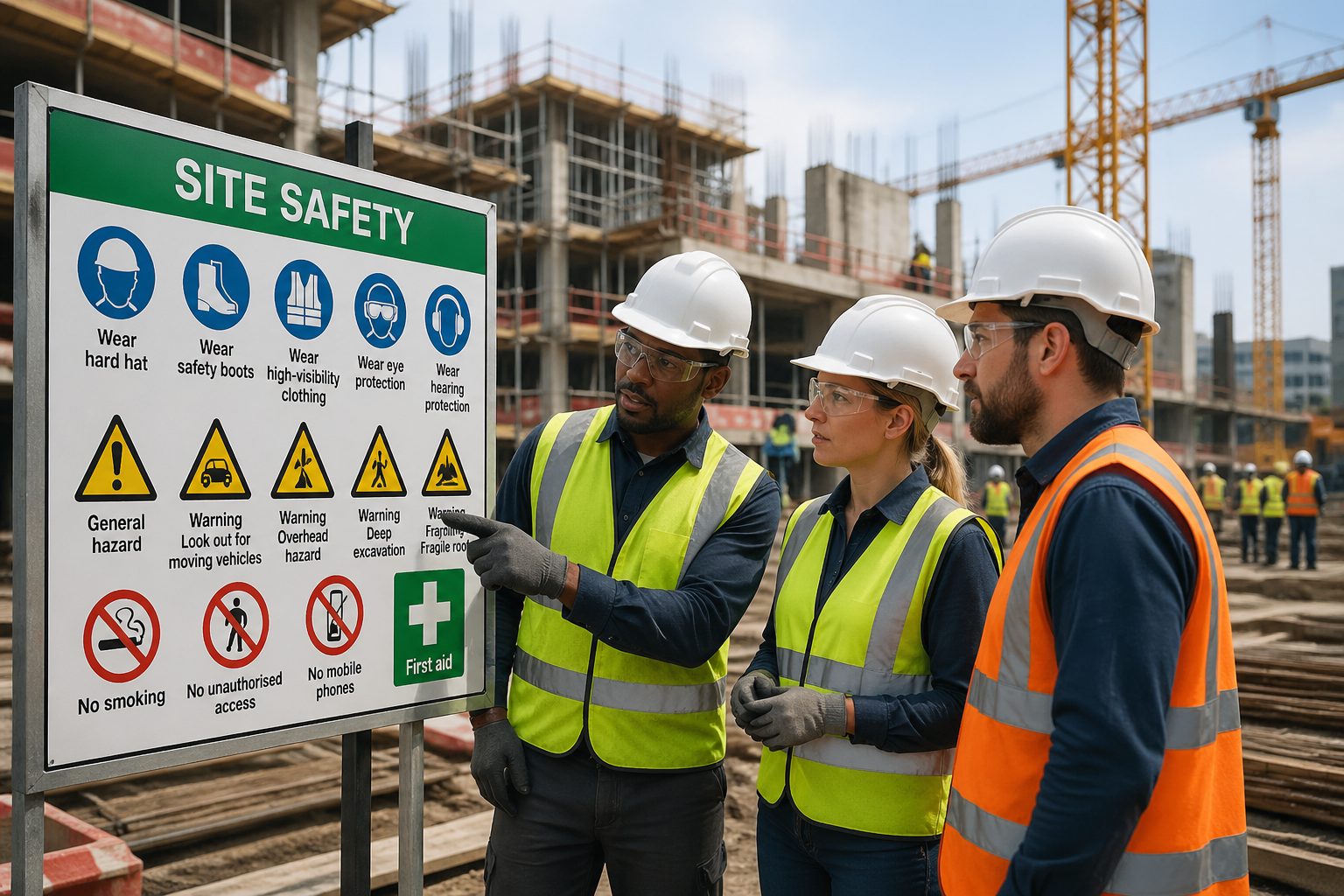
Most construction site pictograms fall into a few buckets, mandatory PPE, prohibition, warning, and emergency information. You see the same families of symbols across many countries because the risks are the same, moving equipment, electricity, heights, and flying debris.
Mandatory symbols usually use a blue circle with a white icon, and they tell you what you must do right now. Prohibition symbols often use a red circle and slash, and they tell you what you cannot do even if it seems convenient.
Warning hazard symbols tend to use a yellow triangle with a black icon, and they point at a condition that can hurt you. Emergency and safe condition symbols often use green, and they mark exits, eyewash stations, first aid, or assembly points.
The meaning is not just the picture, it is also the shape and color, which is why mixing styles can cause trouble. If you print a warning pictogram in random colors because it matches a brand palette, you make it harder to spot in peripheral vision.
When you select construction safety signs, pick symbols that match the standard your site uses and keep the set consistent across entrances, work zones, and temporary barriers. Consistency is what lets a new worker scan the area and understand it in seconds.
Pictograms you see on most sites
If you walk a typical commercial build, you will see a repeating cast of Construction Site Pictograms at gates and staging areas. These include hard hat required, safety glasses required, hearing protection required, high visibility clothing, and safety footwear.
You will also see hazard symbols tied to the work, like warning, overhead load, electrical hazard, forklift traffic, and pinch point. The best sites pair these symbols with short text, but the pictogram still carries the first punch.
| Pictogram type | What it communicates | Typical placement |
|---|---|---|
| Mandatory PPE (blue circle) | Required action, wear specific protection | Entrances, near task areas, tool cribs |
| Warning hazard (yellow triangle) | Hazard present, proceed with care | Perimeters of risk zones, equipment routes |
| Prohibition (red slash) | Forbidden action, do not enter or do not do | Restricted rooms, hot work zones, plant areas |
| Emergency or safe condition (green) | Escape, first aid, eyewash, assembly point | Corridors, welfare areas, near exits |
How to read a pictogram fast under pressure
People do not read signs the way they read a manual, they glance and move. A good pictogram has a simple silhouette, strong contrast, and no tiny details that disappear at ten feet.
Shape recognition matters because the brain catches it before it catches the icon, especially in low light. That is why hazard symbols use triangles and mandatory PPE uses circles, the outline is part of the message.
Watch out for symbols that look too similar at a distance, like two glove icons with slightly different cuffs or two head protection icons with minor variations. If you need different meanings, make the differences obvious or add short text that removes ambiguity.
Placement and sightlines matter as much as design because a sign behind a parked skid steer is functionally invisible. Walk your site at worker eye level and check what you can actually see while moving.
When the site changes, update the signs the same day, because yesterday’s map is how people get hurt today. Temporary hazards like open trenches or new crane swing zones deserve temporary pictograms that look as serious as the permanent ones.
Pictograms for head protection
The hard hat required pictogram is one of the most common Construction Site Pictograms, and it belongs anywhere overhead risks exist. That includes scaffold work, steel erection, formwork stripping, and any area with suspended loads.
Head protection signs get ignored when crews think the area is “safe enough,” which is why you should place them before the risk zone starts. Put the symbol at gates, at stair towers leading to upper levels, and at transitions into active lift areas.
Some sites use a second pictogram for bump caps or for hard hats with chin straps, especially where wind or climbing is common. If you require a chin strap, say it plainly because the basic helmet icon does not always communicate that detail.
If you run a mixed site with visitors, add a clear hard hat pictogram at the reception point and again at the pedestrian route entry. Visitors often focus on where to sign in, and they miss the first sign if it is competing with paperwork and directions.
Keep these construction safety signs clean because dust and sun fade the icon until it looks like a blank circle. Replace them sooner than you think you need to, since a washed out pictogram reads like a suggestion.
Pictograms for eye protection
Eye protection pictograms need aggressive placement because eye injuries happen fast and they happen during “quick” tasks. Grinding, cutting, drilling, chipping concrete, and even sweeping can throw debris into someone’s face.
The standard safety glasses required pictogram is clear, but it can still fail if you put it only at the main gate. Place it at tool issue points, near abrasive saw stations, and at entrances to fabrication areas where visitors step in without PPE.
Use separate site safety pictograms for face shields when the risk is splash or high energy impact, like cutting rebar with a chop saw or using chemicals. When you rely on one generic eye icon for everything, workers improvise and choose the lightest option.
Pair the eye protection pictogram with hazard symbols for flying particles or corrosive substances when those conditions exist. The combination tells people both what can happen and what they must wear, which helps with compliance.
If you have an eyewash station, mark it with the green emergency pictogram and keep the path clear. A perfect sign does nothing if the station is blocked by pallets or the door is locked.
Pictograms for fall protection
Fall protection pictograms belong at every access point to a height hazard, not halfway up the ladder. If a worker has to climb first and then remember PPE, you already created a shortcut opportunity.
The harness required pictogram is common, but you should be specific about the system your site expects. If you require tie off at 6 feet, or you require a certain anchorage method, add text next to the pictogram that states the rule in plain numbers.
Use warning hazard symbols for unprotected edges, roof work, and floor openings, and place them where the walking path changes. People step backward while carrying material, so signs should face the approach route and not just the hazard itself.
For lift operations like boom lifts and scissor lifts, place the harness pictogram at the equipment staging area and on the machine itself if you control the fleet. Rental equipment moves around, so the best reminder is the one attached to the tool.
Fall protection signage fails when it becomes wallpaper, so tighten the sign plan and remove outdated warnings. A clean set of signs that match today’s risks gets more respect than a wall of old rules.
Mistakes that make safety pictograms easy to ignore
The fastest way to ruin Construction Site Pictograms is to post too many of them in one place. When a worker sees twelve icons at the gate, they read none of them and rely on habit.
Another common failure is printing signs too small, especially on interior fit outs where people assume risks are low. A six inch pictogram on a cluttered wall disappears behind conduit, stacked drywall, or a half open door.
Color drift is a quiet problem because cheap printing turns yellow warnings into muddy tan and blue mandatory signs into purple. If the color does not read instantly, the sign loses its category and becomes a random picture.
Do not mix unrelated messages on one board, like a forklift hazard symbol next to a no smoking icon next to a hard hat icon, unless that exact spot truly has all those risks. Workers notice when signs do not match reality, and then they stop trusting the rest.
Finally, watch your mounting methods, because zip ties on fencing sag and twist until the symbol faces the wrong direction. Use rigid backing or proper posts where you can, and fix any sign that is bent or spinning in the wind.
Where to place construction site pictograms
Start with the site perimeter because that is where you set expectations for everyone entering, including deliveries and inspectors. Put your core construction safety signs at vehicle gates, pedestrian gates, and reception points where PPE is issued.
Inside the site, focus on transitions, which are the spots where people change tasks or move into a new risk zone. Stair towers, hoist landings, doorways into plant rooms, and entry points to scaffold platforms all deserve clear site safety pictograms.
Place hazard symbols where the hazard begins, not where the incident would happen, because people need time to react. For example, put the overhead load warning before the crane swing area, and put the electrical hazard warning before the panel room door.
Keep signs at eye level when possible, and avoid placing them behind temporary storage that changes daily. If the only available surface is a fence line, set a rule that material cannot be stored within a clear distance of the sign.
For temporary hazards, use portable sign stands and move them with the work, the same way you move barricades. A pictogram that stays after the hazard is gone trains people to tune out the next warning.
Quick placement checklist for supervisors
Most sign audits fail because people check the box and do not walk the routes the way workers do. If you want a practical check, focus on visibility, relevance, and condition.
This list is what I would carry on a clipboard for a weekly walk, and it catches the issues that lead to ignored construction safety signs. It also keeps the focus on the handful of symbols that prevent the most common injuries.
- Post PPE pictograms at every pedestrian entry
- Place hazard symbols before the risk zone starts
- Mount signs at eye level on approach routes
- Replace faded, cracked, or dirty pictograms
- Remove outdated signs that no longer match conditions
- Keep a clear buffer so materials cannot block signage
Conclusion
Construction Site Pictograms work when you treat them like tools, not decorations. Pick standardized icons, keep them readable, and place them where decisions happen.
Construction safety signs and hazard symbols should match the real work on the ground, or crews will stop trusting them. When your site safety pictograms stay consistent and current, they become part of how the site runs every day.
If you want one practical next step, walk the site from the gate to the highest risk task and note every spot where a new worker could hesitate or guess. Those are the places where the right pictogram earns its keep.


