
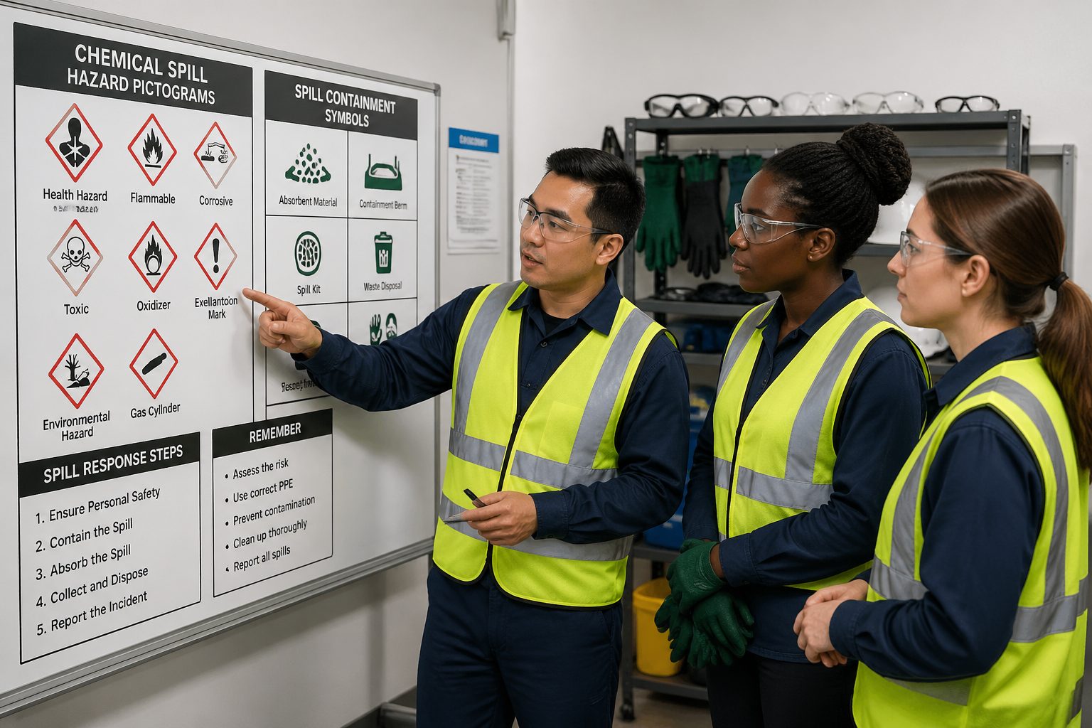
Chemical spills are messy, fast, and unforgiving, and the first few minutes decide whether the incident stays small or turns into a shutdown. Chemical Spill Pictograms exist because people under stress do not have time to read long instructions or debate what a label means.
When a drum leaks, a hose bursts, or a tote gets punctured by a forklift, the response has to be automatic. Clear spill response symbols tell workers what to wear, what to grab, where to go, and what to avoid.
I have seen well trained teams freeze because the signage was inconsistent across rooms, and nobody wanted to make the wrong call. Standardized chemical hazard pictograms and emergency signs remove that hesitation and keep the response moving.
A spill response program is only as strong as its weakest moment, and that moment is usually the first discovery. Pictograms help the person who finds the spill act like a responder instead of a bystander.
Even in facilities with strong safety culture, panic shows up when the chemical is unknown or the smell is sharp. A simple symbol can cut through that fear and point to the next safe step.
These visuals also protect the people who arrive second, because they walk into a scene already in motion. When the first person takes the correct action, everyone else inherits a safer situation.
The Importance of Chemical Spill Pictograms
Chemical Spill Pictograms translate risk into a quick visual cue that works across languages and job roles. A contractor, a new hire, and a visiting driver can all read the same symbol and act the same way.
In a spill, you often have competing goals, protect people, protect the environment, and protect the facility, and you cannot do all three if you waste time. Spill response symbols create a shared playbook so the first person on scene can start the right steps before a supervisor arrives.
These symbols also reduce the “telephone game” that happens when instructions pass from one person to another. A posted chemical hazard pictogram stays accurate even when radios crackle and alarms are loud.
Good pictograms support compliance, but I care more about the practical side, they prevent improvisation. Improvisation is how people mix incompatible absorbents, block the wrong drain, or walk into vapor they did not expect.
They also speed up decision making for people who do not handle chemicals every day, like maintenance, sanitation, or shipping. Those teams often arrive first because they are nearby, and they need a clear baseline response.
When you rely on text only, you rely on literacy, lighting, and calm, and spills rarely give you all three. A bold symbol can still be understood when the floor is wet, gloves are on, and visibility is poor.
I treat pictograms as part of the engineering controls, not just training aids. If the sign is clear and consistent, it functions like a guardrail that keeps people from stepping into the wrong choice.
They also help supervisors do faster triage, because they can scan the area and confirm hazards without digging through binders. That matters when you are deciding whether to isolate, evacuate, or call an outside response team.
Pictograms make drills more realistic because they force responders to use the same cues they will see during a real event. If you only practice with verbal prompts, you are training a scenario that will not exist when alarms are sounding.
They also help reduce near misses that happen after the spill, like slips, secondary exposures, and cross contamination. A simple “contaminated area” symbol can keep foot traffic from tracking chemical residue into clean zones.
Another overlooked benefit is accountability, because a posted symbol makes expectations visible. When everyone can see what the response should have been, it becomes easier to coach and correct without guessing.
Finally, pictograms help you standardize across shifts, which is where many programs fall apart. Night shift should not have to invent its own spill response because the day shift wrote instructions on a whiteboard.
Common chemical spill pictograms explained
The most useful Chemical Spill Pictograms are the ones that tell you what the material does, not what it is called. A label that says “Solvent A” means nothing to a responder, while a flammable liquid symbol changes behavior immediately.
Corrosive symbols are a good example because they change both PPE and containment choices. If the pictogram indicates corrosion, you do not grab a random absorbent, you pick a compatible neutralizer or inert absorbent and protect nearby metals.
Toxicity and inhalation hazard symbols matter most when the spill is spreading vapors, which happens quickly with some acids, ammonia solutions, and many solvents. In that case, emergency signs that point to ventilation controls and respiratory protection save more time than a generic “caution” placard.
Environmental hazard pictograms tend to get ignored until a spill reaches a floor drain or a dock door. I like to pair that symbol with a clear drain protection sign because it pushes people toward booms, mats, and drain covers instead of paper towels and wishful thinking.
Flammable pictograms should trigger two immediate behaviors, remove ignition sources and increase ventilation if it is safe to do so. I have watched people keep running a floor scrubber near a solvent spill because nobody connected the dots until the sign was pointed out.
Oxidizer symbols are another one that people underestimate, because the liquid may not look dangerous. If the pictogram indicates an oxidizer, you keep it away from organic absorbents and anything that could burn, including some common spill pads.
Compressed gas symbols matter when the spill is really a release, like a cylinder valve failure or a broken regulator. The right pictogram reminds people that the hazard is not just the chemical, but also the pressure and the potential for rapid displacement of oxygen.
Biohazard style symbols are less common in industrial chemical spills, but they show up in labs and healthcare support areas. When they are present, they should be paired with disposal and decontamination instructions that are actually achievable with the supplies on hand.
Some sites use “unknown chemical” or “do not touch” pictograms for unlabeled containers and mystery leaks. I like those because they create permission to stop and escalate instead of guessing based on color or smell.
Heat and reactive hazard symbols are useful near mixing stations where exothermic reactions are possible. A spill at a blending skid can be more dangerous than a spill in storage because the material may be mid reaction.
Even simple “slippery surface” symbols have a place in spill response because falls are common during cleanup. If the pictogram reminds people to slow down and use traction, it prevents injuries that have nothing to do with toxicity.
The key is that pictograms should be tied to how your facility actually behaves, including temperature, ventilation, and drainage. A symbol that is technically correct but operationally irrelevant will get ignored over time.
If you use GHS style hazard pictograms, make sure they are not competing with custom icons that say something different. Mixed symbol systems can create hesitation because responders start debating which one is the “real” message.
Pictograms for protective gear
Protective gear pictograms are where signage either helps or hurts, because vague PPE signs lead to under protection. If the symbol says “gloves,” it should also match the glove type stocked nearby, like nitrile for solvents or neoprene for certain acids.
Respiratory symbols need extra care because “mask” can mean anything from a dust mask to a full face respirator. When the hazard calls for cartridges, the pictogram should sit next to a simple selection guide so responders do not guess under pressure.
Eye protection pictograms should be specific about goggles versus safety glasses, because splash risk is not the same as flying debris risk. If you expect pouring, pumping, or neutralization, the symbol should push toward sealed goggles and a face shield.
Protective clothing symbols should match the tasks responders will actually do, including kneeling, lifting saturated pads, and handling waste bags. A thin apron might be fine for a small bench spill, but it is not enough when you are building a berm on the floor.
Footwear pictograms are often treated as generic, but chemical resistant boots are not the same as standard safety toes. If the spill can pool, footwear becomes a primary exposure route, especially when people step into liquid without realizing it.
Hand protection pictograms should also consider dexterity, because thick gloves can cause dropped tools and secondary spills. If you require heavy gloves, the spill kit should include tools that are easy to grip with that glove type.
For respiratory protection, the pictogram should align with your fit testing and medical clearance program. A symbol that calls for a respirator is useless if the only trained users are on a different shift.
Some facilities add a “buddy required” icon for higher hazard spills, and I find that helpful when it is used sparingly. It reminds people that PPE is not a substitute for having someone watch for symptoms, leaks, or wrong turns.
Decontamination pictograms are another smart addition near PPE stations because contaminated gear is a common failure point. If the sign shows where to doff and where to dispose, you reduce the chance of tracking chemicals into break rooms and offices.
PPE signage should also consider eyewash and shower access, because PPE fails and splashes happen. If the pictogram points to water, it gives exposed workers a clear next move instead of standing still in shock.
One practical trick is to place the PPE pictograms directly on the cabinet or bin that holds the gear. When the symbol and the equipment are in the same place, you remove the mental step of searching.
If you have multiple spill kits for different hazards, the PPE pictograms should make that difference obvious at a glance. A universal kit that tries to cover everything often ends up covering nothing well.
| PPE pictogram | What it tells responders to use | Spill situations where it matters most |
|---|---|---|
| Chemical resistant gloves | Compatible gloves from the spill kit, not general purpose work gloves | Solvents, acids, caustics, and unknown liquids |
| Eye protection | Goggles or face shield, based on splash risk | Pressurized leaks, pouring into waste drums, neutralization |
| Protective clothing | Apron, coveralls, or chemical suit as posted | Large floor spills, kneeling to place drain covers, decon work |
| Respiratory protection | Approved respirator and cartridges, or supplied air if posted | Strong odors, confined rooms, volatile chemicals |
| Safety boots | Chemical resistant footwear or boot covers | Spills that pool, slippery surfaces, dock and warehouse aisles |
Pictograms for containment procedures
Containment pictograms should push responders toward one idea, stop the spread before you start cleanup. The best spill response symbols show actions like “block drain,” “place boom,” or “build dike,” because those are the moves that prevent a small leak from becoming a reportable release.
Drain protection symbols deserve a dedicated spot near every floor drain in chemical areas, not buried on a wall across the room. If the sign is close to the drain, it triggers the right reflex, cover first, then absorb.
Diking and berming pictograms work well when they match the actual tools provided, like socks, booms, sand, or spill berms. If the sign shows a berm but the kit only has pads, people will still try to improvise a barrier and waste time.
Waste handling pictograms matter after the spill stops moving, when the job shifts to collecting and labeling contaminated materials. Clear symbols for “hazardous waste container,” “seal drum,” and “label contents” reduce the odds that contaminated absorbents end up in general trash.
Containment symbols should also cover source control, because stopping the leak beats absorbing it forever. A simple “close valve” or “upright container” pictogram can remind people to look for the simplest mechanical fix first.
I like pictograms that distinguish between “absorb” and “neutralize” because those are not interchangeable actions. If the sign suggests neutralization, the kit needs the right agent and a clear warning about heat and fumes.
For spills near doorways and dock plates, a “protect threshold” pictogram can prevent product from leaving the building. That is often the difference between an internal cleanup and an external environmental call.
Containment pictograms should also point to isolation steps, like closing fire doors or restricting traffic. A spill that gets run over by forklifts turns into a facility wide contamination problem quickly.
Some sites use a “no water” pictogram for water reactive materials, and that is worth considering where those chemicals exist. People reach for hoses instinctively, and the wrong rinse can create heat, gas, or splattering.
In areas with sumps or trenches, a pictogram that indicates “protect trench” helps responders think in three dimensions. Liquids travel downhill and out of sight, and the sign should remind people to follow the flow path.
Containment signs should also account for spill kit limitations, because not every spill is a spill kit job. A clear “call for assistance” pictogram can prevent well meaning workers from stepping into a hazardous release they cannot control.
If you use absorbent pads, a pictogram that shows layering and overlap can improve performance. People often place one pad in the middle of a puddle and expect it to work like a sponge, which is not how most pads behave.
Finally, containment pictograms should be consistent with your reporting triggers, especially for drains and outdoor areas. If a symbol indicates environmental risk, it should also cue escalation so the right notifications happen on time.
Pictograms for evacuation routes
Evacuation route pictograms should assume people are disoriented, maybe wearing goggles, and moving fast. That is why emergency signs need high contrast, consistent arrows, and placement at eye level along the path of travel.
For chemical spills that create vapors, the safest route may change based on wind direction at dock doors or ventilation flow in production rooms. I prefer evacuation pictograms that include “do not enter” symbols for likely upwind doors, because people will try the closest exit first.
Assembly point pictograms are not decoration, they stop people from clustering near the building where responders need space. If your site has multiple muster points, the pictogram should include a simple identifier like “A” or “North lot” so headcounts do not turn into arguments.
Do not forget the “eyewash” and “safety shower” emergency signs along evacuation paths in wet process areas. When a spill involves splashing or corrosives, directing an exposed worker to water is as time sensitive as getting everyone else out.
Evacuation pictograms should also consider accessibility, because not everyone can take stairs or move at the same pace. If you have areas of refuge or assisted evacuation procedures, the symbols should point to them clearly.
In noisy environments, people may not hear verbal instructions, so the route signage has to do more work. If the arrows are inconsistent, people will follow the crowd, and crowds do not always pick the safest path.
I also like to see “door closed” pictograms in areas where closing a door helps contain vapors. A propped open fire door can turn a localized release into a building wide problem.
For facilities with multiple tenants or shared corridors, evacuation pictograms need coordination across boundaries. A perfect sign inside your area does not help if the next hallway has different arrows and different terminology.
Emergency exit symbols should be backed up by lighting that works during power loss. If your signs are not visible in low light, a real spill during an outage will expose that weakness immediately.
Evacuation route pictograms should also avoid being blocked by stored materials, pallets, or temporary equipment. If the sign is hidden during normal operations, it will be invisible during an emergency.
In chemical areas, I prefer route signs that help people avoid passing through high hazard zones like bulk storage or mixing rooms. The shortest path is not always the safest path, and pictograms can steer traffic away from predictable danger.
It is also worth placing small confirmation symbols at the end of a corridor so people know they are still on the right route. That reduces the tendency to stop and look around, which is when exposure happens.
Finally, evacuation pictograms should be part of your drill evaluation, not an afterthought. If people hesitate at a door during a drill, the sign failed, even if it meets a standard on paper.
Where to place chemical spill pictograms
Placement is where many facilities get lazy, and it shows during drills. Chemical Spill Pictograms belong where decisions happen, at storage, transfer points, spill kit stations, drains, and doors.
Start with the spill kit, because responders look there first and they need instructions fast. Put spill response symbols on the kit lid and on the wall above it, so the message stays visible even when the kit is open and tools are scattered.
Next, post chemical hazard pictograms at the source areas, like drum racks, IBC fill stations, lab benches, and chemical mixing skids. If a spill starts there, the first person on scene can confirm hazards before grabbing absorbents that might react.
Finally, treat exits and corridors like part of the response system, because that is where confusion spreads. Emergency signs for exits, shutoff valves, and isolation points should be consistent from room to room, even if different departments own the spaces.
Put pictograms at the point of use, not just at the point of storage, because spills happen during handling. A transfer hose connection with a clear symbol often prevents the wrong response more effectively than a sign on a distant wall.
Mount signs where they can be seen over equipment and stacked materials, which often means higher than you think. If a pictogram is at the same height as pallets and carts, it will disappear during normal operations.
Lighting matters, so avoid placing pictograms in shadowed corners or behind swinging doors. If the sign is not readable in the worst lighting conditions you expect, it will not perform when you need it most.
Consider line of sight from the approach path, because responders are usually walking in from a doorway or aisle. If the symbol is only visible once you are already in the hazard zone, it arrived too late.
Use repeated symbols in larger rooms so the message stays in view as people move. One sign at the entrance does not help when the spill is on the far side behind equipment.
Place containment pictograms near drains, expansion joints, and other hidden pathways where liquids travel. Those spots are where spills escape, so the sign should be there before the spill arrives.
In outdoor chemical areas, weatherproof pictograms are not optional, because faded signs become invisible quickly. If the symbol cannot survive sun and rain, it will fail long before the next incident.
Do not forget mobile equipment, because forklifts, tote carts, and transfer skids can carry risk into clean areas. A small pictogram on the equipment can remind operators to stop and assess if they see a leak.
Near control panels and emergency stops, pictograms should be unambiguous about what the shutoff affects. If people are afraid to hit a shutdown button because they do not know what it does, they will delay.
Break rooms, time clocks, and entry vestibules are good places for simple overview pictograms that reinforce the site standard. That way, people see the same symbols before they ever step onto the floor.
After any layout change, treat sign placement as part of the change management process. A moved rack or new machine can block a critical pictogram without anyone noticing until an emergency.
- Mount pictograms at eye level near spill kit stations
- Post drain cover symbols directly above floor drains
- Label chemical transfer points, pumps, and hose connections
- Mark emergency shutoffs for ventilation and process lines
- Place exit and route arrows at corridor decision points
- Add muster point symbols at outdoor gathering locations
Conclusion
Chemical Spill Pictograms work when they are consistent, specific, and placed where people actually look during an incident. If you treat them like a real control, alongside training and equipment, you get faster containment and fewer injuries.
Spill response symbols, chemical hazard pictograms, and emergency signs should match your chemicals, your PPE inventory, and your site layout, or they will fail the first time stress hits. Review them after drills and real events, and replace anything that caused even a moment of hesitation.
If you want these symbols to work, keep them simple and keep them consistent across departments. The goal is not to decorate the walls, it is to make the correct response feel obvious.
Also remember that pictograms do not replace training, they reinforce it. When training and signage say the same thing, people move faster and argue less.
Audit your pictograms the same way you audit spill kits, because both can quietly degrade over time. A missing sign is just as real a gap as an empty glove bin.
When you standardize symbols, you also standardize expectations, and that makes coaching easier after a drill. The best spill response programs are the ones that remove uncertainty before the spill ever happens.


