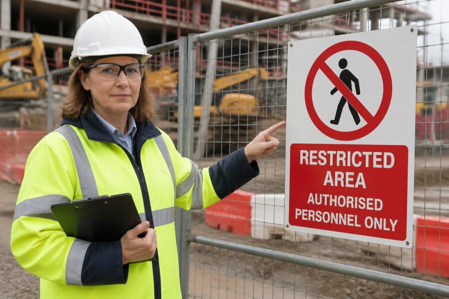
People ignore signs that look like clutter, and restricted zones often end up marked with exactly that kind of visual noise. Restricted Area Pictograms cut through the mess because they communicate fast, even when the reader is stressed, tired, or new to the site.
I have walked into warehouses where the only warning was a small printed notice taped to a door, and it was easy to miss at a glance. A clear symbol, sized and placed correctly, would have prevented the awkward stop, the radio call, and the near miss.
Restricted Area Pictograms matter in factories, airports, hospitals, data centers, and construction sites where traffic patterns change and visitors rotate daily. When you pair symbols with simple supporting text, you get access control that works for contractors, delivery drivers, and multilingual teams.
This article focuses on how to choose, customize, and deploy restricted access symbols without turning your walls into a collage of competing warnings. It also covers how access control pictograms and no entry signs fit into security workflows and compliance expectations.
Why use Restricted Area Pictograms?
Restricted Area Pictograms reduce decision time, which is the whole point when someone is about to cross a line they should not cross. If a worker has to read a paragraph to understand the boundary, you already lost the moment.
Symbols also travel better than words, especially in facilities that rely on temporary labor or visiting technicians. A consistent set of prohibited area symbols keeps rules stable even when the shift roster changes every week.
From a logistics perspective, pictograms prevent traffic friction where forklifts, pedestrians, and autonomous mobile robots share space. A bold no entry sign at the correct approach angle is often cheaper than repainting lanes after every process change.
There is also a social factor that people underestimate, because staff tend to respect a clean, standard symbol more than a homemade warning. When signage looks official and consistent, it signals that the rule will be enforced and audited.

Another practical benefit is that pictograms work in noisy environments where verbal warnings get lost. When hearing protection is required and machines are running, a visual boundary cue becomes the primary communication channel.
Pictograms also reduce the burden on supervisors who otherwise have to repeat the same instructions at the same doorway. When the sign does the first layer of communication, staff can focus on exceptions instead of basics.
They are especially useful during emergencies or abnormal operations, when people are moving quickly and attention narrows. A simple restricted access symbol can prevent someone from running toward the wrong refuge area or into an equipment room during an evacuation.
In mixed-use buildings, pictograms help separate public, semi-public, and controlled spaces without making the site feel hostile. You can communicate “not this way” clearly while still keeping the front-of-house experience calm and organized.
They also create a shared vocabulary for incident reports and corrective actions. When a report can reference a specific pictogram at a specific threshold, the fix becomes concrete instead of subjective.
For training, pictograms act like memory anchors that people recall faster than written policy. A new hire may forget the exact wording of a rule, but they will remember the symbol they saw at the door every day.
Even in highly literate teams, people skim when they are in motion, carrying tools, or pushing carts. A restricted area symbol that reads in half a second is built for how people actually move through facilities.
Standard symbols for restricted access
Standardization is your friend because it keeps meaning stable across sites, vendors, and training materials. Many organizations lean on ISO 7010 safety signs and symbols, then map them to internal access control rules.
For pure access restriction, the most recognizable pattern is the red prohibition circle with a diagonal bar, paired with a simple figure or action. These no entry signs work because they read as a stop cue before the viewer even processes the icon.
When the restriction is conditional, you can combine a prohibition with a mandatory action symbol nearby, such as PPE requirements at a lab entrance. That pairing tells people the area is controlled, but entry is allowed if they meet the condition.
Do not mix too many symbol families on the same doorway, because the viewer starts scanning instead of reacting. Pick a primary restricted access symbol, then support it with one or two secondary pictograms that explain the reason.
Standard symbols also help when you operate multiple buildings with different layouts and different managers. If the same red circle slash means the same thing everywhere, you reduce the learning curve for anyone who travels between sites.
In practice, the most common restricted access messages are “no unauthorized entry,” “staff only,” and “no public access,” and each should map to a consistent pictogram and a consistent text line. When those messages drift, people start negotiating with the sign instead of following it.
It helps to define a small set of restricted zone categories and stick to them, even if the temptation is to create a special sign for every door. The goal is to make the viewer recognize the category instantly, not to teach them a new icon every week.
When you use ISO-style symbols, keep the surrounding design consistent too, including border thickness, background color, and spacing. A standard icon pasted into a random template can look unofficial and lose authority.
Many sites also use supplementary icons like “ID badge required” or “CCTV in operation” to reinforce controlled access. Those symbols are not the main stop cue, but they clarify what is expected before the person reaches the door.
It is worth checking how your symbols appear on printed maps, orientation boards, and digital visitor kiosks. If the same pictogram is used across media, people connect the rule to the location before they even walk there.
Standard symbols also reduce procurement chaos because you can source the same design from multiple vendors without meaning drift. That matters when you need replacements quickly and cannot wait for a custom print run.
If you have legacy signs, plan a transition rather than a patchwork, because mixed eras create confusion. A phased replacement schedule with a clear end date keeps the site from living in “temporary” sign standards forever.
Customizing pictograms for specific hazards
Standard icons cover common cases, but real facilities have odd corners like battery charging rooms, cryogenic storage, MRI suites, or high value cage areas. Custom Restricted Area Pictograms can work well, but only if you keep the same visual grammar as your standard set.
The fastest way to ruin a symbol is to cram in detail, because tiny elements blur at distance and lose meaning under glare. If you need detail, add a short text label under the pictogram and keep the icon itself simple.
A good customization process starts with defining the single behavior you want at the threshold, not the full story of the hazard. If the behavior is “do not enter,” the pictogram should emphasize that first and explain the hazard second.
When you design a custom icon, test it at the distance and angle people will actually see it. A symbol that looks fine on a monitor can become an unreadable blob when printed small and mounted high.
It also helps to check the icon under the lighting conditions of the space, including flicker, glare, and shadow. A high-contrast design that survives bad lighting is more valuable than a clever illustration that needs perfect conditions.
Custom pictograms should still respect familiar shapes like the prohibition circle or warning triangle, because those shapes are the real language. If you invent a new shape, you force the viewer to decode the sign instead of reacting to it.
Use the same stroke weight and icon style across your custom set so the signs look like they belong together. When one sign looks like clip art and another looks like a standards-based icon, people assume neither is authoritative.
For specialized hazards, it is often better to pair a standard hazard symbol with a standard restricted access symbol instead of inventing a brand-new combined icon. That approach keeps the message legible while still calling out what makes the area different.
In high-consequence zones like MRI suites, the icon should focus on the specific risk that visitors do not anticipate. Many people understand “no entry,” but they do not understand “magnetic field will pull objects,” so the hazard cue needs to be unmistakable.
For high value or sensitive information areas, the hazard is not physical injury but policy violation, so the supporting text matters more. A simple “Authorized personnel only” line under the pictogram can prevent arguments and set expectations early.
When you customize, involve the people who work in the area because they know what outsiders do wrong. Their feedback often reveals the one mistake that the pictogram must prevent, like carrying a metal cart into an MRI corridor or bringing a phone into a classified room.
Finally, keep a controlled library of your custom symbols so they do not multiply without oversight. If every department makes its own “restricted” sign, you end up back at clutter, just with nicer graphics.
| Restricted zone type | Recommended pictogram approach | Notes for clarity |
|---|---|---|
| High voltage room | Prohibition plus electrical hazard symbol nearby | Use a clear boundary marker before the door |
| Battery charging area | No entry pictogram plus corrosive and explosive gas cues | Add eye wash location sign close to entrance |
| Cleanroom gowning zone | Access control pictograms with mandatory PPE sequence | Order the PPE icons in the order people dress |
| Data center cage | Prohibited area symbol plus badge required icon | Include visitor escort requirement if applicable |
| MRI controlled area | No entry sign with strong magnet hazard symbol | Call out ferromagnetic items with a simple icon |
Placement guidelines for maximum impact
Placement is where good symbols fail, because even the best icon does nothing if it sits behind a propped door or a pallet stack. Put Restricted Area Pictograms where the decision happens, which is usually 6 to 15 feet before the boundary and again at the boundary.
Height matters, and I prefer eye level placement for pedestrians and a second, higher sign for forklift sight lines when the environment is busy. If the area has vehicle traffic, angle the sign to the approach path rather than mounting it flat to the wall.
Lighting and glare can destroy contrast, especially near loading docks where sunlight washes out colors. Use matte finishes, strong contrast, and retroreflective materials where headlights or emergency lighting are part of the scenario.
Do not rely on a single door placard when the boundary is porous, like a taped off aisle or a temporary construction zone. Use repeated prohibited area symbols along the perimeter so people do not convince themselves the restriction ended after the first marker.
Think about approach speed, because a person walking has more time than a person driving a tugger or a forklift. Faster approaches require larger symbols, earlier placement, and fewer competing messages in the same field of view.
Intersections and blind corners deserve special attention because people commit to a path before they see the door. A restricted symbol placed after the turn is too late, so add a pre-warning sign before the corner when the route is common.
Door hardware can block signs, especially when doors are left open during deliveries or maintenance. If the door swings into the sign, mount an additional pictogram on the wall or on a post that remains visible when the door is open.
In corridors with multiple doors, avoid placing the sign where it could be misread as belonging to the wrong room. A sign centered on the door at a consistent height reduces the chance that someone associates it with the adjacent doorway.
Floor markings can support wall signage, particularly for temporary restricted areas. A red boundary line paired with repeated small pictograms can create a strong “stop” moment without needing a physical barrier.
Outdoor placements add weather and vandal resistance to the equation, so material choice becomes part of placement strategy. A faded sign at a gate is worse than no sign because it tells people the boundary is not maintained.
For visitor-heavy sites, consider placing the pictogram at eye level for someone holding a phone or looking at a map, not just for someone staring straight ahead. People navigate while distracted, and the sign has to win that competition.
Finally, audit sight lines with real obstacles in place, not with a clean facility photo in a slide deck. Pallets, carts, parked equipment, and seasonal displays change what is visible, and your sign plan should survive those realities.
Color, shape, and readability rules that people actually follow
Most readers react to shape before content, so keep prohibition circles, warning triangles, and mandatory action circles consistent across the site. When someone sees a red circle slash, they should not have to ask which department created it.
Text can help, but symbols should carry the core message on their own because distance and noise often make reading impractical. If you add text, keep it short, use plain language, and avoid internal jargon like “authorized personnel only per SOP 14.2.”
Font size and stroke width are not design trivia, they control legibility under motion blur and low light. If your access control pictograms have thin lines, they will disappear on a glossy sign under warehouse LEDs.
Colorblind safe contrast is a real issue, especially for red and green cues on older signage. Use shape and pictogram content to carry meaning so your no entry signs stay clear even when color perception varies.
Readability also depends on whitespace, because cramped layouts make the sign look like a flyer instead of a command. Give the pictogram room to breathe so the eye finds it instantly.
Keep backgrounds clean and avoid mounting signs on visually busy surfaces like patterned insulation, stacked posters, or graffiti-prone panels. If the wall is chaotic, use a backer plate so the sign has its own visual field.
Use consistent wording for the same rule, because small variations create doubt and loopholes. If one sign says “No Entry” and another says “Do Not Enter,” people start wondering if the rules differ.
When you need bilingual text, do not shrink the font until it becomes unreadable. It is better to use a larger sign or a second sign than to produce a single sign that no one can read at speed.
Icon choice should match the audience, especially in public-facing areas where visitors may not know industry-specific symbols. A generic “no entry” cue is often more effective than a niche icon that only trained staff recognize.
Materials affect legibility too, because glossy laminates can turn a sign into a mirror. Matte or anti-glare finishes keep the pictogram visible when overhead lights hit at bad angles.
Consider durability as part of readability because scratches and grime accumulate in high-touch areas. A sign that can be wiped clean without fading keeps its contrast and keeps the message credible.
Finally, resist the urge to add humor or cute phrasing to restricted access signs. People may remember the joke, but they will not treat the boundary as a serious control.
Integrating with security systems
Signs work best when they match what the door hardware and software will do, because inconsistency trains people to ignore everything. If the sign says restricted but the door swings open freely, your Restricted Area Pictograms become decoration.
When you integrate prohibited area symbols with badge readers, turnstiles, and visitor management, the symbol becomes a preview of the rule the system will enforce. That preview reduces tailgating and cuts down on the awkward moment when a visitor gets denied and stands blocking a corridor.
Integration also means aligning pictograms with how people request access, because the sign should point to the next step. If entry requires a badge, an escort, or a call box, the sign should make that process obvious before someone tries the handle.
In high-security areas, the symbol can support anti-tailgating behavior by reminding authorized staff to challenge politely. A simple “no entry” cue at the threshold gives employees social permission to stop someone without escalating.
Camera coverage and signage should reinforce each other, not compete for attention. A small camera icon near the restricted symbol can reduce testing behavior, especially in areas where people think no one is watching.
Alarmed doors are another place where pictograms help, because the goal is to prevent the alarm from happening in the first place. If the sign clearly communicates “door is monitored and restricted,” you get fewer false alarms and fewer nuisance dispatches.
Temporary access is where systems and signage often drift apart, like during shutdowns, audits, or construction. When permissions change for a week, the pictograms and supporting text should change too, or people will follow last month’s rule.
Visitor management benefits from consistent symbols because visitors are often moving without a guide. If the badge says “Escort Required,” the door sign should echo that message with the same icon so the visitor does not wander.
Even simple mechanical controls like keyed locks need signage alignment, because a lock without a clear symbol invites handle pulling and frustration. A clear restricted pictogram reduces wear on hardware and reduces the number of people who “just try it” out of curiosity.
For emergency egress, you have to balance restriction with life safety, and the signage should make that balance visible. People should understand that a door may be restricted for entry but still usable for exit in an emergency.
Finally, make sure the pictograms used in digital access control dashboards match the physical signs on the doors. When security staff and facility staff use the same visual language, coordination becomes faster and less error-prone.
- Match pictograms to badge reader permissions by zone
- Post no entry signs at approach points, not only at the reader
- Add “escort required” icons at visitor entry doors
- Use camera visible decals near restricted thresholds
- Align temporary access windows with temporary signage
- Include emergency egress exceptions on adjacent signs
Legal compliance and best practices
Compliance starts with knowing which standards and regulations apply to your site, because safety signage rules differ by industry and jurisdiction. Many US employers align with OSHA expectations for hazard communication while using ISO style symbols for consistency.
Document your sign system the same way you document lockout tagout or chemical labeling, with a controlled catalog and revision history. When an auditor asks why a door has a specific prohibited area symbol, you should have an answer that is not “someone ordered it years ago.”
Best practice also includes training that matches the symbols people see, especially for contractors who may not get a full onboarding. A short site access briefing that explains your access control pictograms pays off quickly in fewer interruptions and fewer rule violations.
Maintenance is part of compliance, because faded signs and peeling decals read as optional rules. Set inspection intervals, replace damaged no entry signs fast, and treat missing signage like a safety defect rather than a cosmetic issue.
It also helps to define ownership, because signage without an owner never gets updated when the process changes. Assign responsibility by zone or by sign type so changes in equipment, tenants, or workflows trigger a sign review.
Keep records of where restricted access symbols are installed, including photos and dates, so you can prove controls exist when questioned. That inventory also makes it easier to spot gaps after expansions, remodels, or line moves.
When you use custom pictograms, document the rationale and the approval path. A controlled approval process prevents well-meaning teams from creating unofficial symbols that conflict with established standards.
Best practice is to tie signage checks to other routine inspections, like fire door inspections, eyewash checks, and safety walk rounds. If signage is on the checklist, it gets seen before it becomes a problem.
Consider language access as part of compliance, because “everyone here speaks English” is often untrue on night shifts and contractor crews. Pictograms reduce that risk, but supporting text should still reflect the actual language needs of the workforce.
Another overlooked area is consistency between policy documents and posted signs. If the policy says “Authorized personnel only” but the door says “Staff only,” you create ambiguity that shows up during investigations.
For regulated environments like healthcare, aviation, or critical infrastructure, signage can intersect with privacy and security requirements. A sign should communicate restriction without revealing sensitive details about what is behind the door.
Finally, treat near misses and access violations as feedback on your sign system, not just on individual behavior. If the same doorway produces repeated confusion, the fix is often better pictograms, better placement, or simpler rules.
Conclusion
Restricted Area Pictograms work when you treat them as part of the system, not as a last minute label slapped on a door. Choose standard symbols where possible, customize carefully when you must, and place them where the decision happens.
If you want fewer wrong turns, fewer confrontations at controlled doors, and fewer near misses at boundary lines, start by auditing your existing prohibited area symbols for consistency and visibility. A clean set of access control pictograms and no entry signs is one of the simplest upgrades a facility can make.
When you do that audit, look for the small failures that add up, like signs mounted too high, icons that are too thin, or messages that contradict the door hardware. Fixing those details is usually faster than rewriting procedures, and the results show up immediately in daily flow.
Keep the system alive by updating pictograms when zones change, not months later when someone complains. In a busy facility, the best restricted access signage is the kind that quietly prevents problems without becoming part of the background.


