If you have ever stared at a chemical label and wondered why a tiny red diamond seems to be yelling at you, you are not alone. GHS label pictograms explained in plain language can turn that moment of confusion into a quick, confident decision.
These symbols show up everywhere, from drum labels in a warehouse to spray bottles in a janitorial closet to totes crossing borders. When people misread them, the result is not academic, it is burns, fires, exposures, rejected shipments, and paperwork that never ends.
I have seen labels that look professional but still fail because the pictogram does not match the SDS, or the signal word is wrong, or the precautionary statements are missing. Getting it right is less about design flair and more about disciplined consistency.
What GHS is and why consistent labels matter
GHS is the Globally Harmonized System of Classification and Labelling of Chemicals, a framework that ties hazard classification to a standard label format. It gives workers and carriers a common visual language, even when the product name and local language change.
Consistent labels matter because chemicals move, people transfer jobs, and emergency response rarely happens under calm conditions. A forklift driver should recognize hazard pictograms in seconds, not after reading a paragraph in tiny print.
GHS also reduces the “translation gap” that happens when different countries use different terms for the same hazard. The red diamond is a fast cue that tells you this is not just a brand label, it is a hazard label with rules behind it.
In real workplaces, labels are read under pressure, like when someone is rushing to refill a secondary container or trying to stop a leak. If the label is inconsistent, the person improvises, and improvisation is where injuries start.
GHS is not a single global law, it is a system that countries adopt into their own regulations. That means the core ideas are shared, but the enforcement and the fine print can still vary by jurisdiction.
In the United States, OSHA HazCom aligns with GHS concepts, but you still have to follow the exact requirements that apply to your workplace and product type. If you ship internationally, you may also face CLP in the EU, WHMIS in Canada, or other national adoptions that keep the same pictograms but differ on details.
Consistency is also about training, because you cannot train people on a moving target. When your labels follow the same logic every time, workers learn to trust the format and look for the same elements in the same places.
Another reason labels matter is that they are often the only hazard information visible at the point of use. The SDS might be in a binder, a QR code, or a system nobody can access during a power outage, but the label is still on the container.
Consistent labels also protect your business, because inspectors and customers compare your container label to your Safety Data Sheet line by line. When the pictograms, signal word, and precautionary statements do not line up with the SDS classification, it looks like you guessed.
Even if nobody gets hurt, inconsistent labels can trigger customer audits, corrective actions, and re-labeling costs that eat up time and budget. A pallet held at a dock because the label looks off can turn into a chain reaction of missed production schedules.
There is also a reputational side that is hard to measure until it hits you. When a customer sees sloppy hazard communication, they assume the same sloppiness exists in quality control and product stewardship.
Finally, consistent labels help emergency responders who may not know your product line at all. In an incident, they rely on quick hazard cues, and the pictograms are designed to deliver those cues without a long explanation.
The GHS pictograms: what each one communicates
GHS uses nine standard pictograms, each inside a red diamond with a black symbol on white background. You do not get to invent your own icons, and you should not swap in “close enough” graphics from old labels.
It helps to think of pictograms as a shorthand for hazard classes, not as a full risk assessment. They tell you what kind of harm is possible, but they do not tell you how likely it is without the rest of the label and the SDS.
Some products will carry more than one pictogram because they have multiple hazards. That is normal, but it should still be driven by classification rules, not by a desire to “play it safe” by adding extra symbols.
The flame pictogram covers flammables, self-reactives, pyrophorics, self-heating substances, and materials that emit flammable gas. If you store solvent-based cleaners, aerosols, or certain adhesives, this is the one you see most often.
When you see the flame, you should immediately think about ignition sources, static control, and ventilation. It is also a reminder that “flammable” is not just about open flames, because hot surfaces and sparks count too.
Flammability is also a storage and compatibility issue, because a flammable product next to an oxidizer is a bad day waiting to happen. The pictogram is a quick prompt to ask, “Where is this stored, and what is it stored next to?”
The flame over circle is oxidizer, which means the product can intensify a fire even if it is not a fuel. Pool chemicals like calcium hypochlorite and lab oxidizers like potassium permanganate live in this category, and storage separation becomes a big deal.
Oxidizers are the reason some fires behave like they have their own oxygen supply. If you treat an oxidizer like a normal powder and store it with cardboard, oils, or solvents, you can accidentally build a fire starter kit.
The exploding bomb indicates explosives, some self-reactives, and organic peroxides with violent decomposition hazards. People sometimes ignore it because they think “we do not sell explosives,” but peroxide-forming products and certain hardeners can still trigger it.
This pictogram is also a reminder that some hazards are about instability, not toxicity. A product can be relatively low in health hazard but still be dangerous because it can decompose, detonate, or rupture under heat or contamination.
The gas cylinder pictogram is for gases under pressure, including compressed, liquefied, and refrigerated liquefied gases. Think nitrogen cylinders, CO2, propane, and cryogenic oxygen, where physical hazards matter even when toxicity is low.
With gases under pressure, the container is part of the hazard, because a damaged cylinder can become a projectile. Even inert gases can create an asphyxiation risk by displacing oxygen, which is why ventilation and confined-space rules matter.
Refrigerated liquefied gases add cold-burn hazards and rapid expansion risks if released. The pictogram does not show frostbite, but it should make you think about insulated gloves, face protection, and safe handling procedures.
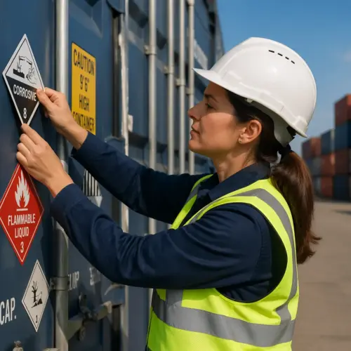
The corrosion pictogram covers skin corrosion and serious eye damage, plus corrosive to metals. If a product can eat through skin or pits aluminum, you should expect this symbol and strong precautionary statements about PPE and first aid.
Corrosion is one of the hazards where first aid speed really matters, because delayed rinsing can mean deeper injury. The label should push immediate action, and your workplace should have eyewash and shower access that matches the risk.
The “corrosive to metals” part is often overlooked, but it affects packaging and storage shelves. A corrosive product stored in the wrong metal cabinet can create leaks, contamination, and a slow-motion failure that nobody notices until it is expensive.
The skull and crossbones is acute toxicity that can kill or severely harm quickly at low doses. This is not a “general poison” icon, it is reserved for higher-severity categories where a small exposure can be catastrophic.
When you see the skull, you should think about exposure routes like inhalation, skin contact, and ingestion, and assume controls need to be tight. It is also a cue that emergency procedures and medical guidance should be easy to find, not buried in a policy manual.
The exclamation mark is the one people overuse, and it causes real confusion. It is for irritants, skin sensitizers, harmful acute toxicity, narcotic effects, and some respiratory tract irritation, so it often appears on common cleaners and coatings.
This pictogram is basically the “pay attention” symbol, but it does not mean the product is mild. A sensitizer can create long-term problems even if the first few exposures feel like nothing, which is why the text statements matter.
It is also a frequent companion pictogram, because many products have both irritation hazards and other hazards like flammability. The label should still prioritize clarity, so the hazard statements do the heavy lifting rather than relying on the icon alone.
The health hazard silhouette, the person with the starburst in the chest, signals chronic or systemic risks like carcinogenicity, reproductive toxicity, respiratory sensitization, and target organ toxicity. If you see it on isocyanate-containing products or certain solvents, you should slow down and read the label carefully.
This pictogram is where people get tripped up because the harm is not always immediate. It points to hazards that can build over time, which is why exposure limits, ventilation design, and medical surveillance may be part of the control plan.
It also shows up with aspiration hazards, where swallowing and then aspirating into the lungs can cause severe injury. That is why some products emphasize not inducing vomiting and getting medical attention quickly.
The environment pictogram, dead fish and tree, is used for aquatic toxicity in many jurisdictions. OSHA does not require it on HazCom labels, but global supply chains still use it, and customers often expect it when the SDS flags aquatic hazards.
Even when it is not required, it is a useful prompt for spill control and disposal practices. If a product is toxic to aquatic life, the “just hose it down the drain” instinct can turn a small spill into a reportable incident.
One more practical note is that pictograms can be suppressed in specific cases when another pictogram already covers the same hazard severity under certain rules. That is why you should not treat pictogram selection like a checklist you fill out by memory.
Required label elements you must include with pictograms
Pictograms do not stand alone, because a red diamond without text can still leave room for bad assumptions. The label needs a specific set of elements so the hazard message stays complete and legally defensible.
A compliant label is basically a compact summary of the SDS that travels with the container. If someone cannot access the SDS immediately, the label should still tell them the major hazards and the first steps to prevent or respond.
When people ask for GHS label pictograms explained, what they usually need is the whole label logic, not just the icons. The signal word, hazard statements, and precautionary statements are the parts that tell a worker what to do next.
The product identifier is not just a name, it is the bridge between the label and the SDS. If the identifier does not match what is on the SDS, the worker cannot reliably find the right document, especially in a facility with many similar products.
Signal words are not optional emphasis, they are assigned by hazard category. If you choose “Danger” because it sounds more serious, you can create a mismatch that makes your whole label look untrustworthy.
Hazard statements are standardized for a reason, because consistent wording reduces interpretation errors across workplaces and languages. When someone rewrites them to sound friendlier, they usually remove the exact detail that makes the statement useful.
Precautionary statements are where the label becomes actionable, because they cover prevention, response, storage, and disposal. If you only include prevention statements and skip response steps, you are leaving the worker alone when something goes wrong.
Supplier information is a real-world lifeline, not a formality. A reachable phone number and a responsible party make it possible to get technical guidance quickly during a spill, exposure, or customer complaint.
Some workplaces also add supplemental information, like recommended PPE icons or internal part numbers, but it should never conflict with the required elements. Supplemental text should support the hazard message, not distract from it or contradict it.
| Label element | What it is | Common mistake |
|---|---|---|
| Product identifier | Name or code that matches the SDS | Using a trade name that does not appear on the SDS |
| Pictogram(s) | Red diamond hazard pictograms tied to classification | Using too many symbols or the wrong icon for the hazard class |
| Signal word | “Danger” or “Warning” based on severity | Picking the stronger word for emphasis instead of the correct one |
| Hazard statements | Standardized phrases that describe the hazard | Rewriting statements in marketing language or shortening them |
| Precautionary statements | Standardized prevention, response, storage, disposal guidance | Omitting first-aid steps or mixing statements from different categories |
| Supplier information | Manufacturer or importer name, address, phone | Leaving out a reachable phone number for emergencies |
One detail people miss is that the label elements have to be legible and durable for the conditions of use. A label that smears when wet or peels off in cold storage is not really a label, it is a future incident report.
Another detail is that workplace labeling rules for secondary containers can differ, but the goal is the same: no mystery bottles. If you decant into a spray bottle, the person who picks it up later still needs a clear hazard message.
It is also worth remembering that “missing” can be as simple as being hidden by a wrap, a strap, or a pallet configuration. If your label is always covered during normal handling, you have not really communicated the hazard.
How to match pictograms to your product information
The fastest way to choose pictograms is to start with the SDS, specifically Section 2 on hazards identification. If your label does not match Section 2, your label is wrong, even if it “looks right” compared to a competitor’s bottle.
Section 2 usually lists the classification, the label elements, and sometimes a summary of other hazards that do not result in a pictogram. If you treat Section 2 as your source of truth, you reduce the chance of drifting into guesswork.
Look for the hazard classification and the listed hazard statements, then confirm the required hazard pictograms for those classes and categories. Many teams skip the category level, but category is what decides whether you use “Danger” or “Warning” and which statements apply.
If you are building labels for multiple package sizes, do not assume the classification changes with the container. The hazard classification is about the chemical, while the packaging changes mostly affect practical handling and sometimes transport rules.
Be careful with mixtures, because classification depends on ingredient concentrations and cutoffs, not just the presence of a scary-sounding chemical name. A cleaner with a small percentage of an irritant may get the exclamation mark, while a higher concentration can trigger corrosion and a different signal word.
Mixture classification is also where rounding and outdated formulations can quietly break your labeling. If your formulation changes, your SDS and your label should be reviewed together, not in separate workflows months apart.
Another trap is relying on a raw ingredient SDS to label your finished product without doing the mixture calculation. The finished product may be less hazardous than the ingredient, or it may introduce new hazards through reaction, pH, or physical properties.
Transport markings can confuse people, because DOT placards and UN labels are not the same as workplace GHS labels. A lithium battery shipping mark or a Class 3 flammable liquid label can appear on outer packaging, while the inner container still needs GHS hazard pictograms and the full HazCom text set.
Sometimes the outer package is labeled for transport and the inner bottle is labeled for workplace use, and people assume one replaces the other. In practice, you often need both, and they serve different audiences and different moments of risk.
If you are importing, do not assume the overseas label is automatically compliant in your market. The pictograms may match, but the language, supplier details, and required statements may need adjustment to meet local rules.
It also helps to keep a controlled mapping document that links hazard classes and categories to the pictograms and statements you use. When auditors ask why a pictogram is present or absent, you should be able to show the logic without scrambling.
Finally, build in a review step that includes someone who understands both the SDS and the label format. A second set of eyes catches the common errors like missing statements, mismatched signal words, and outdated supplier information.
Layout tips: making labels clear at a glance
Good label layout is about speed, because people read labels while wearing gloves, moving product, or dealing with a spill. If the pictograms and the signal word get lost in clutter, the label fails in the moment it matters.
Think about the label as a hierarchy: pictograms and signal word first, hazard statements second, precautionary statements third, and supplier details always present. When everything is the same visual weight, nothing stands out, and the reader has to work too hard.
Keep the pictograms grouped together and sized so they do not look like decorative stamps. A tiny diamond tucked near a barcode is technically present, but it is practically invisible on a drum in a dim warehouse aisle.
Grouping also prevents the eye from bouncing around the label trying to collect hazard cues. If the pictograms are scattered, the reader may miss one and underestimate the hazard.
Put the signal word near the hazard statements so the severity cue and the hazard text land together. When “Danger” floats at the top and the hazard statements are buried below, people miss the connection and skim too fast.
Signal words should be easy to spot, but they should not be styled like a brand slogan. If the design makes “Danger” look like part of the product name, you lose the point of having a standardized cue.
Use plain, high-contrast typography and avoid fancy condensed fonts that turn “precautionary statements” into a gray blur. If you must fit a lot of text on a small bottle, consider a peel-back label or a fold-out, then keep the front panel clean.
Line spacing matters more than people think, because cramped text is unreadable under real conditions. A slightly larger label or a multi-panel format is often cheaper than the cost of misreading a critical first-aid instruction.
Color choices should prioritize legibility over branding, especially for small containers. A pale gray font on a glossy background might look sleek, but it disappears under warehouse lighting and scuffed surfaces.
Placement matters too, because labels get wrapped, strapped, and stacked. If your label is always on the seam side or under a handle, the best layout in the world will not help the person trying to identify the product quickly.
Durability is part of layout, because smudged ink and torn corners remove key information. If the product is used outdoors, in wet areas, or around solvents, choose materials and printing methods that survive the environment.
Finally, keep whitespace where it helps the eye separate sections, because a dense block of text invites skipping. A label that looks readable is more likely to be read, which is the whole point.
Common labeling errors and how you can avoid them
The most common error is copying a label template from an older product without rechecking the SDS classification. One formula change, one new impurity, or one regulatory update can change the hazard category and make your pictograms wrong overnight.
A simple way to avoid this is to treat labels like controlled documents with version history. If the SDS changes, the label should automatically trigger a review, not a casual “we will update it later.”
Another frequent mess is mixing hazard statements from one classification with precautionary statements from another because someone grabbed text from the internet. The result reads like a patchwork, and it often contradicts itself on PPE, first aid, or storage temperature.
To avoid that, pull the exact label elements from the SDS or from a validated classification tool, then lock them in. If you need to shorten anything for space, do it only within the rules that apply to your jurisdiction and document the decision.
People also misuse the exclamation mark as a catch-all, which dulls its meaning and crowds out more severe symbols. If the product causes serious eye damage, the corrosion pictogram belongs there, and the label should say so plainly.
Another misuse is treating pictograms as optional warnings rather than required elements tied to classification. If the SDS calls for a pictogram and you leave it off because it looks scary, you have created a compliance gap and a safety gap.
Language errors are also common, especially when companies translate labels without technical review. A mistranslated hazard statement can change the meaning enough to mislead the user, even if the pictogram is correct.
Do not forget supplier details, especially for private label products where the responsible party is not obvious. If someone calls the number during an incident and reaches a dead line, you have a compliance problem and a trust problem.
Another avoidable error is printing labels that do not survive the product environment, like water-based ink on containers used in wet processing areas. If the label fades, the hazard communication fades with it, and the container becomes a mystery over time.
Secondary container labeling is another place where good programs fail in practice. People decant into an unmarked bottle “just for today,” then the bottle stays for months and nobody knows what it is.
There is also the problem of outdated phone numbers, addresses, or company names after a merger or relocation. Even if the hazard content is perfect, stale supplier information can make the label nonfunctional during an emergency.
Finally, some labels fail because they try to do too much at once, mixing marketing claims, usage instructions, and hazard text with no clear separation. If the hazard elements do not stand out, people will read the friendly parts and miss the critical parts.
Conclusion
GHS label pictograms explained well should leave you with a simple habit: start with the SDS, then build the label so every symbol and line of text agrees with Section 2. When the hazard pictograms, signal word, and precautionary statements match the classification, workers stop guessing and start acting correctly.
That habit also makes training easier, because the label becomes a reliable teaching tool instead of a source of exceptions. When a new employee learns to scan pictograms, then read the signal word, then follow the precautionary statements, the process becomes automatic.
Clear labels also make logistics smoother, because carriers, warehouses, and customers see the same hazard message at every handoff. If you treat label creation like controlled documentation instead of graphic design, you will ship with fewer delays and fewer incidents.
Over time, the payoff is less rework, fewer audit findings, and fewer close calls that never should have happened. A good label is not just compliance, it is a small piece of operational discipline that keeps people and products moving safely.