Scan failures in logistics are rarely random, they are usually the result of small print and placement mistakes that stack up fast. A barcode label quality checklist keeps those mistakes visible before they turn into chargebacks, rework, and missed cutoffs.
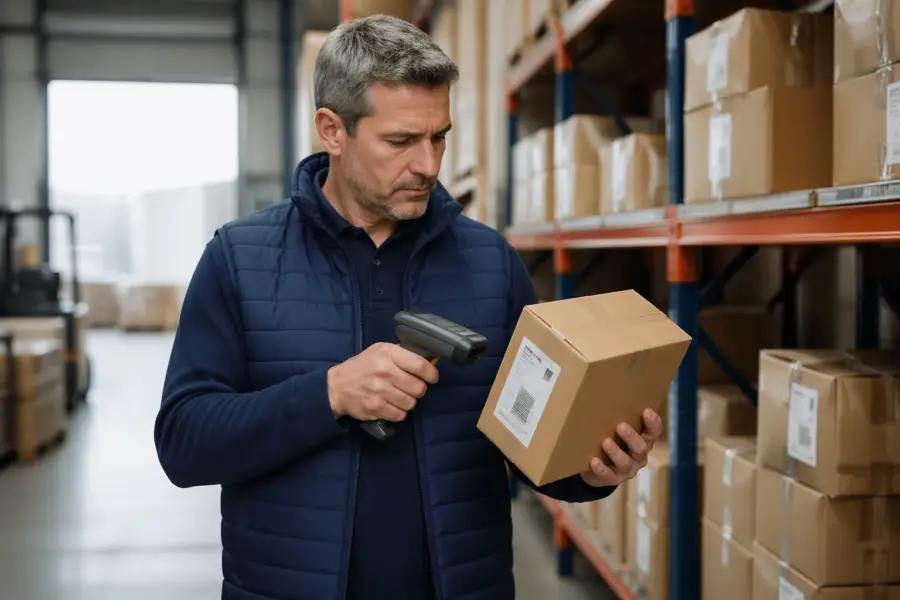
I have watched a perfectly good outbound pallet get held because one carton had a smeared label and the dock scanner refused to read it. The frustrating part is that the failure often traces back to a few controllable details, like print contrast, a damaged barcode quiet zone, or a printer set to the wrong darkness.
Warehouses are harsh on labels, with abrasion from conveyors, cold rooms, stretch wrap, and fork traffic all working against clean scans. If you treat label quality as a receiving and shipping control point instead of a design task, scan rates improve quickly.
This article lays out a practical barcode label quality checklist you can use for shipping labels, location labels, and product labels moving through distribution. It focuses on what scanners see, what operators do under pressure, and what you can verify before product leaves your building.
Why barcodes fail in real warehouses and loading docks
In a real warehouse, labels get scuffed by rollers, rubbed by straps, and fogged by condensation from a freezer door. That damage changes the reflectance pattern a scanner expects, so a symbol that worked at the print bench fails at the dock.
Operators also handle cartons in ways label designers do not picture, like grabbing the corner where the barcode sits or slapping on an overlabel at an angle. A wrinkled face stock or a skewed application can break bars, shrink the barcode quiet zone, and create glare under LED lighting.
Mixed environments cause sneaky problems, like labels printed in an office and then stored in a humid staging area next to a trailer door. Adhesive can lift at the edges, and the resulting curl creates shadows that reduce print contrast at the scan line.
Then there is the reality of scanner variety, with long range imagers on lift trucks, handheld lasers at pack stations, and fixed tunnel scanners on sorters. A symbol that barely passes at arm’s length can fall apart when the same code is read at speed or at a shallow angle.
The core quality factors: size, contrast, and resolution
Barcode quality starts with physical size, because scanners need enough module width to separate bars and spaces reliably. When teams shrink a label to “make it fit,” they often push the X dimension below what the receiving site’s scanners can resolve.
Print contrast matters just as much, and it is where thermal printers quietly get you in trouble. Low darkness settings, worn printheads, or cheap ribbon can produce gray bars that look fine to the eye but read as low contrast to an imager.
Resolution is the third leg of the stool, and it ties directly to your printer’s dots per inch and the symbology you choose. A 203 dpi printer can print many logistics codes well, but tiny Code 128 text with aggressive compression can end up with rounded edges and merged elements.
Label verification is the fastest way to stop arguing about whether a barcode “looks okay,” because it gives a grade and points to the failure mode. If you do not own a verifier, you can still borrow one from a supplier or lab for a week and learn more than months of guesswork.
Quiet zones, margins, and placement rules you should follow
The barcode quiet zone is the blank space before the first bar and after the last bar, and scanners treat it as part of the symbol. When a logo, border, or even a box line creeps into that area, the scanner can misread the start or stop pattern.
Margins and placement rules sound picky until you watch labels ride a conveyor and get read at speed. Put the symbol too close to a carton edge, a seam, or a corner radius and you invite wrinkles, tape overlap, and curved surfaces that distort the bars.
| Rule to check | Common warehouse mistake | What to do instead |
|---|---|---|
| Quiet zone kept clear on both sides | Border line or text touches the code | Remove boxes around the symbol and reserve blank space |
| Symbol placed on a flat panel | Barcode applied over a corner or flap | Move label to the largest flat face, away from folds |
| Safe distance from edges and seams | Label sits partly on a case seam or tape | Shift placement so the entire barcode stays on one plane |
| Orientation consistent for the process | Mixed pick labels rotated randomly | Standardize pick and ship orientation for faster aiming |
| No glossy tape over the barcode | Clear tape added to “protect” the label | Use a tougher face stock or laminate made for scanning |
Materials and adhesives: matching labels to surfaces and temperatures
Face stock and adhesive choices decide whether a label survives the trip, and many scan failures start as adhesion failures. If the label lifts, wrinkles, or slides, the best designed barcode becomes a moving target.
Corrugate is forgiving, but it still varies, especially with recycled liners and dusty cases that come off inbound trailers. Wipe test a few cartons, and if your finger picks up dust, choose an adhesive built for rough surfaces and consider a larger label to increase contact area.
Cold chain labels are their own world, because freezer grade adhesive needs time and pressure to bond and it hates frost. If you apply at 20°F onto a damp case, you should expect edge lift and you should plan for it with the right stock and application method.
High heat and sunlight create a different failure, where thermal paper darkens and the background turns gray, killing print contrast. For yard storage or long dwell times in trailers, switch to thermal transfer with ribbon or use a synthetic face stock that resists UV and abrasion.
Printer setup: settings that make or break scan rates
Printer darkness and speed settings decide whether your bars have clean edges or fuzzy ones that bleed into the spaces. Most teams run printers too fast because they want throughput, then they wonder why location labels fail six months later when the printhead wears.
Calibration matters on direct thermal and thermal transfer printers, and skipping it creates uneven density across the label. If the left side prints light and the right side prints dark, label verification will show it, but a handheld scanner will just beep sometimes and fail other times.
Ribbon and media pairing is another quiet trap, because a wax ribbon on a synthetic stock can smear and a resin ribbon on paper can look speckled if the heat is wrong. Pick a ribbon that matches the abrasion and chemical exposure you expect, then lock the settings so shifts do not “tune” printers randomly.
Printhead cleanliness is boring work, but it is part of any barcode label quality checklist that you want to take seriously. A single line of adhesive buildup can create a repeating void through every label, and that defect often lands right inside the barcode quiet zone.
A barcode label quality checklist for outbound and internal labels
If you only check labels when a customer complains, you are already paying the most expensive price for quality. A short barcode label quality checklist used at print time and again at pack out catches the common failures before they spread across a shift.
The checklist should focus on what scanners need, not what humans prefer, so it should call out barcode quiet zone clearance, print contrast, and symbol size first. It should also include a quick rule for reprinting, because a culture that tolerates “good enough” labels ends up with chronic scan failures.
- Verify quiet zone is blank on both sides
- Check print contrast, bars are dark and background is clean
- Confirm X dimension matches the receiving site’s scanner capability
- Inspect for smears, voids, or repeating white lines
- Ensure label is flat, no wrinkles or edge lift
- Keep barcode away from seams, corners, and stretch wrap folds
- Scan test with the same model used on the dock
Quiet zone mistakes I see over and over
The most common quiet zone failure is a designer putting the barcode inside a nice looking rectangle, then aligning other text to that box. That line might be thin, but scanners do not care, they see it as extra bars.
Another repeat offender is “helpful” human readable text that gets too close to the symbol after someone changes the font or adds a second line. If you must add text, keep it outside the quiet zone and keep it consistent across templates so last minute edits do not creep inward.
Overlabels cause quiet zone damage in the field, especially when returns teams slap a new tracking label across an old one. Train teams to cover the entire old barcode or place the new label on a different panel, because partial coverage creates confusing patterns.
Stretch wrap is a quiet zone problem too, because wrinkles and glare can sit right at the code’s edges. If you wrap after labeling, keep the barcode on the outside layer or use a wrap window, since scanners struggle with the reflections and creases.
Getting print contrast right without wasting labels
Print contrast is a balancing act, because too light causes weak bars and too dark causes bar growth that closes narrow spaces. When someone cranks darkness to “fix” a faint printhead, they often create a different failure that shows up as intermittent reads.
A practical approach is to set a standard speed and darkness for each label stock, then validate it with label verification when you onboard the material. After that, use a short daily check, print a test pattern, scan it, and look for edge sharpness and uniform density.
Direct thermal media can fool teams because it prints fast and looks sharp at first, but it can fade with heat and friction. If cartons sit in a hot trailer for a weekend, the background can darken and crush the contrast that scanners depend on.
Thermal transfer gives you more control, but it adds variables like ribbon formulation and printhead pressure. If you see a speckled pattern or missing dots, stop and clean the printhead and platen, because you are building scan failures into every label you ship.
Resolution, bar growth, and the “it scans here” trap
Resolution problems show up when you design a barcode at one size and then let software scale it at print time. Scaling can create fractional module widths that a printer rounds, and that rounding changes the ratios the symbology expects.
Bar growth is the other half of the trap, where heat and ribbon spread ink beyond the intended edge. A code can scan on a desktop scanner with a generous decoder, then fail on a fixed tunnel scanner that expects tighter tolerances.
If you use a 2D symbol like Data Matrix on small parts, you still need enough cell size for your printer and your scanner distance. Teams try to cram too much data into a tiny symbol, then the cell size drops and the code becomes fragile the moment the label gets scratched.
Label verification gives you a way to spot these issues early, because it measures things like modulation and edge determination instead of relying on “it scanned once.” A code that barely passes today can fail next month when the printhead ages and your margins disappear.
Placement rules that survive conveyors, clamps, and forklifts
Placement is where office assumptions meet warehouse physics, and physics usually wins. If a clamp truck grabs the sides of a pallet load, do not put the barcode on the side panels that get squeezed and scraped.
Conveyors add their own rules, because cartons ride on rails and rub against guides. Place labels on a face that stays clear of guide contact, and keep the barcode away from the bottom edge where dust and abrasion build up fast.
For pallet labels, consistent height matters because lift truck operators aim scanners by muscle memory. If one vendor puts the label at 12 inches and another at 48 inches, you will see more missed scans, more rescans, and more damaged labels from handling.
Do not ignore lighting, because glossy cartons and shrink film can reflect overhead fixtures right into an imager. A matte label stock and a placement that avoids direct glare often fixes “mystery” scan failures without changing the barcode itself.
A simple receiving test you can use to spot problems early
Receiving is the best place to catch label problems because you see many suppliers and many print setups in one shift. If you build a quick test into receiving, you can stop bad labels from flowing into putaway and picking where they cost more to fix.
Start by scanning a sample from each inbound pallet using the same scanner model used in your process, at the same distance and angle your team uses. If scan time feels slow or you need multiple tries, treat that as a defect even if it eventually reads.
Next, inspect the barcode quiet zone with your eyes, because you can spot tape edges, wrinkles, and stray print that a quick scan might miss. If you see intrusion, flag the supplier and take photos, since it is easier to fix label templates than to argue about anecdotal scan issues later.
If you have access to label verification, grade a few samples and record the results by supplier and by stock. Over a month you will see patterns, like one site always printing low contrast or one label material failing in cold rooms, and you can act before peak season pressure hits.
Conclusion
Scan failures usually come from ordinary problems, like weak print contrast, a damaged barcode quiet zone, or labels that lift in cold and humidity. A barcode label quality checklist turns those problems into routine checks instead of expensive surprises.
If you standardize printer settings, choose materials that match your environment, and use label verification when you change stock or templates, your scan rates will stop swinging week to week. The payoff is less rework on the dock, fewer manual key entries, and cleaner data moving through your logistics systems.