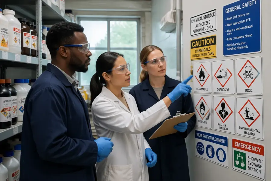
Walk into a chemical storage room and you can usually tell, within seconds, whether it is managed by people who respect risk. The fastest clue is the signage, because pictograms for chemical storage areas either remove ambiguity or they quietly multiply it.
I have seen beautifully written procedures that nobody reads at 2 a.m. during a spill, and I have seen one well-placed symbol stop a bad decision before it starts. Visual cues work because they hit the brain before language, but only when the system is consistent and maintained.
This article focuses on practical symbology for storage zones, not generic hazard labels on individual containers. The goal is to help you choose, place, and maintain symbols that make safer handling the default behavior.
Standards matter here, but so does the messy reality of mixed inventories, contractor traffic, and rushed restocking. When you treat symbols as part of the logistics flow, you get fewer mix-ups and faster response when something goes wrong.
What pictograms can (and can’t) communicate in storage zones
Pictograms for chemical storage areas are great at telling people what the space is for and what rules apply before they touch anything. They are weak at conveying detailed exceptions, so you still need written compatibility guidance nearby.
A symbol can say “corrosive storage” or “oxidizer cabinet” faster than any paragraph. It cannot explain that a specific product has a stabilizer that changes its storage class, so you need a way to route those oddballs.
The best storage pictograms communicate actions, not trivia, such as “wear splash goggles” or “no ignition sources.” If your sign tries to teach chemistry, people tune it out and you lose the one job it should do.
Keep in mind that pictograms are read under stress, low light, and sometimes through fogged face shields. If a symbol needs a long legend to make sense, it is a bad symbol for that location.
Think of zone pictograms as traffic signs, not textbooks, because they are meant to guide movement and choices. When they are designed like a quick decision aid, they reduce hesitation and prevent improvisation.
Pictograms also work best when they are tied to a physical boundary, like a door frame, cabinet face, or shelf edge. If the icon floats on a wall with no clear connection to a storage area, people treat it as a poster.
They can communicate “do not store here” just as effectively as “store here,” which is useful in mixed-use rooms. A clear prohibition symbol on a mop sink or floor drain area can prevent chemical dumping and cross-contamination.
What pictograms cannot do is replace training on why segregation matters, because people will always find edge cases. The trick is to use the icon to trigger the right habit, like checking the compatibility chart before parking a container.
They also cannot compensate for poor housekeeping, because clutter blocks sightlines and creates false storage locations. If the aisle is full of random boxes, even perfect icons will not stop someone from setting a bottle on the nearest flat surface.
Finally, pictograms are only as strong as the consistency behind them, including the same meaning across buildings and shifts. If one department uses a flame icon for any solvent and another uses it only for Class 3 flammables, you create a translation problem.
Core symbol types for entry points, cabinets, and shelves
Start at the door, because that is where you set expectations for anyone entering, including cleaning staff and delivery drivers. Entry signage should combine hazard category cues with PPE requirement signs that match your actual risk assessment.
Inside the room, cabinets need clear identity labels that stay stable even when contents change week to week. I prefer cabinet-level pictograms that state the allowed hazard families, then shelf tags that control the finer sorting.
Shelf pictograms should be small but specific, especially where you store acids, bases, oxidizers, toxics, and flammables in the same room. Storage segregation symbols at the shelf edge reduce the “I will just put it here for now” habit that causes compatibility failures.
Do not forget non-chemical items that create risk, like absorbents, waste funnels, and empty containers waiting for pickup. A simple “empty container staging” symbol stops people from parking empties next to active stock and confusing inventory counts.
At entry points, I like to see three layers of information: what hazards exist, what PPE is required, and what to do in an emergency. That can be as simple as hazard family icons, a few PPE pictograms, and arrows to eyewash, shower, and exits.
Doors also need a decision point for access control, because not everyone should be wandering around toxics or high-consequence reactives. A “restricted access” icon paired with a badge requirement sign prevents the casual shortcut through the room.
Cabinet symbols should be placed where they are visible when the cabinet is closed, because that is when people decide where to put things. If the symbol is only on the inside of the door, it is too late to prevent the wrong placement.
For cabinets that store multiple compatible groups, use a clear “allowed list” approach rather than a vague icon. A cabinet face that shows two or three permitted pictograms is easier to follow than a single symbol that tries to cover everything.
Shelves benefit from both a pictogram and a short word label, because shelf-edge viewing angles are not always friendly. When someone is holding a case with both hands, they should be able to glance and confirm the zone without squinting.
Secondary containment trays can carry their own mini icons, especially when trays are moved for cleaning or reconfiguration. A tray-level symbol helps keep the containment paired with the right chemical family instead of becoming a generic bin.
If you use color on shelves, treat it as an additional cue rather than the only cue, because color perception varies and lighting can distort it. A color band plus a pictogram plus a word is redundant in the best way.
Even simple things like “do not stack” or “store upright” icons matter on shelves that hold fragile glass or vented caps. Those symbols reduce the slow drip of small breakages that turn into cleanup events.
Cold storage and flammable storage refrigerators need their own clear pictograms, because people will use any empty fridge if it looks convenient. A “no food” icon is not enough if the real rule is “no ignition sources and no open chemicals.”
Finally, keep an eye on the transition zones, like the receiving bench or the decanting station, because those are where containers are opened. Those spots deserve extra symbols for splash risk, ventilation requirements, and spill kit proximity.
Using pictograms to support segregation and compatibility rules
Segregation is where pictograms for chemical storage areas either pay off or fail loudly, because the wrong adjacency can turn a minor leak into a reaction. Symbols work best when they mirror your compatibility matrix and your purchasing categories, so staff see the same logic everywhere.
Keep the number of segregation groups low enough that people can remember them, then use storage segregation symbols to enforce the boundaries on shelves and secondary containment. If you need twelve groups to make the system “perfect,” the system will not survive the first busy shift.
When you build your groups, start with the combinations that create heat, gas, fire, or toxic byproducts, because those are the ones that punish mistakes. A good pictogram system is basically a map of your worst-case pairings.
It also helps to separate “chemical family” from “storage condition,” because people confuse them when they are blended into one icon. A water-reactive symbol tells you something different than a “keep dry” symbol, and you may need both on the same shelf.
Use pictograms to mark physical barriers like dividers, bins, or separate trays, because segregation is more reliable when it is built into the furniture. A shelf edge icon without a divider invites drift as soon as the shelf gets crowded.
Compatibility rules should be visible at the point of putaway, not buried in a binder, so consider a small reference chart near the main storage area. The pictograms on the chart should match the ones on the shelves, with no translation step required.
Mixed products are where people get hurt, like flammable corrosives, oxidizing acids, or toxic solvents, because the label feels like it belongs in multiple places. In those cases, decide a primary storage group and use a secondary “special handling” icon to flag the exception.
Another practical move is to reserve a clearly labeled “EHS review” shelf for anything that does not fit cleanly, rather than forcing a guess. The pictogram for that shelf should be obvious and slightly inconvenient, so people do not use it as a dumping ground.
Do not ignore container size, because segregation can break down when a five-gallon pail displaces the normal shelf pattern. A pictogram that indicates “bulk flammables only” on a lower shelf can stop people from parking a random oxidizer there just because it fits.
Finally, remember that compatibility is not only chemical-to-chemical, but also chemical-to-material, like acids eating mild steel shelving or solvents degrading certain plastics. A small “use compatible tray” symbol can prevent slow damage that ends in a sudden spill.
| Segregation pictogram group | Keep away from | Typical storage control |
|---|---|---|
| Flammables | Oxidizers, ignition sources | Flammable cabinet, grounded containers |
| Oxidizers | Organics, flammables | Dedicated cabinet, noncombustible trays |
| Acids (inorganic) | Bases, cyanides, sulfides | Corrosion resistant cabinet, spill tray |
| Bases | Acids, aluminum powder | Separate shelf, compatible secondary containment |
| Toxics | Food, break areas | Locked cabinet, access control |
| Water reactives | Water, aqueous cleaners | Dry cabinet, desiccant where needed |
Marking response equipment and cleanup locations with symbols
When something leaks, people waste time looking for tools that should be obvious. Spill response symbols belong at eye level on the wall and again on the cabinet or cart, so you can spot them from the aisle.
Match the response symbols to the likely incidents in that room, because a generic spill kit icon is not enough in mixed hazard spaces. If you stock acid neutralizer, solvent absorbent, and mercury materials, label those compartments with distinct pictograms and plain language.
Eyewash and safety shower symbols should point to the nearest unit with an arrow, not just indicate the concept. If a door or pallet stack can block the direct path, place repeat wayfinding symbols along the route.
Waste and cleanup staging need their own icons too, because people default to the nearest open space. A marked “contaminated absorbent waste” location prevents the classic mistake of tossing used pads into general trash.
Response symbols should also mark shutoffs, like ventilation emergency stops, gas shutoff valves, or power disconnects for dispensing pumps. If you have those controls, label them clearly so someone can act without guessing which switch matters.
Fire extinguishers are often present, but the chemical storage room may need specific types and specific placement. A pictogram that indicates the extinguisher class, paired with a simple “for flammable liquids” note, reduces the chance of grabbing the wrong tool.
First aid kits and burn gel stations are another common miss, because people assume they are elsewhere in the building. If your risk assessment expects immediate decontamination beyond the eyewash, mark those supplies with the same seriousness as spill kits.
Cleanup locations should include “do not return to stock” cues for anything used in a response, like brooms, dustpans, or squeegees dedicated to chemical areas. A simple pictogram that indicates “contaminated tools only” helps prevent tools migrating to general housekeeping.
If you have a designated decon sink, make sure it is labeled as such, because people will use any sink they see. A “hand wash only” icon near chemical areas can be dangerous if it encourages washing contaminated equipment in the wrong place.
For larger facilities, consider adding a small location code to response symbols, so people can communicate clearly during an incident. When someone calls in “spill kit at C-3,” you avoid the vague “it is by the door” directions that waste time.
Finally, test response symbols during drills, because that is when you find out what is invisible in real life. If the spill kit icon disappears behind an open door or a parked cart, move it rather than blaming the user.
Label durability: moisture, abrasion, and chemical exposure
A perfect pictogram that peels off in a month is worse than no pictogram, because it teaches everyone that signage is optional. Storage rooms are hard on labels, with humidity swings, forklift scuffs, and chemical mist from routine dispensing.
Choose substrates and adhesives based on what hits the surface, not on what is cheapest in the catalog. For example, laminated polyester labels hold up well on cabinets, while rigid plastic placards survive better on pallet racking uprights.
Pay attention to cleaning practices, because alcohol wipes and alkaline detergents can cloud inks and lift corners. If your team sprays down floors with a hose, you need moisture resistant materials and edge sealing on high splash zones.
Color fading is a quiet failure mode that shows up after a year, especially near dock doors with sunlight. If the red border on a flammable symbol turns pink, people stop treating it as a warning and start treating it as decoration.
Surface prep matters more than people expect, because dust, oil, and powdery paint will defeat good adhesive. A quick wipe with a compatible cleaner and a dry surface check can double the life of a label.
Temperature swings can also cause edge lift, especially on metal cabinets that sweat when the room warms up. If you see repeated corner peeling, it is often a material mismatch rather than bad installation.
Abrasion comes from more than forklifts, because boxes and secondary containers scrape labels during routine putaway. If labels are placed at the exact height where cases slide, consider moving them slightly higher or using a protective clear cover strip.
Chemical exposure is not always a direct splash, because vapors and fine mists can slowly attack inks and laminates. Solvent storage areas in particular can turn cheap labels tacky or brittle over time.
In corrosion-prone rooms, fasteners and mounting hardware can fail before the sign face does. Stainless hardware or chemical-resistant plastic mounts keep placards from ending up on the floor after a few months.
If you use magnetic signs on metal cabinets, treat them as temporary controls and verify they do not slide or get swapped. Magnets are convenient for changing inventories, but they can also migrate when doors slam or carts bump them.
Build replacement into the plan, because even the best materials have a service life in harsh rooms. A quarterly check for legibility and adhesion is cheaper than a full rework after everything has degraded.
It also helps to standardize sizes and mounting locations, because that makes replacement fast and consistent. When every cabinet uses the same sign footprint, you can keep spares on hand and avoid custom orders.
A practical walkthrough for auditing your storage pictograms
An audit is not a clipboard exercise, it is a walk through the space the way a new hire would see it. Start outside the room and note whether the entry pictograms match the actual inventory and the current SDS set.
Next, stand at the main aisle and check sightlines to cabinets, spill kits, and exits. If you cannot see the key symbols without weaving around stored cartons, you have a logistics problem as much as a signage problem.
Then open cabinets and check whether shelf level storage segregation symbols match what is physically present today. If you find “temporary” bottles living in the wrong group, treat that as a process failure and fix the restocking routine.
Finish by testing comprehension with real people, not managers who already know the rules. Ask a contractor which PPE requirement signs apply and where the spill response symbols point, then adjust the system based on what they miss.
As you walk, pay attention to where people naturally pause, because that is where signage has the most influence. If everyone stops at a staging table before opening cabinets, that is a prime spot for a quick segregation reminder.
Look for “shadow zones” created by open doors, tall drums, or stored ladders, because signs in those zones may be technically present but functionally invisible. A good audit includes opening typical doors and standing where a worker actually stands.
Check for duplicate or conflicting icons, because they create hesitation and slow down response. If one wall says “no ignition sources” and another has an outdated “authorized personnel only” sign that everyone ignores, clean it up.
Confirm that pictograms are placed at a consistent height, because people scan at predictable eye levels. When signs are scattered from ankle height to above the door frame, the room feels chaotic and nothing stands out.
Inspect the condition of the sign background as well, because a dirty wall can make a clean icon unreadable. A quick wipe-down around critical symbols is a simple fix that improves contrast.
Verify that arrows on wayfinding symbols still make sense after layout changes, because rooms evolve quietly over time. A relocated eyewash with an old arrow is worse than no arrow, because it sends people the wrong direction.
Audit the receiving process by watching one putaway cycle, because that is where the system is tested. If the worker has to stop and ask where something goes, the pictograms are not integrated into the workflow.
Also check the “end of shift” state of the room, because that is when shortcuts show up. If staging areas are overflowing and labels are hidden by temporary stacks, you have a capacity issue that signage cannot solve alone.
Finally, close the loop by tracking fixes and verifying they stayed fixed, because audits without follow-up become theater. A simple log that records what changed, who owns it, and when it will be rechecked keeps the system honest.
- Photograph each entry sign and cabinet face
- Verify symbol meaning against your compatibility matrix
- Check visibility from the main aisle and door
- Inspect for peeling corners, fading, and chemical staining
- Confirm spill kit, neutralizer, and waste icons match contents
- Spot-check PPE requirement signs against task risk assessments
- Log fixes with owner, date, and replacement material
What good PPE requirement signs look like in chemical storage
PPE requirement signs fail when they are generic, because “wear PPE” means nothing on a busy day. A storage room usually needs a tight set of icons, such as splash goggles, chemical resistant gloves, and a face shield for dispensing stations.
Place PPE pictograms where the decision happens, which is at the door and at any point where containers are opened. If the room is only for sealed storage and you have a separate dispensing bench, do not force the same PPE message everywhere.
Be honest about respiratory protection, because people either ignore it or overuse it if the rule is fuzzy. If you require a specific cartridge type for certain tasks, keep the pictogram simple and post the cartridge details on a nearby written notice.
Enforcement matters, but design can reduce friction, such as mounting glove dispensers under the glove icon. When the supplies live far away from the sign, the sign becomes an argument instead of a reminder.
Good PPE signs also distinguish between “entering the room” and “handling chemicals,” because those are not always the same risk. If you require goggles for entry but a face shield only for pouring, show that difference clearly.
Use icons that match the actual PPE you stock, because mismatches create distrust. If the sign shows a full-face respirator but you only provide half-mask units, people conclude the sign is generic and stop paying attention.
Where glove choice matters, consider a glove icon plus a short text cue like “NITRILE” or “BUTYL” rather than a vague glove symbol. That small specificity prevents the common mistake of grabbing the thinnest glove because it is easiest to put on.
Eye protection signage should be placed before the last chance to turn around, not after the door. If the goggles cabinet is outside the room, the icon needs to be outside too.
If you have a dispensing station that creates splash or aerosol risk, add a local PPE cluster sign right at that station. People often enter a room compliant and then remove PPE when they get warm, so reminders need to be close to the hazard.
Do not overload PPE signs with every possible item, because that turns the message into wallpaper. A short set of required icons plus a separate “task-based PPE” note is easier to follow.
Finally, make the PPE signs easy to comply with by keeping supplies stocked and visible. A perfect pictogram next to an empty glove box holder is a fast way to create rule fatigue.
Avoiding common misreads with storage segregation symbols
People misread symbols when the shapes are too similar, the colors are inconsistent, or the icons are overloaded with detail. I have watched staff confuse oxidizer and corrosive icons when both were printed in the same black triangle style with tiny line art.
Pick one visual grammar for your storage segregation symbols and stick to it, such as consistent borders, consistent color meaning, and consistent placement. If flammables use a red background in one aisle and a red border in another, you are training people to ignore color.
Avoid custom icons that look clever but do not match what workers have seen elsewhere, especially in facilities with turnover. Borrow familiar shapes from established systems where possible, then add plain language labels as a backup for anyone new.
Do not rely on bilingual text to fix a confusing icon, because that still assumes reading time and good lighting. A strong icon plus short text, like “ACIDS” or “OXIDIZERS,” is usually the sweet spot for mixed language workplaces.
Misreads also happen when the same pictogram is used for both a hazard and a storage rule, which are not always identical. A corrosive hazard icon on a shelf does not automatically tell someone whether acids and bases are separated, so the storage icon should be explicit.
Scale matters, because tiny shelf tags can turn a clear icon into a blob. If you cannot print it large enough to stay readable at arm’s length, simplify the design rather than shrinking it further.
Watch out for icons that depend on fine line detail, like small droplets or thin flames, because they disappear as labels wear. Bold shapes with strong contrast survive dirt, scratches, and quick glances.
Placement errors create misreads too, especially when the icon is not aligned with the actual storage boundary. If the oxidizer icon is centered between two shelves, people will treat both shelves as oxidizer space.
Another common failure is mixing warning triangles, mandatory circles, and prohibition slashes without a clear logic. If every sign uses a different shape language, people stop interpreting and start guessing.
Keep an eye on hand-written additions, because they often contradict the official system. If someone tapes up a paper note that says “ACID OVERFLOW,” replace it with a proper sign or fix the capacity issue that created the overflow.
Finally, verify that the same symbol means the same thing across sites, because contractors and transferred employees carry assumptions with them. A standardized legend posted in the room can help reset expectations without forcing a training session every time.
Integrating pictograms with inventory control and warehouse flow
Storage signage fails when the warehouse flow fights it, such as when receiving drops mixed pallets wherever there is space. Tie pictograms for chemical storage areas to locations in your inventory system, so putaway tasks send people to the right zone by default.
If you use barcode location labels, place the barcode and the pictogram together on the rack upright or shelf lip. That pairing reduces the chance that someone scans the correct location but stores the item on the wrong shelf two feet away.
Use symbols on staging areas too, because staging is where segregation breaks down during busy receiving. A marked “flammable staging” square on the floor beats a verbal reminder that disappears when the supervisor goes to lunch.
Returns and quarantines need their own pictograms, since unknowns are common in real operations. A “hold for EHS review” icon keeps mystery bottles out of compatible stock until someone checks the label, the lot, and the SDS.
Inventory systems can also carry the same pictograms digitally, so the putaway screen mirrors the physical sign. When the handheld device shows the flammable icon and the shelf shows the same icon, the worker gets a double confirmation.
Receiving labels should include at least a basic hazard family cue, because the outer case is often what people see first. If a carton arrives with no visible hazard hint, it is more likely to be staged in the wrong zone.
Cycle counts and restocking are good moments to reinforce the pictogram system, because they force people to touch locations and look at shelf edges. If your counters routinely find misplacements, treat that as feedback about sign clarity and capacity.
Consider adding pictograms to pick lists for internal users, especially if non-warehouse staff retrieve chemicals after hours. A simple icon next to the location code can prevent a well-meaning engineer from opening the wrong cabinet.
Warehouse flow also includes waste flow, which is often the neglected twin of inventory flow. If waste accumulation points are not marked with clear symbols, people will create informal waste spots that grow over time.
Staging rules should be realistic, because if staging space is too small, people will overflow into aisles no matter what the floor icons say. When pictograms are paired with adequate space, compliance becomes effortless.
Finally, integrate pictograms into change management, because layout changes happen faster than sign updates in many facilities. Any time you add a new rack bay or move a cabinet, updating the icons should be part of the work order, not an afterthought.
Conclusion
Good pictograms for chemical storage areas make the safe choice feel obvious, even to someone who has never seen your facility before. When you combine clear entry icons, consistent storage segregation symbols, and well-placed spill response symbols, you cut down the everyday mistakes that lead to real incidents.
Do not treat signage as a one-time install, because labels age and inventories drift. If you audit regularly and keep PPE requirement signs aligned with actual tasks, your storage room stays readable and your procedures stop gathering dust.
The payoff is not just fewer incidents, but smoother work, because people spend less time asking where things go and more time doing the job. When the room communicates clearly, you also reduce the pressure on supervisors to police every small decision.
Over time, a consistent pictogram system becomes part of your safety culture in a way that binders never will. The goal is simple: when someone is tired, rushed, or new, the signs still guide them toward the right shelf, the right PPE, and the right response.


