Every logistics site has a map in the manager’s head, but visitors do not get that advantage. If you want visitor wayfinding in logistics facilities to work, you have to build it for someone who has never stood at your gate before.
I have watched contractors circle a yard three times because the only sign that mentioned “reception” was inside the building. That kind of confusion wastes time, raises tempers, and pulls attention away from safety.
The fix is not more signs, it is better decisions about where signs go and what they say. When reception signage, visitor route signs, and site entry directions line up with how people actually move, guests find the right door fast and operators keep working.
The Visitor Journey: From Gate to Reception to Meeting Area
Most visitors arrive with one question, “Where do I go right now,” and they ask it at the gate. If the first answer is unclear, they improvise, and improvisation in a yard full of trucks is a bad plan.
Start by writing the intended visitor path as a short sequence of decision points, like Gate 2, visitor parking, reception door, lobby, meeting room. Each point needs a clear cue that is visible before the visitor has to commit to a turn.
People do not read long panels while driving, so the gate approach needs simple site entry directions with big arrows and a single destination. If you have multiple entrances, label them consistently on the fence, on the gatehouse, and on any appointment email you send.
Once a guest parks, their next worry is whether they are allowed to walk where they are standing. Good visitor wayfinding in logistics facilities makes that permission obvious by pointing to a marked walkway and naming the next door, usually reception.
Think about what a first-time visitor sees in the last 100 meters before the gate, because that is where they decide whether to slow, stop, or keep rolling. A single sign that confirms the facility name and the correct entrance reduces last-second lane changes.
At the gate line, the visitor should not have to choose between “shipping,” “receiving,” and “dispatch” if their appointment is with an office team. Give them a clear visitor option that does not require them to understand your internal departments.
If you use a call box or intercom, label it like a visitor would describe it, not like your maintenance team catalogs it. Add a short instruction such as “Press for Reception” so a guest does not stand there waiting for someone to notice them.
Each decision point should confirm the last decision, so the visitor feels they are still on the right track. A small reassurance sign like “Reception →” after the gate can prevent a nervous U-turn at the first fork.
Do not assume visitors know the difference between a dock office and a reception desk, because both can look like “an office” from the outside. If there is a door that looks tempting but is not for visitors, label it early so people do not try it first.
Meeting areas are often deeper inside the building than reception, which creates a second navigation problem after check-in. If the receptionist has to point and explain every time, the route is not self-evident enough.
When visitors are escorted, the path still matters because it sets expectations and reduces awkward wandering when someone arrives early. A clear path also helps when the escort is delayed and the visitor needs to find a restroom without guessing.
Consider the return journey too, because people leaving are often distracted and looking at their phone for the next address. A simple “Exit” direction from the lobby back to the correct gate prevents them from walking into the yard looking for their car.
Clear entry points: parking, doors, and check-in locations
Visitors get lost when the site has “a front,” but the front is not obvious from the road. If your building has ten dock doors and one glass door, treat that glass door like a destination, not an afterthought.
Mark visitor parking with a sign that can be read from the lane, and repeat it at the stall line so people know they picked the right area. If visitor parking is full, post a backup location with the same wording instead of telling people to “park anywhere.”
The reception door should have reception signage that is visible from the parking area, not only when someone is standing at the handle. A simple “Reception” panel with an arrow beats a company logo that assumes the guest knows what the front entrance looks like.
Check-in also needs a single, unambiguous point, even if you run a kiosk plus a desk. If you want visitors to use a QR code or a touchscreen, say that on the door and again inside the vestibule so they do not wander into shipping offices.
Visitor parking should be positioned so a driver does not have to cross active trailer circulation to reach it. If the only available space is near the docks, add a protected pedestrian route and make it the obvious choice from the first step.
Use pavement markings to support the signs, because drivers trust what the ground tells them at low speed. A painted “VISITOR” label at the stall head reduces the chance that a contractor takes the spot and forces a guest to park in a questionable place.
If the building has multiple office doors, label the visitor door with both function and identity, such as “Reception Entrance.” That extra word prevents the common mistake of trying a side office door that is locked for security.
Door hardware can also confuse people, especially when a door looks public but is access-controlled. A small sign that says “Ring bell for entry” or “Swipe badge required” saves visitors from tugging on a locked handle and feeling like they did something wrong.
Make the check-in location visible from the entry, even if it is just a sign that points to the desk around a corner. Visitors should not have to walk past offices to find someone to talk to, because that is when they start interrupting the wrong team.
If you have a security window, label it with the same term used on your instructions, such as “Security Check-In.” Do not make visitors guess whether they should speak to security first or reception first.
When a site uses separate check-in for vendors, auditors, and job applicants, the split needs to be obvious and polite. A short sign like “Vendors →” and “Interviews →” prevents a line from forming in the wrong place.
Consider accessibility as part of entry clarity, because an accessible route that is hidden is not a real route. If the ramp is around the corner, sign it from the parking area so a visitor does not have to backtrack.
Lighting is part of signage, because a perfect sign in a dark corner does not exist at night. If you receive early deliveries or late visitors, ensure the key door and parking signs are lit or reflective.
Finally, keep the area around reception clean of competing messages, because clutter makes people hesitate. If the door is covered in outdated notices, the one instruction that matters will be missed.
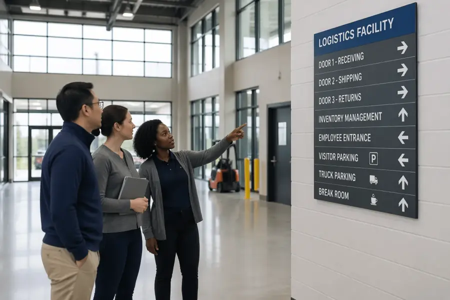
Using simple symbols and plain language for non-operators
Logistics teams love internal shorthand, but visitors are not operators and they do not speak dock slang. Plain language and familiar symbols keep people moving without forcing them to ask a forklift driver for directions.
Use the same few terms everywhere, such as “Reception,” “Visitor Parking,” “Security,” and “Meeting Rooms,” and avoid switching to “Front Office” halfway through the path. When you add symbols, pick ones that match international safety and logistics symbology so a guest from another country still understands the cue.
A good test is whether a visitor can follow the route without reading your company name at all. If the route only works when someone recognizes your branding, it will fail for the person who is stressed, late, or unfamiliar with the site.
Keep words short and concrete, because people scan signs rather than read them. “Reception” is clearer than “Administrative Services,” and “Visitor Parking” is clearer than “External Stakeholder Parking.”
Be careful with abbreviations, because even common ones can mean different things to different industries. If you must use an abbreviation like “PPE,” pair it with the first-time expansion near the point where it matters.
Symbols should support text, not replace it, because not every icon is universal. A person-at-desk icon works well when it sits next to the word “Reception” and points the same direction.
Consistency matters more than creativity, so reuse the same arrow style, colors, and icon set across the whole visitor path. When every sign looks like it belongs to the same system, people trust it and follow it.
Contrast and legibility do most of the heavy lifting, especially in industrial environments with visual noise. High contrast text and large arrows beat subtle design choices every time.
Consider multilingual needs if you host international drivers, contractors, or customers. Even one secondary language on the most critical points, like reception and safety rules, can reduce confusion dramatically.
When you name areas, match the terms used by the people who greet visitors on the phone. If the receptionist says “Reception is by the main entrance,” the signs should not call it “Office 1.”
Do not use humor or clever phrasing for safety and access control, because it creates uncertainty. A visitor should never have to interpret whether a message is serious when they are near operational traffic.
| Visitor need | Plain-language text | Simple symbol cue |
|---|---|---|
| Find the correct entrance | Reception | Information “i” or person-at-desk icon |
| Park without blocking traffic | Visitor Parking | White “P” on blue background |
| Follow the safe walking route | Visitor Route | Walking person with arrow |
| Avoid operational zones | Authorized Personnel Only | Prohibition circle with person silhouette |
| Know where to check in | Check In Here | Clipboard or badge icon |
The table is a starting point, not a full sign family, and you can extend it with your most common visitor tasks. The key is that each task gets one label and one icon, and you stick to them everywhere.
If you already have safety signage standards, align visitor signs with them so the site feels coherent. Visitors notice when one sign system says “No Entry” and another says “Do Not Enter” in a different color and style.
Plain language also applies to instructions, not just destinations. “Wait here for escort” is clearer than “Do not proceed beyond this point without authorization.”
Finally, remember that visitors are often carrying bags, wearing PPE for the first time, or juggling paperwork. The simpler the message, the more likely it is to be followed under real conditions.
Separating visitor paths from operational traffic
If visitors have to cross a truck lane, the site design is asking for trouble. The cleanest visitor wayfinding in logistics facilities keeps guests on a dedicated path that never competes with backing trailers.
Painted walkways work best when they start at visitor parking and continue unbroken to reception, with crossings only where you can control visibility. Put visitor route signs at each crossing, and place them where a person naturally pauses before stepping out.
Barriers matter because people follow the easiest line, not the safest line. A low handrail, bollards, or a chain gate can stop a guest from cutting behind a row of parked tractors to save twenty steps.
Do not rely on “watch for forklifts” warnings as your main control, because they shift responsibility to the least informed person on site. Use physical separation first, then reinforce it with clear site entry directions that keep visitors out of dock aprons and staging zones.
Start by mapping where operational traffic actually moves, not where you wish it moved. If trucks routinely swing wide at a corner, that corner is not a good place for a visitor crossing even if the paint says otherwise.
Separate routes should feel natural, which often means making the safe path the shortest path. When the safe path is longer, people will invent shortcuts and your signs will not stop them.
Use color and texture to make pedestrian space feel different from vehicle space. A different pavement color, a curb edge, or a tactile surface makes the boundary obvious even when someone is distracted.
At unavoidable crossings, treat them like mini-intersections with clear sightlines. Trim landscaping, move stored pallets, and avoid placing signs where they block the view of oncoming vehicles.
Speed control supports wayfinding because slower vehicles give visitors more time to react. If your visitor route runs near a vehicle lane, add speed limit signs and physical calming where appropriate.
Do not forget about forklift routes inside covered dock areas, because visitors often step into these zones without realizing it. A strong visual threshold, like a gate or a bold line with “Stop” messaging, helps prevent accidental entry.
If you host frequent contractors, give them a designated muster point and a clear waiting area that is not in the flow of operations. Waiting in the wrong place is one of the most common ways visitors drift into hazards.
Visitor route signs should face the direction of travel and be placed at the height a walking person naturally scans. A sign that is perfect for a driver can be invisible to a pedestrian if it is too high or angled away.
Weather changes behavior, so plan for rain, snow, and high winds that push people off the intended path. Covered walkways, slip-resistant surfaces, and simple detour signs keep the route usable year-round.
When you have shared yards with multiple tenants, agree on a common visitor approach rather than letting each tenant improvise. A unified visitor path reduces cross-traffic and prevents guests from entering the wrong building.
Indoor navigation: corridors, stairs, and restricted areas
Inside the building, visitors lose the big outdoor landmarks and start guessing again. If your lobby opens into multiple corridors, you need directional signs at eye level that point to meeting rooms and restrooms with the same words used in appointment emails.
Stairs and elevators create another decision point, especially in multi-tenant warehouses with offices above the dock. Put a sign at the base of the stairs that says which departments or room ranges are upstairs, and repeat it at the landing so people do not backtrack.
Restricted areas need firm wording and consistent placement, because a polite sign tucked behind a door closer does not stop anyone. Use “Authorized Personnel Only” or “No Visitor Access” near the handle side, and pair it with a symbol that communicates the same message.
When a hallway ends at a secured door, add a clear “Reception this way” arrow before the dead end. That one decision saves the receptionist from hearing “I think I went the wrong way” ten times a day.
Indoor wayfinding should start immediately at the entry, because the first ten steps set the tone. A lobby directory sign that lists “Reception,” “Meeting Rooms,” and “Restrooms” prevents the awkward pause where people look around for help.
Use confirmation signs after turns, especially in long corridors that look identical. A small wall sign that says “Meeting Rooms 1–5 →” reassures visitors that they did not miss a door.
Room numbering should be visible and logical, because hidden numbers create unnecessary questions. If the meeting room is called “Conference A” in the calendar invite, the door should say “Conference A” in the same format.
Many facilities have a mix of office and operational doors that look similar, which is where visitors make mistakes. Use door labels that clearly separate “Office Access” from “Warehouse Access” so people do not wander into a high-visibility vest zone by accident.
Where the visitor route passes near operational areas, make the boundary obvious with a physical and visual cue. A half-height gate with a “Stop” sign communicates more clearly than a line of tape on the floor.
Restrooms are a frequent visitor need, and unclear restroom signs cause wandering. Place restroom direction signs where someone can see them from the lobby, not halfway down a staff-only corridor.
If your facility requires visitors to wear a badge, the badge should unlock nothing and still guide behavior. A sign that says “Badge required beyond this point” is clearer than assuming the visitor understands access control norms.
Elevators should have clear labels for floors and destinations, not just numbers. If the meeting rooms are on Level 2, say “Meeting Rooms Level 2” on the elevator call area and inside the cab.
For buildings with long internal distances, consider adding simple wall-mounted “You are here” maps at key nodes. The map should be minimal and match the same names used on directional signs.
Do not forget acoustics and noise, because loud environments make verbal directions unreliable. Good indoor signs reduce the need for shouted instructions across a lobby or corridor.
Finally, keep restricted messaging consistent so visitors do not test boundaries. If one door says “No Visitors” and another says nothing, people will assume the unlabeled door is acceptable.
Posting rules and expectations without overloading signs
Visitors do need rules, but a wall of text at the entrance makes people stop reading altogether. Keep the main wayfinding signs focused on direction, then place short rule signs only where the rule applies.
Reception signage can carry a small set of expectations, like “Check in, wear badge, wait to be escorted,” because that is where people naturally pause. Save detailed PPE requirements for the point where a visitor transitions from office space into an operational area.
Rules work best when they are written as actions a visitor can take immediately. “Stay on marked pedestrian routes” is clearer than a general statement about safety culture.
Place rules at the moment of decision, because timing is part of comprehension. A “No phone use in yard” sign is most effective at the door that leads to the yard, not on a bulletin board in the lobby.
Use short lines and consistent formatting so people can scan quickly. If every rule sign has a different layout, visitors will not know what to look for.
When you must post multiple requirements, group them into a small number of categories. Visitors can handle “Check in,” “Wear badge,” and “Wait for escort” more easily than a list of fifteen micro-rules.
Keep enforcement in mind, because a rule that is not enforced becomes background noise. If you post “Wear visitor badge,” make sure staff have a simple process to issue and replace badges without friction.
Use positive instructions where possible, because they guide behavior rather than just blocking it. “Use this walkway to Reception” prevents more problems than “Do not walk in the yard.”
Some rules are better delivered verbally at check-in, especially when they depend on the day’s conditions. If the yard is congested or a dock door is under repair, a quick verbal note plus a temporary sign beats a permanent wall of text.
Temporary signs should still look official enough to be trusted. A printed sheet taped to a wall can work in a pinch, but it should be clear, legible, and removed when no longer needed.
- Check in at reception before entering the warehouse
- Wear visitor badge above the waist
- Stay on marked pedestrian routes
- No phone use in yard and dock areas
- Wait for escort past controlled doors
- Required PPE posted at entry to work zones
This list is short on purpose, because visitors can remember a few rules without feeling overwhelmed. If you need more detail, move it into a handout, a brief induction, or a QR-linked page.
Make sure rules do not contradict the wayfinding, because mixed messages create hesitation. If the sign says “Stay on marked routes” but the route paint is faded or broken, the visitor has no reliable option.
Align rule signs with your actual escort policy, because visitors notice gaps immediately. If you require escorts, do not leave doors propped open in a way that invites self-guided wandering.
Finally, remember that visitors judge your professionalism by how clear your expectations are. A clean, simple ruleset at reception signals that the facility is controlled and that safety is not optional.
Updating visitor wayfinding for schedule and layout changes
Facilities change fast, and the signs often lag behind by months. If you move reception to a temporary trailer during renovations, update site entry directions the same day or you will create a daily stream of lost guests.
Seasonal peaks also change traffic patterns, like overflow parking in a remote lot or a new security checkpoint at shift change. Plan a “peak mode” set of visitor route signs and store them where the site lead can deploy them in minutes.
Walk the visitor path once a quarter with fresh eyes and a clipboard, and fix the small stuff you usually ignore. A faded arrow, a missing door label, or a sign blocked by a pallet stack can break visitor wayfinding in logistics facilities even when the plan is solid.
Digital directions help, but they do not replace physical cues once someone arrives. If you send a map link, match it to the on-site naming, so “Gate 3” in the email is the same “Gate 3” posted on the fence.
Assign ownership for visitor wayfinding, because shared responsibility usually means no responsibility. One person should be accountable for keeping reception signage, visitor route signs, and site entry directions aligned with reality.
Include wayfinding checks in your change management process. When a door is rekeyed, a corridor is closed, or a parking area is reassigned, signage updates should be part of the work order closeout.
Temporary detours need the same clarity as permanent routes. A detour sign should start before the closure, not at the closure, so the visitor can change course without feeling trapped.
Keep a small inventory of spare signs for common situations, like “Reception →,” “Visitor Parking,” and “Route Closed.” Having them ready prevents the scramble that leads to handwritten notes and inconsistent wording.
Review the visitor experience after major incidents or near misses, because those events often reveal wayfinding weaknesses. If a visitor ended up in a dock area, treat it as a design problem, not just a behavior problem.
Ask reception staff what questions they answer repeatedly, because those questions point directly to missing cues. If the phone rings all day with “Which gate is it,” your site entry directions are not doing their job.
Contractors and delivery partners can also provide useful feedback because they see multiple sites and notice what works. A short question at sign-out, like “Was it easy to find reception,” can reveal patterns quickly.
When you update naming, update everything at once, including appointment templates and visitor instructions. A mismatch between “Main Gate” and “Gate 1” creates confusion even if both names refer to the same place.
Finally, inspect signs for wear as part of routine site walks. Sun fade, grime, and impact damage slowly erase clarity, and the decline is easy to miss until a visitor gets lost again.
Conclusion
Good visitor wayfinding in logistics facilities is a safety control, not a branding exercise. When you combine clear site entry directions with consistent reception signage and well-placed visitor route signs, you reduce wandering and keep operational areas predictable.
The best systems are boring in the best way, because guests move smoothly and nobody has to stop work to play tour guide. If you want a quick win, stand at the gate, drive in like a first-time visitor, and fix the first two confusing decisions you hit.
Wayfinding is also a customer experience issue, because the first five minutes on site shape how people feel about the operation. When arrivals are calm and clear, meetings start on time and conversations stay focused on the work.
Small improvements compound, especially when they remove repeated interruptions from supervisors and forklift operators. The goal is not to impress visitors with signage, but to make the right path so obvious that nobody thinks about it.
If you treat the visitor route like any other critical process, you will maintain it, audit it, and improve it. That mindset turns signs from decoration into a practical layer of control that supports safety and throughput.