

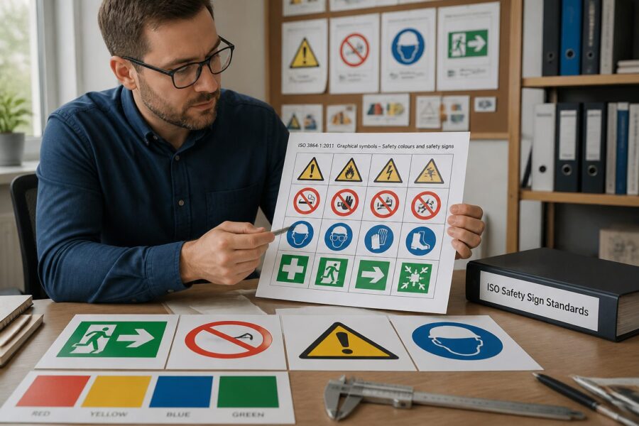
Understanding the nuances of safety and logistics symbology is absolutely vital for maintaining workplace safety across various industries and environments. One of the key standards in this domain, which provides a robust framework for ensuring clarity and consistency in safety communications, is ISO 3864, which outlines guidelines that aim to make safety symbols universally recognized and understood by all individuals, regardless of their background or experience.
ISO 3864 covers various aspects of safety signage, including essential design principles and effective color schemes that enhance the visibility and impact of safety messages. Through its four distinct parts, it establishes a comprehensive framework for creating effective safety symbols that are not only legible and recognizable but also convey critical information swiftly and clearly to prevent accidents and misunderstandings.
The first part of ISO 3864 focuses on the general principles of safety sign design which are foundational to all subsequent parts of the standard. The subsequent parts delve deeper into specific requirements that ensure consistency and clarity across all safety communications, thereby enhancing overall workplace safety and compliance with international standards.
What ISO 3864 Covers Across Its Four Parts
The ISO 3864 standard is divided into four distinct parts that cover a range of topics essential for effective safety symbol design and implementation in various environments. Each part plays a crucial role in ensuring that safety signs are effective in conveying critical information to workers and visitors, thereby fostering a culture of safety awareness and compliance.
Part 1 outlines the general principles of safety sign design, including the need for clear, understandable symbols that can be easily recognized by anyone. This section serves as the foundational basis for the other parts of the standard, ensuring a cohesive and unified approach to international safety symbol design across different regions and industries.
Part 2 focuses specifically on the design of safety signs in relation to safety colors, defining specific colors and their meanings that are vital for creating intuitive safety signs. By establishing a standardized color code, this section greatly enhances the effectiveness of safety symbols, allowing individuals to quickly comprehend the associated messages without the need for extensive verbal explanations.
Part 3 emphasizes the graphical representation of safety symbols, providing detailed guidelines on the shape and structure of symbols to maximize legibility and comprehension. This ensures that the design elements are not only aesthetically pleasing but also functionally effective, allowing for quick recognition and response during critical situations.
Finally, Part 4 addresses the application of these standards in specific environments, ensuring that safety symbols can be adapted to various contexts while maintaining their effectiveness. This adaptability is crucial for ensuring that safety communications remain relevant and impactful in diverse settings, from industrial workplaces to public spaces.
Geometric Shapes and Background Colors in the ISO 3864 System
In the ISO 3864 standard, geometric shapes play a significant role in the recognition and interpretation of safety signs, as each shape conveys a specific meaning that guides individuals in understanding the nature of the warning or instruction being presented. The use of distinct shapes helps to facilitate quick recognition and comprehension, which is particularly important in emergency situations where time is of the essence.
For instance, circular shapes are often utilized to indicate mandatory actions that must be followed, while triangular shapes are commonly used for warnings that alert individuals to potential hazards. Understanding these shapes is crucial for anyone involved in safety sign design and implementation, as it directly impacts how effectively the symbols communicate essential safety information.
Background colors also contribute significantly to the effectiveness of safety symbols, as ISO 3864 specifies particular colors that correspond to specific meanings, enhancing the overall clarity of safety messages. By adhering to these color guidelines, designers can create intuitive safety signage that is easily understood by individuals, thereby reducing the risk of misinterpretation.
Red is typically used for prohibitory signs, indicating actions that are not allowed, while green is associated with safety and permissible actions, signaling that it is safe to proceed. The combination of shape and color creates a powerful visual language that effectively communicates critical safety information to individuals, reinforcing the importance of compliance with safety protocols.
Designers must adhere to these established standards to ensure that safety symbols are universally understood and can be effectively recognized by individuals from various backgrounds. This adherence is essential for effective communication in diverse environments, ensuring that safety messages are conveyed clearly and accurately.
Mandatory, Prohibition, Warning and Emergency Safety Symbol Categories
ISO 3864 categorizes safety symbols into four main types: mandatory, prohibition, warning, and emergency, each of which serves a distinct purpose in communicating critical safety information. By categorizing symbols this way, the standard facilitates a better understanding of the intended message and the actions that individuals should take in specific situations.
Mandatory symbols clearly indicate actions that must be taken, such as wearing personal protective equipment like helmets or gloves, which are essential for ensuring workplace safety. Prohibition symbols, on the other hand, clearly denote actions that are not allowed, ensuring compliance with safety regulations and helping to prevent accidents and injuries in the workplace.
| Symbol Type | Example | Usage |
|---|---|---|
| Mandatory | Wear Hard Hat | Required safety gear |
| Prohibition | No Smoking | Restricted actions |
| Warning | Slippery Surface | Hazard awareness |
| Emergency | Exit Sign | Safety evacuation |
Warning symbols are designed to alert individuals to potential hazards, such as uneven surfaces or the presence of toxic substances, thereby promoting awareness and caution among users. Emergency symbols guide users toward safe exit routes or emergency equipment, enhancing overall safety preparedness and ensuring a swift response in case of an emergency.
Designing Symbols That Meet ISO 3864-3 Graphical Legibility Criteria
Designing symbols that adhere to ISO 3864-3 graphical legibility criteria is vital for effective communication of safety messages in various contexts. These criteria focus on ensuring that symbols are easily recognizable and interpretable at a glance, which is crucial for their functionality in urgent situations.
Legibility factors include the shape, size, and color contrast of the symbols, as these elements play a significant role in how quickly and accurately individuals can interpret safety messages. Designers must carefully consider these elements during the design process to create symbols that meet the ISO standards and effectively convey critical information.
Additionally, the use of clear and uncomplicated designs increases the likelihood of immediate understanding and recognition. Effective symbols should avoid unnecessary complexity that might confuse the viewer, as simplicity is key to ensuring quick comprehension in high-pressure situations.
Testing symbols in various sizes and formats can also enhance their legibility and effectiveness in real-world applications. Conducting trials with diverse populations can provide valuable feedback for further refinement, ensuring that the symbols meet the needs of all potential users.
Incorporating these graphical legibility criteria into the design process ultimately leads to more effective ISO graphical symbol labels. This adherence ensures that safety sign design standards are met consistently across different environments, thereby enhancing overall safety communication and compliance.
Testing Symbol Comprehension Across Diverse Populations
Testing symbol comprehension is crucial for ensuring that safety symbols are understood by all users, regardless of their background or experience. Diverse populations may interpret symbols differently based on cultural, linguistic, and contextual factors, making it essential to conduct comprehensive testing to identify any potential misunderstandings.
Gathering feedback from various demographic groups allows designers to refine symbols effectively, ensuring that they are universally recognized and comprehensible. This process helps in identifying any cultural or contextual misunderstandings that may arise, allowing for adjustments to improve clarity and effectiveness.
Using surveys and focus groups can provide valuable insights into how different audiences perceive safety symbols and their associated meanings. Involving representatives from various backgrounds ensures a broader understanding of symbol effectiveness and helps designers create symbols that resonate with a diverse population.
Prototyping and iterating on designs based on user feedback can lead to improved clarity and efficacy of safety symbols. The ultimate goal is to achieve a level of comprehension that transcends language and cultural barriers, ensuring that safety messages are communicated effectively to everyone.
Ultimately, testing symbol comprehension contributes to the creation of more universally recognized ISO 3864 safety label symbols. This not only enhances safety communication in a globalized world but also fosters a culture of safety awareness that protects individuals in various environments.
How ISO 3864 Aligns With ISO 7010 Registered Safety Signs
ISO 3864 aligns closely with the ISO 7010 standard, which governs registered safety signs and provides a comprehensive list of symbols that are recognized internationally for their clarity and effectiveness. The relationship between these two standards is essential, as it ensures a consistent approach to safety symbol design and facilitates mutual understanding across different regions and industries.
ISO 7010 provides a comprehensive list of registered safety signs that are recognized internationally, which is crucial for effective communication in diverse settings, particularly in multinational workplaces where employees hail from varied backgrounds. This consistency in design and meaning is vital for ensuring that safety messages are conveyed clearly and accurately across cultural and linguistic barriers, ultimately enhancing workplace safety.
- Standardized design principles contribute to uniformity in safety signage.
- Universal recognition of symbols enhances communication across borders.
- Clarity in communication reduces the risk of misunderstandings.
- Enhanced safety compliance is achieved through adherence to established guidelines.
- Global applicability of safety symbols fosters a culture of safety awareness.
By adhering to both ISO 3864 and ISO 7010, organizations can ensure their safety symbols are compliant with international safety practices and standards. This alignment not only fosters a safer environment in workplaces worldwide but also demonstrates a commitment to prioritizing the health and safety of all employees and visitors.
Applying ISO 3864 Principles to Custom Label Designs
Applying ISO 3864 principles to custom label designs is essential for maintaining effective safety communication and ensuring that safety protocols are clearly understood. Custom labels should incorporate the same design elements as standardized safety symbols, including color, shape, and graphical representation, to promote uniformity and clarity.
By following the guidelines set forth in ISO 3864, designers can create labels that are both functional and aesthetically pleasing, thereby improving their effectiveness in conveying safety messages. This adherence not only enhances legibility but also ensures compliance with safety standards, which is crucial for reducing the risk of accidents and injuries in the workplace.
When designing custom labels, it is important to consider the specific context in which they will be used, as tailoring designs to specific environments can significantly improve their effectiveness. Understanding the unique challenges and requirements of each environment allows designers to create labels that resonate with users and effectively communicate critical safety information.
Incorporating recognizable shapes and colors is vital for immediate understanding and recognition of safety messages. This approach enhances the clarity of the message and promotes a culture of safety awareness among employees and visitors alike, ensuring that everyone is informed about potential hazards and required actions.
Ultimately, applying ISO 3864 principles to custom label designs ensures that safety sign design standards are upheld consistently across various settings. This commitment to quality and clarity contributes to a safer working environment, where individuals are aware of potential risks and know how to respond appropriately.
Size and Viewing Distance Requirements for Safety Symbols
Size and viewing distance are critical factors in the effectiveness and impact of safety symbols, as they directly influence how easily symbols can be seen and understood by individuals in various environments. ISO 3864 outlines specific requirements to ensure that symbols are visible and legible from various distances, taking into account the unique challenges posed by different settings.
Designers must carefully consider the environment where the symbols will be displayed, as factors such as lighting conditions, potential obstructions, and the typical distance from which viewers will see the symbols can all influence design decisions. By understanding these variables, designers can create symbols that are appropriately sized and positioned for maximum visibility and impact.
For instance, larger symbols may be necessary in areas where viewers are typically far away, such as on factory floors or in large public spaces. Conversely, smaller symbols can be effective in close-proximity situations, such as in office settings, where individuals are more likely to be within a short distance of the symbols.
Testing different sizes in real-world scenarios can help determine the most effective dimensions for symbols to ensure that safety messages are communicated effectively, regardless of the viewing conditions. This iterative testing process allows designers to gather valuable feedback and make necessary adjustments to enhance the overall effectiveness of safety signage.
Ultimately, adhering to size and viewing distance requirements enhances the overall effectiveness of ISO graphical symbol labels. This attention to detail can significantly impact workplace safety by ensuring that critical messages are conveyed clearly and promptly to all individuals, thereby reducing the likelihood of accidents and injuries.
Getting Custom Symbols Registered Under the ISO System
Getting custom symbols registered under the ISO system involves a structured and detailed process that requires careful attention to established standards and guidelines. Organizations must ensure that their designs adhere to the established ISO standards for safety symbols, which is critical for ensuring their effectiveness and acceptance in various environments.
The first step in this process is to develop a symbol that meets the graphical legibility criteria outlined in ISO 3864, which involves creating a design that is clear, recognizable, and easily understood by all users. Once the symbol is designed, it must be submitted for evaluation to ensure compliance with international safety symbol design standards, which may involve peer review or assessment by relevant authorities.
After approval, organizations can proceed with the registration process, which typically involves filling out necessary documentation and providing evidence of the symbol’s effectiveness in real-world applications. This step is essential for ensuring that the symbol is not only compliant with ISO standards but also practical and functional in conveying safety messages.
Successful registration allows organizations to use their custom symbols confidently, knowing that they adhere to international standards for safety signage. This not only enhances safety within the organization but also establishes credibility in safety communication, reinforcing the organization’s commitment to maintaining a safe working environment.
Ultimately, getting custom symbols registered under the ISO system is a valuable step toward improving workplace safety and ensuring effective communication of safety protocols. It signifies a commitment to upholding global safety standards and fostering a culture of safety that protects all individuals within the organization.