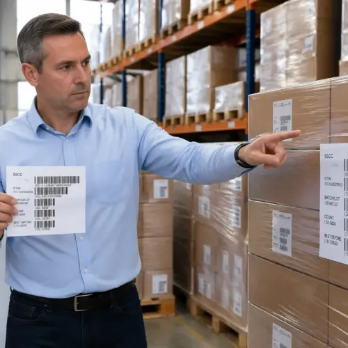
Walk through any busy warehouse and you will see the same problem repeating itself, people waste seconds searching for the right label, the right lane, or the right rule. A label color coding system for logistics can fix that, but only if it is designed like an operating standard instead of a craft project.
I have watched teams add colors one at a time until every shipment looks urgent and every exception looks special. The result is predictable, new hires ignore the colors, veterans argue about meanings, and supervisors fall back to shouting across the dock.
Color can support visual management because it compresses a decision into a glance. The trick is to keep the system small, consistent across sites, and backed by training and enforcement that survives turnover.
When it is done right, color becomes a shared language that reduces questions, reduces walking, and reduces the number of times a carton gets touched. When it is done wrong, it becomes a second set of rules that competes with the WMS and makes the floor louder, not faster.
The goal is not to make the operation look organized for a tour, it is to make the next correct action obvious to the person doing the work. If you cannot explain the system to a new hire in five minutes, the system is already too complicated.
When color coding helps (and when it creates confusion)
Color coding helps most when the worker needs to choose between a few clear actions under time pressure. Think of a picker deciding whether a carton goes to standard packout, cold pack, or the problem solve cage.
It also works when you need fast scanning from a distance, like staging lanes or outbound doors where people read labels while moving. Bright shipping label colors can reduce walking and rework because the right lane becomes obvious before the carton is even set down.
It helps in noisy environments where verbal instructions get lost, especially during peak when you have temps, overtime crews, and rotating leads. A consistent color cue can cut down the number of radio calls and the number of times someone has to stop a pallet jack to ask a question.
Color coding is also strong for separating flows that should never mix, like outbound versus returns, or food grade versus non-food grade handling. When the wrong flow creates expensive rework, a simple visual barrier is worth more than another line on a pick ticket.
It works best when the action is binary or near-binary, like “ship now” versus “do not ship.” The more the worker has to interpret shades, combinations, or multiple rules, the more the system turns into a guessing game.
Color coding creates confusion when it tries to carry too much data that should live in text or barcodes. If you use ten colors to encode ten carriers, the meaning collapses the moment a new carrier is added or a site runs out of one label roll.
Another failure mode is mixing purposes, like using red to mean both expedite and hazmat depending on the building. Standardization matters more than cleverness, especially when labor moves between shifts, buildings, and third party partners.
It also breaks when people start stacking meanings, like a blue label plus a red dot plus a handwritten note that says “rush.” At that point, you are no longer compressing decisions, you are creating a puzzle on every carton.
Confusion shows up fast in the metrics, even if nobody says it out loud, because you will see more misroutes, more lane congestion, and more “mystery pallets” parked in random corners. The floor tells the truth, and the truth is usually that the system is asking too much from tired people.
Another common problem is when leaders use color to compensate for unstable processes, like changing cutoffs, changing carrier pickups, or changing staffing. If the rule changes every day, the colors become a daily debate instead of a standard.
Color should support the WMS, not fight it, and the best systems make the WMS decision visible rather than replacing it. If the WMS says “hold,” the label should reinforce that hold, not introduce a second interpretation of what hold means.
Choosing a color set: limiting options for fast decisions
Start by admitting a hard truth, humans cannot reliably remember a big rainbow of rules while they are lifting, scanning, and dodging pallet jacks. If you want a label color coding system for logistics that survives real work, keep the core set to five or six colors.
Pick colors that are easy to separate under warehouse lighting, including sodium vapor and cheap LED fixtures that shift tones. Avoid subtle shades like teal versus aqua, because what looks different on a design screen can look identical on a dock at 5 a.m.
Think about how the colors look when they are dirty, wrinkled, or partially covered by stretch wrap. A color that only works when the label is pristine is not a warehouse color, it is an office color.
Consider how the colors behave when printed by different methods, because thermal transfer, direct thermal, and preprinted stock do not match perfectly. If your blue turns purple on one printer, you just created a new category by accident.
Reserve the brightest, highest contrast colors for the actions that must interrupt normal flow. If everything is fluorescent, nothing is, and your exception labels turn into background noise.
Make one color the boring default, and make that default the majority of volume. When the floor is mostly green or mostly white, the exceptions pop without anyone having to squint or argue.
Do not pick colors based on what looks good in a slide deck, pick them based on what survives distance and speed. If a worker cannot identify the label color from six feet away while walking, the color is not doing its job.
Plan for procurement and print reality, since some sites will use thermal printers, others will use preprinted stock, and some will use both. Your chosen shipping label colors must exist as readily available label rolls and must print consistently across vendors.
Also plan for shortages and substitutions, because a great system collapses if one missing roll forces people to improvise. If you cannot guarantee supply, you need a fallback rule that is documented, trained, and consistent.
Keep the palette stable across sites, because multi-site operations bleed labor and inventory across buildings whether you like it or not. A worker should not have to unlearn colors just because they picked up an extra shift at a sister facility.
Finally, decide whether you are coding the entire label stock or just a band, corner, or border. A colored stripe can be easier to standardize than full-color paper, and it reduces the temptation to create “special label designs” for every team.
Defining meanings: priority, temperature, returns, and holds
Meanings must map to actions, not categories that sound nice in a meeting. If a color does not change what the worker does next, remove it and keep the system clean.
Write definitions as simple verbs tied to a location, like “stage at Door 12” or “send to problem solve.” That is how visual management becomes warehouse workflow labels that actually drive behavior.
A good definition answers three questions in plain language, what is it, where does it go, and what scan or notification is required. If the definition needs a paragraph of exceptions, it is not ready for the floor.
Priority is the easiest place to overdo it, because everyone wants their freight to be “hot.” If you cannot enforce what qualifies as expedite, you will end up with red everywhere and no real priority at all.
Temperature is a strong use case because it has real handling requirements and real risk. If blue means 2°C to 8°C, then the system must also define what happens when the cold area is full or when the carton arrives warm.
Returns and reverse logistics benefit from color because they often share space with outbound and they attract clutter fast. A clear returns color makes it harder for someone to “temporarily” stage returns in outbound lanes and forget about them.
Holds are where discipline shows up, because holds are unpopular and they slow the line. If orange means hold, then orange cartons cannot be allowed to drift back into standard flow just because the dock is busy.
Quality checks are another area where the action must be specific, because “QC required” can mean ten different things depending on the product. If the QC station needs a reason, the label system should connect to a reason code that tells QC what to look for.
Try to avoid meanings that depend on a person’s judgment in the moment, like “fragile” unless you have a clear packaging rule behind it. If the same SKU is sometimes treated as fragile and sometimes not, the label color becomes a debate instead of a standard.
Document the meanings in the same place you document other operating standards, not in someone’s email or a laminated sheet that only exists at one pack station. When the system lives in the SOP and the training plan, it survives turnover.
| Color | Meaning | Required action |
|---|---|---|
| Red | Expedite or same day cutoff risk | Move to fast lane staging and notify lead |
| Blue | Cold chain, 2°C to 8°C | Send to refrigerated pack area within 10 minutes |
| Orange | Hold for documentation or compliance | Route to hold cage and scan hold reason code |
| Green | Standard outbound | Follow normal packout and dock routing |
| Purple | Returns or reverse logistics | Send to returns sort and apply RMA label |
| Yellow | Quality check required | Stop at QC station before sealing carton |
The table is only useful if the actions are enforced and measurable, because “notify lead” means nothing if the lead never hears about it. Tie each action to a scan event, a queue, or a physical lane so you can verify it happened.
Be explicit about what the colors do not mean, because people will invent meanings if you leave gaps. If red is expedite, say out loud that red is not “heavy,” not “fragile,” and not “VIP customer” unless you want those arguments forever.
When you have multiple temperature ranges, do not try to solve it with multiple blues unless you have a mature operation and strong training. In most buildings, it is better to have one cold chain color and let the detailed range live in the barcode data.
If you have regulated goods, decide whether compliance is a separate color or whether it is an overlay on an existing process like hold. The best systems avoid creating a “compliance rainbow” and instead route everything to a controlled area with clear release rules.
Designing labels for color-blind accessibility and clarity
Relying on color alone is lazy design, and it fails a real chunk of your workforce. Build every colored label with a second cue, like a big icon, a letter code, or a pattern band that stays readable in grayscale.
Red and green are the most common trouble pair, so do not make them your only differentiator for the most important decisions. If you must use both, separate them with shape cues like a triangle for red and a circle for green, printed large enough to read at arm’s length.
Assume the label will be seen by someone who is tired, new, and moving fast, because that is the reality during peak. If the icon is small or the letter code is tucked into a corner, it will not survive real work.
Use fonts that are plain and heavy, and avoid thin type that disappears when the printer head is worn. Warehouse printers drift over time, and your label design should tolerate that drift without turning into a blur.
Keep text short and blunt, because long phrases get ignored during peak. “HOLD” beats “Do not ship until released by compliance,” and the detailed instruction belongs in the SOP and on a nearby sign.
Decide where the color cue lives, because placement matters as much as pigment. A color band at the top edge is often easier to see when cartons are stacked, while a full background can be hidden by tape or other labels.
Make sure the barcode and critical shipping data remain high contrast and scannable. A beautiful colored label that causes scan failures is a direct hit to throughput and will get bypassed by the floor within a week.
Test labels in the real environment, taped to cartons on a pallet, under the same lighting and dust you work with every day. A label that looks crisp on a desk printer can become unreadable once it picks up scuffs, condensation, or stretch wrap glare.
Test at the distances that matter, like the distance from the end of a lane to the staging point, not just at a workstation. If the label is only readable when you are already holding the carton, you missed the point of visual management.
Include a simple error-proofing cue for mixed cases, like a colored corner that remains visible even when a second label is applied. In many operations, cartons collect labels over time, and your system needs to survive that clutter.
Accessibility also includes language, because many warehouses run multilingual teams. Icons and letter codes reduce translation needs, and they make coaching faster when a supervisor and associate do not share fluent speech.
Linking color to locations: lanes, racks, and dock doors
A color system breaks down when the label says one thing and the building says another. If blue means cold chain, then the cold staging lane needs blue signage, blue floor tape, and a blue marker on the rack upright.
This is where visual management earns its keep, because you reduce the number of times a worker has to stop and interpret. People should be able to match label color to a physical destination without reading a map or asking a lead.
Make the destination unmissable, because a small sign on a post is not enough in a crowded dock. Use large lane headers, repeated cues, and clear sight lines so the color is visible even when pallets and equipment block part of the view.
Do not rely on memory for where lanes are, because lanes move when volume changes and when you re-slot. If the meaning is stable but the location changes, update the physical cues immediately or the system will teach people to ignore it.
Be careful with floor tape, since it fades and collects dirt, and faded colors create their own kind of error. Set a replacement cadence, and treat it like replenishing labels, not like a facilities nice to have.
When floor tape is not durable enough, consider painted zones, hanging signs, or rack-mounted placards that last longer. The point is not the specific tool, it is the consistency of the cue over time.
Link colors to dock doors with both signage and process, because doors are where mistakes become expensive. If red expedite goes to a specific door or a specific time window, mark that door and make the staging rule explicit.
Use the same color meanings on screens where possible, like WMS task lists or exception dashboards, but do not assume every device shows colors accurately. If the handheld only has a monochrome display, your icon and letter code become the deciding factor.
Even with color screens, assume brightness and contrast vary, especially on older RF guns. If the system requires a perfect display to work, it is not a system, it is a fragile demo.
Think about upstream and downstream handoffs, because the label travels farther than the building. If a carrier, a cross-dock, or a store backroom sees the label, your colors should not create a misunderstanding outside your four walls.
Finally, align the color system with your slotting and replenishment logic so it does not fight how product moves. If returns are purple but the returns area is three aisles away from where returns are generated, you just built extra walking into the standard.
Rolling out the system: training, signage, and enforcement
Rollout fails when teams treat it as a memo instead of a behavior change. You need a short training module, a hands on practice run, and a supervisor who corrects mistakes in the moment.
Make the first week painfully consistent, even if it slows you down a little. If people see exceptions slide by without correction, they learn that the new warehouse workflow labels are optional.
Training should include the why, not just the what, because adults follow standards better when they understand the cost of failure. When you explain that a misrouted cold chain carton can become scrap, the blue label starts to matter.
Keep the training practical and short, because nobody retains a 45-minute lecture on colors. A ten-minute explanation followed by a ten-minute floor exercise beats a long classroom session every time.
Signage should be placed where decisions happen, not where it is convenient to hang posters. Put the legend at pack stations, at merge points, at the entrance to staging, and at the problem solve area where exceptions get sorted.
Enforcement should be calm and consistent, because inconsistent enforcement teaches people to wait and see which supervisor is on duty. If one lead cares and another does not, the system will drift to the lowest standard.
Build the label rolls into the workstation layout so the right choice is the easy choice. If the red roll is stored across the aisle and the green roll is within reach, people will “temporarily” use green and promise to fix it later.
Include maintenance and replenishment in the rollout plan, because empty rolls create improvisation. If the system depends on a specific color roll, then that roll needs min-max levels and an owner like any other consumable.
- One page color legend posted at every pack and dock zone
- Label roll storage separated by color with clear bin labels
- New hire drill using real cartons and real routing lanes
- Supervisor audit walks twice per shift during the first month
- WMS reason codes aligned to each color meaning
- Escalation rule for misuse, coach first, then document repeats
Build a quick reference into the onboarding checklist so the color system is taught the same way every time. If onboarding varies by trainer, your color meanings will vary by shift within a month.
Use a short daily huddle reminder during the first few weeks, focused on one or two common mistakes. Repetition is not glamorous, but it is how standards stick when turnover is high.
Have a clear plan for what happens when the WMS conflicts with the color cue, because that will happen in real life. The rule should be simple, like “WMS instruction wins, then escalate the mismatch,” so workers are not forced to improvise.
Do not forget indirect roles like problem solve, inventory control, and shipping clerks, because they touch the same cartons. If only pack is trained, then the rest of the building will undo the standard without realizing it.
When you roll out across multiple buildings, schedule it like a deployment with a start date, a freeze period, and a support window. A slow, informal rollout creates a period where half the network uses the system and half does not, which is the worst of both worlds.
Auditing and improving: keeping the system clean over time
Every color coding system drifts, usually because someone adds a special case to solve a short term headache. If you do not run audits, you will wake up with a dozen unofficial colors and a pile of hand written notes stuck to cartons.
Audit in two directions, from label to action and from action to label. If a carton sits in the hold cage, confirm it has the hold color and the correct scan event, and if a carton has the hold color, confirm it is physically in the hold area.
Make audits routine and boring, because boring is what makes them sustainable. A simple weekly checklist beats a heroic quarterly cleanup that everyone forgets the next day.
Walk the floor and look for “workarounds,” like colored sticky notes, marker dots, or double labels. Those are signals that the system is missing something, or that the process is forcing people to cheat to hit rate.
Track a small set of metrics that connect directly to errors, like misroutes per thousand cartons and time to clear holds. If the numbers do not move, the issue is usually training, enforcement, or bad definitions, not the ink color itself.
Also track label consumption by color, because abnormal usage is an early warning sign. If red usage spikes but expedite volume did not, you probably have definition creep or someone trying to game priority.
Interview the people doing the work, not just the leads, because the floor sees problems first. If associates say they ignore a color because it is “always wrong,” treat that as a process defect, not an attitude problem.
When misroutes happen, use them as learning events and trace the failure point, like wrong label applied, right label ignored, or destination signage unclear. If you just blame the last person who touched the carton, you will never fix the real cause.
Change control matters, so treat updates like you would a safety sign or an SOP revision. When you revise a meaning, retire old label stock, update signage the same day, and push the change to every site that shares labor or inventory.
Set a rule that new colors cannot be added without removing or consolidating something else, because the palette must stay small. If every department can add one “just for us” color, you will be back to chaos in a quarter.
When you do need to change, pilot in a controlled area and measure the impact before you scale. A pilot should include peak conditions, because a system that works at half volume can fail at full speed.
Finally, refresh the training periodically, because drift is not only about rules, it is about memory. A five-minute refresher during safety week or peak prep can prevent months of slow degradation.
Conclusion
A label color coding system for logistics works when it stays small, action based, and consistent across the building and across sites. It fails when teams use shipping label colors as decoration or as a substitute for clear process design.
The best systems make the correct move the easiest move, because the label, the lane, and the scan all point in the same direction. When that alignment exists, you stop spending management time on preventable questions and start spending it on real constraints.
If you want standardization that lasts, build color into visual management, train it like a skill, and audit it like inventory. When the rules stay stable, workers stop debating labels and start moving freight.
Keep it simple, keep it enforced, and keep it tied to actions you can verify. If you do that, color becomes a quiet advantage that speeds the dock up without anyone needing to shout.