
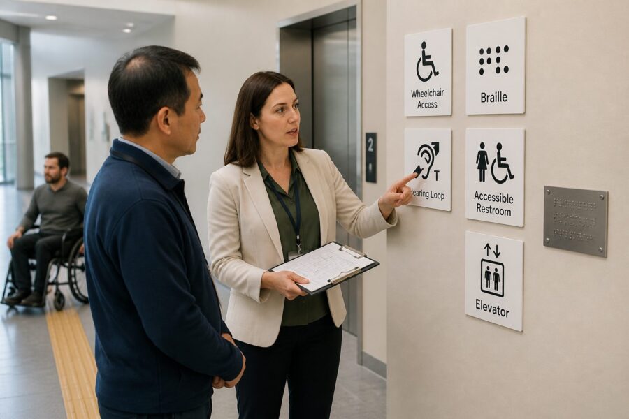
Furthermore, accessible design often benefits a much wider population than initially intended, including parents with strollers, delivery personnel, or individuals with temporary injuries. These “curb cut effects” demonstrate the broad utility of inclusive solutions. What helps one group often helps everyone.
Ultimately, the investment in accessibility pictograms and inclusive design is an investment in human dignity, economic prosperity, and a stronger, more cohesive society. It creates environments where everyone can thrive. This is a goal worth pursuing with dedication.
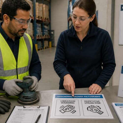
From a logistics perspective, an accessible warehouse or distribution center improves employee morale and reduces accidents by clearly delineating accessible routes and safety features. This attention to detail creates a safer, more efficient working environment for all staff. It is a win-win for both people and productivity.
Future Trends in Accessibility Symbology and Technology
The field of accessibility symbology is not static; it continually evolves with advancements in technology and a deeper understanding of diverse human needs. Future trends point towards more dynamic, integrated, and personalized accessibility solutions. These innovations promise even greater inclusivity.
One significant trend involves the integration of digital information with physical accessibility pictograms. QR codes or NFC tags embedded near symbols could link users to detailed audio descriptions, sign language videos, or real-time navigation assistance. This creates a rich, layered information experience.
Smart building technology offers immense potential for dynamic accessibility. Sensors could detect a user’s specific needs and trigger personalized guidance, such as illuminated pathways for visually impaired individuals or haptic feedback for those with hearing impairments. Buildings could actively adapt to individual requirements.
Augmented Reality (AR) applications are also emerging, allowing users to point their smartphone cameras at a physical space and see overlays of accessibility information. This technology could provide virtual accessibility pictograms, directional arrows, and even verbal instructions in real-time. AR offers a highly interactive way to navigate.
The development of more inclusive and active accessibility pictograms is another area of focus. Designs that depict a wider range of disabilities and emphasize active participation are gaining traction. These symbols aim to challenge outdated perceptions and promote a more positive image of disability.
Personalized accessibility profiles, stored on smartphones or wearable devices, could allow environments to automatically adjust to an individual’s preferences. For example, a building’s signage could switch to large print or high contrast based on a user’s pre-set profile. This level of customization is truly transformative.
The expansion of accessibility symbols beyond traditional physical spaces into digital interfaces is also crucial. Websites and applications increasingly use accessibility pictograms to indicate features like screen reader compatibility or keyboard navigation options. Digital accessibility is just as important as physical accessibility.
Voice-activated systems and AI-powered assistants will further enhance accessibility, allowing users to verbally inquire about accessible features or routes. These technologies reduce the reliance on purely visual cues, offering alternative modes of interaction. They provide a hands-free navigation experience.
As these technologies mature, the role of standardized accessibility pictograms will remain foundational, serving as the anchor for these advanced systems. The physical symbols provide the initial prompt, while technology offers deeper, personalized layers of information. This synergy creates truly comprehensive accessibility solutions.
Ultimately, the future of accessibility symbology lies in creating seamless, intuitive, and adaptable experiences that empower every individual to navigate the world independently. This continuous innovation reflects a growing global commitment to universal inclusion. It is an exciting time for accessibility advancements.
Ensuring Compliance and Best Practices in Symbology
Achieving and maintaining high standards for accessibility pictograms requires a proactive approach to compliance and the consistent application of best practices. It is not enough to simply install symbols; regular monitoring, updates, and education are essential for long-term effectiveness. This commitment ensures ongoing accessibility.
Regular audits of existing signage and facility features are crucial to identify any deficiencies or areas needing improvement. These audits should assess not only the presence of symbols but also their condition, placement, and adherence to current standards like ISO 7001. A thorough audit prevents oversight.
Developing a comprehensive accessibility plan for any new construction or renovation project is a fundamental best practice. This plan should integrate accessibility pictograms from the initial design phase, ensuring they are seamlessly incorporated into the overall facility layout. Early planning saves time and money.
Engaging with accessibility consultants and advocacy groups can provide invaluable insights and ensure that designs meet the real-world needs of diverse user groups. Their expertise offers a practical perspective beyond theoretical guidelines. Collaboration leads to better outcomes.
Providing ongoing training for staff, particularly those in customer service, facility management, and safety roles, is another critical best practice. Knowledgeable staff can support users, answer questions, and report issues with accessibility pictograms promptly. Human support complements visual cues.
Staying informed about updates to international standards, national regulations, and emerging technologies is vital for maintaining compliance and adopting innovative solutions. The landscape of accessibility is always evolving, requiring continuous learning. This vigilance keeps facilities current and compliant.
For large organizations, establishing an internal accessibility committee or appointing a dedicated accessibility officer can help champion these efforts and ensure consistent implementation across all properties. Centralized oversight promotes uniformity and accountability. It drives a culture of inclusion.
Documentation of all accessibility features, including the types and locations of accessibility pictograms, is also important for maintenance, future planning, and demonstrating compliance. Accurate records simplify future audits and ensure historical continuity. Good record-keeping is a professional necessity.
Ultimately, a commitment to best practices in accessibility symbology reflects a broader organizational dedication to inclusion, safety, and operational excellence. It creates environments that are not just compliant, but genuinely welcoming and functional for everyone. This dedication sets leading organizations apart.
This proactive approach ensures that facilities, whether a public building, a retail space, or a large industrial warehouse, remain accessible and safe for all individuals. It demonstrates a commitment to ethical operations and superior logistics. Adherence to these principles benefits the entire community.
The Indispensable Role of Accessibility Pictograms
Accessibility pictograms are far more than simple images; they are indispensable tools for fostering truly inclusive environments and ensuring safety for all. These symbols represent a universal language that transcends barriers, guiding individuals with diverse needs through our complex world. Their importance cannot be overstated in modern facility design.
Adherence to international standards like ISO 7001 provides the crucial framework for consistent and effective communication across borders and cultures. This standardization prevents confusion and ensures that accessibility labeling is universally understood. It is the bedrock of global inclusion.
From public buildings to private businesses, and especially within critical logistics hubs like warehouses, clear and standardized accessibility pictograms are essential. They empower individuals to navigate independently, access services, and respond effectively in emergencies. This empowerment is a cornerstone of human dignity.
The ongoing evolution of these symbols, coupled with technological advancements, promises an even more integrated and personalized future for accessibility. As we move forward, our commitment to robust standards and thoughtful implementation must remain unwavering. This continuous effort benefits everyone in society.
Ultimately, by prioritizing accessibility pictograms, we build a world that is not only safer and more efficient but also more equitable and welcoming for every individual. This collective effort defines our commitment to universal design principles. We create spaces where everyone can thrive.
The sheer volume of different accessibility needs also presents a challenge, as creating a unique pictogram for every single condition becomes impractical. Balancing specificity with simplicity is a delicate act in symbol design. Overly complex systems defeat the purpose of quick communication.
Overcoming these challenges requires a concerted effort from governments, industry bodies, advocacy groups, and individual facility owners. Promoting universal standards, providing clear guidance, and enforcing compliance are all critical steps. We must work together to create truly inclusive environments.
The Economic and Social Benefits of Inclusive Labeling
Investing in comprehensive accessibility pictograms and inclusive facility design yields significant economic and social returns that extend far beyond mere compliance. Businesses and public services that prioritize accessibility tap into a broader customer base and foster a more positive public image. This commitment translates into tangible benefits.
Economically, an accessible environment attracts more patrons, including individuals with disabilities, their families, and friends, who represent a substantial market segment. This increased foot traffic and patronage directly boosts revenue for retail, hospitality, and entertainment venues. Inclusive practices are good for business.
For employers, an accessible workplace expands the talent pool, allowing them to recruit and retain skilled employees with disabilities. This diversity brings new perspectives and strengthens the workforce, contributing to innovation and productivity. A diverse workforce is a stronger workforce.
Reduced liability risks are another significant economic benefit, as adherence to accessibility standards minimizes the likelihood of costly lawsuits and penalties. Proactive compliance is always less expensive than reactive litigation. It protects an organization’s reputation and finances.
Socially, inclusive labeling fosters a more equitable and respectful society where everyone feels valued and empowered to participate fully. It removes barriers that can lead to isolation and dependence, promoting independence and self-reliance. This societal benefit is immeasurable.
Clear accessibility pictograms enhance public safety by ensuring that critical information, especially during emergencies, is accessible to all. This reduces the risk of injury or fatality for vulnerable populations. Safety is a fundamental right that inclusive design helps protect.
A reputation for inclusivity attracts tourism and international visitors, who actively seek out accessible destinations and services. Cities and businesses known for their accessibility gain a competitive edge in the global market. This positive image translates into real economic growth.
Furthermore, accessible design often benefits a much wider population than initially intended, including parents with strollers, delivery personnel, or individuals with temporary injuries. These “curb cut effects” demonstrate the broad utility of inclusive solutions. What helps one group often helps everyone.
Ultimately, the investment in accessibility pictograms and inclusive design is an investment in human dignity, economic prosperity, and a stronger, more cohesive society. It creates environments where everyone can thrive. This is a goal worth pursuing with dedication.
From a logistics perspective, an accessible warehouse or distribution center improves employee morale and reduces accidents by clearly delineating accessible routes and safety features. This attention to detail creates a safer, more efficient working environment for all staff. It is a win-win for both people and productivity.
Future Trends in Accessibility Symbology and Technology
The field of accessibility symbology is not static; it continually evolves with advancements in technology and a deeper understanding of diverse human needs. Future trends point towards more dynamic, integrated, and personalized accessibility solutions. These innovations promise even greater inclusivity.
One significant trend involves the integration of digital information with physical accessibility pictograms. QR codes or NFC tags embedded near symbols could link users to detailed audio descriptions, sign language videos, or real-time navigation assistance. This creates a rich, layered information experience.
Smart building technology offers immense potential for dynamic accessibility. Sensors could detect a user’s specific needs and trigger personalized guidance, such as illuminated pathways for visually impaired individuals or haptic feedback for those with hearing impairments. Buildings could actively adapt to individual requirements.
Augmented Reality (AR) applications are also emerging, allowing users to point their smartphone cameras at a physical space and see overlays of accessibility information. This technology could provide virtual accessibility pictograms, directional arrows, and even verbal instructions in real-time. AR offers a highly interactive way to navigate.
The development of more inclusive and active accessibility pictograms is another area of focus. Designs that depict a wider range of disabilities and emphasize active participation are gaining traction. These symbols aim to challenge outdated perceptions and promote a more positive image of disability.
Personalized accessibility profiles, stored on smartphones or wearable devices, could allow environments to automatically adjust to an individual’s preferences. For example, a building’s signage could switch to large print or high contrast based on a user’s pre-set profile. This level of customization is truly transformative.
The expansion of accessibility symbols beyond traditional physical spaces into digital interfaces is also crucial. Websites and applications increasingly use accessibility pictograms to indicate features like screen reader compatibility or keyboard navigation options. Digital accessibility is just as important as physical accessibility.
Voice-activated systems and AI-powered assistants will further enhance accessibility, allowing users to verbally inquire about accessible features or routes. These technologies reduce the reliance on purely visual cues, offering alternative modes of interaction. They provide a hands-free navigation experience.
As these technologies mature, the role of standardized accessibility pictograms will remain foundational, serving as the anchor for these advanced systems. The physical symbols provide the initial prompt, while technology offers deeper, personalized layers of information. This synergy creates truly comprehensive accessibility solutions.
Ultimately, the future of accessibility symbology lies in creating seamless, intuitive, and adaptable experiences that empower every individual to navigate the world independently. This continuous innovation reflects a growing global commitment to universal inclusion. It is an exciting time for accessibility advancements.
Ensuring Compliance and Best Practices in Symbology
Achieving and maintaining high standards for accessibility pictograms requires a proactive approach to compliance and the consistent application of best practices. It is not enough to simply install symbols; regular monitoring, updates, and education are essential for long-term effectiveness. This commitment ensures ongoing accessibility.
Regular audits of existing signage and facility features are crucial to identify any deficiencies or areas needing improvement. These audits should assess not only the presence of symbols but also their condition, placement, and adherence to current standards like ISO 7001. A thorough audit prevents oversight.
Developing a comprehensive accessibility plan for any new construction or renovation project is a fundamental best practice. This plan should integrate accessibility pictograms from the initial design phase, ensuring they are seamlessly incorporated into the overall facility layout. Early planning saves time and money.
Engaging with accessibility consultants and advocacy groups can provide invaluable insights and ensure that designs meet the real-world needs of diverse user groups. Their expertise offers a practical perspective beyond theoretical guidelines. Collaboration leads to better outcomes.
Providing ongoing training for staff, particularly those in customer service, facility management, and safety roles, is another critical best practice. Knowledgeable staff can support users, answer questions, and report issues with accessibility pictograms promptly. Human support complements visual cues.
Staying informed about updates to international standards, national regulations, and emerging technologies is vital for maintaining compliance and adopting innovative solutions. The landscape of accessibility is always evolving, requiring continuous learning. This vigilance keeps facilities current and compliant.
For large organizations, establishing an internal accessibility committee or appointing a dedicated accessibility officer can help champion these efforts and ensure consistent implementation across all properties. Centralized oversight promotes uniformity and accountability. It drives a culture of inclusion.
Documentation of all accessibility features, including the types and locations of accessibility pictograms, is also important for maintenance, future planning, and demonstrating compliance. Accurate records simplify future audits and ensure historical continuity. Good record-keeping is a professional necessity.
Ultimately, a commitment to best practices in accessibility symbology reflects a broader organizational dedication to inclusion, safety, and operational excellence. It creates environments that are not just compliant, but genuinely welcoming and functional for everyone. This dedication sets leading organizations apart.
This proactive approach ensures that facilities, whether a public building, a retail space, or a large industrial warehouse, remain accessible and safe for all individuals. It demonstrates a commitment to ethical operations and superior logistics. Adherence to these principles benefits the entire community.
The Indispensable Role of Accessibility Pictograms
Accessibility pictograms are far more than simple images; they are indispensable tools for fostering truly inclusive environments and ensuring safety for all. These symbols represent a universal language that transcends barriers, guiding individuals with diverse needs through our complex world. Their importance cannot be overstated in modern facility design.
Adherence to international standards like ISO 7001 provides the crucial framework for consistent and effective communication across borders and cultures. This standardization prevents confusion and ensures that accessibility labeling is universally understood. It is the bedrock of global inclusion.
From public buildings to private businesses, and especially within critical logistics hubs like warehouses, clear and standardized accessibility pictograms are essential. They empower individuals to navigate independently, access services, and respond effectively in emergencies. This empowerment is a cornerstone of human dignity.
The ongoing evolution of these symbols, coupled with technological advancements, promises an even more integrated and personalized future for accessibility. As we move forward, our commitment to robust standards and thoughtful implementation must remain unwavering. This continuous effort benefits everyone in society.
Ultimately, by prioritizing accessibility pictograms, we build a world that is not only safer and more efficient but also more equitable and welcoming for every individual. This collective effort defines our commitment to universal design principles. We create spaces where everyone can thrive.
The sheer volume of different accessibility needs also presents a challenge, as creating a unique pictogram for every single condition becomes impractical. Balancing specificity with simplicity is a delicate act in symbol design. Overly complex systems defeat the purpose of quick communication.
Overcoming these challenges requires a concerted effort from governments, industry bodies, advocacy groups, and individual facility owners. Promoting universal standards, providing clear guidance, and enforcing compliance are all critical steps. We must work together to create truly inclusive environments.
The Economic and Social Benefits of Inclusive Labeling
Investing in comprehensive accessibility pictograms and inclusive facility design yields significant economic and social returns that extend far beyond mere compliance. Businesses and public services that prioritize accessibility tap into a broader customer base and foster a more positive public image. This commitment translates into tangible benefits.
Economically, an accessible environment attracts more patrons, including individuals with disabilities, their families, and friends, who represent a substantial market segment. This increased foot traffic and patronage directly boosts revenue for retail, hospitality, and entertainment venues. Inclusive practices are good for business.
For employers, an accessible workplace expands the talent pool, allowing them to recruit and retain skilled employees with disabilities. This diversity brings new perspectives and strengthens the workforce, contributing to innovation and productivity. A diverse workforce is a stronger workforce.
Reduced liability risks are another significant economic benefit, as adherence to accessibility standards minimizes the likelihood of costly lawsuits and penalties. Proactive compliance is always less expensive than reactive litigation. It protects an organization’s reputation and finances.
Socially, inclusive labeling fosters a more equitable and respectful society where everyone feels valued and empowered to participate fully. It removes barriers that can lead to isolation and dependence, promoting independence and self-reliance. This societal benefit is immeasurable.
Clear accessibility pictograms enhance public safety by ensuring that critical information, especially during emergencies, is accessible to all. This reduces the risk of injury or fatality for vulnerable populations. Safety is a fundamental right that inclusive design helps protect.
A reputation for inclusivity attracts tourism and international visitors, who actively seek out accessible destinations and services. Cities and businesses known for their accessibility gain a competitive edge in the global market. This positive image translates into real economic growth.
Furthermore, accessible design often benefits a much wider population than initially intended, including parents with strollers, delivery personnel, or individuals with temporary injuries. These “curb cut effects” demonstrate the broad utility of inclusive solutions. What helps one group often helps everyone.
Ultimately, the investment in accessibility pictograms and inclusive design is an investment in human dignity, economic prosperity, and a stronger, more cohesive society. It creates environments where everyone can thrive. This is a goal worth pursuing with dedication.
From a logistics perspective, an accessible warehouse or distribution center improves employee morale and reduces accidents by clearly delineating accessible routes and safety features. This attention to detail creates a safer, more efficient working environment for all staff. It is a win-win for both people and productivity.
Future Trends in Accessibility Symbology and Technology
The field of accessibility symbology is not static; it continually evolves with advancements in technology and a deeper understanding of diverse human needs. Future trends point towards more dynamic, integrated, and personalized accessibility solutions. These innovations promise even greater inclusivity.
One significant trend involves the integration of digital information with physical accessibility pictograms. QR codes or NFC tags embedded near symbols could link users to detailed audio descriptions, sign language videos, or real-time navigation assistance. This creates a rich, layered information experience.
Smart building technology offers immense potential for dynamic accessibility. Sensors could detect a user’s specific needs and trigger personalized guidance, such as illuminated pathways for visually impaired individuals or haptic feedback for those with hearing impairments. Buildings could actively adapt to individual requirements.
Augmented Reality (AR) applications are also emerging, allowing users to point their smartphone cameras at a physical space and see overlays of accessibility information. This technology could provide virtual accessibility pictograms, directional arrows, and even verbal instructions in real-time. AR offers a highly interactive way to navigate.
The development of more inclusive and active accessibility pictograms is another area of focus. Designs that depict a wider range of disabilities and emphasize active participation are gaining traction. These symbols aim to challenge outdated perceptions and promote a more positive image of disability.
Personalized accessibility profiles, stored on smartphones or wearable devices, could allow environments to automatically adjust to an individual’s preferences. For example, a building’s signage could switch to large print or high contrast based on a user’s pre-set profile. This level of customization is truly transformative.
The expansion of accessibility symbols beyond traditional physical spaces into digital interfaces is also crucial. Websites and applications increasingly use accessibility pictograms to indicate features like screen reader compatibility or keyboard navigation options. Digital accessibility is just as important as physical accessibility.
Voice-activated systems and AI-powered assistants will further enhance accessibility, allowing users to verbally inquire about accessible features or routes. These technologies reduce the reliance on purely visual cues, offering alternative modes of interaction. They provide a hands-free navigation experience.
As these technologies mature, the role of standardized accessibility pictograms will remain foundational, serving as the anchor for these advanced systems. The physical symbols provide the initial prompt, while technology offers deeper, personalized layers of information. This synergy creates truly comprehensive accessibility solutions.
Ultimately, the future of accessibility symbology lies in creating seamless, intuitive, and adaptable experiences that empower every individual to navigate the world independently. This continuous innovation reflects a growing global commitment to universal inclusion. It is an exciting time for accessibility advancements.
Ensuring Compliance and Best Practices in Symbology
Achieving and maintaining high standards for accessibility pictograms requires a proactive approach to compliance and the consistent application of best practices. It is not enough to simply install symbols; regular monitoring, updates, and education are essential for long-term effectiveness. This commitment ensures ongoing accessibility.
Regular audits of existing signage and facility features are crucial to identify any deficiencies or areas needing improvement. These audits should assess not only the presence of symbols but also their condition, placement, and adherence to current standards like ISO 7001. A thorough audit prevents oversight.
Developing a comprehensive accessibility plan for any new construction or renovation project is a fundamental best practice. This plan should integrate accessibility pictograms from the initial design phase, ensuring they are seamlessly incorporated into the overall facility layout. Early planning saves time and money.
Engaging with accessibility consultants and advocacy groups can provide invaluable insights and ensure that designs meet the real-world needs of diverse user groups. Their expertise offers a practical perspective beyond theoretical guidelines. Collaboration leads to better outcomes.
Providing ongoing training for staff, particularly those in customer service, facility management, and safety roles, is another critical best practice. Knowledgeable staff can support users, answer questions, and report issues with accessibility pictograms promptly. Human support complements visual cues.
Staying informed about updates to international standards, national regulations, and emerging technologies is vital for maintaining compliance and adopting innovative solutions. The landscape of accessibility is always evolving, requiring continuous learning. This vigilance keeps facilities current and compliant.
For large organizations, establishing an internal accessibility committee or appointing a dedicated accessibility officer can help champion these efforts and ensure consistent implementation across all properties. Centralized oversight promotes uniformity and accountability. It drives a culture of inclusion.
Documentation of all accessibility features, including the types and locations of accessibility pictograms, is also important for maintenance, future planning, and demonstrating compliance. Accurate records simplify future audits and ensure historical continuity. Good record-keeping is a professional necessity.
Ultimately, a commitment to best practices in accessibility symbology reflects a broader organizational dedication to inclusion, safety, and operational excellence. It creates environments that are not just compliant, but genuinely welcoming and functional for everyone. This dedication sets leading organizations apart.
This proactive approach ensures that facilities, whether a public building, a retail space, or a large industrial warehouse, remain accessible and safe for all individuals. It demonstrates a commitment to ethical operations and superior logistics. Adherence to these principles benefits the entire community.
The Indispensable Role of Accessibility Pictograms
Accessibility pictograms are far more than simple images; they are indispensable tools for fostering truly inclusive environments and ensuring safety for all. These symbols represent a universal language that transcends barriers, guiding individuals with diverse needs through our complex world. Their importance cannot be overstated in modern facility design.
Adherence to international standards like ISO 7001 provides the crucial framework for consistent and effective communication across borders and cultures. This standardization prevents confusion and ensures that accessibility labeling is universally understood. It is the bedrock of global inclusion.
From public buildings to private businesses, and especially within critical logistics hubs like warehouses, clear and standardized accessibility pictograms are essential. They empower individuals to navigate independently, access services, and respond effectively in emergencies. This empowerment is a cornerstone of human dignity.
The ongoing evolution of these symbols, coupled with technological advancements, promises an even more integrated and personalized future for accessibility. As we move forward, our commitment to robust standards and thoughtful implementation must remain unwavering. This continuous effort benefits everyone in society.
Ultimately, by prioritizing accessibility pictograms, we build a world that is not only safer and more efficient but also more equitable and welcoming for every individual. This collective effort defines our commitment to universal design principles. We create spaces where everyone can thrive.
Integrating tactile elements, such as raised symbols and braille text, alongside visual pictograms further enhances accessibility for individuals with visual impairments. This multi-sensory approach ensures that information is conveyed through various channels. It provides redundancy for critical information.
Regular audits of existing signage are essential to ensure continued compliance and effectiveness. Faded, damaged, or obscured accessibility pictograms are useless and must be replaced promptly. Maintenance is a continuous process, not a one-time task.
Training staff on the meaning and importance of accessibility pictograms also contributes to a more inclusive environment. Knowledgeable staff can assist users who may still have questions, even with clear signage. Human interaction complements effective labeling.
Ultimately, effective pictogram labeling is a commitment to ensuring every person can navigate and utilize a facility with confidence and dignity. It reflects a proactive stance on inclusion and safety. This dedication to detail makes a real difference in people’s lives.
Considering the broader logistics of a large campus or warehouse environment, clear accessibility pictograms guide individuals to designated accessible routes, emergency exits, and specific service points. This structured approach to labeling prevents confusion and enhances operational efficiency. It’s a critical aspect of modern facility management.
Pictograms in Safety and Emergency Logistics
Accessibility pictograms are not just about convenience; they are integral to safety and emergency logistics, particularly for individuals with disabilities. During an emergency, clear and unambiguous symbols can mean the difference between safety and severe danger. They guide people to secure locations efficiently.
Emergency exit symbols, accessible refuge areas, and assembly points must be clearly marked with universally understood pictograms. These symbols ensure that all occupants, including those with mobility challenges or sensory impairments, can locate safe routes and assistance. Effective labeling saves lives in critical situations.
- Identify accessible evacuation routes
- Mark accessible refuge areas
- Indicate emergency assistance points
- Highlight accessible first aid stations
- Show locations of emergency communication devices
Challenges in Adoption and Enforcement of Standards
Despite the clear benefits and existence of international standards, widespread and consistent adoption of accessibility pictograms still faces significant challenges. One major hurdle is the sheer diversity of local regulations and interpretations, which can lead to variations in symbol design and application. This lack of uniformity creates confusion for users.
Many older buildings and infrastructure predate modern accessibility standards, making retrofitting a complex and often expensive undertaking. The cost of updating signage and making structural modifications can deter property owners from full compliance. Economic considerations often clash with accessibility mandates.
A lack of awareness among designers, architects, and facility managers about the specific requirements of ISO standards or national guidelines also contributes to inconsistent implementation. Education and training are essential to bridge this knowledge gap. Without proper understanding, mistakes are inevitable.
Enforcement mechanisms vary widely by region, with some areas having robust inspection and penalty systems, while others have minimal oversight. This disparity means that compliance can be inconsistent, even within the same country. Stronger enforcement is needed to ensure adherence.
The “International Symbol of Access” itself has faced criticism for its static, passive depiction of a wheelchair user, prompting discussions about more active and inclusive alternatives. While some new designs exist, widespread adoption requires overcoming inertia and established recognition. Changing a globally recognized symbol is a monumental task.
Furthermore, the rapid evolution of technology and assistive devices means that standards must constantly adapt to remain relevant. What constitutes “accessible” today might be outdated tomorrow, requiring continuous updates to guidelines and symbols. The standards bodies must remain agile and responsive.
The sheer volume of different accessibility needs also presents a challenge, as creating a unique pictogram for every single condition becomes impractical. Balancing specificity with simplicity is a delicate act in symbol design. Overly complex systems defeat the purpose of quick communication.
Overcoming these challenges requires a concerted effort from governments, industry bodies, advocacy groups, and individual facility owners. Promoting universal standards, providing clear guidance, and enforcing compliance are all critical steps. We must work together to create truly inclusive environments.
The Economic and Social Benefits of Inclusive Labeling
Investing in comprehensive accessibility pictograms and inclusive facility design yields significant economic and social returns that extend far beyond mere compliance. Businesses and public services that prioritize accessibility tap into a broader customer base and foster a more positive public image. This commitment translates into tangible benefits.
Economically, an accessible environment attracts more patrons, including individuals with disabilities, their families, and friends, who represent a substantial market segment. This increased foot traffic and patronage directly boosts revenue for retail, hospitality, and entertainment venues. Inclusive practices are good for business.
For employers, an accessible workplace expands the talent pool, allowing them to recruit and retain skilled employees with disabilities. This diversity brings new perspectives and strengthens the workforce, contributing to innovation and productivity. A diverse workforce is a stronger workforce.
Reduced liability risks are another significant economic benefit, as adherence to accessibility standards minimizes the likelihood of costly lawsuits and penalties. Proactive compliance is always less expensive than reactive litigation. It protects an organization’s reputation and finances.
Socially, inclusive labeling fosters a more equitable and respectful society where everyone feels valued and empowered to participate fully. It removes barriers that can lead to isolation and dependence, promoting independence and self-reliance. This societal benefit is immeasurable.
Clear accessibility pictograms enhance public safety by ensuring that critical information, especially during emergencies, is accessible to all. This reduces the risk of injury or fatality for vulnerable populations. Safety is a fundamental right that inclusive design helps protect.
A reputation for inclusivity attracts tourism and international visitors, who actively seek out accessible destinations and services. Cities and businesses known for their accessibility gain a competitive edge in the global market. This positive image translates into real economic growth.
Furthermore, accessible design often benefits a much wider population than initially intended, including parents with strollers, delivery personnel, or individuals with temporary injuries. These “curb cut effects” demonstrate the broad utility of inclusive solutions. What helps one group often helps everyone.
Ultimately, the investment in accessibility pictograms and inclusive design is an investment in human dignity, economic prosperity, and a stronger, more cohesive society. It creates environments where everyone can thrive. This is a goal worth pursuing with dedication.
From a logistics perspective, an accessible warehouse or distribution center improves employee morale and reduces accidents by clearly delineating accessible routes and safety features. This attention to detail creates a safer, more efficient working environment for all staff. It is a win-win for both people and productivity.
Future Trends in Accessibility Symbology and Technology
The field of accessibility symbology is not static; it continually evolves with advancements in technology and a deeper understanding of diverse human needs. Future trends point towards more dynamic, integrated, and personalized accessibility solutions. These innovations promise even greater inclusivity.
One significant trend involves the integration of digital information with physical accessibility pictograms. QR codes or NFC tags embedded near symbols could link users to detailed audio descriptions, sign language videos, or real-time navigation assistance. This creates a rich, layered information experience.
Smart building technology offers immense potential for dynamic accessibility. Sensors could detect a user’s specific needs and trigger personalized guidance, such as illuminated pathways for visually impaired individuals or haptic feedback for those with hearing impairments. Buildings could actively adapt to individual requirements.
Augmented Reality (AR) applications are also emerging, allowing users to point their smartphone cameras at a physical space and see overlays of accessibility information. This technology could provide virtual accessibility pictograms, directional arrows, and even verbal instructions in real-time. AR offers a highly interactive way to navigate.
The development of more inclusive and active accessibility pictograms is another area of focus. Designs that depict a wider range of disabilities and emphasize active participation are gaining traction. These symbols aim to challenge outdated perceptions and promote a more positive image of disability.
Personalized accessibility profiles, stored on smartphones or wearable devices, could allow environments to automatically adjust to an individual’s preferences. For example, a building’s signage could switch to large print or high contrast based on a user’s pre-set profile. This level of customization is truly transformative.
The expansion of accessibility symbols beyond traditional physical spaces into digital interfaces is also crucial. Websites and applications increasingly use accessibility pictograms to indicate features like screen reader compatibility or keyboard navigation options. Digital accessibility is just as important as physical accessibility.
Voice-activated systems and AI-powered assistants will further enhance accessibility, allowing users to verbally inquire about accessible features or routes. These technologies reduce the reliance on purely visual cues, offering alternative modes of interaction. They provide a hands-free navigation experience.
As these technologies mature, the role of standardized accessibility pictograms will remain foundational, serving as the anchor for these advanced systems. The physical symbols provide the initial prompt, while technology offers deeper, personalized layers of information. This synergy creates truly comprehensive accessibility solutions.
Ultimately, the future of accessibility symbology lies in creating seamless, intuitive, and adaptable experiences that empower every individual to navigate the world independently. This continuous innovation reflects a growing global commitment to universal inclusion. It is an exciting time for accessibility advancements.
Ensuring Compliance and Best Practices in Symbology
Achieving and maintaining high standards for accessibility pictograms requires a proactive approach to compliance and the consistent application of best practices. It is not enough to simply install symbols; regular monitoring, updates, and education are essential for long-term effectiveness. This commitment ensures ongoing accessibility.
Regular audits of existing signage and facility features are crucial to identify any deficiencies or areas needing improvement. These audits should assess not only the presence of symbols but also their condition, placement, and adherence to current standards like ISO 7001. A thorough audit prevents oversight.
Developing a comprehensive accessibility plan for any new construction or renovation project is a fundamental best practice. This plan should integrate accessibility pictograms from the initial design phase, ensuring they are seamlessly incorporated into the overall facility layout. Early planning saves time and money.
Engaging with accessibility consultants and advocacy groups can provide invaluable insights and ensure that designs meet the real-world needs of diverse user groups. Their expertise offers a practical perspective beyond theoretical guidelines. Collaboration leads to better outcomes.
Providing ongoing training for staff, particularly those in customer service, facility management, and safety roles, is another critical best practice. Knowledgeable staff can support users, answer questions, and report issues with accessibility pictograms promptly. Human support complements visual cues.
Staying informed about updates to international standards, national regulations, and emerging technologies is vital for maintaining compliance and adopting innovative solutions. The landscape of accessibility is always evolving, requiring continuous learning. This vigilance keeps facilities current and compliant.
For large organizations, establishing an internal accessibility committee or appointing a dedicated accessibility officer can help champion these efforts and ensure consistent implementation across all properties. Centralized oversight promotes uniformity and accountability. It drives a culture of inclusion.
Documentation of all accessibility features, including the types and locations of accessibility pictograms, is also important for maintenance, future planning, and demonstrating compliance. Accurate records simplify future audits and ensure historical continuity. Good record-keeping is a professional necessity.
Ultimately, a commitment to best practices in accessibility symbology reflects a broader organizational dedication to inclusion, safety, and operational excellence. It creates environments that are not just compliant, but genuinely welcoming and functional for everyone. This dedication sets leading organizations apart.
This proactive approach ensures that facilities, whether a public building, a retail space, or a large industrial warehouse, remain accessible and safe for all individuals. It demonstrates a commitment to ethical operations and superior logistics. Adherence to these principles benefits the entire community.
The Indispensable Role of Accessibility Pictograms
Accessibility pictograms are far more than simple images; they are indispensable tools for fostering truly inclusive environments and ensuring safety for all. These symbols represent a universal language that transcends barriers, guiding individuals with diverse needs through our complex world. Their importance cannot be overstated in modern facility design.
Adherence to international standards like ISO 7001 provides the crucial framework for consistent and effective communication across borders and cultures. This standardization prevents confusion and ensures that accessibility labeling is universally understood. It is the bedrock of global inclusion.
From public buildings to private businesses, and especially within critical logistics hubs like warehouses, clear and standardized accessibility pictograms are essential. They empower individuals to navigate independently, access services, and respond effectively in emergencies. This empowerment is a cornerstone of human dignity.
The ongoing evolution of these symbols, coupled with technological advancements, promises an even more integrated and personalized future for accessibility. As we move forward, our commitment to robust standards and thoughtful implementation must remain unwavering. This continuous effort benefits everyone in society.
Ultimately, by prioritizing accessibility pictograms, we build a world that is not only safer and more efficient but also more equitable and welcoming for every individual. This collective effort defines our commitment to universal design principles. We create spaces where everyone can thrive.
Integrating tactile elements, such as raised symbols and braille text, alongside visual pictograms further enhances accessibility for individuals with visual impairments. This multi-sensory approach ensures that information is conveyed through various channels. It provides redundancy for critical information.
Regular audits of existing signage are essential to ensure continued compliance and effectiveness. Faded, damaged, or obscured accessibility pictograms are useless and must be replaced promptly. Maintenance is a continuous process, not a one-time task.
Training staff on the meaning and importance of accessibility pictograms also contributes to a more inclusive environment. Knowledgeable staff can assist users who may still have questions, even with clear signage. Human interaction complements effective labeling.
Ultimately, effective pictogram labeling is a commitment to ensuring every person can navigate and utilize a facility with confidence and dignity. It reflects a proactive stance on inclusion and safety. This dedication to detail makes a real difference in people’s lives.
Considering the broader logistics of a large campus or warehouse environment, clear accessibility pictograms guide individuals to designated accessible routes, emergency exits, and specific service points. This structured approach to labeling prevents confusion and enhances operational efficiency. It’s a critical aspect of modern facility management.
Pictograms in Safety and Emergency Logistics
Accessibility pictograms are not just about convenience; they are integral to safety and emergency logistics, particularly for individuals with disabilities. During an emergency, clear and unambiguous symbols can mean the difference between safety and severe danger. They guide people to secure locations efficiently.
Emergency exit symbols, accessible refuge areas, and assembly points must be clearly marked with universally understood pictograms. These symbols ensure that all occupants, including those with mobility challenges or sensory impairments, can locate safe routes and assistance. Effective labeling saves lives in critical situations.
- Identify accessible evacuation routes
- Mark accessible refuge areas
- Indicate emergency assistance points
- Highlight accessible first aid stations
- Show locations of emergency communication devices
Challenges in Adoption and Enforcement of Standards
Despite the clear benefits and existence of international standards, widespread and consistent adoption of accessibility pictograms still faces significant challenges. One major hurdle is the sheer diversity of local regulations and interpretations, which can lead to variations in symbol design and application. This lack of uniformity creates confusion for users.
Many older buildings and infrastructure predate modern accessibility standards, making retrofitting a complex and often expensive undertaking. The cost of updating signage and making structural modifications can deter property owners from full compliance. Economic considerations often clash with accessibility mandates.
A lack of awareness among designers, architects, and facility managers about the specific requirements of ISO standards or national guidelines also contributes to inconsistent implementation. Education and training are essential to bridge this knowledge gap. Without proper understanding, mistakes are inevitable.
Enforcement mechanisms vary widely by region, with some areas having robust inspection and penalty systems, while others have minimal oversight. This disparity means that compliance can be inconsistent, even within the same country. Stronger enforcement is needed to ensure adherence.
The “International Symbol of Access” itself has faced criticism for its static, passive depiction of a wheelchair user, prompting discussions about more active and inclusive alternatives. While some new designs exist, widespread adoption requires overcoming inertia and established recognition. Changing a globally recognized symbol is a monumental task.
Furthermore, the rapid evolution of technology and assistive devices means that standards must constantly adapt to remain relevant. What constitutes “accessible” today might be outdated tomorrow, requiring continuous updates to guidelines and symbols. The standards bodies must remain agile and responsive.
The sheer volume of different accessibility needs also presents a challenge, as creating a unique pictogram for every single condition becomes impractical. Balancing specificity with simplicity is a delicate act in symbol design. Overly complex systems defeat the purpose of quick communication.
Overcoming these challenges requires a concerted effort from governments, industry bodies, advocacy groups, and individual facility owners. Promoting universal standards, providing clear guidance, and enforcing compliance are all critical steps. We must work together to create truly inclusive environments.
The Economic and Social Benefits of Inclusive Labeling
Investing in comprehensive accessibility pictograms and inclusive facility design yields significant economic and social returns that extend far beyond mere compliance. Businesses and public services that prioritize accessibility tap into a broader customer base and foster a more positive public image. This commitment translates into tangible benefits.
Economically, an accessible environment attracts more patrons, including individuals with disabilities, their families, and friends, who represent a substantial market segment. This increased foot traffic and patronage directly boosts revenue for retail, hospitality, and entertainment venues. Inclusive practices are good for business.
For employers, an accessible workplace expands the talent pool, allowing them to recruit and retain skilled employees with disabilities. This diversity brings new perspectives and strengthens the workforce, contributing to innovation and productivity. A diverse workforce is a stronger workforce.
Reduced liability risks are another significant economic benefit, as adherence to accessibility standards minimizes the likelihood of costly lawsuits and penalties. Proactive compliance is always less expensive than reactive litigation. It protects an organization’s reputation and finances.
Socially, inclusive labeling fosters a more equitable and respectful society where everyone feels valued and empowered to participate fully. It removes barriers that can lead to isolation and dependence, promoting independence and self-reliance. This societal benefit is immeasurable.
Clear accessibility pictograms enhance public safety by ensuring that critical information, especially during emergencies, is accessible to all. This reduces the risk of injury or fatality for vulnerable populations. Safety is a fundamental right that inclusive design helps protect.
A reputation for inclusivity attracts tourism and international visitors, who actively seek out accessible destinations and services. Cities and businesses known for their accessibility gain a competitive edge in the global market. This positive image translates into real economic growth.
Furthermore, accessible design often benefits a much wider population than initially intended, including parents with strollers, delivery personnel, or individuals with temporary injuries. These “curb cut effects” demonstrate the broad utility of inclusive solutions. What helps one group often helps everyone.
Ultimately, the investment in accessibility pictograms and inclusive design is an investment in human dignity, economic prosperity, and a stronger, more cohesive society. It creates environments where everyone can thrive. This is a goal worth pursuing with dedication.
From a logistics perspective, an accessible warehouse or distribution center improves employee morale and reduces accidents by clearly delineating accessible routes and safety features. This attention to detail creates a safer, more efficient working environment for all staff. It is a win-win for both people and productivity.
Future Trends in Accessibility Symbology and Technology
The field of accessibility symbology is not static; it continually evolves with advancements in technology and a deeper understanding of diverse human needs. Future trends point towards more dynamic, integrated, and personalized accessibility solutions. These innovations promise even greater inclusivity.
One significant trend involves the integration of digital information with physical accessibility pictograms. QR codes or NFC tags embedded near symbols could link users to detailed audio descriptions, sign language videos, or real-time navigation assistance. This creates a rich, layered information experience.
Smart building technology offers immense potential for dynamic accessibility. Sensors could detect a user’s specific needs and trigger personalized guidance, such as illuminated pathways for visually impaired individuals or haptic feedback for those with hearing impairments. Buildings could actively adapt to individual requirements.
Augmented Reality (AR) applications are also emerging, allowing users to point their smartphone cameras at a physical space and see overlays of accessibility information. This technology could provide virtual accessibility pictograms, directional arrows, and even verbal instructions in real-time. AR offers a highly interactive way to navigate.
The development of more inclusive and active accessibility pictograms is another area of focus. Designs that depict a wider range of disabilities and emphasize active participation are gaining traction. These symbols aim to challenge outdated perceptions and promote a more positive image of disability.
Personalized accessibility profiles, stored on smartphones or wearable devices, could allow environments to automatically adjust to an individual’s preferences. For example, a building’s signage could switch to large print or high contrast based on a user’s pre-set profile. This level of customization is truly transformative.
The expansion of accessibility symbols beyond traditional physical spaces into digital interfaces is also crucial. Websites and applications increasingly use accessibility pictograms to indicate features like screen reader compatibility or keyboard navigation options. Digital accessibility is just as important as physical accessibility.
Voice-activated systems and AI-powered assistants will further enhance accessibility, allowing users to verbally inquire about accessible features or routes. These technologies reduce the reliance on purely visual cues, offering alternative modes of interaction. They provide a hands-free navigation experience.
As these technologies mature, the role of standardized accessibility pictograms will remain foundational, serving as the anchor for these advanced systems. The physical symbols provide the initial prompt, while technology offers deeper, personalized layers of information. This synergy creates truly comprehensive accessibility solutions.
Ultimately, the future of accessibility symbology lies in creating seamless, intuitive, and adaptable experiences that empower every individual to navigate the world independently. This continuous innovation reflects a growing global commitment to universal inclusion. It is an exciting time for accessibility advancements.
Ensuring Compliance and Best Practices in Symbology
Achieving and maintaining high standards for accessibility pictograms requires a proactive approach to compliance and the consistent application of best practices. It is not enough to simply install symbols; regular monitoring, updates, and education are essential for long-term effectiveness. This commitment ensures ongoing accessibility.
Regular audits of existing signage and facility features are crucial to identify any deficiencies or areas needing improvement. These audits should assess not only the presence of symbols but also their condition, placement, and adherence to current standards like ISO 7001. A thorough audit prevents oversight.
Developing a comprehensive accessibility plan for any new construction or renovation project is a fundamental best practice. This plan should integrate accessibility pictograms from the initial design phase, ensuring they are seamlessly incorporated into the overall facility layout. Early planning saves time and money.
Engaging with accessibility consultants and advocacy groups can provide invaluable insights and ensure that designs meet the real-world needs of diverse user groups. Their expertise offers a practical perspective beyond theoretical guidelines. Collaboration leads to better outcomes.
Providing ongoing training for staff, particularly those in customer service, facility management, and safety roles, is another critical best practice. Knowledgeable staff can support users, answer questions, and report issues with accessibility pictograms promptly. Human support complements visual cues.
Staying informed about updates to international standards, national regulations, and emerging technologies is vital for maintaining compliance and adopting innovative solutions. The landscape of accessibility is always evolving, requiring continuous learning. This vigilance keeps facilities current and compliant.
For large organizations, establishing an internal accessibility committee or appointing a dedicated accessibility officer can help champion these efforts and ensure consistent implementation across all properties. Centralized oversight promotes uniformity and accountability. It drives a culture of inclusion.
Documentation of all accessibility features, including the types and locations of accessibility pictograms, is also important for maintenance, future planning, and demonstrating compliance. Accurate records simplify future audits and ensure historical continuity. Good record-keeping is a professional necessity.
Ultimately, a commitment to best practices in accessibility symbology reflects a broader organizational dedication to inclusion, safety, and operational excellence. It creates environments that are not just compliant, but genuinely welcoming and functional for everyone. This dedication sets leading organizations apart.
This proactive approach ensures that facilities, whether a public building, a retail space, or a large industrial warehouse, remain accessible and safe for all individuals. It demonstrates a commitment to ethical operations and superior logistics. Adherence to these principles benefits the entire community.
The Indispensable Role of Accessibility Pictograms
Accessibility pictograms are far more than simple images; they are indispensable tools for fostering truly inclusive environments and ensuring safety for all. These symbols represent a universal language that transcends barriers, guiding individuals with diverse needs through our complex world. Their importance cannot be overstated in modern facility design.
Adherence to international standards like ISO 7001 provides the crucial framework for consistent and effective communication across borders and cultures. This standardization prevents confusion and ensures that accessibility labeling is universally understood. It is the bedrock of global inclusion.
From public buildings to private businesses, and especially within critical logistics hubs like warehouses, clear and standardized accessibility pictograms are essential. They empower individuals to navigate independently, access services, and respond effectively in emergencies. This empowerment is a cornerstone of human dignity.
The ongoing evolution of these symbols, coupled with technological advancements, promises an even more integrated and personalized future for accessibility. As we move forward, our commitment to robust standards and thoughtful implementation must remain unwavering. This continuous effort benefits everyone in society.
Ultimately, by prioritizing accessibility pictograms, we build a world that is not only safer and more efficient but also more equitable and welcoming for every individual. This collective effort defines our commitment to universal design principles. We create spaces where everyone can thrive.
Temporary disabilities, such as a broken leg or pregnancy, also benefit from well-placed accessibility pictograms. These symbols help individuals navigate spaces with temporary limitations, offering practical guidance during their recovery. Inclusive design serves everyone, even those with short-term needs.
The goal is to create environments where everyone can move freely and confidently, accessing all available services without undue difficulty. This holistic view of accessibility ensures that no one is left behind or excluded from public life. It is a fundamental aspect of societal equity.
Considering the full spectrum of human abilities and limitations leads to better, more thoughtful design solutions for all. Accessibility pictograms are the visual shorthand for this expansive vision of inclusion. They represent a commitment to serving every member of the community.
Implementing Effective Pictogram Labeling in Facilities
Proper implementation of accessibility pictograms extends beyond simply placing a symbol on a wall; it involves strategic planning, adherence to visibility guidelines, and consistent application. Effective labeling ensures that the intended message reaches all users clearly and efficiently. This requires careful consideration of placement and design.
Placement is critical; symbols must be located where they are easily seen and understood by the target audience. This means placing them at appropriate heights, in well-lit areas, and in logical proximity to the feature they describe. A symbol for an accessible restroom should be directly outside the door, not down a hallway.
Contrast and size are also paramount for visibility, especially for individuals with visual impairments. Symbols should have a high contrast ratio against their background, and their size must be appropriate for the viewing distance. Large, clear symbols are always better than small, obscure ones.
Consistency in design, color, and placement across an entire facility, or even a network of facilities, reinforces the message and aids cognitive processing. Users learn to recognize symbols quickly when they are presented uniformly. This consistency builds trust and reduces cognitive load.
For large facilities like airports, hospitals, or warehouses, a comprehensive signage plan is indispensable. This plan should map out every necessary accessibility pictogram, its exact location, and the specific standards it adheres to. Such a plan streamlines implementation and maintenance.
Integrating tactile elements, such as raised symbols and braille text, alongside visual pictograms further enhances accessibility for individuals with visual impairments. This multi-sensory approach ensures that information is conveyed through various channels. It provides redundancy for critical information.
Regular audits of existing signage are essential to ensure continued compliance and effectiveness. Faded, damaged, or obscured accessibility pictograms are useless and must be replaced promptly. Maintenance is a continuous process, not a one-time task.
Training staff on the meaning and importance of accessibility pictograms also contributes to a more inclusive environment. Knowledgeable staff can assist users who may still have questions, even with clear signage. Human interaction complements effective labeling.
Ultimately, effective pictogram labeling is a commitment to ensuring every person can navigate and utilize a facility with confidence and dignity. It reflects a proactive stance on inclusion and safety. This dedication to detail makes a real difference in people’s lives.
Considering the broader logistics of a large campus or warehouse environment, clear accessibility pictograms guide individuals to designated accessible routes, emergency exits, and specific service points. This structured approach to labeling prevents confusion and enhances operational efficiency. It’s a critical aspect of modern facility management.
Pictograms in Safety and Emergency Logistics
Accessibility pictograms are not just about convenience; they are integral to safety and emergency logistics, particularly for individuals with disabilities. During an emergency, clear and unambiguous symbols can mean the difference between safety and severe danger. They guide people to secure locations efficiently.
Emergency exit symbols, accessible refuge areas, and assembly points must be clearly marked with universally understood pictograms. These symbols ensure that all occupants, including those with mobility challenges or sensory impairments, can locate safe routes and assistance. Effective labeling saves lives in critical situations.
- Identify accessible evacuation routes
- Mark accessible refuge areas
- Indicate emergency assistance points
- Highlight accessible first aid stations
- Show locations of emergency communication devices
Challenges in Adoption and Enforcement of Standards
Despite the clear benefits and existence of international standards, widespread and consistent adoption of accessibility pictograms still faces significant challenges. One major hurdle is the sheer diversity of local regulations and interpretations, which can lead to variations in symbol design and application. This lack of uniformity creates confusion for users.
Many older buildings and infrastructure predate modern accessibility standards, making retrofitting a complex and often expensive undertaking. The cost of updating signage and making structural modifications can deter property owners from full compliance. Economic considerations often clash with accessibility mandates.
A lack of awareness among designers, architects, and facility managers about the specific requirements of ISO standards or national guidelines also contributes to inconsistent implementation. Education and training are essential to bridge this knowledge gap. Without proper understanding, mistakes are inevitable.
Enforcement mechanisms vary widely by region, with some areas having robust inspection and penalty systems, while others have minimal oversight. This disparity means that compliance can be inconsistent, even within the same country. Stronger enforcement is needed to ensure adherence.
The “International Symbol of Access” itself has faced criticism for its static, passive depiction of a wheelchair user, prompting discussions about more active and inclusive alternatives. While some new designs exist, widespread adoption requires overcoming inertia and established recognition. Changing a globally recognized symbol is a monumental task.
Furthermore, the rapid evolution of technology and assistive devices means that standards must constantly adapt to remain relevant. What constitutes “accessible” today might be outdated tomorrow, requiring continuous updates to guidelines and symbols. The standards bodies must remain agile and responsive.
The sheer volume of different accessibility needs also presents a challenge, as creating a unique pictogram for every single condition becomes impractical. Balancing specificity with simplicity is a delicate act in symbol design. Overly complex systems defeat the purpose of quick communication.
Overcoming these challenges requires a concerted effort from governments, industry bodies, advocacy groups, and individual facility owners. Promoting universal standards, providing clear guidance, and enforcing compliance are all critical steps. We must work together to create truly inclusive environments.
The Economic and Social Benefits of Inclusive Labeling
Investing in comprehensive accessibility pictograms and inclusive facility design yields significant economic and social returns that extend far beyond mere compliance. Businesses and public services that prioritize accessibility tap into a broader customer base and foster a more positive public image. This commitment translates into tangible benefits.
Economically, an accessible environment attracts more patrons, including individuals with disabilities, their families, and friends, who represent a substantial market segment. This increased foot traffic and patronage directly boosts revenue for retail, hospitality, and entertainment venues. Inclusive practices are good for business.
For employers, an accessible workplace expands the talent pool, allowing them to recruit and retain skilled employees with disabilities. This diversity brings new perspectives and strengthens the workforce, contributing to innovation and productivity. A diverse workforce is a stronger workforce.
Reduced liability risks are another significant economic benefit, as adherence to accessibility standards minimizes the likelihood of costly lawsuits and penalties. Proactive compliance is always less expensive than reactive litigation. It protects an organization’s reputation and finances.
Socially, inclusive labeling fosters a more equitable and respectful society where everyone feels valued and empowered to participate fully. It removes barriers that can lead to isolation and dependence, promoting independence and self-reliance. This societal benefit is immeasurable.
Clear accessibility pictograms enhance public safety by ensuring that critical information, especially during emergencies, is accessible to all. This reduces the risk of injury or fatality for vulnerable populations. Safety is a fundamental right that inclusive design helps protect.
A reputation for inclusivity attracts tourism and international visitors, who actively seek out accessible destinations and services. Cities and businesses known for their accessibility gain a competitive edge in the global market. This positive image translates into real economic growth.
Furthermore, accessible design often benefits a much wider population than initially intended, including parents with strollers, delivery personnel, or individuals with temporary injuries. These “curb cut effects” demonstrate the broad utility of inclusive solutions. What helps one group often helps everyone.
Ultimately, the investment in accessibility pictograms and inclusive design is an investment in human dignity, economic prosperity, and a stronger, more cohesive society. It creates environments where everyone can thrive. This is a goal worth pursuing with dedication.
From a logistics perspective, an accessible warehouse or distribution center improves employee morale and reduces accidents by clearly delineating accessible routes and safety features. This attention to detail creates a safer, more efficient working environment for all staff. It is a win-win for both people and productivity.
Future Trends in Accessibility Symbology and Technology
The field of accessibility symbology is not static; it continually evolves with advancements in technology and a deeper understanding of diverse human needs. Future trends point towards more dynamic, integrated, and personalized accessibility solutions. These innovations promise even greater inclusivity.
One significant trend involves the integration of digital information with physical accessibility pictograms. QR codes or NFC tags embedded near symbols could link users to detailed audio descriptions, sign language videos, or real-time navigation assistance. This creates a rich, layered information experience.
Smart building technology offers immense potential for dynamic accessibility. Sensors could detect a user’s specific needs and trigger personalized guidance, such as illuminated pathways for visually impaired individuals or haptic feedback for those with hearing impairments. Buildings could actively adapt to individual requirements.
Augmented Reality (AR) applications are also emerging, allowing users to point their smartphone cameras at a physical space and see overlays of accessibility information. This technology could provide virtual accessibility pictograms, directional arrows, and even verbal instructions in real-time. AR offers a highly interactive way to navigate.
The development of more inclusive and active accessibility pictograms is another area of focus. Designs that depict a wider range of disabilities and emphasize active participation are gaining traction. These symbols aim to challenge outdated perceptions and promote a more positive image of disability.
Personalized accessibility profiles, stored on smartphones or wearable devices, could allow environments to automatically adjust to an individual’s preferences. For example, a building’s signage could switch to large print or high contrast based on a user’s pre-set profile. This level of customization is truly transformative.
The expansion of accessibility symbols beyond traditional physical spaces into digital interfaces is also crucial. Websites and applications increasingly use accessibility pictograms to indicate features like screen reader compatibility or keyboard navigation options. Digital accessibility is just as important as physical accessibility.
Voice-activated systems and AI-powered assistants will further enhance accessibility, allowing users to verbally inquire about accessible features or routes. These technologies reduce the reliance on purely visual cues, offering alternative modes of interaction. They provide a hands-free navigation experience.
As these technologies mature, the role of standardized accessibility pictograms will remain foundational, serving as the anchor for these advanced systems. The physical symbols provide the initial prompt, while technology offers deeper, personalized layers of information. This synergy creates truly comprehensive accessibility solutions.
Ultimately, the future of accessibility symbology lies in creating seamless, intuitive, and adaptable experiences that empower every individual to navigate the world independently. This continuous innovation reflects a growing global commitment to universal inclusion. It is an exciting time for accessibility advancements.
Ensuring Compliance and Best Practices in Symbology
Achieving and maintaining high standards for accessibility pictograms requires a proactive approach to compliance and the consistent application of best practices. It is not enough to simply install symbols; regular monitoring, updates, and education are essential for long-term effectiveness. This commitment ensures ongoing accessibility.
Regular audits of existing signage and facility features are crucial to identify any deficiencies or areas needing improvement. These audits should assess not only the presence of symbols but also their condition, placement, and adherence to current standards like ISO 7001. A thorough audit prevents oversight.
Developing a comprehensive accessibility plan for any new construction or renovation project is a fundamental best practice. This plan should integrate accessibility pictograms from the initial design phase, ensuring they are seamlessly incorporated into the overall facility layout. Early planning saves time and money.
Engaging with accessibility consultants and advocacy groups can provide invaluable insights and ensure that designs meet the real-world needs of diverse user groups. Their expertise offers a practical perspective beyond theoretical guidelines. Collaboration leads to better outcomes.
Providing ongoing training for staff, particularly those in customer service, facility management, and safety roles, is another critical best practice. Knowledgeable staff can support users, answer questions, and report issues with accessibility pictograms promptly. Human support complements visual cues.
Staying informed about updates to international standards, national regulations, and emerging technologies is vital for maintaining compliance and adopting innovative solutions. The landscape of accessibility is always evolving, requiring continuous learning. This vigilance keeps facilities current and compliant.
For large organizations, establishing an internal accessibility committee or appointing a dedicated accessibility officer can help champion these efforts and ensure consistent implementation across all properties. Centralized oversight promotes uniformity and accountability. It drives a culture of inclusion.
Documentation of all accessibility features, including the types and locations of accessibility pictograms, is also important for maintenance, future planning, and demonstrating compliance. Accurate records simplify future audits and ensure historical continuity. Good record-keeping is a professional necessity.
Ultimately, a commitment to best practices in accessibility symbology reflects a broader organizational dedication to inclusion, safety, and operational excellence. It creates environments that are not just compliant, but genuinely welcoming and functional for everyone. This dedication sets leading organizations apart.
This proactive approach ensures that facilities, whether a public building, a retail space, or a large industrial warehouse, remain accessible and safe for all individuals. It demonstrates a commitment to ethical operations and superior logistics. Adherence to these principles benefits the entire community.
The Indispensable Role of Accessibility Pictograms
Accessibility pictograms are far more than simple images; they are indispensable tools for fostering truly inclusive environments and ensuring safety for all. These symbols represent a universal language that transcends barriers, guiding individuals with diverse needs through our complex world. Their importance cannot be overstated in modern facility design.
Adherence to international standards like ISO 7001 provides the crucial framework for consistent and effective communication across borders and cultures. This standardization prevents confusion and ensures that accessibility labeling is universally understood. It is the bedrock of global inclusion.
From public buildings to private businesses, and especially within critical logistics hubs like warehouses, clear and standardized accessibility pictograms are essential. They empower individuals to navigate independently, access services, and respond effectively in emergencies. This empowerment is a cornerstone of human dignity.
The ongoing evolution of these symbols, coupled with technological advancements, promises an even more integrated and personalized future for accessibility. As we move forward, our commitment to robust standards and thoughtful implementation must remain unwavering. This continuous effort benefits everyone in society.
Ultimately, by prioritizing accessibility pictograms, we build a world that is not only safer and more efficient but also more equitable and welcoming for every individual. This collective effort defines our commitment to universal design principles. We create spaces where everyone can thrive.
Temporary disabilities, such as a broken leg or pregnancy, also benefit from well-placed accessibility pictograms. These symbols help individuals navigate spaces with temporary limitations, offering practical guidance during their recovery. Inclusive design serves everyone, even those with short-term needs.
The goal is to create environments where everyone can move freely and confidently, accessing all available services without undue difficulty. This holistic view of accessibility ensures that no one is left behind or excluded from public life. It is a fundamental aspect of societal equity.
Considering the full spectrum of human abilities and limitations leads to better, more thoughtful design solutions for all. Accessibility pictograms are the visual shorthand for this expansive vision of inclusion. They represent a commitment to serving every member of the community.
Implementing Effective Pictogram Labeling in Facilities
Proper implementation of accessibility pictograms extends beyond simply placing a symbol on a wall; it involves strategic planning, adherence to visibility guidelines, and consistent application. Effective labeling ensures that the intended message reaches all users clearly and efficiently. This requires careful consideration of placement and design.
Placement is critical; symbols must be located where they are easily seen and understood by the target audience. This means placing them at appropriate heights, in well-lit areas, and in logical proximity to the feature they describe. A symbol for an accessible restroom should be directly outside the door, not down a hallway.
Contrast and size are also paramount for visibility, especially for individuals with visual impairments. Symbols should have a high contrast ratio against their background, and their size must be appropriate for the viewing distance. Large, clear symbols are always better than small, obscure ones.
Consistency in design, color, and placement across an entire facility, or even a network of facilities, reinforces the message and aids cognitive processing. Users learn to recognize symbols quickly when they are presented uniformly. This consistency builds trust and reduces cognitive load.
For large facilities like airports, hospitals, or warehouses, a comprehensive signage plan is indispensable. This plan should map out every necessary accessibility pictogram, its exact location, and the specific standards it adheres to. Such a plan streamlines implementation and maintenance.
Integrating tactile elements, such as raised symbols and braille text, alongside visual pictograms further enhances accessibility for individuals with visual impairments. This multi-sensory approach ensures that information is conveyed through various channels. It provides redundancy for critical information.
Regular audits of existing signage are essential to ensure continued compliance and effectiveness. Faded, damaged, or obscured accessibility pictograms are useless and must be replaced promptly. Maintenance is a continuous process, not a one-time task.
Training staff on the meaning and importance of accessibility pictograms also contributes to a more inclusive environment. Knowledgeable staff can assist users who may still have questions, even with clear signage. Human interaction complements effective labeling.
Ultimately, effective pictogram labeling is a commitment to ensuring every person can navigate and utilize a facility with confidence and dignity. It reflects a proactive stance on inclusion and safety. This dedication to detail makes a real difference in people’s lives.
Considering the broader logistics of a large campus or warehouse environment, clear accessibility pictograms guide individuals to designated accessible routes, emergency exits, and specific service points. This structured approach to labeling prevents confusion and enhances operational efficiency. It’s a critical aspect of modern facility management.
Pictograms in Safety and Emergency Logistics
Accessibility pictograms are not just about convenience; they are integral to safety and emergency logistics, particularly for individuals with disabilities. During an emergency, clear and unambiguous symbols can mean the difference between safety and severe danger. They guide people to secure locations efficiently.
Emergency exit symbols, accessible refuge areas, and assembly points must be clearly marked with universally understood pictograms. These symbols ensure that all occupants, including those with mobility challenges or sensory impairments, can locate safe routes and assistance. Effective labeling saves lives in critical situations.
- Identify accessible evacuation routes
- Mark accessible refuge areas
- Indicate emergency assistance points
- Highlight accessible first aid stations
- Show locations of emergency communication devices
Challenges in Adoption and Enforcement of Standards
Despite the clear benefits and existence of international standards, widespread and consistent adoption of accessibility pictograms still faces significant challenges. One major hurdle is the sheer diversity of local regulations and interpretations, which can lead to variations in symbol design and application. This lack of uniformity creates confusion for users.
Many older buildings and infrastructure predate modern accessibility standards, making retrofitting a complex and often expensive undertaking. The cost of updating signage and making structural modifications can deter property owners from full compliance. Economic considerations often clash with accessibility mandates.
A lack of awareness among designers, architects, and facility managers about the specific requirements of ISO standards or national guidelines also contributes to inconsistent implementation. Education and training are essential to bridge this knowledge gap. Without proper understanding, mistakes are inevitable.
Enforcement mechanisms vary widely by region, with some areas having robust inspection and penalty systems, while others have minimal oversight. This disparity means that compliance can be inconsistent, even within the same country. Stronger enforcement is needed to ensure adherence.
The “International Symbol of Access” itself has faced criticism for its static, passive depiction of a wheelchair user, prompting discussions about more active and inclusive alternatives. While some new designs exist, widespread adoption requires overcoming inertia and established recognition. Changing a globally recognized symbol is a monumental task.
Furthermore, the rapid evolution of technology and assistive devices means that standards must constantly adapt to remain relevant. What constitutes “accessible” today might be outdated tomorrow, requiring continuous updates to guidelines and symbols. The standards bodies must remain agile and responsive.
The sheer volume of different accessibility needs also presents a challenge, as creating a unique pictogram for every single condition becomes impractical. Balancing specificity with simplicity is a delicate act in symbol design. Overly complex systems defeat the purpose of quick communication.
Overcoming these challenges requires a concerted effort from governments, industry bodies, advocacy groups, and individual facility owners. Promoting universal standards, providing clear guidance, and enforcing compliance are all critical steps. We must work together to create truly inclusive environments.
The Economic and Social Benefits of Inclusive Labeling
Investing in comprehensive accessibility pictograms and inclusive facility design yields significant economic and social returns that extend far beyond mere compliance. Businesses and public services that prioritize accessibility tap into a broader customer base and foster a more positive public image. This commitment translates into tangible benefits.
Economically, an accessible environment attracts more patrons, including individuals with disabilities, their families, and friends, who represent a substantial market segment. This increased foot traffic and patronage directly boosts revenue for retail, hospitality, and entertainment venues. Inclusive practices are good for business.
For employers, an accessible workplace expands the talent pool, allowing them to recruit and retain skilled employees with disabilities. This diversity brings new perspectives and strengthens the workforce, contributing to innovation and productivity. A diverse workforce is a stronger workforce.
Reduced liability risks are another significant economic benefit, as adherence to accessibility standards minimizes the likelihood of costly lawsuits and penalties. Proactive compliance is always less expensive than reactive litigation. It protects an organization’s reputation and finances.
Socially, inclusive labeling fosters a more equitable and respectful society where everyone feels valued and empowered to participate fully. It removes barriers that can lead to isolation and dependence, promoting independence and self-reliance. This societal benefit is immeasurable.
Clear accessibility pictograms enhance public safety by ensuring that critical information, especially during emergencies, is accessible to all. This reduces the risk of injury or fatality for vulnerable populations. Safety is a fundamental right that inclusive design helps protect.
A reputation for inclusivity attracts tourism and international visitors, who actively seek out accessible destinations and services. Cities and businesses known for their accessibility gain a competitive edge in the global market. This positive image translates into real economic growth.
Furthermore, accessible design often benefits a much wider population than initially intended, including parents with strollers, delivery personnel, or individuals with temporary injuries. These “curb cut effects” demonstrate the broad utility of inclusive solutions. What helps one group often helps everyone.
Ultimately, the investment in accessibility pictograms and inclusive design is an investment in human dignity, economic prosperity, and a stronger, more cohesive society. It creates environments where everyone can thrive. This is a goal worth pursuing with dedication.
From a logistics perspective, an accessible warehouse or distribution center improves employee morale and reduces accidents by clearly delineating accessible routes and safety features. This attention to detail creates a safer, more efficient working environment for all staff. It is a win-win for both people and productivity.
Future Trends in Accessibility Symbology and Technology
The field of accessibility symbology is not static; it continually evolves with advancements in technology and a deeper understanding of diverse human needs. Future trends point towards more dynamic, integrated, and personalized accessibility solutions. These innovations promise even greater inclusivity.
One significant trend involves the integration of digital information with physical accessibility pictograms. QR codes or NFC tags embedded near symbols could link users to detailed audio descriptions, sign language videos, or real-time navigation assistance. This creates a rich, layered information experience.
Smart building technology offers immense potential for dynamic accessibility. Sensors could detect a user’s specific needs and trigger personalized guidance, such as illuminated pathways for visually impaired individuals or haptic feedback for those with hearing impairments. Buildings could actively adapt to individual requirements.
Augmented Reality (AR) applications are also emerging, allowing users to point their smartphone cameras at a physical space and see overlays of accessibility information. This technology could provide virtual accessibility pictograms, directional arrows, and even verbal instructions in real-time. AR offers a highly interactive way to navigate.
The development of more inclusive and active accessibility pictograms is another area of focus. Designs that depict a wider range of disabilities and emphasize active participation are gaining traction. These symbols aim to challenge outdated perceptions and promote a more positive image of disability.
Personalized accessibility profiles, stored on smartphones or wearable devices, could allow environments to automatically adjust to an individual’s preferences. For example, a building’s signage could switch to large print or high contrast based on a user’s pre-set profile. This level of customization is truly transformative.
The expansion of accessibility symbols beyond traditional physical spaces into digital interfaces is also crucial. Websites and applications increasingly use accessibility pictograms to indicate features like screen reader compatibility or keyboard navigation options. Digital accessibility is just as important as physical accessibility.
Voice-activated systems and AI-powered assistants will further enhance accessibility, allowing users to verbally inquire about accessible features or routes. These technologies reduce the reliance on purely visual cues, offering alternative modes of interaction. They provide a hands-free navigation experience.
As these technologies mature, the role of standardized accessibility pictograms will remain foundational, serving as the anchor for these advanced systems. The physical symbols provide the initial prompt, while technology offers deeper, personalized layers of information. This synergy creates truly comprehensive accessibility solutions.
Ultimately, the future of accessibility symbology lies in creating seamless, intuitive, and adaptable experiences that empower every individual to navigate the world independently. This continuous innovation reflects a growing global commitment to universal inclusion. It is an exciting time for accessibility advancements.
Ensuring Compliance and Best Practices in Symbology
Achieving and maintaining high standards for accessibility pictograms requires a proactive approach to compliance and the consistent application of best practices. It is not enough to simply install symbols; regular monitoring, updates, and education are essential for long-term effectiveness. This commitment ensures ongoing accessibility.
Regular audits of existing signage and facility features are crucial to identify any deficiencies or areas needing improvement. These audits should assess not only the presence of symbols but also their condition, placement, and adherence to current standards like ISO 7001. A thorough audit prevents oversight.
Developing a comprehensive accessibility plan for any new construction or renovation project is a fundamental best practice. This plan should integrate accessibility pictograms from the initial design phase, ensuring they are seamlessly incorporated into the overall facility layout. Early planning saves time and money.
Engaging with accessibility consultants and advocacy groups can provide invaluable insights and ensure that designs meet the real-world needs of diverse user groups. Their expertise offers a practical perspective beyond theoretical guidelines. Collaboration leads to better outcomes.
Providing ongoing training for staff, particularly those in customer service, facility management, and safety roles, is another critical best practice. Knowledgeable staff can support users, answer questions, and report issues with accessibility pictograms promptly. Human support complements visual cues.
Staying informed about updates to international standards, national regulations, and emerging technologies is vital for maintaining compliance and adopting innovative solutions. The landscape of accessibility is always evolving, requiring continuous learning. This vigilance keeps facilities current and compliant.
For large organizations, establishing an internal accessibility committee or appointing a dedicated accessibility officer can help champion these efforts and ensure consistent implementation across all properties. Centralized oversight promotes uniformity and accountability. It drives a culture of inclusion.
Documentation of all accessibility features, including the types and locations of accessibility pictograms, is also important for maintenance, future planning, and demonstrating compliance. Accurate records simplify future audits and ensure historical continuity. Good record-keeping is a professional necessity.
Ultimately, a commitment to best practices in accessibility symbology reflects a broader organizational dedication to inclusion, safety, and operational excellence. It creates environments that are not just compliant, but genuinely welcoming and functional for everyone. This dedication sets leading organizations apart.
This proactive approach ensures that facilities, whether a public building, a retail space, or a large industrial warehouse, remain accessible and safe for all individuals. It demonstrates a commitment to ethical operations and superior logistics. Adherence to these principles benefits the entire community.
The Indispensable Role of Accessibility Pictograms
Accessibility pictograms are far more than simple images; they are indispensable tools for fostering truly inclusive environments and ensuring safety for all. These symbols represent a universal language that transcends barriers, guiding individuals with diverse needs through our complex world. Their importance cannot be overstated in modern facility design.
Adherence to international standards like ISO 7001 provides the crucial framework for consistent and effective communication across borders and cultures. This standardization prevents confusion and ensures that accessibility labeling is universally understood. It is the bedrock of global inclusion.
From public buildings to private businesses, and especially within critical logistics hubs like warehouses, clear and standardized accessibility pictograms are essential. They empower individuals to navigate independently, access services, and respond effectively in emergencies. This empowerment is a cornerstone of human dignity.
The ongoing evolution of these symbols, coupled with technological advancements, promises an even more integrated and personalized future for accessibility. As we move forward, our commitment to robust standards and thoughtful implementation must remain unwavering. This continuous effort benefits everyone in society.
Ultimately, by prioritizing accessibility pictograms, we build a world that is not only safer and more efficient but also more equitable and welcoming for every individual. This collective effort defines our commitment to universal design principles. We create spaces where everyone can thrive.
Hearing impairments require different solutions, such as visual fire alarms, induction loops, and sign language interpretation services. Specific accessibility pictograms communicate the availability of these features, making public spaces more accessible for the deaf and hard of hearing community. Clear symbols prevent communication breakdowns.
Cognitive disabilities also present unique challenges, requiring clear, simple, and consistent signage to minimize confusion and anxiety. Pictograms that simplify wayfinding or indicate quiet zones can be incredibly beneficial. These visual aids support independent decision-making.
Mobility impairments extend beyond wheelchair users to include individuals using walkers, crutches, or those with limited stamina. Symbols indicating accessible seating, priority queuing, or accessible routes without stairs are essential. Comprehensive labeling ensures that all mobility needs are addressed.
Temporary disabilities, such as a broken leg or pregnancy, also benefit from well-placed accessibility pictograms. These symbols help individuals navigate spaces with temporary limitations, offering practical guidance during their recovery. Inclusive design serves everyone, even those with short-term needs.
The goal is to create environments where everyone can move freely and confidently, accessing all available services without undue difficulty. This holistic view of accessibility ensures that no one is left behind or excluded from public life. It is a fundamental aspect of societal equity.
Considering the full spectrum of human abilities and limitations leads to better, more thoughtful design solutions for all. Accessibility pictograms are the visual shorthand for this expansive vision of inclusion. They represent a commitment to serving every member of the community.
Implementing Effective Pictogram Labeling in Facilities
Proper implementation of accessibility pictograms extends beyond simply placing a symbol on a wall; it involves strategic planning, adherence to visibility guidelines, and consistent application. Effective labeling ensures that the intended message reaches all users clearly and efficiently. This requires careful consideration of placement and design.
Placement is critical; symbols must be located where they are easily seen and understood by the target audience. This means placing them at appropriate heights, in well-lit areas, and in logical proximity to the feature they describe. A symbol for an accessible restroom should be directly outside the door, not down a hallway.
Contrast and size are also paramount for visibility, especially for individuals with visual impairments. Symbols should have a high contrast ratio against their background, and their size must be appropriate for the viewing distance. Large, clear symbols are always better than small, obscure ones.
Consistency in design, color, and placement across an entire facility, or even a network of facilities, reinforces the message and aids cognitive processing. Users learn to recognize symbols quickly when they are presented uniformly. This consistency builds trust and reduces cognitive load.
For large facilities like airports, hospitals, or warehouses, a comprehensive signage plan is indispensable. This plan should map out every necessary accessibility pictogram, its exact location, and the specific standards it adheres to. Such a plan streamlines implementation and maintenance.
Integrating tactile elements, such as raised symbols and braille text, alongside visual pictograms further enhances accessibility for individuals with visual impairments. This multi-sensory approach ensures that information is conveyed through various channels. It provides redundancy for critical information.
Regular audits of existing signage are essential to ensure continued compliance and effectiveness. Faded, damaged, or obscured accessibility pictograms are useless and must be replaced promptly. Maintenance is a continuous process, not a one-time task.
Training staff on the meaning and importance of accessibility pictograms also contributes to a more inclusive environment. Knowledgeable staff can assist users who may still have questions, even with clear signage. Human interaction complements effective labeling.
Ultimately, effective pictogram labeling is a commitment to ensuring every person can navigate and utilize a facility with confidence and dignity. It reflects a proactive stance on inclusion and safety. This dedication to detail makes a real difference in people’s lives.
Considering the broader logistics of a large campus or warehouse environment, clear accessibility pictograms guide individuals to designated accessible routes, emergency exits, and specific service points. This structured approach to labeling prevents confusion and enhances operational efficiency. It’s a critical aspect of modern facility management.
Pictograms in Safety and Emergency Logistics
Accessibility pictograms are not just about convenience; they are integral to safety and emergency logistics, particularly for individuals with disabilities. During an emergency, clear and unambiguous symbols can mean the difference between safety and severe danger. They guide people to secure locations efficiently.
Emergency exit symbols, accessible refuge areas, and assembly points must be clearly marked with universally understood pictograms. These symbols ensure that all occupants, including those with mobility challenges or sensory impairments, can locate safe routes and assistance. Effective labeling saves lives in critical situations.
- Identify accessible evacuation routes
- Mark accessible refuge areas
- Indicate emergency assistance points
- Highlight accessible first aid stations
- Show locations of emergency communication devices
Challenges in Adoption and Enforcement of Standards
Despite the clear benefits and existence of international standards, widespread and consistent adoption of accessibility pictograms still faces significant challenges. One major hurdle is the sheer diversity of local regulations and interpretations, which can lead to variations in symbol design and application. This lack of uniformity creates confusion for users.
Many older buildings and infrastructure predate modern accessibility standards, making retrofitting a complex and often expensive undertaking. The cost of updating signage and making structural modifications can deter property owners from full compliance. Economic considerations often clash with accessibility mandates.
A lack of awareness among designers, architects, and facility managers about the specific requirements of ISO standards or national guidelines also contributes to inconsistent implementation. Education and training are essential to bridge this knowledge gap. Without proper understanding, mistakes are inevitable.
Enforcement mechanisms vary widely by region, with some areas having robust inspection and penalty systems, while others have minimal oversight. This disparity means that compliance can be inconsistent, even within the same country. Stronger enforcement is needed to ensure adherence.
The “International Symbol of Access” itself has faced criticism for its static, passive depiction of a wheelchair user, prompting discussions about more active and inclusive alternatives. While some new designs exist, widespread adoption requires overcoming inertia and established recognition. Changing a globally recognized symbol is a monumental task.
Furthermore, the rapid evolution of technology and assistive devices means that standards must constantly adapt to remain relevant. What constitutes “accessible” today might be outdated tomorrow, requiring continuous updates to guidelines and symbols. The standards bodies must remain agile and responsive.
The sheer volume of different accessibility needs also presents a challenge, as creating a unique pictogram for every single condition becomes impractical. Balancing specificity with simplicity is a delicate act in symbol design. Overly complex systems defeat the purpose of quick communication.
Overcoming these challenges requires a concerted effort from governments, industry bodies, advocacy groups, and individual facility owners. Promoting universal standards, providing clear guidance, and enforcing compliance are all critical steps. We must work together to create truly inclusive environments.
The Economic and Social Benefits of Inclusive Labeling
Investing in comprehensive accessibility pictograms and inclusive facility design yields significant economic and social returns that extend far beyond mere compliance. Businesses and public services that prioritize accessibility tap into a broader customer base and foster a more positive public image. This commitment translates into tangible benefits.
Economically, an accessible environment attracts more patrons, including individuals with disabilities, their families, and friends, who represent a substantial market segment. This increased foot traffic and patronage directly boosts revenue for retail, hospitality, and entertainment venues. Inclusive practices are good for business.
For employers, an accessible workplace expands the talent pool, allowing them to recruit and retain skilled employees with disabilities. This diversity brings new perspectives and strengthens the workforce, contributing to innovation and productivity. A diverse workforce is a stronger workforce.
Reduced liability risks are another significant economic benefit, as adherence to accessibility standards minimizes the likelihood of costly lawsuits and penalties. Proactive compliance is always less expensive than reactive litigation. It protects an organization’s reputation and finances.
Socially, inclusive labeling fosters a more equitable and respectful society where everyone feels valued and empowered to participate fully. It removes barriers that can lead to isolation and dependence, promoting independence and self-reliance. This societal benefit is immeasurable.
Clear accessibility pictograms enhance public safety by ensuring that critical information, especially during emergencies, is accessible to all. This reduces the risk of injury or fatality for vulnerable populations. Safety is a fundamental right that inclusive design helps protect.
A reputation for inclusivity attracts tourism and international visitors, who actively seek out accessible destinations and services. Cities and businesses known for their accessibility gain a competitive edge in the global market. This positive image translates into real economic growth.
Furthermore, accessible design often benefits a much wider population than initially intended, including parents with strollers, delivery personnel, or individuals with temporary injuries. These “curb cut effects” demonstrate the broad utility of inclusive solutions. What helps one group often helps everyone.
Ultimately, the investment in accessibility pictograms and inclusive design is an investment in human dignity, economic prosperity, and a stronger, more cohesive society. It creates environments where everyone can thrive. This is a goal worth pursuing with dedication.
From a logistics perspective, an accessible warehouse or distribution center improves employee morale and reduces accidents by clearly delineating accessible routes and safety features. This attention to detail creates a safer, more efficient working environment for all staff. It is a win-win for both people and productivity.
Future Trends in Accessibility Symbology and Technology
The field of accessibility symbology is not static; it continually evolves with advancements in technology and a deeper understanding of diverse human needs. Future trends point towards more dynamic, integrated, and personalized accessibility solutions. These innovations promise even greater inclusivity.
One significant trend involves the integration of digital information with physical accessibility pictograms. QR codes or NFC tags embedded near symbols could link users to detailed audio descriptions, sign language videos, or real-time navigation assistance. This creates a rich, layered information experience.
Smart building technology offers immense potential for dynamic accessibility. Sensors could detect a user’s specific needs and trigger personalized guidance, such as illuminated pathways for visually impaired individuals or haptic feedback for those with hearing impairments. Buildings could actively adapt to individual requirements.
Augmented Reality (AR) applications are also emerging, allowing users to point their smartphone cameras at a physical space and see overlays of accessibility information. This technology could provide virtual accessibility pictograms, directional arrows, and even verbal instructions in real-time. AR offers a highly interactive way to navigate.
The development of more inclusive and active accessibility pictograms is another area of focus. Designs that depict a wider range of disabilities and emphasize active participation are gaining traction. These symbols aim to challenge outdated perceptions and promote a more positive image of disability.
Personalized accessibility profiles, stored on smartphones or wearable devices, could allow environments to automatically adjust to an individual’s preferences. For example, a building’s signage could switch to large print or high contrast based on a user’s pre-set profile. This level of customization is truly transformative.
The expansion of accessibility symbols beyond traditional physical spaces into digital interfaces is also crucial. Websites and applications increasingly use accessibility pictograms to indicate features like screen reader compatibility or keyboard navigation options. Digital accessibility is just as important as physical accessibility.
Voice-activated systems and AI-powered assistants will further enhance accessibility, allowing users to verbally inquire about accessible features or routes. These technologies reduce the reliance on purely visual cues, offering alternative modes of interaction. They provide a hands-free navigation experience.
As these technologies mature, the role of standardized accessibility pictograms will remain foundational, serving as the anchor for these advanced systems. The physical symbols provide the initial prompt, while technology offers deeper, personalized layers of information. This synergy creates truly comprehensive accessibility solutions.
Ultimately, the future of accessibility symbology lies in creating seamless, intuitive, and adaptable experiences that empower every individual to navigate the world independently. This continuous innovation reflects a growing global commitment to universal inclusion. It is an exciting time for accessibility advancements.
Ensuring Compliance and Best Practices in Symbology
Achieving and maintaining high standards for accessibility pictograms requires a proactive approach to compliance and the consistent application of best practices. It is not enough to simply install symbols; regular monitoring, updates, and education are essential for long-term effectiveness. This commitment ensures ongoing accessibility.
Regular audits of existing signage and facility features are crucial to identify any deficiencies or areas needing improvement. These audits should assess not only the presence of symbols but also their condition, placement, and adherence to current standards like ISO 7001. A thorough audit prevents oversight.
Developing a comprehensive accessibility plan for any new construction or renovation project is a fundamental best practice. This plan should integrate accessibility pictograms from the initial design phase, ensuring they are seamlessly incorporated into the overall facility layout. Early planning saves time and money.
Engaging with accessibility consultants and advocacy groups can provide invaluable insights and ensure that designs meet the real-world needs of diverse user groups. Their expertise offers a practical perspective beyond theoretical guidelines. Collaboration leads to better outcomes.
Providing ongoing training for staff, particularly those in customer service, facility management, and safety roles, is another critical best practice. Knowledgeable staff can support users, answer questions, and report issues with accessibility pictograms promptly. Human support complements visual cues.
Staying informed about updates to international standards, national regulations, and emerging technologies is vital for maintaining compliance and adopting innovative solutions. The landscape of accessibility is always evolving, requiring continuous learning. This vigilance keeps facilities current and compliant.
For large organizations, establishing an internal accessibility committee or appointing a dedicated accessibility officer can help champion these efforts and ensure consistent implementation across all properties. Centralized oversight promotes uniformity and accountability. It drives a culture of inclusion.
Documentation of all accessibility features, including the types and locations of accessibility pictograms, is also important for maintenance, future planning, and demonstrating compliance. Accurate records simplify future audits and ensure historical continuity. Good record-keeping is a professional necessity.
Ultimately, a commitment to best practices in accessibility symbology reflects a broader organizational dedication to inclusion, safety, and operational excellence. It creates environments that are not just compliant, but genuinely welcoming and functional for everyone. This dedication sets leading organizations apart.
This proactive approach ensures that facilities, whether a public building, a retail space, or a large industrial warehouse, remain accessible and safe for all individuals. It demonstrates a commitment to ethical operations and superior logistics. Adherence to these principles benefits the entire community.
The Indispensable Role of Accessibility Pictograms
Accessibility pictograms are far more than simple images; they are indispensable tools for fostering truly inclusive environments and ensuring safety for all. These symbols represent a universal language that transcends barriers, guiding individuals with diverse needs through our complex world. Their importance cannot be overstated in modern facility design.
Adherence to international standards like ISO 7001 provides the crucial framework for consistent and effective communication across borders and cultures. This standardization prevents confusion and ensures that accessibility labeling is universally understood. It is the bedrock of global inclusion.
From public buildings to private businesses, and especially within critical logistics hubs like warehouses, clear and standardized accessibility pictograms are essential. They empower individuals to navigate independently, access services, and respond effectively in emergencies. This empowerment is a cornerstone of human dignity.
The ongoing evolution of these symbols, coupled with technological advancements, promises an even more integrated and personalized future for accessibility. As we move forward, our commitment to robust standards and thoughtful implementation must remain unwavering. This continuous effort benefits everyone in society.
Ultimately, by prioritizing accessibility pictograms, we build a world that is not only safer and more efficient but also more equitable and welcoming for every individual. This collective effort defines our commitment to universal design principles. We create spaces where everyone can thrive.
Hearing impairments require different solutions, such as visual fire alarms, induction loops, and sign language interpretation services. Specific accessibility pictograms communicate the availability of these features, making public spaces more accessible for the deaf and hard of hearing community. Clear symbols prevent communication breakdowns.
Cognitive disabilities also present unique challenges, requiring clear, simple, and consistent signage to minimize confusion and anxiety. Pictograms that simplify wayfinding or indicate quiet zones can be incredibly beneficial. These visual aids support independent decision-making.
Mobility impairments extend beyond wheelchair users to include individuals using walkers, crutches, or those with limited stamina. Symbols indicating accessible seating, priority queuing, or accessible routes without stairs are essential. Comprehensive labeling ensures that all mobility needs are addressed.
Temporary disabilities, such as a broken leg or pregnancy, also benefit from well-placed accessibility pictograms. These symbols help individuals navigate spaces with temporary limitations, offering practical guidance during their recovery. Inclusive design serves everyone, even those with short-term needs.
The goal is to create environments where everyone can move freely and confidently, accessing all available services without undue difficulty. This holistic view of accessibility ensures that no one is left behind or excluded from public life. It is a fundamental aspect of societal equity.
Considering the full spectrum of human abilities and limitations leads to better, more thoughtful design solutions for all. Accessibility pictograms are the visual shorthand for this expansive vision of inclusion. They represent a commitment to serving every member of the community.
Implementing Effective Pictogram Labeling in Facilities
Proper implementation of accessibility pictograms extends beyond simply placing a symbol on a wall; it involves strategic planning, adherence to visibility guidelines, and consistent application. Effective labeling ensures that the intended message reaches all users clearly and efficiently. This requires careful consideration of placement and design.
Placement is critical; symbols must be located where they are easily seen and understood by the target audience. This means placing them at appropriate heights, in well-lit areas, and in logical proximity to the feature they describe. A symbol for an accessible restroom should be directly outside the door, not down a hallway.
Contrast and size are also paramount for visibility, especially for individuals with visual impairments. Symbols should have a high contrast ratio against their background, and their size must be appropriate for the viewing distance. Large, clear symbols are always better than small, obscure ones.
Consistency in design, color, and placement across an entire facility, or even a network of facilities, reinforces the message and aids cognitive processing. Users learn to recognize symbols quickly when they are presented uniformly. This consistency builds trust and reduces cognitive load.
For large facilities like airports, hospitals, or warehouses, a comprehensive signage plan is indispensable. This plan should map out every necessary accessibility pictogram, its exact location, and the specific standards it adheres to. Such a plan streamlines implementation and maintenance.
Integrating tactile elements, such as raised symbols and braille text, alongside visual pictograms further enhances accessibility for individuals with visual impairments. This multi-sensory approach ensures that information is conveyed through various channels. It provides redundancy for critical information.
Regular audits of existing signage are essential to ensure continued compliance and effectiveness. Faded, damaged, or obscured accessibility pictograms are useless and must be replaced promptly. Maintenance is a continuous process, not a one-time task.
Training staff on the meaning and importance of accessibility pictograms also contributes to a more inclusive environment. Knowledgeable staff can assist users who may still have questions, even with clear signage. Human interaction complements effective labeling.
Ultimately, effective pictogram labeling is a commitment to ensuring every person can navigate and utilize a facility with confidence and dignity. It reflects a proactive stance on inclusion and safety. This dedication to detail makes a real difference in people’s lives.
Considering the broader logistics of a large campus or warehouse environment, clear accessibility pictograms guide individuals to designated accessible routes, emergency exits, and specific service points. This structured approach to labeling prevents confusion and enhances operational efficiency. It’s a critical aspect of modern facility management.
Pictograms in Safety and Emergency Logistics
Accessibility pictograms are not just about convenience; they are integral to safety and emergency logistics, particularly for individuals with disabilities. During an emergency, clear and unambiguous symbols can mean the difference between safety and severe danger. They guide people to secure locations efficiently.
Emergency exit symbols, accessible refuge areas, and assembly points must be clearly marked with universally understood pictograms. These symbols ensure that all occupants, including those with mobility challenges or sensory impairments, can locate safe routes and assistance. Effective labeling saves lives in critical situations.
- Identify accessible evacuation routes
- Mark accessible refuge areas
- Indicate emergency assistance points
- Highlight accessible first aid stations
- Show locations of emergency communication devices
Challenges in Adoption and Enforcement of Standards
Despite the clear benefits and existence of international standards, widespread and consistent adoption of accessibility pictograms still faces significant challenges. One major hurdle is the sheer diversity of local regulations and interpretations, which can lead to variations in symbol design and application. This lack of uniformity creates confusion for users.
Many older buildings and infrastructure predate modern accessibility standards, making retrofitting a complex and often expensive undertaking. The cost of updating signage and making structural modifications can deter property owners from full compliance. Economic considerations often clash with accessibility mandates.
A lack of awareness among designers, architects, and facility managers about the specific requirements of ISO standards or national guidelines also contributes to inconsistent implementation. Education and training are essential to bridge this knowledge gap. Without proper understanding, mistakes are inevitable.
Enforcement mechanisms vary widely by region, with some areas having robust inspection and penalty systems, while others have minimal oversight. This disparity means that compliance can be inconsistent, even within the same country. Stronger enforcement is needed to ensure adherence.
The “International Symbol of Access” itself has faced criticism for its static, passive depiction of a wheelchair user, prompting discussions about more active and inclusive alternatives. While some new designs exist, widespread adoption requires overcoming inertia and established recognition. Changing a globally recognized symbol is a monumental task.
Furthermore, the rapid evolution of technology and assistive devices means that standards must constantly adapt to remain relevant. What constitutes “accessible” today might be outdated tomorrow, requiring continuous updates to guidelines and symbols. The standards bodies must remain agile and responsive.
The sheer volume of different accessibility needs also presents a challenge, as creating a unique pictogram for every single condition becomes impractical. Balancing specificity with simplicity is a delicate act in symbol design. Overly complex systems defeat the purpose of quick communication.
Overcoming these challenges requires a concerted effort from governments, industry bodies, advocacy groups, and individual facility owners. Promoting universal standards, providing clear guidance, and enforcing compliance are all critical steps. We must work together to create truly inclusive environments.
The Economic and Social Benefits of Inclusive Labeling
Investing in comprehensive accessibility pictograms and inclusive facility design yields significant economic and social returns that extend far beyond mere compliance. Businesses and public services that prioritize accessibility tap into a broader customer base and foster a more positive public image. This commitment translates into tangible benefits.
Economically, an accessible environment attracts more patrons, including individuals with disabilities, their families, and friends, who represent a substantial market segment. This increased foot traffic and patronage directly boosts revenue for retail, hospitality, and entertainment venues. Inclusive practices are good for business.
For employers, an accessible workplace expands the talent pool, allowing them to recruit and retain skilled employees with disabilities. This diversity brings new perspectives and strengthens the workforce, contributing to innovation and productivity. A diverse workforce is a stronger workforce.
Reduced liability risks are another significant economic benefit, as adherence to accessibility standards minimizes the likelihood of costly lawsuits and penalties. Proactive compliance is always less expensive than reactive litigation. It protects an organization’s reputation and finances.
Socially, inclusive labeling fosters a more equitable and respectful society where everyone feels valued and empowered to participate fully. It removes barriers that can lead to isolation and dependence, promoting independence and self-reliance. This societal benefit is immeasurable.
Clear accessibility pictograms enhance public safety by ensuring that critical information, especially during emergencies, is accessible to all. This reduces the risk of injury or fatality for vulnerable populations. Safety is a fundamental right that inclusive design helps protect.
A reputation for inclusivity attracts tourism and international visitors, who actively seek out accessible destinations and services. Cities and businesses known for their accessibility gain a competitive edge in the global market. This positive image translates into real economic growth.
Furthermore, accessible design often benefits a much wider population than initially intended, including parents with strollers, delivery personnel, or individuals with temporary injuries. These “curb cut effects” demonstrate the broad utility of inclusive solutions. What helps one group often helps everyone.
Ultimately, the investment in accessibility pictograms and inclusive design is an investment in human dignity, economic prosperity, and a stronger, more cohesive society. It creates environments where everyone can thrive. This is a goal worth pursuing with dedication.
From a logistics perspective, an accessible warehouse or distribution center improves employee morale and reduces accidents by clearly delineating accessible routes and safety features. This attention to detail creates a safer, more efficient working environment for all staff. It is a win-win for both people and productivity.
Future Trends in Accessibility Symbology and Technology
The field of accessibility symbology is not static; it continually evolves with advancements in technology and a deeper understanding of diverse human needs. Future trends point towards more dynamic, integrated, and personalized accessibility solutions. These innovations promise even greater inclusivity.
One significant trend involves the integration of digital information with physical accessibility pictograms. QR codes or NFC tags embedded near symbols could link users to detailed audio descriptions, sign language videos, or real-time navigation assistance. This creates a rich, layered information experience.
Smart building technology offers immense potential for dynamic accessibility. Sensors could detect a user’s specific needs and trigger personalized guidance, such as illuminated pathways for visually impaired individuals or haptic feedback for those with hearing impairments. Buildings could actively adapt to individual requirements.
Augmented Reality (AR) applications are also emerging, allowing users to point their smartphone cameras at a physical space and see overlays of accessibility information. This technology could provide virtual accessibility pictograms, directional arrows, and even verbal instructions in real-time. AR offers a highly interactive way to navigate.
The development of more inclusive and active accessibility pictograms is another area of focus. Designs that depict a wider range of disabilities and emphasize active participation are gaining traction. These symbols aim to challenge outdated perceptions and promote a more positive image of disability.
Personalized accessibility profiles, stored on smartphones or wearable devices, could allow environments to automatically adjust to an individual’s preferences. For example, a building’s signage could switch to large print or high contrast based on a user’s pre-set profile. This level of customization is truly transformative.
The expansion of accessibility symbols beyond traditional physical spaces into digital interfaces is also crucial. Websites and applications increasingly use accessibility pictograms to indicate features like screen reader compatibility or keyboard navigation options. Digital accessibility is just as important as physical accessibility.
Voice-activated systems and AI-powered assistants will further enhance accessibility, allowing users to verbally inquire about accessible features or routes. These technologies reduce the reliance on purely visual cues, offering alternative modes of interaction. They provide a hands-free navigation experience.
As these technologies mature, the role of standardized accessibility pictograms will remain foundational, serving as the anchor for these advanced systems. The physical symbols provide the initial prompt, while technology offers deeper, personalized layers of information. This synergy creates truly comprehensive accessibility solutions.
Ultimately, the future of accessibility symbology lies in creating seamless, intuitive, and adaptable experiences that empower every individual to navigate the world independently. This continuous innovation reflects a growing global commitment to universal inclusion. It is an exciting time for accessibility advancements.
Ensuring Compliance and Best Practices in Symbology
Achieving and maintaining high standards for accessibility pictograms requires a proactive approach to compliance and the consistent application of best practices. It is not enough to simply install symbols; regular monitoring, updates, and education are essential for long-term effectiveness. This commitment ensures ongoing accessibility.
Regular audits of existing signage and facility features are crucial to identify any deficiencies or areas needing improvement. These audits should assess not only the presence of symbols but also their condition, placement, and adherence to current standards like ISO 7001. A thorough audit prevents oversight.
Developing a comprehensive accessibility plan for any new construction or renovation project is a fundamental best practice. This plan should integrate accessibility pictograms from the initial design phase, ensuring they are seamlessly incorporated into the overall facility layout. Early planning saves time and money.
Engaging with accessibility consultants and advocacy groups can provide invaluable insights and ensure that designs meet the real-world needs of diverse user groups. Their expertise offers a practical perspective beyond theoretical guidelines. Collaboration leads to better outcomes.
Providing ongoing training for staff, particularly those in customer service, facility management, and safety roles, is another critical best practice. Knowledgeable staff can support users, answer questions, and report issues with accessibility pictograms promptly. Human support complements visual cues.
Staying informed about updates to international standards, national regulations, and emerging technologies is vital for maintaining compliance and adopting innovative solutions. The landscape of accessibility is always evolving, requiring continuous learning. This vigilance keeps facilities current and compliant.
For large organizations, establishing an internal accessibility committee or appointing a dedicated accessibility officer can help champion these efforts and ensure consistent implementation across all properties. Centralized oversight promotes uniformity and accountability. It drives a culture of inclusion.
Documentation of all accessibility features, including the types and locations of accessibility pictograms, is also important for maintenance, future planning, and demonstrating compliance. Accurate records simplify future audits and ensure historical continuity. Good record-keeping is a professional necessity.
Ultimately, a commitment to best practices in accessibility symbology reflects a broader organizational dedication to inclusion, safety, and operational excellence. It creates environments that are not just compliant, but genuinely welcoming and functional for everyone. This dedication sets leading organizations apart.
This proactive approach ensures that facilities, whether a public building, a retail space, or a large industrial warehouse, remain accessible and safe for all individuals. It demonstrates a commitment to ethical operations and superior logistics. Adherence to these principles benefits the entire community.
The Indispensable Role of Accessibility Pictograms
Accessibility pictograms are far more than simple images; they are indispensable tools for fostering truly inclusive environments and ensuring safety for all. These symbols represent a universal language that transcends barriers, guiding individuals with diverse needs through our complex world. Their importance cannot be overstated in modern facility design.
Adherence to international standards like ISO 7001 provides the crucial framework for consistent and effective communication across borders and cultures. This standardization prevents confusion and ensures that accessibility labeling is universally understood. It is the bedrock of global inclusion.
From public buildings to private businesses, and especially within critical logistics hubs like warehouses, clear and standardized accessibility pictograms are essential. They empower individuals to navigate independently, access services, and respond effectively in emergencies. This empowerment is a cornerstone of human dignity.
The ongoing evolution of these symbols, coupled with technological advancements, promises an even more integrated and personalized future for accessibility. As we move forward, our commitment to robust standards and thoughtful implementation must remain unwavering. This continuous effort benefits everyone in society.
Ultimately, by prioritizing accessibility pictograms, we build a world that is not only safer and more efficient but also more equitable and welcoming for every individual. This collective effort defines our commitment to universal design principles. We create spaces where everyone can thrive.
For example, a symbol indicating an accessible entrance should be placed prominently at the entrance itself, not hidden around a corner. The contrast between the symbol and its background must also be sufficient for visibility, especially for individuals with visual impairments. These details are critical for effective communication.
Understanding the specific meaning behind each pictogram allows facility managers to implement appropriate labeling strategies. This knowledge ensures that every necessary accessibility feature is clearly signposted for its intended users. Proper education about these symbols benefits both providers and users of facilities.
The evolution of accessibility symbols reflects a growing awareness of diverse needs within our communities. As our understanding of accessibility expands, so too does the visual vocabulary we use to communicate it. This ongoing development ensures that symbology remains relevant and comprehensive.
International Standards and Harmonization Efforts
The global nature of travel and commerce demands a unified approach to accessibility pictograms to avoid confusion and ensure safety. International organizations like ISO play a pivotal role in developing and promoting these crucial standards. Their work provides a common language for accessibility worldwide.
ISO 7001, “Graphical symbols — Public information symbols,” is a key standard that defines many of the accessibility symbols we encounter daily. This standard ensures that symbols are universally recognizable, regardless of cultural or linguistic background. Adherence to ISO 7001 is essential for effective global communication.
| Standard/Organization | Key Contribution to Accessibility Pictograms | Impact on Facility Design |
|---|---|---|
| ISO 7001 | Standardization of public information symbols, including many accessibility symbols. | Ensures universal recognition of symbols like accessible restrooms and entrances. |
| Americans with Disabilities Act (ADA) | Mandates specific accessibility requirements and the use of the International Symbol of Access (ISA) in the United States. | Drives consistent labeling and accessible infrastructure across the U.S. |
| European Union Directives | Promotes harmonization of accessibility standards and symbols across member states. | Facilitates seamless travel and access for individuals with disabilities within Europe. |
| International Civil Aviation Organization (ICAO) | Develops standards for accessible airport facilities and aircraft, including related signage. | Crucial for ensuring accessible air travel and clear guidance in airports globally. |
Beyond the Ramp: A Spectrum of Accessibility Needs
While ramps and elevators are often the first things that come to mind for accessibility, the scope of inclusive design is much broader. Accessibility pictograms address a wide array of needs, ensuring that facilities cater to individuals with various types of impairments. This comprehensive approach creates truly welcoming environments.
For instance, individuals with visual impairments rely heavily on tactile information, high-contrast labeling, and auditory cues. Pictograms indicating braille signage or audio guidance systems are crucial for their independent navigation. These symbols direct users to assistive technologies.
Hearing impairments require different solutions, such as visual fire alarms, induction loops, and sign language interpretation services. Specific accessibility pictograms communicate the availability of these features, making public spaces more accessible for the deaf and hard of hearing community. Clear symbols prevent communication breakdowns.
Cognitive disabilities also present unique challenges, requiring clear, simple, and consistent signage to minimize confusion and anxiety. Pictograms that simplify wayfinding or indicate quiet zones can be incredibly beneficial. These visual aids support independent decision-making.
Mobility impairments extend beyond wheelchair users to include individuals using walkers, crutches, or those with limited stamina. Symbols indicating accessible seating, priority queuing, or accessible routes without stairs are essential. Comprehensive labeling ensures that all mobility needs are addressed.
Temporary disabilities, such as a broken leg or pregnancy, also benefit from well-placed accessibility pictograms. These symbols help individuals navigate spaces with temporary limitations, offering practical guidance during their recovery. Inclusive design serves everyone, even those with short-term needs.
The goal is to create environments where everyone can move freely and confidently, accessing all available services without undue difficulty. This holistic view of accessibility ensures that no one is left behind or excluded from public life. It is a fundamental aspect of societal equity.
Considering the full spectrum of human abilities and limitations leads to better, more thoughtful design solutions for all. Accessibility pictograms are the visual shorthand for this expansive vision of inclusion. They represent a commitment to serving every member of the community.
Implementing Effective Pictogram Labeling in Facilities
Proper implementation of accessibility pictograms extends beyond simply placing a symbol on a wall; it involves strategic planning, adherence to visibility guidelines, and consistent application. Effective labeling ensures that the intended message reaches all users clearly and efficiently. This requires careful consideration of placement and design.
Placement is critical; symbols must be located where they are easily seen and understood by the target audience. This means placing them at appropriate heights, in well-lit areas, and in logical proximity to the feature they describe. A symbol for an accessible restroom should be directly outside the door, not down a hallway.
Contrast and size are also paramount for visibility, especially for individuals with visual impairments. Symbols should have a high contrast ratio against their background, and their size must be appropriate for the viewing distance. Large, clear symbols are always better than small, obscure ones.
Consistency in design, color, and placement across an entire facility, or even a network of facilities, reinforces the message and aids cognitive processing. Users learn to recognize symbols quickly when they are presented uniformly. This consistency builds trust and reduces cognitive load.
For large facilities like airports, hospitals, or warehouses, a comprehensive signage plan is indispensable. This plan should map out every necessary accessibility pictogram, its exact location, and the specific standards it adheres to. Such a plan streamlines implementation and maintenance.
Integrating tactile elements, such as raised symbols and braille text, alongside visual pictograms further enhances accessibility for individuals with visual impairments. This multi-sensory approach ensures that information is conveyed through various channels. It provides redundancy for critical information.
Regular audits of existing signage are essential to ensure continued compliance and effectiveness. Faded, damaged, or obscured accessibility pictograms are useless and must be replaced promptly. Maintenance is a continuous process, not a one-time task.
Training staff on the meaning and importance of accessibility pictograms also contributes to a more inclusive environment. Knowledgeable staff can assist users who may still have questions, even with clear signage. Human interaction complements effective labeling.
Ultimately, effective pictogram labeling is a commitment to ensuring every person can navigate and utilize a facility with confidence and dignity. It reflects a proactive stance on inclusion and safety. This dedication to detail makes a real difference in people’s lives.
Considering the broader logistics of a large campus or warehouse environment, clear accessibility pictograms guide individuals to designated accessible routes, emergency exits, and specific service points. This structured approach to labeling prevents confusion and enhances operational efficiency. It’s a critical aspect of modern facility management.
Pictograms in Safety and Emergency Logistics
Accessibility pictograms are not just about convenience; they are integral to safety and emergency logistics, particularly for individuals with disabilities. During an emergency, clear and unambiguous symbols can mean the difference between safety and severe danger. They guide people to secure locations efficiently.
Emergency exit symbols, accessible refuge areas, and assembly points must be clearly marked with universally understood pictograms. These symbols ensure that all occupants, including those with mobility challenges or sensory impairments, can locate safe routes and assistance. Effective labeling saves lives in critical situations.
- Identify accessible evacuation routes
- Mark accessible refuge areas
- Indicate emergency assistance points
- Highlight accessible first aid stations
- Show locations of emergency communication devices
Challenges in Adoption and Enforcement of Standards
Despite the clear benefits and existence of international standards, widespread and consistent adoption of accessibility pictograms still faces significant challenges. One major hurdle is the sheer diversity of local regulations and interpretations, which can lead to variations in symbol design and application. This lack of uniformity creates confusion for users.
Many older buildings and infrastructure predate modern accessibility standards, making retrofitting a complex and often expensive undertaking. The cost of updating signage and making structural modifications can deter property owners from full compliance. Economic considerations often clash with accessibility mandates.
A lack of awareness among designers, architects, and facility managers about the specific requirements of ISO standards or national guidelines also contributes to inconsistent implementation. Education and training are essential to bridge this knowledge gap. Without proper understanding, mistakes are inevitable.
Enforcement mechanisms vary widely by region, with some areas having robust inspection and penalty systems, while others have minimal oversight. This disparity means that compliance can be inconsistent, even within the same country. Stronger enforcement is needed to ensure adherence.
The “International Symbol of Access” itself has faced criticism for its static, passive depiction of a wheelchair user, prompting discussions about more active and inclusive alternatives. While some new designs exist, widespread adoption requires overcoming inertia and established recognition. Changing a globally recognized symbol is a monumental task.
Furthermore, the rapid evolution of technology and assistive devices means that standards must constantly adapt to remain relevant. What constitutes “accessible” today might be outdated tomorrow, requiring continuous updates to guidelines and symbols. The standards bodies must remain agile and responsive.
The sheer volume of different accessibility needs also presents a challenge, as creating a unique pictogram for every single condition becomes impractical. Balancing specificity with simplicity is a delicate act in symbol design. Overly complex systems defeat the purpose of quick communication.
Overcoming these challenges requires a concerted effort from governments, industry bodies, advocacy groups, and individual facility owners. Promoting universal standards, providing clear guidance, and enforcing compliance are all critical steps. We must work together to create truly inclusive environments.
The Economic and Social Benefits of Inclusive Labeling
Investing in comprehensive accessibility pictograms and inclusive facility design yields significant economic and social returns that extend far beyond mere compliance. Businesses and public services that prioritize accessibility tap into a broader customer base and foster a more positive public image. This commitment translates into tangible benefits.
Economically, an accessible environment attracts more patrons, including individuals with disabilities, their families, and friends, who represent a substantial market segment. This increased foot traffic and patronage directly boosts revenue for retail, hospitality, and entertainment venues. Inclusive practices are good for business.
For employers, an accessible workplace expands the talent pool, allowing them to recruit and retain skilled employees with disabilities. This diversity brings new perspectives and strengthens the workforce, contributing to innovation and productivity. A diverse workforce is a stronger workforce.
Reduced liability risks are another significant economic benefit, as adherence to accessibility standards minimizes the likelihood of costly lawsuits and penalties. Proactive compliance is always less expensive than reactive litigation. It protects an organization’s reputation and finances.
Socially, inclusive labeling fosters a more equitable and respectful society where everyone feels valued and empowered to participate fully. It removes barriers that can lead to isolation and dependence, promoting independence and self-reliance. This societal benefit is immeasurable.
Clear accessibility pictograms enhance public safety by ensuring that critical information, especially during emergencies, is accessible to all. This reduces the risk of injury or fatality for vulnerable populations. Safety is a fundamental right that inclusive design helps protect.
A reputation for inclusivity attracts tourism and international visitors, who actively seek out accessible destinations and services. Cities and businesses known for their accessibility gain a competitive edge in the global market. This positive image translates into real economic growth.
Furthermore, accessible design often benefits a much wider population than initially intended, including parents with strollers, delivery personnel, or individuals with temporary injuries. These “curb cut effects” demonstrate the broad utility of inclusive solutions. What helps one group often helps everyone.
Ultimately, the investment in accessibility pictograms and inclusive design is an investment in human dignity, economic prosperity, and a stronger, more cohesive society. It creates environments where everyone can thrive. This is a goal worth pursuing with dedication.
From a logistics perspective, an accessible warehouse or distribution center improves employee morale and reduces accidents by clearly delineating accessible routes and safety features. This attention to detail creates a safer, more efficient working environment for all staff. It is a win-win for both people and productivity.
Future Trends in Accessibility Symbology and Technology
The field of accessibility symbology is not static; it continually evolves with advancements in technology and a deeper understanding of diverse human needs. Future trends point towards more dynamic, integrated, and personalized accessibility solutions. These innovations promise even greater inclusivity.
One significant trend involves the integration of digital information with physical accessibility pictograms. QR codes or NFC tags embedded near symbols could link users to detailed audio descriptions, sign language videos, or real-time navigation assistance. This creates a rich, layered information experience.
Smart building technology offers immense potential for dynamic accessibility. Sensors could detect a user’s specific needs and trigger personalized guidance, such as illuminated pathways for visually impaired individuals or haptic feedback for those with hearing impairments. Buildings could actively adapt to individual requirements.
Augmented Reality (AR) applications are also emerging, allowing users to point their smartphone cameras at a physical space and see overlays of accessibility information. This technology could provide virtual accessibility pictograms, directional arrows, and even verbal instructions in real-time. AR offers a highly interactive way to navigate.
The development of more inclusive and active accessibility pictograms is another area of focus. Designs that depict a wider range of disabilities and emphasize active participation are gaining traction. These symbols aim to challenge outdated perceptions and promote a more positive image of disability.
Personalized accessibility profiles, stored on smartphones or wearable devices, could allow environments to automatically adjust to an individual’s preferences. For example, a building’s signage could switch to large print or high contrast based on a user’s pre-set profile. This level of customization is truly transformative.
The expansion of accessibility symbols beyond traditional physical spaces into digital interfaces is also crucial. Websites and applications increasingly use accessibility pictograms to indicate features like screen reader compatibility or keyboard navigation options. Digital accessibility is just as important as physical accessibility.
Voice-activated systems and AI-powered assistants will further enhance accessibility, allowing users to verbally inquire about accessible features or routes. These technologies reduce the reliance on purely visual cues, offering alternative modes of interaction. They provide a hands-free navigation experience.
As these technologies mature, the role of standardized accessibility pictograms will remain foundational, serving as the anchor for these advanced systems. The physical symbols provide the initial prompt, while technology offers deeper, personalized layers of information. This synergy creates truly comprehensive accessibility solutions.
Ultimately, the future of accessibility symbology lies in creating seamless, intuitive, and adaptable experiences that empower every individual to navigate the world independently. This continuous innovation reflects a growing global commitment to universal inclusion. It is an exciting time for accessibility advancements.
Ensuring Compliance and Best Practices in Symbology
Achieving and maintaining high standards for accessibility pictograms requires a proactive approach to compliance and the consistent application of best practices. It is not enough to simply install symbols; regular monitoring, updates, and education are essential for long-term effectiveness. This commitment ensures ongoing accessibility.
Regular audits of existing signage and facility features are crucial to identify any deficiencies or areas needing improvement. These audits should assess not only the presence of symbols but also their condition, placement, and adherence to current standards like ISO 7001. A thorough audit prevents oversight.
Developing a comprehensive accessibility plan for any new construction or renovation project is a fundamental best practice. This plan should integrate accessibility pictograms from the initial design phase, ensuring they are seamlessly incorporated into the overall facility layout. Early planning saves time and money.
Engaging with accessibility consultants and advocacy groups can provide invaluable insights and ensure that designs meet the real-world needs of diverse user groups. Their expertise offers a practical perspective beyond theoretical guidelines. Collaboration leads to better outcomes.
Providing ongoing training for staff, particularly those in customer service, facility management, and safety roles, is another critical best practice. Knowledgeable staff can support users, answer questions, and report issues with accessibility pictograms promptly. Human support complements visual cues.
Staying informed about updates to international standards, national regulations, and emerging technologies is vital for maintaining compliance and adopting innovative solutions. The landscape of accessibility is always evolving, requiring continuous learning. This vigilance keeps facilities current and compliant.
For large organizations, establishing an internal accessibility committee or appointing a dedicated accessibility officer can help champion these efforts and ensure consistent implementation across all properties. Centralized oversight promotes uniformity and accountability. It drives a culture of inclusion.
Documentation of all accessibility features, including the types and locations of accessibility pictograms, is also important for maintenance, future planning, and demonstrating compliance. Accurate records simplify future audits and ensure historical continuity. Good record-keeping is a professional necessity.
Ultimately, a commitment to best practices in accessibility symbology reflects a broader organizational dedication to inclusion, safety, and operational excellence. It creates environments that are not just compliant, but genuinely welcoming and functional for everyone. This dedication sets leading organizations apart.
This proactive approach ensures that facilities, whether a public building, a retail space, or a large industrial warehouse, remain accessible and safe for all individuals. It demonstrates a commitment to ethical operations and superior logistics. Adherence to these principles benefits the entire community.
The Indispensable Role of Accessibility Pictograms
Accessibility pictograms are far more than simple images; they are indispensable tools for fostering truly inclusive environments and ensuring safety for all. These symbols represent a universal language that transcends barriers, guiding individuals with diverse needs through our complex world. Their importance cannot be overstated in modern facility design.
Adherence to international standards like ISO 7001 provides the crucial framework for consistent and effective communication across borders and cultures. This standardization prevents confusion and ensures that accessibility labeling is universally understood. It is the bedrock of global inclusion.
From public buildings to private businesses, and especially within critical logistics hubs like warehouses, clear and standardized accessibility pictograms are essential. They empower individuals to navigate independently, access services, and respond effectively in emergencies. This empowerment is a cornerstone of human dignity.
The ongoing evolution of these symbols, coupled with technological advancements, promises an even more integrated and personalized future for accessibility. As we move forward, our commitment to robust standards and thoughtful implementation must remain unwavering. This continuous effort benefits everyone in society.
Ultimately, by prioritizing accessibility pictograms, we build a world that is not only safer and more efficient but also more equitable and welcoming for every individual. This collective effort defines our commitment to universal design principles. We create spaces where everyone can thrive.
For example, a symbol indicating an accessible entrance should be placed prominently at the entrance itself, not hidden around a corner. The contrast between the symbol and its background must also be sufficient for visibility, especially for individuals with visual impairments. These details are critical for effective communication.
Understanding the specific meaning behind each pictogram allows facility managers to implement appropriate labeling strategies. This knowledge ensures that every necessary accessibility feature is clearly signposted for its intended users. Proper education about these symbols benefits both providers and users of facilities.
The evolution of accessibility symbols reflects a growing awareness of diverse needs within our communities. As our understanding of accessibility expands, so too does the visual vocabulary we use to communicate it. This ongoing development ensures that symbology remains relevant and comprehensive.
International Standards and Harmonization Efforts
The global nature of travel and commerce demands a unified approach to accessibility pictograms to avoid confusion and ensure safety. International organizations like ISO play a pivotal role in developing and promoting these crucial standards. Their work provides a common language for accessibility worldwide.
ISO 7001, “Graphical symbols — Public information symbols,” is a key standard that defines many of the accessibility symbols we encounter daily. This standard ensures that symbols are universally recognizable, regardless of cultural or linguistic background. Adherence to ISO 7001 is essential for effective global communication.
| Standard/Organization | Key Contribution to Accessibility Pictograms | Impact on Facility Design |
|---|---|---|
| ISO 7001 | Standardization of public information symbols, including many accessibility symbols. | Ensures universal recognition of symbols like accessible restrooms and entrances. |
| Americans with Disabilities Act (ADA) | Mandates specific accessibility requirements and the use of the International Symbol of Access (ISA) in the United States. | Drives consistent labeling and accessible infrastructure across the U.S. |
| European Union Directives | Promotes harmonization of accessibility standards and symbols across member states. | Facilitates seamless travel and access for individuals with disabilities within Europe. |
| International Civil Aviation Organization (ICAO) | Develops standards for accessible airport facilities and aircraft, including related signage. | Crucial for ensuring accessible air travel and clear guidance in airports globally. |
Beyond the Ramp: A Spectrum of Accessibility Needs
While ramps and elevators are often the first things that come to mind for accessibility, the scope of inclusive design is much broader. Accessibility pictograms address a wide array of needs, ensuring that facilities cater to individuals with various types of impairments. This comprehensive approach creates truly welcoming environments.
For instance, individuals with visual impairments rely heavily on tactile information, high-contrast labeling, and auditory cues. Pictograms indicating braille signage or audio guidance systems are crucial for their independent navigation. These symbols direct users to assistive technologies.
Hearing impairments require different solutions, such as visual fire alarms, induction loops, and sign language interpretation services. Specific accessibility pictograms communicate the availability of these features, making public spaces more accessible for the deaf and hard of hearing community. Clear symbols prevent communication breakdowns.
Cognitive disabilities also present unique challenges, requiring clear, simple, and consistent signage to minimize confusion and anxiety. Pictograms that simplify wayfinding or indicate quiet zones can be incredibly beneficial. These visual aids support independent decision-making.
Mobility impairments extend beyond wheelchair users to include individuals using walkers, crutches, or those with limited stamina. Symbols indicating accessible seating, priority queuing, or accessible routes without stairs are essential. Comprehensive labeling ensures that all mobility needs are addressed.
Temporary disabilities, such as a broken leg or pregnancy, also benefit from well-placed accessibility pictograms. These symbols help individuals navigate spaces with temporary limitations, offering practical guidance during their recovery. Inclusive design serves everyone, even those with short-term needs.
The goal is to create environments where everyone can move freely and confidently, accessing all available services without undue difficulty. This holistic view of accessibility ensures that no one is left behind or excluded from public life. It is a fundamental aspect of societal equity.
Considering the full spectrum of human abilities and limitations leads to better, more thoughtful design solutions for all. Accessibility pictograms are the visual shorthand for this expansive vision of inclusion. They represent a commitment to serving every member of the community.
Implementing Effective Pictogram Labeling in Facilities
Proper implementation of accessibility pictograms extends beyond simply placing a symbol on a wall; it involves strategic planning, adherence to visibility guidelines, and consistent application. Effective labeling ensures that the intended message reaches all users clearly and efficiently. This requires careful consideration of placement and design.
Placement is critical; symbols must be located where they are easily seen and understood by the target audience. This means placing them at appropriate heights, in well-lit areas, and in logical proximity to the feature they describe. A symbol for an accessible restroom should be directly outside the door, not down a hallway.
Contrast and size are also paramount for visibility, especially for individuals with visual impairments. Symbols should have a high contrast ratio against their background, and their size must be appropriate for the viewing distance. Large, clear symbols are always better than small, obscure ones.
Consistency in design, color, and placement across an entire facility, or even a network of facilities, reinforces the message and aids cognitive processing. Users learn to recognize symbols quickly when they are presented uniformly. This consistency builds trust and reduces cognitive load.
For large facilities like airports, hospitals, or warehouses, a comprehensive signage plan is indispensable. This plan should map out every necessary accessibility pictogram, its exact location, and the specific standards it adheres to. Such a plan streamlines implementation and maintenance.
Integrating tactile elements, such as raised symbols and braille text, alongside visual pictograms further enhances accessibility for individuals with visual impairments. This multi-sensory approach ensures that information is conveyed through various channels. It provides redundancy for critical information.
Regular audits of existing signage are essential to ensure continued compliance and effectiveness. Faded, damaged, or obscured accessibility pictograms are useless and must be replaced promptly. Maintenance is a continuous process, not a one-time task.
Training staff on the meaning and importance of accessibility pictograms also contributes to a more inclusive environment. Knowledgeable staff can assist users who may still have questions, even with clear signage. Human interaction complements effective labeling.
Ultimately, effective pictogram labeling is a commitment to ensuring every person can navigate and utilize a facility with confidence and dignity. It reflects a proactive stance on inclusion and safety. This dedication to detail makes a real difference in people’s lives.
Considering the broader logistics of a large campus or warehouse environment, clear accessibility pictograms guide individuals to designated accessible routes, emergency exits, and specific service points. This structured approach to labeling prevents confusion and enhances operational efficiency. It’s a critical aspect of modern facility management.
Pictograms in Safety and Emergency Logistics
Accessibility pictograms are not just about convenience; they are integral to safety and emergency logistics, particularly for individuals with disabilities. During an emergency, clear and unambiguous symbols can mean the difference between safety and severe danger. They guide people to secure locations efficiently.
Emergency exit symbols, accessible refuge areas, and assembly points must be clearly marked with universally understood pictograms. These symbols ensure that all occupants, including those with mobility challenges or sensory impairments, can locate safe routes and assistance. Effective labeling saves lives in critical situations.
- Identify accessible evacuation routes
- Mark accessible refuge areas
- Indicate emergency assistance points
- Highlight accessible first aid stations
- Show locations of emergency communication devices
Challenges in Adoption and Enforcement of Standards
Despite the clear benefits and existence of international standards, widespread and consistent adoption of accessibility pictograms still faces significant challenges. One major hurdle is the sheer diversity of local regulations and interpretations, which can lead to variations in symbol design and application. This lack of uniformity creates confusion for users.
Many older buildings and infrastructure predate modern accessibility standards, making retrofitting a complex and often expensive undertaking. The cost of updating signage and making structural modifications can deter property owners from full compliance. Economic considerations often clash with accessibility mandates.
A lack of awareness among designers, architects, and facility managers about the specific requirements of ISO standards or national guidelines also contributes to inconsistent implementation. Education and training are essential to bridge this knowledge gap. Without proper understanding, mistakes are inevitable.
Enforcement mechanisms vary widely by region, with some areas having robust inspection and penalty systems, while others have minimal oversight. This disparity means that compliance can be inconsistent, even within the same country. Stronger enforcement is needed to ensure adherence.
The “International Symbol of Access” itself has faced criticism for its static, passive depiction of a wheelchair user, prompting discussions about more active and inclusive alternatives. While some new designs exist, widespread adoption requires overcoming inertia and established recognition. Changing a globally recognized symbol is a monumental task.
Furthermore, the rapid evolution of technology and assistive devices means that standards must constantly adapt to remain relevant. What constitutes “accessible” today might be outdated tomorrow, requiring continuous updates to guidelines and symbols. The standards bodies must remain agile and responsive.
The sheer volume of different accessibility needs also presents a challenge, as creating a unique pictogram for every single condition becomes impractical. Balancing specificity with simplicity is a delicate act in symbol design. Overly complex systems defeat the purpose of quick communication.
Overcoming these challenges requires a concerted effort from governments, industry bodies, advocacy groups, and individual facility owners. Promoting universal standards, providing clear guidance, and enforcing compliance are all critical steps. We must work together to create truly inclusive environments.
The Economic and Social Benefits of Inclusive Labeling
Investing in comprehensive accessibility pictograms and inclusive facility design yields significant economic and social returns that extend far beyond mere compliance. Businesses and public services that prioritize accessibility tap into a broader customer base and foster a more positive public image. This commitment translates into tangible benefits.
Economically, an accessible environment attracts more patrons, including individuals with disabilities, their families, and friends, who represent a substantial market segment. This increased foot traffic and patronage directly boosts revenue for retail, hospitality, and entertainment venues. Inclusive practices are good for business.
For employers, an accessible workplace expands the talent pool, allowing them to recruit and retain skilled employees with disabilities. This diversity brings new perspectives and strengthens the workforce, contributing to innovation and productivity. A diverse workforce is a stronger workforce.
Reduced liability risks are another significant economic benefit, as adherence to accessibility standards minimizes the likelihood of costly lawsuits and penalties. Proactive compliance is always less expensive than reactive litigation. It protects an organization’s reputation and finances.
Socially, inclusive labeling fosters a more equitable and respectful society where everyone feels valued and empowered to participate fully. It removes barriers that can lead to isolation and dependence, promoting independence and self-reliance. This societal benefit is immeasurable.
Clear accessibility pictograms enhance public safety by ensuring that critical information, especially during emergencies, is accessible to all. This reduces the risk of injury or fatality for vulnerable populations. Safety is a fundamental right that inclusive design helps protect.
A reputation for inclusivity attracts tourism and international visitors, who actively seek out accessible destinations and services. Cities and businesses known for their accessibility gain a competitive edge in the global market. This positive image translates into real economic growth.
Furthermore, accessible design often benefits a much wider population than initially intended, including parents with strollers, delivery personnel, or individuals with temporary injuries. These “curb cut effects” demonstrate the broad utility of inclusive solutions. What helps one group often helps everyone.
Ultimately, the investment in accessibility pictograms and inclusive design is an investment in human dignity, economic prosperity, and a stronger, more cohesive society. It creates environments where everyone can thrive. This is a goal worth pursuing with dedication.
From a logistics perspective, an accessible warehouse or distribution center improves employee morale and reduces accidents by clearly delineating accessible routes and safety features. This attention to detail creates a safer, more efficient working environment for all staff. It is a win-win for both people and productivity.
Future Trends in Accessibility Symbology and Technology
The field of accessibility symbology is not static; it continually evolves with advancements in technology and a deeper understanding of diverse human needs. Future trends point towards more dynamic, integrated, and personalized accessibility solutions. These innovations promise even greater inclusivity.
One significant trend involves the integration of digital information with physical accessibility pictograms. QR codes or NFC tags embedded near symbols could link users to detailed audio descriptions, sign language videos, or real-time navigation assistance. This creates a rich, layered information experience.
Smart building technology offers immense potential for dynamic accessibility. Sensors could detect a user’s specific needs and trigger personalized guidance, such as illuminated pathways for visually impaired individuals or haptic feedback for those with hearing impairments. Buildings could actively adapt to individual requirements.
Augmented Reality (AR) applications are also emerging, allowing users to point their smartphone cameras at a physical space and see overlays of accessibility information. This technology could provide virtual accessibility pictograms, directional arrows, and even verbal instructions in real-time. AR offers a highly interactive way to navigate.
The development of more inclusive and active accessibility pictograms is another area of focus. Designs that depict a wider range of disabilities and emphasize active participation are gaining traction. These symbols aim to challenge outdated perceptions and promote a more positive image of disability.
Personalized accessibility profiles, stored on smartphones or wearable devices, could allow environments to automatically adjust to an individual’s preferences. For example, a building’s signage could switch to large print or high contrast based on a user’s pre-set profile. This level of customization is truly transformative.
The expansion of accessibility symbols beyond traditional physical spaces into digital interfaces is also crucial. Websites and applications increasingly use accessibility pictograms to indicate features like screen reader compatibility or keyboard navigation options. Digital accessibility is just as important as physical accessibility.
Voice-activated systems and AI-powered assistants will further enhance accessibility, allowing users to verbally inquire about accessible features or routes. These technologies reduce the reliance on purely visual cues, offering alternative modes of interaction. They provide a hands-free navigation experience.
As these technologies mature, the role of standardized accessibility pictograms will remain foundational, serving as the anchor for these advanced systems. The physical symbols provide the initial prompt, while technology offers deeper, personalized layers of information. This synergy creates truly comprehensive accessibility solutions.
Ultimately, the future of accessibility symbology lies in creating seamless, intuitive, and adaptable experiences that empower every individual to navigate the world independently. This continuous innovation reflects a growing global commitment to universal inclusion. It is an exciting time for accessibility advancements.
Ensuring Compliance and Best Practices in Symbology
Achieving and maintaining high standards for accessibility pictograms requires a proactive approach to compliance and the consistent application of best practices. It is not enough to simply install symbols; regular monitoring, updates, and education are essential for long-term effectiveness. This commitment ensures ongoing accessibility.
Regular audits of existing signage and facility features are crucial to identify any deficiencies or areas needing improvement. These audits should assess not only the presence of symbols but also their condition, placement, and adherence to current standards like ISO 7001. A thorough audit prevents oversight.
Developing a comprehensive accessibility plan for any new construction or renovation project is a fundamental best practice. This plan should integrate accessibility pictograms from the initial design phase, ensuring they are seamlessly incorporated into the overall facility layout. Early planning saves time and money.
Engaging with accessibility consultants and advocacy groups can provide invaluable insights and ensure that designs meet the real-world needs of diverse user groups. Their expertise offers a practical perspective beyond theoretical guidelines. Collaboration leads to better outcomes.
Providing ongoing training for staff, particularly those in customer service, facility management, and safety roles, is another critical best practice. Knowledgeable staff can support users, answer questions, and report issues with accessibility pictograms promptly. Human support complements visual cues.
Staying informed about updates to international standards, national regulations, and emerging technologies is vital for maintaining compliance and adopting innovative solutions. The landscape of accessibility is always evolving, requiring continuous learning. This vigilance keeps facilities current and compliant.
For large organizations, establishing an internal accessibility committee or appointing a dedicated accessibility officer can help champion these efforts and ensure consistent implementation across all properties. Centralized oversight promotes uniformity and accountability. It drives a culture of inclusion.
Documentation of all accessibility features, including the types and locations of accessibility pictograms, is also important for maintenance, future planning, and demonstrating compliance. Accurate records simplify future audits and ensure historical continuity. Good record-keeping is a professional necessity.
Ultimately, a commitment to best practices in accessibility symbology reflects a broader organizational dedication to inclusion, safety, and operational excellence. It creates environments that are not just compliant, but genuinely welcoming and functional for everyone. This dedication sets leading organizations apart.
This proactive approach ensures that facilities, whether a public building, a retail space, or a large industrial warehouse, remain accessible and safe for all individuals. It demonstrates a commitment to ethical operations and superior logistics. Adherence to these principles benefits the entire community.
The Indispensable Role of Accessibility Pictograms
Accessibility pictograms are far more than simple images; they are indispensable tools for fostering truly inclusive environments and ensuring safety for all. These symbols represent a universal language that transcends barriers, guiding individuals with diverse needs through our complex world. Their importance cannot be overstated in modern facility design.
Adherence to international standards like ISO 7001 provides the crucial framework for consistent and effective communication across borders and cultures. This standardization prevents confusion and ensures that accessibility labeling is universally understood. It is the bedrock of global inclusion.
From public buildings to private businesses, and especially within critical logistics hubs like warehouses, clear and standardized accessibility pictograms are essential. They empower individuals to navigate independently, access services, and respond effectively in emergencies. This empowerment is a cornerstone of human dignity.
The ongoing evolution of these symbols, coupled with technological advancements, promises an even more integrated and personalized future for accessibility. As we move forward, our commitment to robust standards and thoughtful implementation must remain unwavering. This continuous effort benefits everyone in society.
Ultimately, by prioritizing accessibility pictograms, we build a world that is not only safer and more efficient but also more equitable and welcoming for every individual. This collective effort defines our commitment to universal design principles. We create spaces where everyone can thrive.
Creating truly inclusive environments requires more than just good intentions; it demands clear, standardized communication that transcends language barriers. Accessibility pictograms serve as a universal language, guiding individuals with diverse needs safely and efficiently through public and private spaces. These symbols are not merely decorative elements; they are critical components of facility design and operational safety.
Properly implemented accessibility pictograms ensure everyone, regardless of their physical or sensory abilities, can understand important information about services, facilities, and emergency routes. This commitment to clear labeling aligns perfectly with the core mission of international standards for safety and logistics symbology. Our goal is to make every space navigable and equitable for all users.
Ignoring the importance of standardized accessibility pictograms results in confusion, frustration, and potential safety hazards. We must recognize these symbols as essential tools for fostering independence and ensuring the well-being of every person. Adopting a consistent approach to these symbols is a fundamental step towards universal design.
The Imperative of Universal Design Principles
Universal design champions the creation of products and environments usable by all people, to the greatest extent possible, without the need for adaptation or specialized design. Accessibility pictograms are a direct manifestation of this philosophy, translating complex information into easily digestible visual cues. They eliminate barriers that might otherwise prevent individuals from fully participating in society.
Implementing universal design principles from the outset saves resources and avoids costly retrofits later on. Thinking about how everyone will interact with a space, including those with disabilities, drives better design decisions overall. This proactive approach benefits not just specific groups, but the entire population.
Effective accessibility pictograms provide equitable use, meaning they are useful and marketable to people with diverse abilities. They offer flexibility in use, accommodating a wide range of individual preferences and abilities. This adaptability ensures that the message reaches its intended audience without ambiguity.
Designers must consider simple and intuitive use, making information easy to understand regardless of a user’s experience, knowledge, language skills, or current concentration level. Perceptible information is another key principle, where essential information is communicated effectively to the user, regardless of ambient conditions or the user’s sensory abilities. Clear symbols achieve this goal efficiently.
Tolerance for error is also crucial, as the design minimizes hazards and the adverse consequences of accidental or unintended actions. Physical effort should be low, allowing for efficient and comfortable use with a minimum of fatigue. These principles guide the development and deployment of effective accessibility pictograms.
Considering the size and space for approach and use is another vital aspect, ensuring appropriate size and space is provided for approach, reach, manipulation, and use regardless of user’s body size, posture, or mobility. Adhering to these principles ensures that accessibility pictograms are not just present, but truly functional and helpful. This comprehensive consideration makes spaces genuinely inclusive for everyone.
Decoding the Language of Accessibility Symbols
Accessibility pictograms are graphic symbols designed to convey information about accessible facilities, services, or features. These symbols communicate instantly, cutting through language barriers and literacy levels. They provide crucial information for navigation and safety.
The most widely recognized symbol is the International Symbol of Access (ISA), depicting a person in a wheelchair. This symbol indicates accessible entrances, restrooms, parking spaces, and transportation. Its global recognition makes it invaluable for international travelers and local residents alike.
However, accessibility extends far beyond wheelchair users, encompassing a spectrum of needs including visual, hearing, cognitive, and mobility impairments. Therefore, a broader range of accessibility pictograms is necessary to address these diverse requirements. We need to move beyond a single symbol to represent all accessibility features.
Symbols for hearing loops, sign language interpretation, large print, braille, and accessible restrooms without specific wheelchair depiction are becoming increasingly common. Each symbol has a specific meaning and application, preventing confusion and ensuring clarity. Consistent application of these symbols is paramount.
The effectiveness of these symbols depends heavily on their clarity, simplicity, and consistent use across different locations and jurisdictions. Ambiguous or poorly designed symbols can lead to misinterpretation, negating their intended purpose. Good design is clear, unmistakable, and immediately understandable.
For example, a symbol indicating an accessible entrance should be placed prominently at the entrance itself, not hidden around a corner. The contrast between the symbol and its background must also be sufficient for visibility, especially for individuals with visual impairments. These details are critical for effective communication.
Understanding the specific meaning behind each pictogram allows facility managers to implement appropriate labeling strategies. This knowledge ensures that every necessary accessibility feature is clearly signposted for its intended users. Proper education about these symbols benefits both providers and users of facilities.
The evolution of accessibility symbols reflects a growing awareness of diverse needs within our communities. As our understanding of accessibility expands, so too does the visual vocabulary we use to communicate it. This ongoing development ensures that symbology remains relevant and comprehensive.
International Standards and Harmonization Efforts
The global nature of travel and commerce demands a unified approach to accessibility pictograms to avoid confusion and ensure safety. International organizations like ISO play a pivotal role in developing and promoting these crucial standards. Their work provides a common language for accessibility worldwide.
ISO 7001, “Graphical symbols — Public information symbols,” is a key standard that defines many of the accessibility symbols we encounter daily. This standard ensures that symbols are universally recognizable, regardless of cultural or linguistic background. Adherence to ISO 7001 is essential for effective global communication.
| Standard/Organization | Key Contribution to Accessibility Pictograms | Impact on Facility Design |
|---|---|---|
| ISO 7001 | Standardization of public information symbols, including many accessibility symbols. | Ensures universal recognition of symbols like accessible restrooms and entrances. |
| Americans with Disabilities Act (ADA) | Mandates specific accessibility requirements and the use of the International Symbol of Access (ISA) in the United States. | Drives consistent labeling and accessible infrastructure across the U.S. |
| European Union Directives | Promotes harmonization of accessibility standards and symbols across member states. | Facilitates seamless travel and access for individuals with disabilities within Europe. |
| International Civil Aviation Organization (ICAO) | Develops standards for accessible airport facilities and aircraft, including related signage. | Crucial for ensuring accessible air travel and clear guidance in airports globally. |
Beyond the Ramp: A Spectrum of Accessibility Needs
While ramps and elevators are often the first things that come to mind for accessibility, the scope of inclusive design is much broader. Accessibility pictograms address a wide array of needs, ensuring that facilities cater to individuals with various types of impairments. This comprehensive approach creates truly welcoming environments.
For instance, individuals with visual impairments rely heavily on tactile information, high-contrast labeling, and auditory cues. Pictograms indicating braille signage or audio guidance systems are crucial for their independent navigation. These symbols direct users to assistive technologies.
Hearing impairments require different solutions, such as visual fire alarms, induction loops, and sign language interpretation services. Specific accessibility pictograms communicate the availability of these features, making public spaces more accessible for the deaf and hard of hearing community. Clear symbols prevent communication breakdowns.
Cognitive disabilities also present unique challenges, requiring clear, simple, and consistent signage to minimize confusion and anxiety. Pictograms that simplify wayfinding or indicate quiet zones can be incredibly beneficial. These visual aids support independent decision-making.
Mobility impairments extend beyond wheelchair users to include individuals using walkers, crutches, or those with limited stamina. Symbols indicating accessible seating, priority queuing, or accessible routes without stairs are essential. Comprehensive labeling ensures that all mobility needs are addressed.
Temporary disabilities, such as a broken leg or pregnancy, also benefit from well-placed accessibility pictograms. These symbols help individuals navigate spaces with temporary limitations, offering practical guidance during their recovery. Inclusive design serves everyone, even those with short-term needs.
The goal is to create environments where everyone can move freely and confidently, accessing all available services without undue difficulty. This holistic view of accessibility ensures that no one is left behind or excluded from public life. It is a fundamental aspect of societal equity.
Considering the full spectrum of human abilities and limitations leads to better, more thoughtful design solutions for all. Accessibility pictograms are the visual shorthand for this expansive vision of inclusion. They represent a commitment to serving every member of the community.
Implementing Effective Pictogram Labeling in Facilities
Proper implementation of accessibility pictograms extends beyond simply placing a symbol on a wall; it involves strategic planning, adherence to visibility guidelines, and consistent application. Effective labeling ensures that the intended message reaches all users clearly and efficiently. This requires careful consideration of placement and design.
Placement is critical; symbols must be located where they are easily seen and understood by the target audience. This means placing them at appropriate heights, in well-lit areas, and in logical proximity to the feature they describe. A symbol for an accessible restroom should be directly outside the door, not down a hallway.
Contrast and size are also paramount for visibility, especially for individuals with visual impairments. Symbols should have a high contrast ratio against their background, and their size must be appropriate for the viewing distance. Large, clear symbols are always better than small, obscure ones.
Consistency in design, color, and placement across an entire facility, or even a network of facilities, reinforces the message and aids cognitive processing. Users learn to recognize symbols quickly when they are presented uniformly. This consistency builds trust and reduces cognitive load.
For large facilities like airports, hospitals, or warehouses, a comprehensive signage plan is indispensable. This plan should map out every necessary accessibility pictogram, its exact location, and the specific standards it adheres to. Such a plan streamlines implementation and maintenance.
Integrating tactile elements, such as raised symbols and braille text, alongside visual pictograms further enhances accessibility for individuals with visual impairments. This multi-sensory approach ensures that information is conveyed through various channels. It provides redundancy for critical information.
Regular audits of existing signage are essential to ensure continued compliance and effectiveness. Faded, damaged, or obscured accessibility pictograms are useless and must be replaced promptly. Maintenance is a continuous process, not a one-time task.
Training staff on the meaning and importance of accessibility pictograms also contributes to a more inclusive environment. Knowledgeable staff can assist users who may still have questions, even with clear signage. Human interaction complements effective labeling.
Ultimately, effective pictogram labeling is a commitment to ensuring every person can navigate and utilize a facility with confidence and dignity. It reflects a proactive stance on inclusion and safety. This dedication to detail makes a real difference in people’s lives.
Considering the broader logistics of a large campus or warehouse environment, clear accessibility pictograms guide individuals to designated accessible routes, emergency exits, and specific service points. This structured approach to labeling prevents confusion and enhances operational efficiency. It’s a critical aspect of modern facility management.
Pictograms in Safety and Emergency Logistics
Accessibility pictograms are not just about convenience; they are integral to safety and emergency logistics, particularly for individuals with disabilities. During an emergency, clear and unambiguous symbols can mean the difference between safety and severe danger. They guide people to secure locations efficiently.
Emergency exit symbols, accessible refuge areas, and assembly points must be clearly marked with universally understood pictograms. These symbols ensure that all occupants, including those with mobility challenges or sensory impairments, can locate safe routes and assistance. Effective labeling saves lives in critical situations.
- Identify accessible evacuation routes
- Mark accessible refuge areas
- Indicate emergency assistance points
- Highlight accessible first aid stations
- Show locations of emergency communication devices
Challenges in Adoption and Enforcement of Standards
Despite the clear benefits and existence of international standards, widespread and consistent adoption of accessibility pictograms still faces significant challenges. One major hurdle is the sheer diversity of local regulations and interpretations, which can lead to variations in symbol design and application. This lack of uniformity creates confusion for users.
Many older buildings and infrastructure predate modern accessibility standards, making retrofitting a complex and often expensive undertaking. The cost of updating signage and making structural modifications can deter property owners from full compliance. Economic considerations often clash with accessibility mandates.
A lack of awareness among designers, architects, and facility managers about the specific requirements of ISO standards or national guidelines also contributes to inconsistent implementation. Education and training are essential to bridge this knowledge gap. Without proper understanding, mistakes are inevitable.
Enforcement mechanisms vary widely by region, with some areas having robust inspection and penalty systems, while others have minimal oversight. This disparity means that compliance can be inconsistent, even within the same country. Stronger enforcement is needed to ensure adherence.
The “International Symbol of Access” itself has faced criticism for its static, passive depiction of a wheelchair user, prompting discussions about more active and inclusive alternatives. While some new designs exist, widespread adoption requires overcoming inertia and established recognition. Changing a globally recognized symbol is a monumental task.
Furthermore, the rapid evolution of technology and assistive devices means that standards must constantly adapt to remain relevant. What constitutes “accessible” today might be outdated tomorrow, requiring continuous updates to guidelines and symbols. The standards bodies must remain agile and responsive.
The sheer volume of different accessibility needs also presents a challenge, as creating a unique pictogram for every single condition becomes impractical. Balancing specificity with simplicity is a delicate act in symbol design. Overly complex systems defeat the purpose of quick communication.
Overcoming these challenges requires a concerted effort from governments, industry bodies, advocacy groups, and individual facility owners. Promoting universal standards, providing clear guidance, and enforcing compliance are all critical steps. We must work together to create truly inclusive environments.
The Economic and Social Benefits of Inclusive Labeling
Investing in comprehensive accessibility pictograms and inclusive facility design yields significant economic and social returns that extend far beyond mere compliance. Businesses and public services that prioritize accessibility tap into a broader customer base and foster a more positive public image. This commitment translates into tangible benefits.
Economically, an accessible environment attracts more patrons, including individuals with disabilities, their families, and friends, who represent a substantial market segment. This increased foot traffic and patronage directly boosts revenue for retail, hospitality, and entertainment venues. Inclusive practices are good for business.
For employers, an accessible workplace expands the talent pool, allowing them to recruit and retain skilled employees with disabilities. This diversity brings new perspectives and strengthens the workforce, contributing to innovation and productivity. A diverse workforce is a stronger workforce.
Reduced liability risks are another significant economic benefit, as adherence to accessibility standards minimizes the likelihood of costly lawsuits and penalties. Proactive compliance is always less expensive than reactive litigation. It protects an organization’s reputation and finances.
Socially, inclusive labeling fosters a more equitable and respectful society where everyone feels valued and empowered to participate fully. It removes barriers that can lead to isolation and dependence, promoting independence and self-reliance. This societal benefit is immeasurable.
Clear accessibility pictograms enhance public safety by ensuring that critical information, especially during emergencies, is accessible to all. This reduces the risk of injury or fatality for vulnerable populations. Safety is a fundamental right that inclusive design helps protect.
A reputation for inclusivity attracts tourism and international visitors, who actively seek out accessible destinations and services. Cities and businesses known for their accessibility gain a competitive edge in the global market. This positive image translates into real economic growth.
Furthermore, accessible design often benefits a much wider population than initially intended, including parents with strollers, delivery personnel, or individuals with temporary injuries. These “curb cut effects” demonstrate the broad utility of inclusive solutions. What helps one group often helps everyone.
Ultimately, the investment in accessibility pictograms and inclusive design is an investment in human dignity, economic prosperity, and a stronger, more cohesive society. It creates environments where everyone can thrive. This is a goal worth pursuing with dedication.
From a logistics perspective, an accessible warehouse or distribution center improves employee morale and reduces accidents by clearly delineating accessible routes and safety features. This attention to detail creates a safer, more efficient working environment for all staff. It is a win-win for both people and productivity.
Future Trends in Accessibility Symbology and Technology
The field of accessibility symbology is not static; it continually evolves with advancements in technology and a deeper understanding of diverse human needs. Future trends point towards more dynamic, integrated, and personalized accessibility solutions. These innovations promise even greater inclusivity.
One significant trend involves the integration of digital information with physical accessibility pictograms. QR codes or NFC tags embedded near symbols could link users to detailed audio descriptions, sign language videos, or real-time navigation assistance. This creates a rich, layered information experience.
Smart building technology offers immense potential for dynamic accessibility. Sensors could detect a user’s specific needs and trigger personalized guidance, such as illuminated pathways for visually impaired individuals or haptic feedback for those with hearing impairments. Buildings could actively adapt to individual requirements.
Augmented Reality (AR) applications are also emerging, allowing users to point their smartphone cameras at a physical space and see overlays of accessibility information. This technology could provide virtual accessibility pictograms, directional arrows, and even verbal instructions in real-time. AR offers a highly interactive way to navigate.
The development of more inclusive and active accessibility pictograms is another area of focus. Designs that depict a wider range of disabilities and emphasize active participation are gaining traction. These symbols aim to challenge outdated perceptions and promote a more positive image of disability.
Personalized accessibility profiles, stored on smartphones or wearable devices, could allow environments to automatically adjust to an individual’s preferences. For example, a building’s signage could switch to large print or high contrast based on a user’s pre-set profile. This level of customization is truly transformative.
The expansion of accessibility symbols beyond traditional physical spaces into digital interfaces is also crucial. Websites and applications increasingly use accessibility pictograms to indicate features like screen reader compatibility or keyboard navigation options. Digital accessibility is just as important as physical accessibility.
Voice-activated systems and AI-powered assistants will further enhance accessibility, allowing users to verbally inquire about accessible features or routes. These technologies reduce the reliance on purely visual cues, offering alternative modes of interaction. They provide a hands-free navigation experience.
As these technologies mature, the role of standardized accessibility pictograms will remain foundational, serving as the anchor for these advanced systems. The physical symbols provide the initial prompt, while technology offers deeper, personalized layers of information. This synergy creates truly comprehensive accessibility solutions.
Ultimately, the future of accessibility symbology lies in creating seamless, intuitive, and adaptable experiences that empower every individual to navigate the world independently. This continuous innovation reflects a growing global commitment to universal inclusion. It is an exciting time for accessibility advancements.
Ensuring Compliance and Best Practices in Symbology
Achieving and maintaining high standards for accessibility pictograms requires a proactive approach to compliance and the consistent application of best practices. It is not enough to simply install symbols; regular monitoring, updates, and education are essential for long-term effectiveness. This commitment ensures ongoing accessibility.
Regular audits of existing signage and facility features are crucial to identify any deficiencies or areas needing improvement. These audits should assess not only the presence of symbols but also their condition, placement, and adherence to current standards like ISO 7001. A thorough audit prevents oversight.
Developing a comprehensive accessibility plan for any new construction or renovation project is a fundamental best practice. This plan should integrate accessibility pictograms from the initial design phase, ensuring they are seamlessly incorporated into the overall facility layout. Early planning saves time and money.
Engaging with accessibility consultants and advocacy groups can provide invaluable insights and ensure that designs meet the real-world needs of diverse user groups. Their expertise offers a practical perspective beyond theoretical guidelines. Collaboration leads to better outcomes.
Providing ongoing training for staff, particularly those in customer service, facility management, and safety roles, is another critical best practice. Knowledgeable staff can support users, answer questions, and report issues with accessibility pictograms promptly. Human support complements visual cues.
Staying informed about updates to international standards, national regulations, and emerging technologies is vital for maintaining compliance and adopting innovative solutions. The landscape of accessibility is always evolving, requiring continuous learning. This vigilance keeps facilities current and compliant.
For large organizations, establishing an internal accessibility committee or appointing a dedicated accessibility officer can help champion these efforts and ensure consistent implementation across all properties. Centralized oversight promotes uniformity and accountability. It drives a culture of inclusion.
Documentation of all accessibility features, including the types and locations of accessibility pictograms, is also important for maintenance, future planning, and demonstrating compliance. Accurate records simplify future audits and ensure historical continuity. Good record-keeping is a professional necessity.
Ultimately, a commitment to best practices in accessibility symbology reflects a broader organizational dedication to inclusion, safety, and operational excellence. It creates environments that are not just compliant, but genuinely welcoming and functional for everyone. This dedication sets leading organizations apart.
This proactive approach ensures that facilities, whether a public building, a retail space, or a large industrial warehouse, remain accessible and safe for all individuals. It demonstrates a commitment to ethical operations and superior logistics. Adherence to these principles benefits the entire community.
The Indispensable Role of Accessibility Pictograms
Accessibility pictograms are far more than simple images; they are indispensable tools for fostering truly inclusive environments and ensuring safety for all. These symbols represent a universal language that transcends barriers, guiding individuals with diverse needs through our complex world. Their importance cannot be overstated in modern facility design.
Adherence to international standards like ISO 7001 provides the crucial framework for consistent and effective communication across borders and cultures. This standardization prevents confusion and ensures that accessibility labeling is universally understood. It is the bedrock of global inclusion.
From public buildings to private businesses, and especially within critical logistics hubs like warehouses, clear and standardized accessibility pictograms are essential. They empower individuals to navigate independently, access services, and respond effectively in emergencies. This empowerment is a cornerstone of human dignity.
The ongoing evolution of these symbols, coupled with technological advancements, promises an even more integrated and personalized future for accessibility. As we move forward, our commitment to robust standards and thoughtful implementation must remain unwavering. This continuous effort benefits everyone in society.
Ultimately, by prioritizing accessibility pictograms, we build a world that is not only safer and more efficient but also more equitable and welcoming for every individual. This collective effort defines our commitment to universal design principles. We create spaces where everyone can thrive.