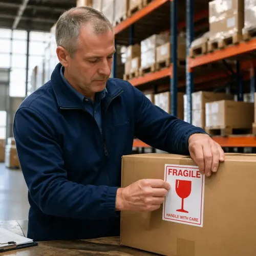
Walk through any warehouse, lab, or maintenance shop and you will see hazard labels everywhere, on drums, spray bottles, totes, and even pipes. When those labels are wrong or missing, people make bad assumptions fast, and OSHA tends to notice.
Hazard Communication Labeling is one of those topics that sounds like paperwork until you watch someone grab the wrong solvent or mix incompatible cleaners. A solid label is cheap insurance because it puts the right warning in the worker’s hands at the exact moment a decision gets made.
This guide focuses on OSHA labeling requirements under the Hazard Communication Standard, plus the practical details that keep labels readable in real workplaces. If you handle chemicals, ship them, relabel them, or store them, you need a labeling system that survives daily abuse.
I am going to be blunt because the stakes are real, chemical safety fails most often at the handoff points. Labels are where purchasing, receiving, operations, and training either line up or fall apart.
Understanding OSHA’s Hazard Communication Standard
OSHA’s Hazard Communication Standard (HCS), found at 29 CFR 1910.1200, requires employers to inform employees about hazardous chemicals in their work area. The core idea is simple, workers have a right to know what they are handling and how to protect themselves.
The HCS aligns with the Globally Harmonized System (GHS), which is why you see standardized pictograms, signal words, and hazard statements on many products. That alignment matters for international logistics because the same container may cross multiple jurisdictions before it is opened.
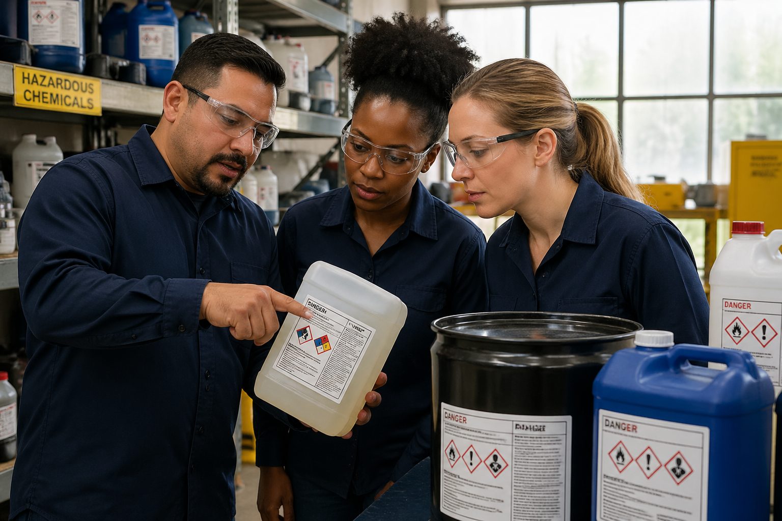
Hazard Communication Labeling ties directly to Safety Data Sheets, training, and the written HazCom program, so you cannot treat labels as a standalone project. If the label says “flammable liquid” but the SDS lists a different classification, you have created confusion that can show up in an incident report.
OSHA labeling applies to shipped containers and to workplace containers, but the rules and expectations are not identical. A manufacturer label must meet specific content requirements, while an in house workplace label can be simpler if it still communicates the hazards clearly to trained employees.
One place companies trip is secondary containers like spray bottles and small jars used on the floor. If a chemical leaves the original container and the new one is not labeled, you have turned a controlled hazard into a mystery liquid.
Another common gap is assuming that “we have SDSs” automatically means you are covered under HazCom. OSHA expects the system to work at the point of use, and the label is the thing the worker sees when the SDS binder is across the building.
The standard also expects you to maintain an inventory of hazardous chemicals, which is where labeling starts to become operational instead of theoretical. If your inventory says you have one degreaser but the floor has five unlabeled bottles, your inventory is not helping anyone.
HCS compliance is not just a manufacturing problem, because offices, schools, hospitals, and retail backrooms still use chemicals. The moment you store or use a hazardous chemical in a workplace, you have HazCom responsibilities.
Employers sometimes confuse HazCom with other OSHA standards like PPE or respiratory protection, but they are connected in practice. The label tells you what the hazard is, and that drives what gloves, goggles, ventilation, or respirator decisions make sense.
Another practical point is that OSHA cares about employee access, meaning workers must be able to obtain hazard information during their shift. Labels are part of that access because they travel with the container instead of living in a file cabinet.
If you have contractors on site, labeling becomes even more important because they may not be trained on your internal shorthand. A clear label is one of the few tools that works across company boundaries without a long orientation.
For multi site companies, the standard is the same but the execution varies, and that is where audits find problems. If Plant A uses full GHS workplace labels and Plant B uses handwritten abbreviations, your training and incident response will be inconsistent.
Finally, remember that HazCom is designed to prevent exposure and injury, not just satisfy a checklist. A label that is technically present but unreadable, incomplete, or misleading is a failure in the same way a missing label is.
Key elements of a hazard communication label
A compliant shipped container label has a defined set of items that must appear together, and skipping one is a common OSHA labeling citation. When you build a labeling template, treat these items as non negotiable fields instead of optional design features.
At minimum, the label needs the product identifier, supplier identification, a signal word, hazard statement(s), precautionary statement(s), and the appropriate pictogram(s). Those pieces work as a system, because a pictogram without the matching hazard statement can mislead a worker who thinks they recognize the symbol.
The product identifier must match the identifier on the SDS, and that includes trade names, chemical names, and internal codes if you use them. If your receiving team relabels totes with a shortened nickname, your SDS binder becomes hard to use during an emergency.
Supplier information is not filler, it gives you a direct line to the manufacturer for technical questions and it supports traceability. For imported chemicals, check that the responsible party is listed in a way your team can actually contact.
Good hazard labels stay readable, so material choice and print quality are part of chemical safety, not just aesthetics. If your labels smear with isopropyl alcohol or fade under UV light near dock doors, you need a different stock and adhesive.
On shipped container labels, the hazard information is tied to the hazard classification performed by the manufacturer or importer. If you are the one creating the shipped label because you blend or repackage, you own that classification work and the label accuracy that comes with it.
In the workplace, you still need a clear product identifier and general hazard information even if you use an alternative labeling system. The goal is that a trained employee can look at the container and immediately understand what it is and what can hurt them.
Do not ignore language and literacy realities in your workforce, because a label that cannot be understood is not doing its job. Many sites improve comprehension by pairing the required text with consistent icons, color coding, and training examples that match the labels workers see daily.
Label size matters more than people admit, especially on small containers where text gets compressed into unreadable micro print. If the container is too small for a full label, plan for tags, fold out labels, or a secondary packaging approach that keeps the information accessible.
Another element that gets overlooked is batch or lot identification when you have multiple versions of a product with different hazards. If a supplier reformulates a cleaner and the hazard category changes, your labels and SDSs need to change with it, not months later.
If you use internal product codes, make sure they are stable and used everywhere, including purchasing, inventory, and SDS access systems. A code that changes by department is a quiet way to create mislabeled containers without anyone realizing it.
For decanted chemicals, consider including the date and the person or department that transferred the chemical, even if it is not strictly required. That small accountability detail helps you trace problems when an unlabeled bottle shows up during an audit.
It also helps to standardize where you place labels on common container types so people know where to look. When every spray bottle has the label on the same face, workers stop rotating bottles in their hands trying to find the information.
Lastly, treat label control like document control, because outdated labels are a real hazard. If your SDS is updated, your label content needs a trigger to update too, or you end up training people on information that is no longer true.
Signal words: Danger vs. Warning
Signal words are the quickest severity cue on a GHS style label, and OSHA recognizes two options, “Danger” and “Warning.” “Danger” is reserved for more severe hazard categories, while “Warning” covers less severe categories within the same hazard class.
You do not get to pick the signal word based on how you want the label to look, because the classification drives it. If a mixture triggers any hazard that requires “Danger,” then the label uses “Danger” even if other hazards on the same product would only require “Warning.”
Workers tend to treat signal words like a ranking system, which is exactly why you should keep them consistent and correct. If you overuse “Danger” on mild products, you train people to ignore it, and that is the opposite of what HazCom is trying to do.
At the same time, using “Warning” when “Danger” is required is not a harmless downgrade, because it changes how people approach PPE and handling. In real life, that can be the difference between someone grabbing splash goggles or just squinting and hoping for the best.
Signal words also affect how supervisors talk about chemicals during onboarding and job hazard analyses. If the label says “Danger” and the training says “this stuff is pretty mild,” you have created a credibility problem that will show up later.
For mixtures, the signal word is driven by the most severe applicable hazard, which is why blended shop chemicals often land on “Danger.” That is not a reason to panic, but it is a reason to verify the classification instead of guessing based on smell or past experience.
Some workplaces try to add extra severity words like “Caution” or “Severe” as a local convention, but that can confuse people who are trained on GHS. If you add anything, make sure it does not conflict with or obscure the actual required signal word.
It is also worth remembering that the signal word is not the whole story, because the hazard statements and pictograms carry the details. A “Warning” label can still describe serious chronic hazards, and a “Danger” label may be focused on a specific acute risk like flammability.
When you audit labels, check for the subtle error of printing both signal words on one label, which happens when templates get merged. OSHA expects one signal word, and the presence of both is a clear sign the label was not built from a proper classification.
In training, it helps to teach employees what the signal word does and does not mean. The signal word tells severity, but it does not tell exposure route, so people still need to read whether the hazard is inhalation, skin contact, ingestion, or all of the above.
| Label item | What it tells the worker | Common mistake |
|---|---|---|
| Signal word | Overall severity level | Using both “Danger” and “Warning” on one label |
| Hazard class and category | Type of hazard and its strength | Guessing category without SDS classification |
| Pictogram | Fast visual hazard cue | Choosing symbols that do not match the hazards |
| Hazard statement | Standardized description of the hazard | Paraphrasing and changing the meaning |
| Precautionary statement | How to prevent harm and respond | Trimming text until actions become unclear |
Hazard statements and precautionary statements explained
Hazard statements are standardized phrases assigned to each hazard classification, such as “Highly flammable liquid and vapor” or “Causes severe skin burns and eye damage.” They are not marketing copy, and you should not rewrite them to sound friendlier.
Precautionary statements tell people what to do, including prevention, response, storage, and disposal steps. When they are written well and kept intact, they turn hazard labels from warnings into usable instructions.
A label can carry multiple hazard statements, and the trick is to keep them readable without losing required content. If space is tight, consider a fold out label or a larger label format rather than deleting statements that matter for chemical safety.
Precautionary statements often look long because they cover real actions like wearing nitrile gloves, using eye protection, grounding containers, or keeping away from heat. If you shorten them, shorten carefully, because “Keep container tightly closed” is not the same as “Close lid.”
Workplace labels can use alternative systems like NFPA diamonds or HMIS, but employees must be trained on that system and it must still communicate hazards. In practice, many sites use a hybrid approach, GHS shipped labels on incoming containers and simplified workplace labels on secondary containers.
Hazard statements are designed to be consistent across suppliers, which helps when you stock similar products from different brands. When the statements match, workers can compare hazards without needing to interpret a different writing style on every label.
One mistake is swapping in a generic phrase like “harmful” when the correct statement is specific, like “Toxic if inhaled.” That kind of paraphrasing removes the exposure route, and it changes how people decide on ventilation and respiratory protection.
Another mistake is dropping hazard statements that feel redundant, such as listing both flammability and vapor ignition risks. Vapors are often the real hazard in a shop, and the statement is there because people underestimate what they cannot see.
Precautionary statements are grouped into prevention, response, storage, and disposal, and each group matters for different roles. Operators care about prevention, maintenance cares about response, and EHS often cares about storage and disposal, but the label has to serve all of them.
Response statements are where you see first aid and spill guidance, and they are often the first thing someone reads after an exposure. If the label says “IF IN EYES: Rinse cautiously with water for several minutes,” that is not optional advice, it is a time critical instruction.
Storage statements can prevent slow motion incidents like incompatible chemicals sitting together for months until a leak happens. A simple line like “Store locked up” or “Store in a well ventilated place” can drive better cabinet choices and fewer surprises.
Disposal statements matter because people will throw away what they do not understand, especially on night shift. If the label calls out disposal requirements, it supports your waste program and reduces the temptation to dump leftovers down a drain.
When you build workplace labels, you can sometimes condense precautionary statements, but you cannot remove the meaning. If you reduce text, make sure the key actions remain, like “Wear eye protection” and “Keep away from heat, sparks, open flames.”
Consistency between the label and the SDS is a practical requirement, not a legal technicality. If the SDS says respiratory sensitizer and the label does not, your training and medical response planning will be misaligned.
It also helps to teach employees that hazard statements describe the hazard, not the probability. A chemical can be labeled for severe burns even if burns are rare, because the label is about what happens if exposure occurs.
For multilingual workplaces, consider how precautionary statements will be understood during stress. Even when the label is in English, you can support comprehension with training cards and posted translations that mirror the exact label wording.
Finally, do not let label software auto select statements without review, because templates can drift over time. A quick check against the current SDS is faster than dealing with the consequences of a wrong statement on a high use chemical.
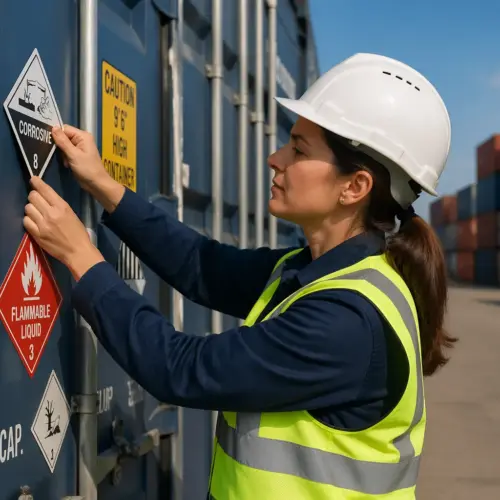
Pictograms and their meanings
GHS pictograms are standardized symbols in a red diamond, and they are meant to be recognized at a glance. They work best when workers see them consistently across hazard labels, training posters, and SDS sections.
The flame pictogram covers flammables, pyrophorics, self heating substances, and materials that emit flammable gas, so it is broader than many people assume. The corrosion pictogram signals skin burns, eye damage, and corrosive effects on metals, which is why it belongs on some acids and some caustics.
The skull and crossbones is for acute toxicity, and it should make you pause because it implies serious harm from short exposure. The exclamation mark covers irritants and less severe acute toxicity, but it still matters because repeated irritation is how a lot of chronic problems start.
The health hazard pictogram, the silhouette with a starburst, is the one people misread most often. It points to carcinogenicity, respiratory sensitization, reproductive toxicity, and target organ toxicity, so it is a long term risk flag rather than an immediate burn warning.
The gas cylinder pictogram is common in logistics areas because compressed gases show up in welding, labs, and refrigeration work. Even “inert” gases can create an asphyxiation hazard in confined spaces, so the pictogram is a reminder to respect the container and the environment.
The exploding bomb pictogram is used for explosives, self reactive substances, and organic peroxides, and it deserves serious attention. Even if your site does not handle classic explosives, some reactive materials can still fall into these categories.
The flame over circle pictogram indicates oxidizers, which are often misunderstood because they are not always flammable themselves. Oxidizers make fires burn hotter and faster, and they can turn ordinary materials into fuel under the wrong conditions.
The environment pictogram is widely seen on consumer products, but it is not mandatory under OSHA HazCom for workplace labeling. Many suppliers still include it, and it can be useful for reinforcing spill prevention and proper disposal habits.
Pictograms are not meant to replace reading, because they do not tell you the full story about concentration, exposure route, or required controls. They are a trigger to slow down and read the hazard and precautionary statements before you open the container.
One training tip that works is to show employees real labels from your own inventory instead of generic posters. When the examples match what people see on the shelf, the pictograms stop being abstract symbols and start being practical cues.
Another common failure is pictogram overload on workplace labels, where people add every symbol just to be safe. Over labeling is still misleading, because it trains workers to treat all products as equally dangerous and to ignore the differences that matter.
Color and contrast matter, because a red diamond that prints as faded pink is easy to miss. If you print labels in house, check your printers and supplies regularly, especially when labels are exposed to sunlight or harsh cleaning routines.
Pictograms also need to be the right size to be useful, which is hard on small bottles. If a pictogram is so small that it looks like a red dot, it is not functioning as a visual warning anymore.
Do not forget that pipes, tanks, and process equipment may have labeling requirements beyond HazCom, but HazCom still influences what you communicate. If a line carries a corrosive, the same hazard concepts apply even if you use a different marking standard for piping.
When you see a pictogram that does not match the product use, do not assume the supplier made a mistake, but do verify it. The right response is to check the SDS classification and confirm the label content, because sometimes the hazard is not obvious from the task.
Over time, the goal is for workers to build a quick mental map, flame equals ignition control, corrosion equals splash protection, skull equals strict exposure control. That kind of pattern recognition only develops when pictograms are accurate and consistently applied.
How to properly affix hazard communication labels
A hazard communication label that peels off in a week is basically a temporary suggestion, and OSHA will not treat it kindly after an incident. You need the right adhesive for the surface, the right face stock for the environment, and a placement that stays visible during use.
Start with surface prep, because oil, dust, condensation, and powder residue ruin adhesion. If containers arrive cold from a truck and you label them in a humid room, expect lifting edges unless you control the temperature and wipe the surface first.
Labels also fail when they are applied to textured plastic, because the adhesive cannot make full contact. If you have that problem, switch to a more aggressive adhesive or use tags and ties that do not rely on a perfect surface.
Placement is not just about visibility, it is about survivability during handling. If the label sits where the forklift clamp rubs or where a drum strap slides, the label will be destroyed even if the adhesive is strong.
Think about how the container is used, because some labels get soaked, some get scraped, and some get wiped daily with disinfectants. A label that survives a dry warehouse may fail instantly in a washdown area or a lab with solvent spray bottles.
Temperature swings matter too, especially for outdoor storage and unheated warehouses. Adhesives that perform fine at room temperature can become brittle in the cold and gummy in the heat, which is why you should match label materials to your actual conditions.
If you print labels in house, protect the print itself, not just the paper. Thermal transfer with the right ribbon can be very durable, while some inkjet and laser prints will smear when exposed to oils, alcohols, or water.
Overlaminates and clear protective films can extend label life, but they have to be applied cleanly to avoid bubbles and lifting edges. In high abrasion areas, that extra layer is often the difference between a label lasting a month and a label lasting a year.
When you relabel, do not stack new labels over old ones unless you are sure the old label is fully removed or fully covered. Partial coverage creates a messy label that is hard to read and can expose conflicting hazard information.
For drums and totes, consider using two labels on opposite sides so at least one is visible no matter how the container is staged. That is especially useful in crowded chemical storage where containers are rotated and stacked tightly.
Secondary containers need a process, not just good intentions, because decanting happens fast. If the rule is “label it immediately,” then you need labels and markers or printers at the point of transfer, not locked in an office.
Some sites use pre printed blank workplace labels where employees fill in the product name and hazards, and that can work if training is solid. The failure mode is predictable, people skip fields when they are rushed, so audits and supervisor checks still matter.
Do not forget about temporary containers, because “I will use it all today” turns into “it is still here next week” more often than anyone wants to admit. If a container will leave the immediate control of the person who filled it, label it like it will be found by a stranger.
- Clean and dry the container surface before labeling
- Place the label on a smooth, low curvature area
- Avoid seams, ribs, and handles that cause wrinkling
- Use chemical resistant stock for solvents and oils
- Protect labels from abrasion with a clear overlaminate when needed
- Replace damaged labels immediately during routine inspections
Build label checks into routine inspections, because that is when you catch fading and peeling before it becomes a compliance issue. If you already do weekly 5S or safety walks, add “label legible and present” as a standard checkpoint.
Receiving is another leverage point, because it is easier to correct labeling before a chemical is distributed across the facility. If a shipped container arrives damaged or missing a label, quarantine it until the supplier provides correct information or you recreate the label from the SDS.
For refillable containers, plan for label replacement as part of the lifecycle. A reusable spray bottle that gets refilled for years should have a label strategy that assumes repeated cleaning and handling, not a one time sticker.
Finally, treat label printers, label stock, and ribbons as safety critical supplies. If you run out and people start using masking tape and handwriting abbreviations, your labeling system will degrade quickly and predictably.
Conclusion
Hazard Communication Labeling works when it is consistent, readable, and tied to the SDS and training your people actually use. If your hazard labels survive handling, match your classifications, and stay visible on the container, you are already ahead of many workplaces.
OSHA labeling compliance is not about perfect paperwork, it is about preventing predictable mistakes when someone is tired, rushed, or new. Treat labels as part of chemical safety operations, budget for durable materials, and audit your secondary containers before OSHA does.
When you standardize label templates and enforce relabeling rules at the point of transfer, you cut confusion in receiving, storage, and production. That is the kind of boring discipline that keeps people out of the clinic and keeps shipments moving.
If you want one practical next step, walk your facility and pick ten containers at random, then check whether each one has a legible label and a matching SDS. That quick check tells you whether your system is real or just aspirational.
If the audit shows gaps, do not overcomplicate the fix, because most labeling failures come from missing tools and unclear responsibility. Decide who creates workplace labels, where the labels live, and what happens when a label is damaged or a container is decanted.
Also remember that labels are a communication tool, which means they should be tested against real behavior. Ask a new employee to interpret a label and explain what PPE they would use, and you will learn quickly whether your labeling system is actually working.
When your labels, SDS access, and training all point in the same direction, chemical safety becomes easier to manage and easier to enforce. That alignment reduces near misses, speeds up emergency response, and makes compliance feel like normal operations instead of a scramble before an inspection.