Warehouses do not fail because people cannot do the work, they fail because people cannot find the work. Wayfinding signage for distribution centers is the quiet system that keeps drivers, visitors, and operators from colliding with each other and with deadlines.
I have walked sites where a first time truck driver has to stop three times just to confirm the right dock door, and each stop turns into a safety risk. A good signage plan removes those stops by making distribution center navigation obvious at speed.
The best part is that you do not need fancy digital boards to get results, you need a disciplined planning approach and consistent symbols. If you treat signs like an afterthought, people will treat them the same way and ignore them.
When signage is done well, it reduces radio traffic, reduces supervisor interruptions, and reduces the small mistakes that turn into big delays. It also makes the building feel calmer because people stop improvising routes in the moment.
Wayfinding is not just about getting from point A to point B, it is about getting there without crossing a hazard zone or breaking a yard rule. In a distribution center, the fastest route is only good if it is also the safest route.
Most sites already have signs, but they are usually a mix of old tenant leftovers, quick printed labels, and one off warnings added after an incident. The goal is to turn that patchwork into a system that reads like one voice.
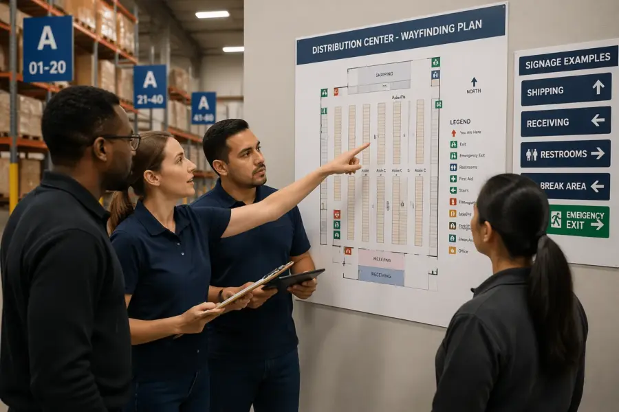
Start with a simple wayfinding map of your facility
Start by drawing a plain map that matches how people actually move, not how the building looks on a lease exhibit. Include the truck entrance, guard shack, trailer yard lanes, pedestrian doors, and the interior aisles that connect receiving, storage, and shipping.
Keep the first version ugly on purpose so you focus on flow instead of graphics. If your team argues about fonts before you agree on routes, the project is already drifting.
Mark every decision point where someone must choose left or right, speed up or slow down, or switch from vehicle traffic to foot traffic. Those decision point signs are where wrong turns happen, and wrong turns are where near misses pile up.
Then add destinations that matter to each group, like Visitor Parking, Shipping Office, Will Call, Battery Charging, First Aid, and Restrooms. When the map shows what people ask for at the gate, the signage plan writes itself.
Do not rely on tribal knowledge when you build the map, because the loudest voices in the room are often the ones who never leave their department. Spend time with the yard jockeys, the receiving clerks, and the security team because they see the confusion first.
Walk the site with a clipboard and write down the exact questions you hear, because those questions are your missing signs. If people keep asking where to drop paperwork or where to stage empties, those are destinations whether you like it or not.
Include the routes that happen during exceptions, like late night deliveries, after hours visitor entry, and overflow parking during peak season. A map that only covers the perfect day will fail on the day you need it most.
Show the boundaries between zones, like where the yard becomes the dock apron and where the dock apron becomes interior pedestrian space. Those boundaries are where you need the clearest rule signs and the clearest directional signs.
Add the locations of hazards and constraints, like low clearance doors, one way lanes, and blind corners near the compactor. When these constraints are on the map, you can design routes that reduce conflict instead of just labeling the conflict.
Make sure the map includes the actual naming scheme for dock doors, rows, and aisles, even if it is imperfect today. If Door 1 is on the far right and Door 40 is on the far left, the map should expose that problem instead of hiding it.
Once the draft is done, print it big and put it on a table so people can point to it and argue productively. The goal is not to win debates, it is to surface every confusing turn before a driver makes it at 3 a.m.
Finally, treat the map as a living document that can be updated when you add racking, move departments, or change traffic patterns. If the map stays current, the signage system can stay consistent without starting over every year.
Define your audiences: visitors, drivers, new hires, and operators
Distribution center navigation breaks down when one sign tries to speak to everyone at once. Split your audiences into at least four groups, visitors, over the road drivers, new hires, and experienced operators.
Visitors need reassurance and simple destinations, so give them parking, reception, and pedestrian paths with clear arrows. They should never be tempted to follow a forklift lane because a sign feels ambiguous.
Drivers need yard rules and dock assignments that they can read from a cab, and they need them early. If the first dock direction appears only after the driver passes the last safe turnaround, you will see backing maneuvers in the wrong places.
New hires need labels that match training language, like Pick Module A, Pack Out, or Returns, and they need repetition. Operators need speed, so give them short terms, consistent colors, and aisle markers that match WMS location formats.
Each audience also arrives with different stress levels, and stress changes how well people read. A driver who is late to an appointment reads less carefully than a driver who arrived early, so your signs have to work for the rushed version of the user.
Visitors often do not know the difference between shipping and receiving, so avoid assuming they understand logistics terms. If you need them to reach a specific office, name it in plain language and point them to a safe door.
Drivers care about check in, staging, and the next instruction, so the sequence of messages matters. If you tell them the dock row before you tell them where to check in, you are inviting them to bypass the process.
New hires are learning the building and the culture at the same time, which makes them prone to following whoever looks confident. Clear wayfinding reduces that herd behavior and keeps people from wandering into restricted areas.
Operators are not reading signs for fun, they are reading them while moving product and watching for pedestrians. That is why the best operator signs feel almost boring, because they are predictable and instantly recognized.
Do not forget contractors and vendors, because they show up with tools and urgency and can end up in the wrong zone fast. If you have a maintenance entrance or a designated check in point, label it like you mean it.
Security and gate staff are also an audience, because they are the human interface to the system. If your signage plan makes their job easier, they will enforce it, but if it makes their job harder, they will work around it.
Think about language and literacy levels without making it awkward, because distribution centers are diverse workplaces. Symbols, color cues, and consistent layouts help everyone, including people who read slowly or speak a different first language.
Finally, decide what you want each audience to never do, like visitors entering the yard or drivers walking through pick aisles. Those “never” behaviors should have their own signs, not just a line in a policy binder.
Sign hierarchy: primary routes, secondary routes, and local labels
A hierarchy keeps your wayfinding signage for distribution centers from turning into wall clutter. Primary route signs guide the longest movements, like Truck Entrance to Yard Check In to Dock Row, and they should be readable at the highest approach speed.
Secondary route signs handle the handoffs, like Dock Row C to Shipping Office or Pedestrian Door 3 to Reception. Local labels finish the job with aisle IDs, door numbers, room names, and equipment zones.
Without hierarchy, every department asks for the biggest sign, and the building becomes a shouting match. When everything is emphasized, nothing is emphasized, and people start ignoring the system.
Primary route signs should be limited in number and consistent in placement so users learn where to look. If the main yard lane sign is on the right at one intersection and on the left at the next, you are forcing extra scanning time.
Secondary signs should anticipate the moment people start thinking, which is usually before they slow down. They work best when they confirm that the user is still on the right path, not just when they are already lost.
Local labels should be ruthlessly specific, because ambiguity at the last ten feet wastes more time than you expect. If you have Door 14 and Door 14A, that needs to be obvious from a distance and at the door itself.
Temporary and exception signage deserves its own category because it behaves differently than permanent signs. A detour sign should stand out, but it should still look like it belongs to the same system.
Another benefit of hierarchy is budgeting, because you can spend more on the signs that do the most work. If you have to choose, invest in the primary route signs first because they prevent the biggest wrong turns.
Hierarchy also helps with change management, because you can update local labels without redesigning the whole campus. When a department moves, you should not have to touch the truck entrance signs to keep the system accurate.
Make sure the hierarchy applies both outside and inside, because many sites treat the yard and the interior as separate worlds. Drivers experience them as one trip, and your signage should feel like one trip too.
If you use color, assign it by hierarchy level or by zone, but do not mix logic halfway through the building. A color that means “shipping” on one wall should not mean “returns” on another wall just because someone liked the shade.
| Hierarchy level | Typical locations | Examples of messages |
|---|---|---|
| Primary routes | Site entry, main yard lanes, main interior corridors | Truck Entrance, Yard Check In, Shipping Docks, Visitor Parking |
| Secondary routes | Intersections, cross aisles, dock row transitions | Dock Row A, Receiving Office, Trailer Drop, Pedestrian Entry |
| Local labels | At doors, at aisles, at equipment zones | Door 14, Aisle 32, Battery Charging, First Aid, Break Room |
| Temporary and exceptions | Construction areas, seasonal overflow, detours | Detour, Closed, Overflow Parking, Temporary Staging |
When you publish the hierarchy, make it part of your internal standards so new signs do not drift over time. If a supervisor prints a new label, they should know whether it is a local label or a routing sign and format it accordingly.
Hierarchy also clarifies what not to sign, because not every internal nickname deserves a panel. If a destination is not relevant to most users, keep it out of the main routes and handle it with local labels or training.
Standardizing symbols, arrows, and terminology
Standardization sounds boring until you watch someone misread a homemade arrow at a four way intersection. Pick one arrow style, one set of safety and logistics symbols, and one naming convention, then lock them down.
Use symbols that match international safety signage expectations where you can, especially for PPE, hazards, emergency equipment, and restricted access. When a driver from another state or country recognizes the icon instantly, you just removed a language barrier.
Terminology is where teams sabotage themselves, because different departments use different nicknames for the same place. Decide whether it is “Shipping Office” or “Dispatch”, whether it is “Returns” or “Reverse Logistics”, and do not mix them on signs.
Keep messages short and avoid clever abbreviations unless they already exist in your WMS and training materials. If you must abbreviate, do it once, document it in the signage plan, and repeat it the same way everywhere.
Arrow standards are more than aesthetics, because arrow shape and placement affect how people interpret direction at speed. Decide whether arrows sit to the left or right of text, whether they point diagonally or only at 90 degrees, and stick to it.
Be careful with “up” arrows on overhead signs, because some users read them as “straight ahead” and others read them as “this lane.” If you have multiple lanes, add lane specific cues like “Keep Right” or use overhead placement that clearly maps to the lane.
Standardize capitalization and numbering, because “Dock 12” and “DOCK 12” look like different systems when they are mixed. The goal is for the user to recognize the pattern before they even read the words.
Color can help, but only if you define what it means and protect it from improvisation. If red is reserved for safety warnings, do not let a department use red for “important” directions just because it pops.
Match your terminology to what shows up on paperwork, appointment confirmations, and carrier instructions. If the rate confirmation says “Gate 2” but your sign says “Truck Entrance B,” you just created a translation problem for every new driver.
Inside the building, align aisle markers with your WMS location logic so scanners and signs tell the same story. If the WMS says A-32-04 but the sign says “Aisle 32,” consider adding the zone prefix so the mental model stays consistent.
Do not ignore bilingual needs if your workforce or driver base expects it, because it is cheaper than repeated mistakes. If you add a second language, keep the layout consistent so the sign stays scannable and does not turn into a paragraph.
Create a small standards sheet that shows approved arrows, icons, colors, and example messages, and treat it like a controlled document. When a new sign is requested, the standards sheet should answer most design questions in minutes.
Standardization also helps with procurement, because you can order replacements without redesigning them. When a sign gets damaged, you should be able to replace it like a part, not like a custom art project.
Placement strategy: sightlines, intersections, and time-to-decision
Placement is where good designs die, because a perfect sign is useless behind a rack end or a stacked pallet. Walk the routes at the same speed as the user, and look for what blocks sightlines, like dock doors, cross traffic, and parked trailers.
At every intersection, give the reader enough time to see, understand, and act, and treat that as a measurable requirement. If a forklift operator needs two seconds to read and react, the sign must appear far enough ahead to avoid sudden braking.
Decision point signs belong before the choice, not at the choice, and you should repeat them after the turn when the user doubts themselves. That simple confirmation sign reduces radio chatter and prevents people from cutting across active lanes to correct a mistake.
Do not forget vertical placement, because low signs disappear behind pallets and high signs disappear into skylight glare. In mixed traffic areas, I prefer overhead or high wall mounted signs for routing, with low local labels reserved for doors and aisles.
Think in terms of time-to-decision, because distance alone is not the right measure in a busy facility. A sign that is 50 feet ahead might be plenty on an empty aisle, but not enough when there is cross traffic and noise competing for attention.
In the yard, give drivers information in a sequence that matches how they can safely maneuver. First tell them which lane to be in, then tell them where to stop, then tell them what to do next.
At the gate, do not stack too many rules on one board, because drivers will only read the top few lines. Put the most critical instruction first, like “Stop,” “Check In,” or “Proceed to Staging,” and move the rest to a secondary sign.
Inside, treat cross aisles like intersections on a road, because that is how the traffic behaves. If you have frequent pedestrian crossings, add advance warnings so operators are not surprised at the last second.
Use repetition strategically, because one sign rarely survives the real world of blocked views and shifting inventory. A second sign placed 20 feet later can be the difference between confidence and a wrong turn.
Be realistic about what will block signs over time, like seasonal staging, empty pallets, and parked equipment. If a location is always getting cluttered, move the sign or elevate it instead of fighting the clutter with reminders.
Lighting is part of placement, because a sign in shadow becomes invisible even if it is perfectly positioned. If you have dark corners, consider reflective materials or dedicated lighting so the message stays readable.
Glare is the opposite problem, and it is common near dock doors, skylights, and glossy floors. Test signs at different times of day, because the morning sun can erase contrast that looked fine at noon.
When you place signs for drivers, consider eye height from the cab and the angle of approach. A sign that is readable from a pedestrian perspective can be useless from a truck if it is too low or too close to the turn.
Finally, make sure the placement plan includes what happens when a sign is missing, because signs do get hit. If one missing panel creates a total dead end, you need redundancy at the previous decision point.
Materials and mounting options for industrial settings
Industrial signs take hits, and the material choice decides whether they stay readable after the first month. For interiors, rigid PVC or aluminum composite panels handle washdowns better than paper laminates, and they do not curl at the corners.
For exteriors, use UV stable inks and substrates, because sun fade turns a red warning into a pink suggestion. Reflective sheeting is worth the money at truck entrances and yard lanes where headlights are the main light source.
Mounting matters as much as the face, since vibration and impacts loosen cheap hardware. Use mechanical fasteners for long term signs, and reserve high tack adhesives for short term labels or places where drilling is not allowed.
Protect corners and edges in high contact zones, like near dock levelers or battery changing rooms. If you can, add bollards or guard rails to protect freestanding posts, because forklifts will find them sooner or later.
Consider the cleaning chemicals used on site, because some solvents haze plastics and degrade adhesives. If you do regular sanitation or washdowns, choose materials that can handle it without the print lifting or the surface clouding.
Temperature swings matter too, especially near dock doors where cold air and humidity hit hard. A sign that looks flat in the office may warp near a door if the substrate is too thin.
For aisle markers, think about impact resistance and long term legibility, because they will be brushed by loads and mast uprights. Rounded edges and protected faces last longer than sharp corners and exposed vinyl.
If you use floor markings as part of wayfinding, use industrial grade paint or tape rated for forklift traffic. Cheap tape becomes shredded confetti, and once people see that, they stop trusting floor cues.
Magnets can be useful on racking or steel doors for temporary routing, but they should not be your permanent plan. If a magnet sign can be moved by accident, someone will move it and swear they did not.
Post mounted yard signs need foundations that match the abuse of plows, trailers, and tight turns. A sign that leans after the first bump is not just ugly, it changes the viewing angle and reduces readability.
Choose finishes that reduce glare, because glossy panels can wash out under high bay lights. Matte or low gloss laminates often read better in industrial lighting even if they look less “premium.”
Hardware should be standardized too, because maintenance teams need to replace parts quickly. If every sign uses a different screw type and bracket, repairs will be delayed and missing signs will become normal.
Plan for vandal resistance in public facing areas like visitor parking and exterior doors. Even simple choices like tamper resistant fasteners and thicker substrates can prevent constant replacements.
Finally, think about how signs will be updated when dock assignments or departments change. A modular approach, like a fixed header with replaceable inserts, can save money and keep the system looking consistent.
Commissioning and walkthrough testing before full rollout
Before you print everything, test the system with temporary signs and real users who do not know the building. A manager who has worked there for ten years cannot judge whether distribution center navigation is clear, because they already know every shortcut.
Give testers tasks like “find Door 28 for inbound”, “find the shipping office”, and “walk from reception to the training room” while you observe where they hesitate. Those hesitations tell you where you need bigger type, earlier arrows, or a different destination name.
Use a mix of testers, because a visitor, a driver, and a picker will read the same sign differently. The point is to catch the edge cases, not just confirm that one confident person can navigate.
Do the walkthrough at realistic times, like shift change or peak inbound hours, because empty buildings hide problems. Noise, congestion, and parked equipment change sightlines and change how long people can look at a sign.
Temporary signs should mimic the final size and placement as much as possible, even if they are printed on paper. If you test with a huge poster and then install a small panel, you did not really test the system.
During testing, listen to what people say out loud, because it reveals what they think the sign means. If someone reads “Shipping” and walks toward outbound docks when they needed the shipping office, the message is not doing the job.
Measure the yard like you would measure a traffic study, because trucks need room and time to react. If the correct lane change requires crossing two lanes in 100 feet, the sign needs to be earlier or the traffic pattern needs adjustment.
Test at night if you receive after hours, because reflective performance and lighting become the whole game. A sign that looks perfect in daylight can disappear under glare or darkness when headlights hit it.
Include emergency wayfinding in the walkthrough, even if it feels separate from operations. If someone cannot find an exit route or first aid station quickly, the rest of the signage system loses credibility.
After the walkthrough, update the map and standards document before you order final production. It is much cheaper to change a file than to change a hundred installed panels.
When you roll out the final signs, communicate the changes to staff so they know the system is intentional. A short briefing and a posted map can prevent people from dismissing new signs as random decoration.
- Mark every hesitation point on the map
- Photograph sightline blockers at intersections
- Time the last safe lane change in the yard
- Check arrow direction from driver eye height
- Verify terminology matches training and WMS labels
- Confirm emergency and PPE symbols match site policy
Keep the testing notes, because they become your justification when someone questions why a sign is where it is. When you can say “we watched five drivers miss this turn,” the conversation gets practical fast.
Plan a short follow up audit after installation, because real behavior changes once people trust the signs. The first two weeks will show you whether the system reduces stops and wrong turns, or just looks nicer.
Conclusion
Wayfinding signage for distribution centers works when you plan it like a traffic system, not like wall decor. A clear hierarchy, consistent symbols, and well placed decision point signs reduce wrong turns, near misses, and constant radio questions.
If you start with a simple map and build a signage plan around real routes, the building becomes easier to run and easier to train. The payoff shows up fast, because every saved minute at the gate and every avoided detour stacks up across a full shift.
Keep the system maintained, because faded panels and missing aisle markers teach people to ignore all signage. When you treat signs as operational equipment, distribution center navigation stays predictable even when the site is busy.
Document standards and placement rules so expansions and tenant changes do not break consistency. That discipline is what turns a one time install into a durable wayfinding system.
When the signage system is consistent, it becomes part of onboarding instead of a scavenger hunt. New hires ramp faster because they can verify where they are without asking for help every ten minutes.
Drivers notice it too, and they reward clear sites with smoother check ins and fewer confrontations at the gate. Over time, that reduces the friction that makes facilities feel chaotic during peak volume.
Do not aim for perfect, aim for clear, repeatable, and maintainable. A simple sign that is always right beats a clever sign that is only right when the building is quiet.
If you treat wayfinding as a system, you can scale it as the operation grows without losing control. That is how distribution center navigation stays stable even when everything else is moving fast.