Shipping and receiving wayfinding signs are the difference between a dock that runs on time and a dock that runs on apologies. When drivers, yard jockeys, and new hires cannot tell where to go, they improvise, and improvisation causes near misses and detention fees.
Most dock confusion starts before the trailer ever touches a dock leveler. A driver misses the correct entrance, circles the building, then guesses at a door number that does not match the paperwork.
Inside the building, the same problem shows up as pallets staged in the wrong lane, forklifts crossing paths, and people shouting door numbers over radios. You can fix a lot of that with a sign plan that matches how work really happens, not how a site map looks in a binder.
This article focuses on practical sign systems that reduce wrong turns, wrong doors, and blocked aisles. The goal is simple, make the correct path obvious for first time visitors and still efficient for regulars.
Mapping the shipping and receiving path from entry to exit
Start by writing down what a truck driver does in your yard, step by step, from public road to check in to dock door to exit. If you skip this, you will end up with nice signs that point to places drivers never need to go.
Include the pre-arrival reality in the map, like where drivers first see your building name and where they typically pull over to check their phone. If the first clear instruction is inside the yard, you are already late.
Walk the route at driver eye level, not from a satellite view, and note every spot where a person must choose left or right. Those choice points are where yard navigation signs and truck driver signage pay for themselves.
Do the walk twice, once in daylight and once when shadows and glare change what is visible. A sign that is obvious at noon can disappear at 6 a.m. when the sun is straight down the lane.
Pay attention to what drivers can see while moving at low speed, because many yards do not have safe pull-off areas. If your process assumes a driver can stop to read a long instruction, your process is really asking for a traffic jam.
Include exceptions, like drop trailers, rejected loads, late arrivals, and oversize vehicles that cannot fit under a canopy. If your process has a separate path for those cases, your wayfinding must show it without forcing drivers to stop and ask.
Also include the human exceptions, like a new driver who does not know your abbreviations or a contractor who is delivering dock plates instead of freight. If those visitors show up monthly, they are not rare, and the sign plan should treat them as normal.
Map the internal handoffs too, such as where the driver checks in, where they wait, and where they are released after loading. If the driver must leave the cab, show the pedestrian path and the safe door they should use.
Write down what information is needed at each step, because not every point needs the same detail. Early in the route, drivers need big directional cues, and later they need precise door identification.
Finish the map at the exit gate and confirm the last sign is not a tiny plaque hidden behind a dumpster. If the last instruction is unclear, drivers turn around in the yard and create the exact conflict you were trying to avoid.
Confirm the exit path includes what happens after paperwork, because many sites forget the final steps. If drivers must stop for seal checks, paperwork drop, or scale out, the sign sequence should guide them in that order.
Once the route is mapped, compare it to incident reports and detention notes to see where confusion is already costing you. The best sign locations are often the same places where people currently argue over the radio.
Core sign types: directional, identification, and instructional
Directional signs answer one question, where do I go next, and they should appear before the turn, not at the turn. Place them far enough back that a tractor trailer can slow down and commit without blocking traffic.
Directional signs should also be consistent in how they name destinations, because “Outbound,” “Shipping,” and “Dispatch” may mean the same thing to your team but not to a visitor. Pick one term per destination and stick to it on every panel.
When a route has multiple steps, directional signs should confirm the sequence instead of dumping every option on one board. A driver can follow “Truck check-in” first and then follow “Doors 01-20” after they are released.
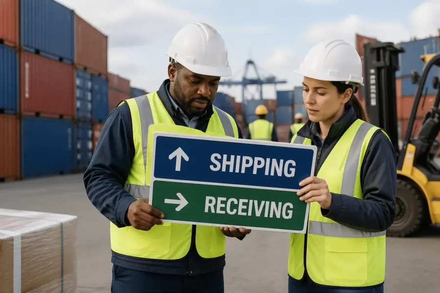
Identification signs confirm, you are here, such as building letters, gate names, and dock door labeling that matches the bill of lading. If a driver cannot confirm the location in two seconds, the sign is not doing its job.
Identification signs should be placed where a person naturally looks for confirmation, like at the start of a dock row and above each door. If the only door number is on the wall between doors, it will be blocked by a trailer exactly when it matters.
Use identification signs to reduce radio dependence, because radios are not always available to visiting drivers. A clear door number and zone label lets a yard jockey spot-check placement without calling anyone.
Instructional signs tell people what to do at the point of action, like check in at window, set brakes, or chock wheels. Keep these short and specific, because long paragraphs get ignored at a dock that is loud and moving.
Instructional signs should describe the action in the order it must happen, because sequence matters at the dock. If a driver must check in before backing, say it plainly and place it before the backing area.
Use instructional signs to support your safety program, but do not use them as a substitute for training. A sign can remind someone to wear a vest, but it cannot explain a complicated procedure in a high-traffic lane.
Many sites mix these types on one panel and end up with clutter that nobody reads. Separate direction from rules when you can, and reserve the big text for the one decision that matters at that location.
If you must combine messages, use hierarchy so the main instruction is readable first and the secondary instruction is smaller. A driver should never have to read a block of text to find out whether to turn left or right.
Keep an eye on sign creep, where every department adds a rule until the dock looks like a bulletin board. When everything is emphasized, nothing is emphasized, and drivers learn to ignore the whole wall.
Symbol and text pairing for mixed audiences
Docks are mixed audience spaces, with local staff, visiting drivers, contractors, and sometimes non English speakers. Shipping and receiving wayfinding signs work best when a clear symbol and plain text reinforce each other.
Symbols help when someone is scanning quickly, but the symbol has to be recognizable at the size and distance you are using. If the icon turns into a blob from 150 feet away, it is decoration, not wayfinding.
Text alone fails when people read slowly or the sign is viewed at an angle through a windshield. Symbols alone fail when the symbol is unfamiliar, so pair them and keep the wording consistent across the site.
Consistency matters because drivers build confidence when the same message looks the same every time it appears. If “Receiving check-in” is sometimes called “Inbound office,” you are forcing people to translate while they drive.
Use plain words that match the paperwork, because the bill of lading is the one document most drivers will have in hand. If the paperwork says “Receiving,” do not label the destination “Inbound” unless you also update the paperwork.
When you have multiple languages on site, keep the primary message in the largest text and use a second line for translation if needed. Avoid squeezing two languages into one line, because it reduces letter height and readability.
Be careful with abbreviations, because what is obvious to your team may be meaningless to visitors. “OS&D” and “LTL” might be common internally, but they do not belong on a sign that a first-time driver has to interpret.
Use arrows that clearly indicate the path, and avoid fancy arrow styles that can be misread. A simple, bold arrow is more effective than a stylized arrow that looks like a logo.
If you use color as a cue, make sure the color is supported by text and not the only differentiator. Color can fade, lighting can shift, and some people cannot distinguish certain colors, so the message must still work in black and white.
| Message needed | Recommended symbol | Plain text to pair |
|---|---|---|
| Shipping check-in location | Information symbol (i) or counter icon | Shipping check-in |
| Receiving check-in location | Clipboard or receiving dock icon | Receiving check-in |
| Stop and wait | Stop sign shape or hand symbol | Stop, wait for instructions |
| One-way traffic | One-way arrow | One way |
| Dock door identification | Number panel with bay icon | Door 21 |
| Pedestrian crossing | Pedestrian symbol | Pedestrian crossing |
Test your symbol and text pairing by asking someone unfamiliar with the site to explain what each sign means. If they hesitate, simplify the wording or swap the icon for something more standard.
Remember that a dock is a noisy environment, so signs are often the only reliable communication. A clear symbol plus a short phrase beats a long instruction that depends on perfect attention.
Dock door numbering and zone naming that actually scales
Dock door labeling breaks down when numbering grows organically, especially after expansions and temporary doors. If you have Door 1 through 20 on the north wall and then Door 1A through 1F on the new wing, drivers will pick the wrong side.
Even when drivers arrive with the right door number, inconsistent placement can cause mistakes. If the number is above some doors and on the jamb for others, people will assume it is missing and guess.
Use a scheme that survives growth, like N01 to N40 for the north face and E01 to E30 for the east face. Put the same code on paperwork, appointment systems, and the sign above the door, or the code becomes a local nickname nobody else knows.
Letter prefixes help when a building has multiple dock rows that are not visible from each other. A driver can be told “E12” and immediately know which side of the building to approach.
Make the door ID large enough to read from the driver lane, not just from the dock plate. If a driver has to pull forward and crane their neck to confirm the number, they will block the lane while they do it.
Place repeating confirmation markers along long dock rows, because trailers can hide overhead numbers. A second door ID on the building corner or on a column can keep the sequence visible even when doors are occupied.
Zone naming should match how the operation talks, like “Frozen receiving” or “Parcel outbound,” and it should appear on approach signs before a driver commits to a lane. Avoid cute names like “Blue Zone” unless the entire zone is actually blue and stays that way after repainting.
Zones should align with real process differences, like temperature control, hazmat handling, or appointment type. If zones do not reflect how work is organized, people will ignore them and revert to door numbers only.
Keep zone names short so they fit on signs without shrinking the font. A zone label should be readable at speed, not something that requires a second pass.
When you add doors, keep spacing in the numbering so you can insert later without renumbering the whole building. A little planning saves you from the expensive choice between new signs everywhere or years of confusing exceptions.
Spacing also helps with temporary closures, because you can take a door out of service without renaming the entire row. If Door E14 is down for maintenance, the sequence still makes sense and drivers can be redirected cleanly.
Document the numbering and zone rules in a simple one-page standard that dispatch, scheduling, and security can reference. If the rules live only in one supervisor’s head, the system will drift as soon as staffing changes.
When you update numbering, plan a transition period where both old and new identifiers are visible on internal documents. A short overlap reduces the risk of missed appointments and wrong-door unloading during the change.
Visibility basics: height, contrast, and lighting at the dock
Truck driver signage fails most often because it is mounted for pedestrians, not for someone sitting high in a cab. Mount key directional signs higher and use larger letter heights so they remain readable over parked trailers and stacked pallets.
Think about sightlines from the approach lane, because a sign that is technically tall enough can still be blocked by a guard shack or a parked container. If the sign is not visible until the last second, it is not a wayfinding sign, it is a post-turn confirmation.
Letter height should match viewing distance, and most docks underestimate how far away a driver needs to read. If you want a driver to decide at 200 feet, the text must be sized for 200 feet, not for someone standing under it.
Contrast matters more than fancy materials, so choose dark text on a light background or the reverse with high contrast colors. If your dock is full of safety yellow rails and orange cones, do not make your signs the same color as the noise.
Use a limited color palette so color has meaning instead of becoming visual clutter. If every sign is a different color, drivers will not learn any pattern and will treat the whole yard as a guessing game.
Lighting changes throughout the day, and backlit glare off wet pavement can wash out a sign that looked fine at noon. Check readability at dawn, at night, and in rain, then add external lighting or reflective sheeting where drivers slow down.
Night operations need special attention because your yard lights may create bright spots and dark gaps. If a driver moves from a bright gate area into a darker dock row, the sign needs to remain readable through that transition.
Reflective materials help, but only if headlights hit the sign at a useful angle. If the sign is too high or angled away from the lane, reflectivity will not save it.
Keep signs out of the forklift impact zone, because a bent post turns a good message into a hazard. If you must mount low, use bollards and place the sign where turning radii will not clip it.
Weather and grime are part of visibility too, especially near docks where exhaust and dust collect. A sign that is readable on installation day can become a gray rectangle after a season if it is not cleaned.
Plan for maintenance access so signs can be cleaned and replaced without shutting down a lane. If replacing a panel requires a lift in the middle of the yard, the sign will stay broken longer than it should.
Preventing bottlenecks with one-way flow and decision points
Traffic plans fail when the yard has too many two way lanes that turn into standoffs between tractors. Yard navigation signs should support a one way loop whenever the property allows it, because loops remove the need for backing and negotiating.
One-way flow also makes it easier to place signs, because drivers expect the next cue to appear on the same side and in the same sequence. When lanes are two-way, you end up duplicating signs and still missing someone’s line of sight.
Every time you force a driver to stop and choose, you create a queue behind them. Put big, early decisions at the perimeter, like “Shipping doors 1-20 left” and “Receiving doors 21-40 right,” so the internal yard stays calm.
Decision points should be designed so a driver can be wrong without being trapped. If a missed turn forces a three-point turn in a tight lane, you will see near misses even if the signs are technically correct.
Use confirmation signs after major turns so drivers know they are still on the right path. A simple “Truck route” arrow repeated along the loop reduces last-minute lane changes.
Queue management is part of wayfinding, because waiting trucks can block the view of signs and doors. If you have a common early-arrival problem, the yard needs a clearly marked staging area that is easy to find.
Keep the check-in area from becoming a choke point by separating “stop here” instructions from “park here” instructions. Drivers should not have to guess whether they are supposed to wait at a window or pull forward.
When you have mixed traffic, like employee cars and trucks, signs should prevent them from sharing the same decision points. A truck route that crosses the employee entrance will always generate conflict, even with perfect arrows.
- Mark a single entry gate for trucks
- Post a speed limit before the first turn
- Place a decision sign 150 to 300 feet before a split
- Use one-way arrows at every merge
- Assign a pull-ahead lane for early arrivals
- Label staging lanes with large zone IDs
- Post exit directions before the dock row ends
Those list items work best when they are treated as a connected system instead of isolated fixes. If you add a staging lane but do not sign it from the entry gate, drivers will still stop in the travel lane to ask where it is.
Speed limit signs should be paired with physical cues like painted lane edges or speed tables where appropriate, because signs alone do not slow down a rushed yard. The goal is not to punish drivers, it is to keep turning movements predictable.
Merges are where small misunderstandings become big delays, so make right-of-way obvious. If you cannot change the pavement, use signage that clearly indicates who yields and where the merge happens.
Exit directions should start before the final door in a row, because drivers often focus on clearing the dock and miss a small sign at the end. A large “Exit” arrow placed while they are still moving forward prevents dead-end turns.
If your yard includes scales, add signs that prevent drivers from accidentally entering the scale approach lane. A single wrong entry can block the scale for everyone behind them.
Finally, make sure your one-way plan is enforceable with the geometry you have. If a lane is too narrow for a safe loop, the best sign in the world will not stop someone from backing up.
Quick audit checklist for your current dock signage
Auditing signs is easier when you act like a visitor who does not know your local jargon. Drive in, follow the posted truck route, and count how many times you must slow down to hunt for information.
Do the audit during a normal busy window, because an empty yard hides the real problems. When trailers are parked and doors are full, you will see which signs disappear behind equipment.
Bring a checklist that includes entry, check-in, staging, dock approach, and exit, because missing one link breaks the chain. A perfect dock door sign does not help if the driver never finds the correct dock row.
Take photos at each decision point and review them on a laptop, because tiny text looks even smaller when you are not standing next to it. If you cannot read a sign in a photo taken from the driver lane, the sign is probably too small or too far back.
Take photos in both directions when lanes are shared, because what is visible inbound may not be visible outbound. A sign that works for arriving drivers may be useless for drivers trying to find the exit.
Check for conflicts between dock door labeling and paperwork, because mismatched identifiers cause the worst kind of confusion. If the appointment system says Door 12 and the building says Bay 12, decide on one and fix the other.
Also check the language used by security, because gate staff often give verbal directions that do not match posted terms. If the guard says “go to inbound” but the sign says “receiving,” you have created a translation step that invites errors.
Look for missing messages where people are currently using cones, pallets, or handwritten cardboard as direction. Temporary fixes are useful clues, because they show you exactly where the sign system is not keeping up with daily reality.
Track which temporary signs reappear after being removed, because that indicates a permanent need. If someone keeps taping “Do not park” to the same column, that message belongs on a real sign in a real location.
Check the condition of existing signs, including fading, peeling, and damage from impacts. A sign that is half missing is worse than no sign, because it creates false confidence and wrong turns.
Verify placement against actual driver behavior by watching a few arrivals from a safe vantage point. If multiple drivers hesitate at the same spot, that is a sign location problem even if the message is technically correct.
After the audit, prioritize fixes that reduce stops and reversals first, because those are the highest risk movements. If you can remove even one common backing maneuver with better signage, you will feel the improvement quickly.
Conclusion
Clear shipping and receiving wayfinding signs reduce wrong doors, radio chatter, and the slow chaos that creeps into busy yards. They also make your site safer, because predictable movement beats constant negotiation between vehicles and pedestrians.
Wayfinding is also a customer experience issue, even in industrial settings, because drivers remember sites that waste their time. A clean, obvious route tells carriers that you respect their schedule and your own operation.
If you fix only two things, make dock door labeling consistent and make truck driver signage visible before each turn. After that, tighten your yard navigation signs into a simple loop that new drivers can follow without stopping.
When you standardize terms, numbering, and sign placement, training gets easier for everyone. New hires learn the layout faster, and supervisors spend less time giving directions and more time managing flow.
Good dock signage is not a one time project, because operations change and expansions happen. Set a quarterly walk through, update the sign plan when processes change, and treat wayfinding like equipment that needs maintenance.
When you treat signs as part of the process, they stay aligned with reality instead of becoming background noise. The payoff shows up in fewer wrong turns, fewer close calls, and a dock that runs like it was planned that way.