High racks change how people read a warehouse, because the work happens above eye level as much as it does on the floor. When you stack product five, eight, or twelve levels high, the building turns into a vertical map that has to make sense at a glance.
Wayfinding for High-Rack Warehouses breaks down when signs assume everyone stands in the same place and looks in the same direction. Pickers, lift drivers, auditors, and maintenance teams view the same aisle from different heights, different speeds, and different angles.
I have seen perfectly labeled aisles still produce constant radio calls because the labels were readable only from one end cap. If your operation relies on tribal knowledge, your signage is already costing you time and adding risk.
This article focuses on practical symbology and layout rules that hold up in tall storage, where perspective and distance distort everything. The goal is simple, get people to the right aisle, the right bay, and the right level without second guessing.
Why vertical space creates unique navigation problems
High rack environments punish small wayfinding mistakes because the correction cost is high. If a picker realizes the error after raising a platform or positioning a reach truck, the reset takes minutes, not seconds.
That time penalty compounds because other people are waiting behind the equipment, especially in narrow aisles with one-way travel rules. A single wrong bay can ripple into a line of stopped trucks and a wave that misses its cutoff.
Depth cues also fail in tall aisles, because a bay number at level 1 looks close while level 8 looks like it is in the next aisle. Vertical Signage has to fight that optical trick with size, contrast, and repetition.
Perspective distortion gets worse when the operator is moving, because the brain is processing motion, load stability, and clearance at the same time. If the label is small or low contrast, it becomes background texture instead of information.

Noise adds another layer, since lift alarms, conveyors, and fans make verbal directions unreliable. When people cannot hear, they rely on consistent visual anchors like aisle IDs, level markers, and rack face labels.
Even when radios work, the language people use is inconsistent unless you force a standard. One person says “third bay down,” another says “two uprights past the column,” and neither translates cleanly to a location code.
There is also a human factor that planners forget, operators look where the load is, not where the sign designer wants them to look. If the critical label sits above the load backrest or behind an upright, it might as well not exist.
Glance behavior matters, because most location checks happen in under a second as the truck rolls. If the label requires a head tilt, a long focus shift, or a second confirmation, error rates climb fast.
High rack also introduces more “same-looking” views, where multiple aisles share the same sightlines and the same repeating structure. When everything is steel gray and evenly spaced, your identifiers have to do the work that architecture cannot.
Safety constraints tighten the problem because people cannot always stop where they want to read. If the only readable sign is in a no-stop zone or behind a pedestrian crossing, the system is asking operators to choose between compliance and clarity.
Aisle and bay numbering systems that scale with your rack height
Aisle numbering should work like a street grid, with a clear pattern you can explain in one minute to a temp worker. Odd and even aisle IDs on opposite sides of a main cross aisle is a simple scheme that stays readable when the building expands.
Make sure the pattern matches how people actually enter the storage area, because “Aisle 1” should feel like the first aisle you reach, not a number hidden in a far corner. If you have two main entry points, pick one as the official reference and sign the other as a secondary entrance with a map.
If you use zone prefixes, keep them short and pronounceable, because operators will say them out loud. A prefix like “N” for north or “R” for reserve is easier than multi-letter codes that sound alike over a radio.
Bay numbering needs a rule that survives re-slotting, because high rack facilities change constantly. I prefer ascending bay numbers from a fixed reference point, such as the shipping office end, and I avoid renumbering unless the physical aisle geometry changes.
That reference point should be physically obvious, not just a note in a SOP, because new hires will anchor to what they can see. If the “start” end is always the same end cap color or has a large “Bay 001 starts here” marker, the rule becomes self-teaching.
Decide early whether bays are counted by pallet positions or by upright spans, and then never mix the logic. A common failure is counting by spans in one aisle and by positions in another after a retrofit, which makes the same bay number mean different physical widths.
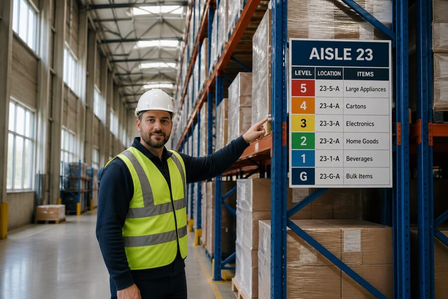
Level numbering must be explicit, because people will invent their own terms like ground, pick face, and top deck. Use Level 01, Level 02, and so on, and post the level convention at every main entry so nobody argues about what level means.
Two-digit levels look boring, but they prevent the “is that 1 or 7” problem when a label is scuffed or viewed at an angle. They also sort correctly in systems and spreadsheets, which matters when you export locations for cycle counts.
Be careful with mezzanines, catwalks, and pick modules that introduce half-levels, because people will try to label them informally. If you truly have intermediate working heights, define them as explicit levels like 01A or 02M and document what equipment can access them.
Keep the full location format short enough to say on a radio without stumbling, but structured enough to prevent ambiguity. A format like Aisle 12, Bay 034, Level 06, Position B is long, yet it stays consistent across pallet, carton flow, and shelving.
Consistency is more important than cleverness, so avoid mixing words and letters in ways that sound similar, like “A” for aisle and “A” for position. If you must use letters for positions, skip letters that look like numbers such as O and I.
Think about how the code prints on pick labels and how it displays on handheld screens, because cramped fonts can erase the benefit of a good schema. If your handheld wraps the location onto two lines, operators will misread it under pressure.
Finally, test the system with real people before you roll it out, because a numbering rule that makes sense in a meeting can still feel backwards on the floor. A ten-minute walkthrough with a new hire will reveal confusing transitions, like where one zone ends and the next begins.
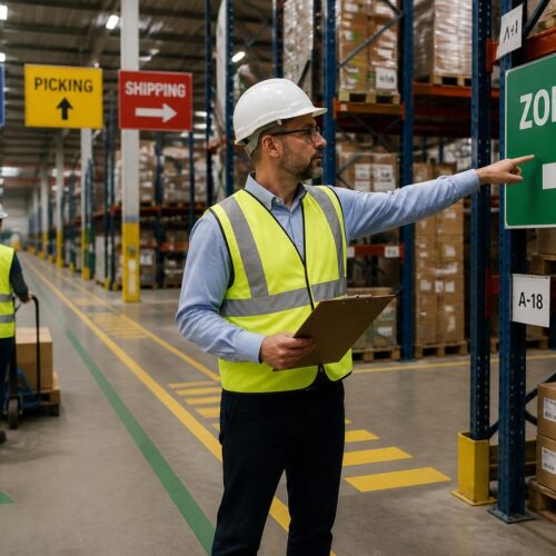
Implementing clear vertical signage at every level
Vertical Signage works when it repeats the same information at multiple heights, because the viewer’s height changes with the equipment. If you only label the aisle at the top beam, pedestrians and pallet jack operators lose the cue.
The reverse is also true, because a low sign can disappear behind staged pallets, trash carts, or a line of people picking. A layered approach gives you redundancy when the aisle is messy, which is most of the time in peak.
Start with end cap signs that show aisle ID and travel direction, then add mid-aisle repeaters where sightlines break. I like repeaters mounted to uprights at a consistent elevation, because crews can spot the rhythm while moving fast.
That rhythm matters because it trains the eye to look in the same place every time, which reduces cognitive load. When repeaters jump between beams, guards, and random posts, operators stop scanning and start hunting.
Use arrows sparingly and make them unambiguous, because too many arrows create the illusion of choice where none exists. If an aisle is one-way, show a single bold arrow and remove any conflicting directional hints nearby.
Mounting hardware is part of the design, because a sign that twists out of alignment becomes unreadable at height. If you cannot keep a sign square to the viewer, choose a larger panel and keep the message centered with generous margins.
Consider the background behind the sign, because rack steel, sprinkler pipe, and stored product can all reduce contrast. A solid backer panel in a consistent color can make the text readable even when the rack behind it changes every week.
Standardize the typography so people can distinguish a location identifier from a safety notice without reading it. If every sign uses the same font weight and size, the warehouse becomes a wall of text.
When you have cross aisles with names or numbers, treat them like streets and label them at intersections. A picker who knows they are at “Cross Aisle C” can recover from a wrong turn without calling a supervisor.
| Sign placement | Best viewed by | Recommended content |
|---|---|---|
| End cap header (top beam) | Reach truck and turret truck operators | Aisle ID, arrow for travel direction, zone color |
| End cap mid-height panel | Pedestrians and pallet jack operators | Aisle ID, cross aisle name, emergency exit arrow |
| Upright repeater every 6 to 10 bays | All traffic in-aisle | Aisle ID, bay range (e.g., 030-039) |
| Level marker strip on uprights | Order pickers at height | Level numbers, max load, inspection tag location |
Use the table as a baseline, then adjust spacing based on your actual sightlines, because some aisles have columns, cages, or conveyor drops that block views. If you have a long uninterrupted aisle, you can push repeaters farther apart, but only if the bay range stays readable at speed.
Level marker strips deserve special attention because they are often the last cue before a lift goes up. If the level marker is missing or ambiguous, the operator will rely on counting beams, which fails when beam spacing varies.
Do not hide max load or inspection information inside the same visual hierarchy as location data. Safety information should be present, but it should not compete with the location code that prevents mispicks and wrong putaways.
When you use zone colors, apply them consistently to the same physical boundaries, like a block of aisles or a side of the building. If zone colors shift mid-aisle or change after a re-slot, people stop trusting color and treat it as decoration.
Optimizing rack face labels for fast visual scanning
Rack Labeling fails when every label looks the same, because the eye needs a dominant cue first and details second. Make aisle and bay information the largest text, then level and position slightly smaller, and keep barcodes secondary.
Dominance is not just font size, because spacing and grouping do as much work as bold text. If you separate the code into clear blocks, like “12” then “034” then “06,” the brain can validate the location without reading every character.
Use a consistent label orientation, because rotated labels slow scanning and cause misreads when operators are tilted in a cage. If you need both human readable text and machine scanning, put the barcode below the text and keep quiet zones clear.
Quiet zones are easy to ruin with well-meaning add-ons like “fragile” stickers or handwritten notes. If you need extra handling cues, put them on a separate label so the barcode area stays clean.
Decide what distance you want the label to be readable from, and then design for that, because “readable” is not a feeling but a measurement. A label that works at 6 feet may be useless from a turret truck at 15 feet with a load in front.
Use a font that stays legible when printed large and when viewed at an angle, because tall aisles rarely give you a perfect straight-on view. Avoid condensed fonts that look sharp on a screen but blur into vertical strokes on plastic stock.
Color coding can help, but only if you limit it to a few meanings that never change. I have seen facilities assign colors to zones and also to hazard classes, and the result was confusion the first time a product moved zones.
If you do use color, treat it as a secondary cue that supports the text, not a replacement for it. Color-blind operators exist, lighting shifts color perception, and dust can mute the difference between two shades that looked distinct in a conference room.
Label material matters in high rack, because dust, stretch wrap abrasion, and forklift contact are constant. Laminated polyester with aggressive adhesive lasts longer than paper, and rigid placards beat stickers at end caps where impacts happen.
Adhesive performance is not uniform across rack paint types, especially on powder-coated uprights that have a slightly textured finish. If you have chronic peel-off, switch to riveted placards or use a backer plate that gives the adhesive a better surface.
Think about where labels get hit, because the first point of contact is often the guard, not the upright. If the guard takes the impacts, put the bay ID there so it survives the abuse and stays in the operator’s natural line of sight.
Keep a rule for damaged labels, because missing labels create “holes” that force people to infer locations from neighbors. Inference is where mispicks start, especially when the missing label is on a high-demand SKU.
Finally, align Rack Labeling with your WMS validation rules, because the system should catch what the eye misses. If the WMS expects a check digit or a scan confirmation, the label should make that process fast, not fiddly.
Floor-level markings that guide order pickers to the right bay
Floor markings are the fastest way to lock a person into the correct bay before they look up. A simple bay tick mark with the bay number at the floor line reduces the chance of raising to the wrong location.
They also help visitors and auditors who are not trained on your Rack Labeling, because the floor is the first plane people scan when they enter an aisle. If the floor tells them where they are, they stop wandering into active lift paths.
Use durable paint or thermoplastic where lift tires scrub, and place markings where pallets will not cover them. If your pick faces sit at the first beam, put the bay ID on the upright guard or on a low mounted plate instead of the floor.
Placement is a design choice, not an afterthought, because staging habits will hide anything placed in the wrong spot. Walk the aisle during peak and see where pallets naturally land, then put markings where the floor stays visible.
Directional arrows on cross aisles help, but only if they match the traffic plan and do not contradict one way aisles. When the arrow system is sloppy, operators stop trusting all wayfinding cues and rely on memory.
Memory is fragile when you rotate labor or add seasonal temps, which is exactly when volume is highest. A clean arrow system reduces the need for supervisors to play traffic cop at every intersection.
Keep the floor scheme boring and consistent, because too many symbols become visual clutter. Reserve special markings for safety items like pedestrian lanes, battery charging, and egress paths, and keep location wayfinding separate in style.
That separation can be as simple as using one color family for safety and another for navigation, so the eye does not confuse a bay tick with a no-go boundary. If everything is yellow, nothing is special, and people tune it out.
Floor markings can also support counting and replenishment if you add subtle bay range markers at aisle entries. A small “Bays 001–020” note at the start of an aisle reduces hunting when someone is sent to an unfamiliar section.
Do not forget that floors get resurfaced, scrubbed, and repaired, which can erase markings without anyone noticing. Put floor marking inspection into the same cadence as rack inspection, because both affect safety and accuracy.
If you have pedestrian picking in high rack aisles, use floor cues to keep people out of lift travel envelopes. A simple “stand here” box at pick faces can reduce the tendency to step into the aisle while looking up.
Providing wayfinding for elevator and lift access points
Elevator Wayfinding is where high rack buildings often fall apart, because vertical travel points are few and people queue under pressure. If an operator chooses the wrong lift, they lose time and create congestion around the access point.
Congestion is not just a productivity issue, because it increases near-misses when pedestrians and equipment mix in a tight footprint. Clear lift signage reduces the number of people who stop in the wrong place to ask questions.
Label each elevator or vertical lift like a critical piece of infrastructure, with an ID that appears on pick lists and on the physical unit. Post a simple map at the lift showing which aisles and levels it serves, because not every lift reaches every mezzanine or platform.
The map should be simple enough to read in five seconds, because nobody studies a map while holding a cart and watching for traffic. If the service range is complex, use a “you are here” diagram with bold aisle blocks rather than a detailed floor plan.
Make sure the lift ID is unique across the site, because duplicate IDs create the worst kind of confusion when someone calls for help. If you have multiple buildings or expansions, add a building prefix so “Lift 3” is never ambiguous.
Queue management is part of wayfinding, because a good sign does not help if people cannot physically see it. Use floor markings and stanchions if needed so the waiting line does not block the sign face.
- Lift ID sign visible from 30 feet
- Service range panel, aisles served
- Level stop list, lowest to highest
- Queue line marking on floor
- Call button label, up or down
- Out-of-service placard holder
The out-of-service placard holder sounds minor, but it prevents the handwritten paper-tape mess that makes a professional system look temporary. When a lift is down, you want a clear, standardized message that redirects people to the correct alternative.
Call button labels should match the language of your level numbering, because “up” and “down” mean different things when people are thinking in Level 06 and Level 07. If you can label buttons with the next served level, you reduce wrong calls and wasted trips.
If you have multiple lift types, like a freight elevator and a VRC, sign the difference and the capacity limits in a consistent format. Operators should not have to remember which unit can take a pallet jack, a cart, or a full pallet.
Finally, treat the lift lobby as a decision point that deserves the same clarity as a main cross aisle. If you solve Elevator Wayfinding, you remove a major source of delays that people often accept as “just how it is.”
Lighting considerations that make signage readable at height
Bad lighting turns good signage into a guessing game, especially when the sign sits above LED glare or in a shadow cast by rack beams. Measure light levels at the viewing position, not at the sign, because the operator’s eyes are what matter.
Lighting also changes throughout the day if you have dock doors open, skylights, or motion-sensor fixtures that ramp up and down. A label that reads fine at noon can disappear at 6 a.m. in a dim aisle with cold-start LEDs.
High rack aisles need uniform illumination down the vertical plane, not just bright floors. Vertical Signage reads best when you reduce contrast extremes, so avoid hot spots at the end caps and dim tunnels in the middle.
Uniformity helps cameras and scanners too, because many operations now rely on device cameras for barcode capture. If the lighting creates flicker or banding, scan times increase and operators start keying locations manually.
Choose sign finishes that work with your fixtures, because glossy surfaces can bloom under high output LEDs. Matte laminates and anti-glare acrylic covers cost more, yet they pay back quickly when scanning errors drop.
Glare is especially nasty at height because the viewing angle is steep and the operator may be looking past a light fixture. If you cannot change the fixture layout, adjust sign placement so the most common viewing angle avoids direct reflections.
Plan for maintenance, since burned out fixtures in tall ceilings can linger for weeks if access is hard. If you cannot guarantee fast relamping, make the sign design more forgiving with higher contrast and larger type.
Dust and lens yellowing also reduce light output over time, which makes a “barely acceptable” design fail later. Build in margin so the system still works after a year of real warehouse conditions.
Emergency lighting deserves a mention because power events are when people are most stressed and most likely to get lost. If your egress signage is clear but your aisle IDs vanish in low light, recovery and evacuation both slow down.
When you upgrade lighting, re-validate sign readability instead of assuming brighter is always better. Overly bright fixtures can wash out pale label backgrounds and make black text look thinner than it is.
Digital displays vs. physical signs in high-rack environments
Digital signs look tempting because you can change content quickly, but they can fail in dusty, cold, or high vibration zones. Physical signs keep working during Wi-Fi outages and during the exact kind of chaos when wayfinding matters most.
Digital also introduces a governance problem, because someone has to own the content and keep it current. A stale screen is worse than no screen because people will follow it once, get burned, and then ignore it forever.
I like digital displays at decision points, such as the main cross aisle, returns triage, or elevator queues. Use them for live instructions, like directing waves to a specific zone, and keep the core location system on fixed Rack Labeling.
Decision points are where dynamic messaging adds real value, because the instruction can change by shift, by wave, or by congestion. If you put digital screens deep in aisles, they become expensive duplicates of labels that already exist.
If you use electronic shelf labels or e-ink location tags, confirm viewing distance and refresh speed at height. Some e-ink tags wash out under certain LEDs, and the problem shows up only after you mount them ten levels up.
Battery life and replacement labor matter too, because a dead e-ink tag becomes a missing label at the worst possible height. If you cannot service them easily, limit them to lower levels or to high-change areas where the benefit is real.
Whatever mix you choose, keep the symbology consistent across media. If a bay is labeled 034 on a placard, do not show it as 34 on a screen, because operators will assume they are different places.
Consistency also includes abbreviations, because “Lvl 06” and “Level 6” look similar but can cause hesitation when someone is tired. Hesitation is the hidden cost that shows up as slower pick rates and more supervisor interruptions.
Think about failure modes and what the floor should do when the screen goes dark. If the digital layer is additive, operations continue, but if it replaces physical wayfinding, a simple outage becomes a site-wide slowdown.
Digital can still be a win when you use it to reduce exceptions, like showing which lift is down or which aisle is closed for maintenance. In that role, it complements Wayfinding for High-Rack Warehouses instead of trying to reinvent it.
Maintaining and updating signage when rack layouts change
Signage governance is boring work, and that is why it breaks first during growth. If supervisors let people handwrite location changes, Wayfinding for High-Rack Warehouses turns into a patchwork within a month.
Patchwork is not just ugly, it creates multiple “truths” about where things are. Once people start translating between old and new labels, you have effectively doubled training time and doubled the chance of a mistake.
Set a change control rule, no rack move is complete until labels, maps, and WMS location masters match. Put one owner in charge of the location schema, because committees tend to approve exceptions that slowly destroy the pattern.
The owner should have the authority to say no to “quick fixes” that create long-term confusion, like reusing an aisle ID because it is convenient. It is easier to delay a move by one day than to live with a broken numbering system for five years.
Keep a small inventory of blank label stock and preprinted templates for common formats. When a bay is added or split, the crew should print a compliant label the same day instead of improvising.
Templates should include font sizes, margins, and barcode placement so every printer in the building produces the same look. If one shift prints labels with a different scale, you will see it immediately in misreads at height.
Audit with real tasks, not clipboard walks that miss operational reality. Send a picker to find ten random reserve locations at levels 6 and up, then log where they hesitated, because hesitation is the first sign your system is slipping.
Include putaway drivers in the audit, because they experience the system differently than pickers. Putaway is where new locations are learned, and if putaway is wrong, every downstream task becomes a recovery job.
Track label defects like you track equipment defects, because missing or damaged labels are a form of operational downtime. If you log them and assign fixes, you stop relying on the one person who “knows where everything is.”
When you re-slot or change pick paths, update any posted maps and remove outdated ones immediately. Old maps are dangerous because they look official, and people will follow them even when they conflict with reality.
Plan for seasonal overflow and temporary racking, because those areas often become permanent without the signage ever catching up. If you add a temporary zone, give it a real location schema from day one so it does not become a black hole of exceptions.
Conclusion
High racks force you to treat navigation as a three dimensional problem, where every decision point has a vertical component. When you design for that reality, Rack Labeling, Vertical Signage, and floor cues work together instead of competing for attention.
The best systems stay plain, consistent, and a little repetitive, because repetition is what makes them reliable under speed and stress. If you standardize numbering, mark levels clearly, and handle Elevator Wayfinding with the same rigor as aisle IDs, your team stops asking for directions and starts moving product.
Good wayfinding also makes training faster because new hires can self-correct without feeling lost. When the environment explains itself, supervisors spend less time escorting and more time improving flow.
It also improves safety because fewer wrong turns means fewer sudden stops, fewer reversals, and fewer people standing in travel lanes looking up. In a high rack building, clarity is not a nice-to-have, it is part of controlling risk.
If you take one lesson from tall storage, it should be that the system must work from multiple heights and at multiple speeds. Design for the fastest truck, the newest temp, and the worst lighting corner, and the rest of the building becomes easy.