
Most hygiene problems at work are simple, boring, and completely preventable. The hard part is getting busy people to remember the basics when their mind is on a shift change, a customer line, or a production deadline.
That is where Personal Hygiene Pictograms earn their keep, because a good symbol does not need a meeting or a translation. When you place the right image at the right moment, you cut through habit and autopilot.
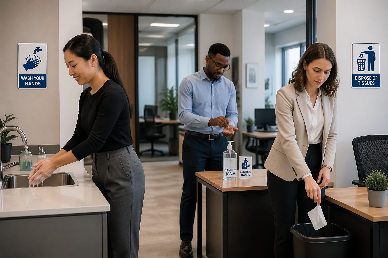
I have seen beautifully written policies that nobody reads, taped to a wall that nobody faces. A clear set of workplace health symbols, placed where hands touch and food moves, gets more real world compliance than another memo.
For organizations that run on international standards, consistency matters as much as clarity. Personal Hygiene Pictograms help standardize hygiene reminders across sites, contractors, and visitors who may not share a first language.
They also reduce the amount of verbal policing that wears supervisors out. When the environment does more of the reminding, people can focus on work instead of constant corrections.
Even in small teams, the same problem shows up: everyone assumes someone else will clean up. A simple visual cue can make responsibility feel immediate and shared.
Hygiene is not just about sickness, it is also about product quality and customer trust. A workplace that looks clean tends to behave clean, and pictograms help keep that standard visible.
Why personal hygiene pictograms matter
Personal Hygiene Pictograms work because they reduce decision time to almost zero. A person does not have to stop, read, interpret, and then act, they see the cue and move.
This matters most when people are under time pressure and running on routine. In those moments, the brain is not looking for a paragraph of instructions, it is looking for a quick signal.
In shared workplaces, one person’s shortcuts become everyone’s exposure. Hand washing signs and cough etiquette symbols are small controls that protect the whole room, including the people who never get a vote on cleanliness.
It is easy to forget that hygiene failures usually spread quietly before they become obvious. By the time someone feels sick or a complaint shows up, the exposure has already happened.
Pictograms also help supervisors, because they make expectations visible without turning every correction into a personal critique. When the symbol is posted, the standard looks like a rule of the site, not a manager’s preference.
That reduces friction in teams where people come from different backgrounds and habits. A posted standard creates a neutral reference point that keeps conversations calm.
They matter most in high turnover environments like warehouses, food service, and temporary staffing. A new hire can understand the baseline hygiene reminders on day one, even before they learn site jargon.
They also help when you have mixed literacy levels or people who are not comfortable reading long instructions. A clear symbol can be understood without putting anyone on the spot.
There is also a legal and audit angle that people ignore until something goes wrong. Clear workplace health symbols support training records by showing that the facility reinforced the message at point of use.
Auditors and inspectors often look for layered controls, not just a policy binder. Pictograms count as a visible layer that shows the organization thought about human behavior.
They can also reduce incident investigations that spiral into blame. When reminders are clear and consistent, it is easier to focus on fixing process gaps instead of arguing about what the rule was.
In customer facing spaces, hygiene symbols quietly communicate professionalism. People may not comment on a good sign, but they notice when nothing is posted and everything feels improvised.
Most importantly, pictograms support the people who are already trying to do the right thing. A reminder at the right moment is like a small nudge that protects their effort from a rushed mistake.
Design principles that make pictograms work
A strong pictogram is concrete, not cute, and it shows the action you want. If the image needs a caption to make sense, it is usually too abstract for a fast moving workplace.
People should be able to understand it from a few steps away. If someone has to lean in to decode it, the sign will fail when the area is crowded or noisy.
Keep the figure simple, with high contrast and clean lines that survive cheap printing and glare. Thin details disappear under fluorescent lighting, and then your hygiene reminders turn into wall decoration.
Think about the environment where the sign lives, because lighting and steam change how visuals read. A restroom mirror reflection and a stainless wall can wash out a low contrast design.
Consistency across a facility is not a style preference, it is how people learn. If every hand washing sign uses a different faucet, hand shape, or arrow style, workers stop trusting the visuals.
Consistency also prevents the “which one is the real rule” problem. When pictograms look like a single system, the brain treats them as official guidance instead of random posters.
Color can help, but do not make color do all the work. A red slash for “do not” is widely understood, yet the core meaning still needs to read in black and white for photocopies and accessibility.
Remember that some people are color blind or working in dim spaces. If the meaning disappears without color, you are relying on a fragile design choice.
Text can support the symbol, especially for visitors, but it should stay secondary. The pictogram should carry the message first, then a short label can confirm it in plain American English.
Keep labels short enough that they do not turn into a mini policy statement. If you need multiple sentences, you probably need multiple signs or a different training tool.
Use familiar shapes and avoid clever metaphors that only designers love. A workplace is not a museum, and people do not have time to appreciate symbolic storytelling.
Scale matters more than most teams expect, because a small icon can look fine on a screen and fail on a wall. Print tests at actual size are the quickest way to catch unreadable details.
Orientation matters too, because people read images in a direction that matches their movement. A handwashing pictogram that points away from the sink can feel subtly wrong and reduce compliance.
Finally, avoid mixing too many messages in one frame. A cluttered sign becomes wallpaper, while a single clear action stays memorable.
Standard pictograms for handwashing
Hand washing signs should show the full act, not a vague hand icon floating near water. The most effective Personal Hygiene Pictograms include hands under running water, soap, and a motion cue that implies scrubbing.
That motion cue is not decoration, it is the difference between rinsing and washing. People copy what they see, so show the behavior you want repeated.
If you want better compliance, do not rely on “wash hands” alone, because people rush and cut corners. A symbol that implies steps, like soap then rinse then dry, nudges behavior toward a real wash instead of a quick splash.
Those implied steps also reduce arguments about what counts as “washing.” When the sign shows soap and scrubbing, the expectation becomes harder to negotiate.
Good handwashing pictograms also match the actual fixtures people see. If your restrooms use touchless dispensers and air dryers, the icons should reflect that so the sign does not feel out of date.
When signs feel outdated, people treat them like old rules that no longer matter. Matching the environment signals that the facility is paying attention and expects others to do the same.
In food environments, you often need separate workplace health symbols for “wash hands” and “wash hands after handling raw food.” The second cue belongs near prep sinks and glove stations, not buried in a poster by the time clock.
Task specific signs work because they connect the reminder to a real risk. When the cue is tied to raw poultry, trash handling, or restroom use, people can feel the logic.
One detail I like is a clear time cue that suggests a thorough wash, such as a small “20” next to a scrubbing motion. It keeps the message visual, and it avoids a wall of text that nobody reads.
Time cues also help people who genuinely do not know what “thorough” means. A number gives them a target that is easy to remember and repeat.
Drying is often the forgotten step, so a towel or dryer icon can improve outcomes. Wet hands transfer germs more easily, and a good pictogram can quietly prevent that mistake.
If your process requires turning off the faucet with a towel, show that too. It is a small detail, but it prevents people from recontaminating clean hands at the last second.
For glove heavy environments, include a clear cue that gloves do not replace handwashing. Many people treat gloves as a shortcut, and the sign needs to correct that assumption without shaming anyone.
If you use hand sanitizer as a supplement, keep the icon distinct from handwashing. Sanitizer and soap are not interchangeable in every situation, and the symbols should not blur the difference.
Common handwashing sign messages and when to use them
Even within “wash your hands,” workplaces need different triggers and different placements. A shipping office needs a reminder after restroom use, while a cold storage area needs one after glove removal.
Different triggers also help reduce sign fatigue, because the message feels specific instead of generic. When people see the same vague reminder everywhere, they stop seeing it at all.
When you standardize the message set, you avoid the chaos of homemade posters with mixed wording. A consistent library of Personal Hygiene Pictograms keeps hygiene reminders aligned across departments.
Standardization also makes training easier, because instructors can point to the same visuals across every area. That reduces the mental load on new hires who are already learning equipment and safety rules.
Use a basic hand washing sign at every restroom exit, because that is the moment people decide whether to comply. Put a second one at the sink area if the room layout allows people to bypass the basins.
Restroom exit signs work best when they are unavoidable, like on the door or directly beside it. If the sign is off to the side, people can pretend they did not notice it.
In manufacturing, add a “wash hands before returning to work” cue at the door back to the floor. That placement catches workers who washed quickly but then touched a phone, a handle, or a dirty apron.
This is also where you can add a reminder about jewelry, nails, or bandages if your policy requires it. The transition point is where people reset from break mode to production mode.
In healthcare adjacent settings like labs or clinics, combine the hand icon with sanitizer where sinks are not practical. The workplace health symbols should match your infection control plan, not fight it.
That means being honest about what is available, because a sign that demands soap where there is no sink creates cynicism. If you want compliance, provide the tools and then post the reminder.
In food service, use “wash hands before putting on gloves” at glove boxes and prep counters. This prevents the common mistake of putting gloves on dirty hands and calling it safe.
In warehouses and delivery operations, use “wash hands after handling returns” or “after trash handling” near receiving and waste stations. Those tasks have high contact with unknown surfaces, and the reminder fits the risk.
For office settings, a simple “wash hands after using shared equipment” can help during illness spikes. Printers, break room handles, and shared tools become transmission points when people are stressed and distracted.
For visitor entry points, use a combined cue like “sanitize or wash hands before entering” at reception. Visitors do not know your routines, so you have to make the expectation obvious and easy.
When you choose messages, keep them short and tied to a moment someone can recognize. People follow cues that feel like part of the workflow, not like a lecture.
Pictograms for cough etiquette
Cough etiquette is where symbols can prevent awkward confrontations. A clear image of covering a cough with an elbow sets the expectation without calling out any one person.
It also reduces the temptation to ignore the issue because nobody wants to be rude. A posted standard makes the reminder feel normal instead of personal.
The best cough etiquette Personal Hygiene Pictograms show a head profile, an arm bend, and droplets contained by the sleeve. If the droplets are drawn outside the arm, the message gets muddy.
Droplet visuals need to be clear but not gross, because people tune out images that feel like scare tactics. The goal is quick behavior change, not disgust.
Include a tissue option where it makes sense, like reception desks and break rooms. Pair it with a second icon that shows disposing of the tissue, because “cover” without “throw away” leaves germs behind.
Trash can placement matters here, because people will not hold a used tissue while looking for a bin. If you post the sign, make sure the bin is close and easy to use.
Spacing matters in respiratory reminders, and pictograms can show it without sounding preachy. A simple two person icon with arrows between them works as a quick cue during flu season or a local outbreak.
That spacing cue is especially helpful in break rooms where people relax and forget the rest of the site rules. When the room is crowded, the sign can be a gentle reminder to spread out when possible.
If your site provides masks during illness spikes, show that option clearly and keep the sign factual. People accept workplace health symbols more easily when the message is practical and not moralizing.
A mask pictogram should be paired with a simple “when sick” or “when required” label so it does not create confusion. If everyone thinks masks are optional or permanent, compliance becomes inconsistent.
Add a hand hygiene cue near cough etiquette signs, because coughing often leads to touching the face. A combined reminder helps people connect respiratory etiquette with clean hands.
If you have a stay home policy, keep the message supportive and clear. A simple “fever or vomiting: do not work” symbol can prevent people from pushing through and spreading illness.
In customer facing areas, cough etiquette signs also protect staff from feeling like they have to police customers. The symbol sets a baseline expectation without escalating the situation.
For multilingual sites, cough etiquette is one of the easiest wins because the action is so visual. A well drawn elbow cover icon can work even when people do not share vocabulary.
Placement in restrooms and food areas
Placement is the difference between a sign that changes behavior and a sign that collects dust. Hygiene reminders belong at decision points, like the sink, the door, the glove station, and the entry to a prep area.
Decision points are where people choose speed or compliance. If the reminder is posted after the choice is already made, it becomes a decoration instead of a control.
In restrooms, put hand washing signs where people naturally look, which is usually above the sink and near the mirror. If you place them behind the door swing or too high above eye level, most people miss them.
It also helps to place a reminder on the path out, because the exit is where people are thinking about getting back to work. A sign at the exit catches the person who is tempted to skip the sink entirely.
In food areas, do not hide Personal Hygiene Pictograms behind equipment, menus, or storage racks. Post them at the hand sink and at the transition into the food handling zone, where workers switch tasks.
Transitions are where contamination risk rises, because people move from phones and boxes to ingredients and utensils. A symbol at that boundary helps workers mentally reset.
Think about flow, because people follow the shortest path when they are busy. If the fastest route from restroom to workstation bypasses the sink, add a reminder at the exit and adjust the layout if you can.
Flow also includes line of sight, because people do not notice signs that are blocked by open doors or stacked supplies. A quick walkthrough during a busy shift will show you what is actually visible.
Durability is part of placement, because a peeling sign sends the wrong message. Use materials that survive humidity, cleaning chemicals, and constant wiping, especially near sinks and prep counters.
Laminated paper can work short term, but it often curls and traps grime at the edges. Rigid plastic, aluminum, or sealed decals tend to look cleaner longer, which supports the message.
Height and angle matter more than people expect, especially in tight restrooms. A sign placed at eye level for a standing adult is more effective than one placed near the ceiling for “visibility.”
In food prep, avoid placing signs where they will be splashed with grease or sauce. A sign that looks dirty undermines the entire hygiene program, even if the message is correct.
Consider placing reminders near time clocks and break room exits, because those are high traffic funnels. People touch shared surfaces there, and a cue can prompt hand hygiene before they return to tasks.
For visitors, place a simple hygiene cue at the entrance to production or kitchen areas. Visitors do not know where sinks are, so the sign should point them to the correct station.
Finally, keep the area around the sign clean and uncluttered. A perfectly designed pictogram loses power when it competes with ten other posters and a pile of boxes.
Adapting pictograms for different cultures
One reason Personal Hygiene Pictograms are popular is that they travel well across languages. Still, “universal” symbols can land differently depending on local conventions and what people see in public spaces.
Even the way a sink is drawn can confuse people if it does not match what they recognize. If the fixture looks unfamiliar, the brain spends time decoding the object instead of following the instruction.
Start by testing comprehension with the people who will use the sign, including contractors and visitors. A five minute walk through with a mixed group can reveal confusion that a design team never anticipates.
Ask people to explain what they think the symbol means without leading them. If they hesitate or give different answers, the pictogram needs refinement before rollout.
Be careful with facial expressions, because a “sick” face in one culture can read as “angry” in another. Neutral faces reduce unintended emotional messaging and keep the sign focused on action.
Also pay attention to clothing and PPE in the icon, because it can signal who the sign is for. If the figure looks like a chef, warehouse workers may subconsciously treat it as not their problem.
Directionality is another quiet issue, especially for arrows and sequences. If the sign implies a left to right sequence, make sure it still reads correctly for teams used to different reading directions.
When you add text labels, keep them short and use the words people actually use on site. A perfect translation that nobody says out loud will not stick during a busy shift.
- Use simple human figures with neutral features
- Avoid hand gestures that can offend in some regions
- Pair pictograms with short local language labels
- Keep arrows consistent with local reading direction
- Use familiar restroom and faucet shapes for the region
- Validate symbols with frontline workers before rollout
Validation should include night shift and weekend staff, not just day shift leaders. Different shifts often have different routines, and that can change how a sign is interpreted.
Consider accessibility too, because cultural adaptation includes different abilities and needs. High contrast, clear shapes, and simple layouts help everyone, not just multilingual teams.
If you operate across multiple countries, keep the core pictogram consistent and localize only the label. That approach protects brand and compliance consistency while respecting local language needs.
Be cautious about humor, because it rarely travels well in safety and hygiene messaging. A funny sign can feel disrespectful in one place and confusing in another.
Finally, watch how people behave after the signs go up, because real comprehension shows up in action. If compliance does not improve, assume the message is not landing and adjust quickly.
Promoting a culture of hygiene
Signs alone do not fix a workplace where soap runs out or sinks are blocked by boxes. Hygiene reminders work best when the facility makes the clean choice the easy choice.
That means supplies are stocked, stations are accessible, and the workflow allows time to wash hands. If the process punishes people for taking 30 seconds, the signs will not win.
Supervisors should model the behavior in plain view, because workers copy what leaders do more than what posters say. When managers ignore hand washing signs, everyone learns that the rule is optional.
Modeling also includes small habits like using sanitizer after shared tools or covering coughs correctly. Those tiny actions set a tone that spreads faster than any training slide.
Training should reference the same Personal Hygiene Pictograms that appear on the walls. When the onboarding slide deck matches the restroom and break room symbols, the message sticks faster.
It also helps to teach people what each pictogram means and where they will see it. When workers know the symbol set, the signs become part of the environment instead of background noise.
Maintenance teams are part of hygiene culture, whether they want that job or not. If dispensers leak, trash cans overflow, or paper towels vanish, the workplace health symbols start to look like a joke.
Cleaning schedules should be visible and realistic, because people notice when reality does not match the message. A spotless sink area supports a handwashing sign more than any extra wording ever will.
Use small feedback loops, like spot checks and quick coaching, instead of big punishments. People respond better when you treat hygiene as a shared standard, not a trap.
Coaching works best when it is immediate and specific, like pointing to the pictogram and asking for the step that was missed. That keeps the conversation about the process, not the person.
Recognition can help too, especially in teams that feel constantly criticized. A quick thank you for good hygiene habits reinforces that the standard is noticed and valued.
Make it easy for workers to report problems like empty soap or broken dispensers. When reporting is simple and response is fast, people stop improvising and start trusting the system.
Seasonal pushes can keep hygiene from fading into the background. During flu season or local outbreaks, refresh the visual reminders and restock supplies before the first wave hits.
Finally, keep the rules consistent across roles, including office staff, managers, and visitors. The fastest way to kill a hygiene culture is to let some people act exempt from the basics.
Conclusion
Personal Hygiene Pictograms are a practical tool for reducing illness spread and keeping operations steady. When you combine clear visuals with smart placement, hand washing signs and cough etiquette cues become part of how the workplace runs.
They work best when they are treated as operational tools, not as decoration or a compliance checkbox. A sign that people see at the right moment can prevent a mistake that no one would admit later.
The best programs treat pictograms as one piece of a real system, with supplies, cleaning schedules, and leadership behavior that match the message. If you want hygiene reminders to work, keep them consistent, keep them visible, and keep them honest.
When the visuals, the workflow, and the culture point in the same direction, compliance becomes normal instead of forced. That is when hygiene stops being a constant problem and starts being part of the way work gets done.


