Walk into a busy distribution center and you can tell in 30 seconds whether the place has a wayfinding system or just a bunch of paint. If your visitors, temps, and new forklift drivers keep asking where shipping is, your signs are not doing their job.
Color coding for wayfinding in logistics facilities can fix that, but only if the rules stay consistent across floors, walls, posts, and signs. When colors drift, people stop trusting them and go back to asking the nearest person in a hi vis vest.
This article lays out a practical approach that works in real buildings with real constraints like dust, racking shadows, and mixed lighting. The aim is a system that supports safety, keeps traffic moving, and still makes sense a year after the rollout.
Wayfinding is not just about visitors, either, because your own associates lose time when a location scheme is hard to interpret. Every wrong turn is a small delay that stacks up across a shift.
Color is one of the few tools that can cut through noise without adding more text, but it needs discipline to stay useful. The goal is a code that works when people are tired, rushed, or new.
Why color works (and where it can fail) in busy facilities
Color works because people process it faster than text when they are walking, driving, or scanning for an aisle marker. In a facility with pallet jacks, forklifts, and pedestrians sharing space, that speed matters.
It also works because color can group information without adding more words. A green band on a sign and a green line on the floor tell the same story even when the sign is partly blocked by a load.
Color helps reduce cognitive load because it lets the brain filter options before reading details. When someone is looking for outbound staging, a consistent color narrows the search instantly.
It is especially effective in high-bay spaces where the viewing distance is long and the background is repetitive. A color cue breaks up the sea of racking in a way that aisle numbers alone often cannot.
Color also supports communication across languages and literacy levels, which is common in logistics operations. Even when someone cannot read a long sign quickly, they can still follow the right color family.
It can also reinforce training without turning every interaction into a lecture. When supervisors say “stay in green walkways,” the floor itself backs up the instruction.
Color fails when it becomes decoration instead of a code. I have seen sites where every department picked its favorite shade, and the result looked like a sports arena, not a logistics operation.
It fails when there is no hierarchy and everything is screaming at once. If every wall has a different stripe and every sign has a different band, nothing stands out when it needs to.
Color also fails when it ignores human limits like color vision deficiency and low light. If your wayfinding depends on distinguishing red from green at 4 a.m. under sodium fixtures, you are building a trap.
It can fail when the same color is used for both navigation and safety warnings, because the brain cannot tell which meaning to prioritize. People start hesitating, and hesitation is a safety risk around moving equipment.
It can also fail when the building itself changes faster than the color system is maintained. If you move packing to a new corner but leave the old purple bands up for six months, you teach everyone not to trust the code.
Finally, color fails when it is applied inconsistently across materials and surfaces. A “blue” floor stripe that looks teal next to a “blue” sign band creates doubt at exactly the moment you want certainty.
Picking a color logic: functions, areas, or routes
Before you pick paint chips, pick the logic, because the logic is what makes the system stable. For color coding for wayfinding in logistics facilities, the three workable models are function based, area based, or route based.
The best logic is the one that matches how people talk about the building on the floor. If your team says “go to inbound” more than “go to the north side,” that tells you something about what will stick.
Also decide whether the system is primarily for associates, visitors, or both. A code built for pickers may be too detailed for a driver looking for the right door, and a visitor code may be too broad for operations.
Function based colors map to what happens there, like receiving, storage, picking, packing, shipping, maintenance, and first aid. This works best when the function stays put and the building layout changes less often than the process.
Function logic is strong in facilities where departments have clear boundaries and dedicated supervisors. It also helps when you onboard temps who need to find a department quickly without understanding the full location scheme.
The downside is that functions can move during peak season or process redesigns. If you know you re-slot or reconfigure often, you need a plan for updating the color layer without leaving ghosts behind.
Area based colors map to physical zones, like North mezzanine, freezer, hazmat cage, or outbound dock doors 1 through 20. This is strong for large campuses where people navigate by geography more than by workflow.
Area logic pairs well with location IDs that already encode geography, like N-12-04 or MZ-S-07. When the color matches the prefix people see in the WMS, the system feels obvious instead of forced.
Area logic can also survive process changes better because the building stays the building. You can move packing from one zone to another without repainting the whole plant if the color is tied to place, not function.
Route based colors map to paths, like pedestrian corridors, forklift arterials, and tugger loops. This is my pick when your main risk is traffic conflict and you need visual management colors that reduce hesitation at intersections.
Route logic is also useful when the facility has lots of cross traffic between departments. If people constantly move between receiving, storage, and shipping, a clear route layer keeps travel predictable.
The risk with route logic is that it can turn into a floor-paint-only project. If the route color is not reinforced with signs at decision points, it fades into the background and stops guiding anyone.
In practice, many sites use a hybrid, but the trick is to pick a primary layer and keep the secondary layer quiet. If you try to make function, area, and route all equally loud, you create visual noise instead of wayfinding.
Whatever logic you choose, write down the rules in plain language before you order anything. A one-page standard beats a shared folder full of “final_v7” PDFs every time.
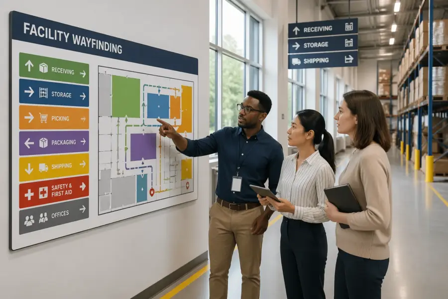
Creating a color legend everyone can find and understand
A color system is only real when it has a legend that people can check in five seconds. Put the legend where decisions happen, like at main entrances, time clocks, break rooms, control desks, and dock offices.
Make the legend visible from a few steps away, not something people have to lean in to read. If it is posted behind a vending machine or covered by flyers, it might as well not exist.
Keep the legend blunt and specific, and do not bury it in a safety binder. If you use zone color standards, name the zones exactly as they appear on signs and in the WMS location format.
Use the same names people already use, even if they are not perfect, because adoption beats elegance. If everyone calls it “the cage,” do not label it “Controlled Inventory Enclosure” and expect the legend to help.
A good legend also shows examples, not just words, because people learn by matching. A small sketch of a sign band, a floor line, and an overhead marker makes the code feel consistent across surfaces.
Keep the legend updated when operations change, and treat it like a controlled document. If you change orange from picking to replenishment, the legend should change the same day the signs do.
Consider a quick-start version for visitors and drivers that only includes what they need to reach key destinations. A full associate legend can be more detailed, but it should still be readable at a glance.
Digital versions help too, but only if they are easy to access. A QR code at the entrance that opens a simple facility map can support the physical legend without replacing it.
| Color | Meaning in the legend | Where it appears |
|---|---|---|
| Blue | Receiving and inbound staging | Overhead aisle markers, dock door IDs, inbound floor bands |
| Orange | Picking and replenishment aisles | Rack end caps, pick module headers, handheld map screens |
| Purple | Packing and value added services | Workcell signs, wall stripes, queue lane markers |
| Green | Pedestrian routes and safe walkways | Floor lines, crossing signs, gate posts near man doors |
| Red | Restricted access and stop points | Door placards, stop bars, lockout stations |
The legend should also clarify what color does not mean, especially if you have similar shades on equipment or packaging. If blue is inbound, say that blue is not “cold storage” or “maintenance” in this building.
If you operate multiple shifts, post the legend in places night shift actually uses, not just the front office hallway. A system that only day shift sees will drift quickly.
Train the legend in two minutes during onboarding and reinforce it during daily huddles. The point is not to test people, but to make the code feel like part of the building.
Finally, make sure the legend matches the physical reality on the floor. If the legend says green is walkways but half the walkways are taped in yellow, people will follow the tape and ignore the poster.
Contrast and legibility: backgrounds, text, and symbols
Color is not enough, because people read contrast first and hue second. If you want color contrast signage that works, design for high contrast between the background and the text or pictogram.
Contrast is what makes a sign readable when someone glances up for half a second. In logistics, that half-second is often all you get before the next task or intersection.
Start with a simple rule, dark text on a light field or light text on a dark field, and do not improvise per sign. A yellow sign with white text looks fine in a conference room mockup and turns unreadable on a bright dock apron.
Pick one or two standard background colors for sign faces, then use the wayfinding colors as bands or headers. This keeps the code consistent without sacrificing readability.
Font choice matters more than people think, and thin fonts die at distance. Use a simple sans-serif with enough weight that it survives glare, dust, and motion blur.
Letter height should match viewing distance, especially for overhead markers in wide aisles. If you cannot read it from the normal travel path, it is not a wayfinding sign, it is decoration.
Symbols matter because they survive distance and language barriers better than words. Use consistent pictograms for shipping, first aid, eyewash, pedestrian crossing, and forklift traffic, and keep them the same style across vendors.
Keep symbol meaning stable, because improvised icons create doubt. If one sign uses a box icon for packing and another uses a tape gun, people will pause to interpret instead of moving.
Also watch for background clutter like racking, shrink wrap glare, and stacked pallets that create visual noise. If a sign competes with product packaging colors, the sign loses every time.
Mounting location is part of legibility, because a perfect sign placed behind a beam is still a bad sign. Walk the routes at eye level and from a forklift seat to see what is actually visible.
Reflective materials can help in dark areas, but they can also create hot spots under certain lighting. Test reflective sheeting under your actual fixtures so you do not create glare that hides the text.
Do not rely on color alone to communicate a safety-critical instruction. Pair color with a shape, a word like STOP, and a symbol so the message survives poor lighting and quick glances.
Finally, keep the sign layout consistent so people know where to look for information. If the color band is sometimes at the top and sometimes at the bottom, you add friction for no benefit.
Using color on floors, walls, posts, and signs together
A consistent system uses the same color logic across multiple surfaces, because people look in different places depending on their task. A picker looks at rack ends and overhead markers, while a visitor looks at walls and door headers.
Think in layers, where each surface has a job and none of them has to do everything. Floors can guide movement, walls can confirm zones, and signs can provide the exact destination.
Floors are powerful for routes and boundaries, but they wear out and get dirty fast. Plan for refresh cycles, and pick coatings that resist tire marks and pallet scraping so your visual management colors do not fade into gray.
Floor markings should be wide enough to read as a system, not a hairline that disappears under dust. If you rely on tape, choose industrial grades and assume you will be replacing sections regularly.
Use floor color to show where movement is expected and where it is not. A clear boundary around staging lanes reduces the slow creep of pallets into travel paths.
Walls are better for zone identification because they stay visible when the floor is blocked by staged pallets. A wide wall band at eye level reads faster than a tiny door placard that sits behind a trash can.
Wall bands also help in mezzanine areas where the floor is busy with equipment and workstations. If the wall carries the zone color, people can orient themselves without searching for a sign.
In high-bay warehouses, consider using large vertical markers on columns that can be seen from the aisle ends. A column wrap in the zone color can act like a lighthouse in a repetitive environment.
Posts and bollards act like punctuation at corners, doors, and crossings. If you paint posts in your zone colors, keep the meaning narrow, because a post color that means two things will confuse people at speed.
Bollards are also abused surfaces that get scraped and repainted, so they are a common source of color drift. If you use them in the system, include them in the maintenance standard and the audit.
Signs are where you add precision, like door numbers, aisle IDs, and department names. The color should support the sign, not replace the information the sign needs to convey.
Overhead markers should align with floor and wall cues at the same decision points. If the floor says green route but the overhead marker has no green reference, people will not connect the layers.
When you use multiple surfaces, be consistent about where the color appears on each surface. For example, if zone colors appear as a top band on signs, keep them as a top band everywhere.
Also plan for temporary conditions like peak staging, construction, or re-slotting projects. If a route is closed, use temporary signage that still respects the color logic so the system does not feel optional.
Avoiding common problems: too many colors and mixed meanings
The fastest way to break color coding for wayfinding in logistics facilities is to use too many colors. If your legend needs a full page and a training video, you already lost the floor.
People can remember a small palette under pressure, but they cannot remember a rainbow. If you need more differentiation, use numbers, letters, or patterns instead of inventing new shades.
Limit the core wayfinding palette to a small set, then use shapes, text, and symbols for the rest. When every special case gets a new shade, the code becomes impossible to remember under pressure.
Shades are a common trap, because “light blue” and “dark blue” look the same in shadows and look different under different lights. If two colors need to mean different things, make them obviously different, not cousins.
Mixed meanings are worse than extra colors, because they teach people that the system lies. If green means pedestrian walkway on the floor, it cannot mean “returns area” on a wall sign in another part of the building.
Mixed meanings also show up when departments create their own local rules. A supervisor labeling a corner with a new color band might solve a short-term problem but it damages the long-term system.
Another common mess happens when safety colors collide with operational colors. If your site uses red for fire equipment and emergency stop points, do not reuse red for a normal process zone just because it looks nice.
It also happens when corporate branding sneaks into the building. Brand colors can live in offices and break rooms, but the warehouse needs a code that is about function and safety, not marketing.
A related problem is using color to show importance instead of meaning, like making the manager office gold and the rest neutral. That kind of hierarchy does not help anyone find shipping or stay out of restricted zones.
Do not let temporary labels become permanent by accident. If you use a special tape color for a short-term project, remove it when the project ends or it will become a second unofficial system.
Finally, avoid letting different vendors interpret the palette their own way. If one vendor’s purple is another vendor’s magenta, the building will look inconsistent even if the legend is correct.
Rolling out changes without confusing daily operations
Changing wayfinding in an operating facility is like changing road signs while traffic keeps moving. You need a plan that respects peak shipping windows, temp labor cycles, and the fact that people rely on habit.
People will keep following the old cues until the new cues are more obvious and more reliable. That means the transition period needs clear messaging, not a quiet overnight repaint and a hope for the best.
Start with a pilot zone that has clear boundaries, like outbound staging and the main pedestrian spine. If you cannot make one area consistent, scaling it to the full building will multiply the confusion.
Pick a pilot area that has enough traffic to test the system but not so much that mistakes become dangerous. A controlled rollout lets you fix legibility problems before they become building-wide habits.
During rollout, over-communicate at the points where people make choices, like intersections and doorways. A simple “New color system in effect” callout can prevent the first week of wrong turns.
Use temporary overlays rather than ripping everything out at once if you cannot complete the change quickly. A clean temporary sign that says “Old blue = New orange” is better than leaving people to guess.
Coordinate with training so new hires do not learn the old system on Monday and the new system on Friday. If you have a temp agency, give them the same one-page legend you give supervisors.
Schedule physical work with operations input, because floor marking work can block aisles and docks. If you paint during peak outbound, you will create workarounds that become bad habits.
After the initial rollout, do a short feedback loop with the people who actually move through the space. If three different drivers say the same intersection is confusing, believe them and fix it.
- Freeze the color legend before ordering materials
- Mark old colors as temporary during the transition
- Update facility maps at entrances and break rooms
- Brief supervisors with a one page cheat sheet
- Audit signage weekly for missing or mismatched colors
- Schedule floor paint work around dock peak hours
Make sure the WMS and any printed pick lists do not contradict the physical system. If the handheld says “Zone P” but the building says purple is packing, you are asking people to translate under pressure.
Keep a short list of “critical destinations” that must be correct first, like first aid, exits, shipping office, and driver check-in. If those are wrong or inconsistent, confidence in the whole system drops fast.
Plan for a cleanup pass after rollout, because the last 10 percent is where quality shows. Removing old tape residue and patching mismatched paint keeps the building from looking like a half-finished project.
Finally, assign ownership so the system does not become nobody’s job. If there is no owner, the legend will drift as soon as the first urgent change hits.
How to align zone color standards with safety and compliance needs
Zone color standards should not fight your safety program, they should support it. If your EHS team already uses specific colors for hazards, lockout points, or emergency gear, treat those as reserved.
Safety has its own visual language, and it is usually more regulated and more sensitive than operations wayfinding. If you blur that language, you reduce the impact of warnings that need to be immediate.
Write down which colors are off limits for wayfinding so operations cannot quietly reuse them later. This one rule prevents the classic problem where a new manager repaints a zone and accidentally mimics a warning color.
Also document where safety colors are allowed to appear, because placement matters as much as hue. If red is reserved for fire and emergency, keep it on equipment and cabinets, not as a decorative stripe on walls.
Consider local fire code expectations, insurer guidance, and any corporate standards that apply across sites. Consistency across a network matters when you rotate supervisors between buildings or bring in traveling maintenance teams.
If you have multiple facilities, align the palette so a person can walk into any site and still interpret the basics. Even partial alignment, like keeping green for pedestrian routes everywhere, reduces training load.
When you must overlap, separate by pattern and placement instead of bending the meaning. For example, keep emergency red for equipment cabinets, and use a different zone color for the area while keeping red out of the wayfinding layer.
Patterns are a good tool for restricted areas, like diagonal striping or chevrons, because they read as “special” even if the color is not unique. A restricted zone can be marked by both a color and a pattern without stealing a safety color.
Think about compliance labels too, especially around hazmat, battery charging, and chemical storage. Those areas often require specific signage, so your wayfinding should frame it, not compete with it.
Include EHS in the sign review process so you do not discover conflicts after installation. A 15-minute review up front beats repainting and reprinting later.
Finally, make sure emergency egress signs and exit paths remain obvious and unblocked by the new wayfinding layer. Wayfinding should help people move safely, including when things go wrong.
Designing for color vision deficiency and harsh lighting
Plenty of good workers do not see color the way designers assume, and you cannot train your way around that. Build redundancy by pairing every color with a letter, number, icon, or pattern that carries the same meaning.
Redundancy should be built into the base design, not added as an afterthought. If the icon and the text are optional, people will ignore them until they need them, and then it is too late.
Lighting also changes colors, especially under LED retrofits, skylights, or freezer fixtures. Test samples on site at the times you run, because a blue that reads clean at noon can look black at 2 a.m.
Test in the real environment, including dusty conditions and with equipment parked where it normally sits. A color that works on a clean wall can disappear once the wall has a year of scuffs and grime.
Avoid relying on red and green as the only differentiator for critical decisions like stop versus go. If you use them at all, separate them by shape, like a red octagon stop sign and a green rectangular route marker.
Also avoid using colors that are too close in brightness, because they blend in low contrast conditions. Two different hues with the same lightness can look identical in a shadowed aisle.
Color contrast signage helps here because contrast survives perception differences better than hue. I would rather see a black icon on a white field with a small color band than a full color sign that turns muddy in low light.
Harsh lighting can also create glare on glossy sign faces and polished floors. Matte finishes and anti-slip coatings can improve readability while also supporting safety.
Consider the view from a forklift seat, because the mast and load change what is visible. A cue that is only visible to pedestrians is not enough in mixed-traffic areas.
If you have freezer or refrigerated zones, remember that frost and condensation can obscure signs and dull colors. In those areas, bigger text and higher contrast are not optional.
Finally, keep the system simple enough that people can verify it quickly. When someone is unsure, they should be able to confirm with one glance at a legend or a consistent marker, not a long search.
Maintaining consistency across vendors, print runs, and repairs
The system falls apart when the second batch of signs comes back a little different. Lock your palette to specific paint and print specifications, and keep a small approved sample kit on site.
A sample kit should include physical swatches, not just digital values, because screens lie. A laminated card with the approved colors can save you from endless “close enough” decisions.
Ask sign vendors to provide proofs that show the color band next to the background and the text, not as a tiny swatch in a corner. If you use digital printing, the same file can still print differently on reflective sheeting versus matte vinyl.
Standardize materials where you can, because mixing substrates changes how colors appear. If half your signs are reflective and half are matte, your palette will look inconsistent even if the ink formula is the same.
Repairs are where consistency goes to die, because maintenance teams grab whatever tape or spray paint is available. Stock the correct colors in labeled bins, and make it easy to do the right thing during a midnight fix.
Give maintenance a simple rule for what they can fix and what needs a formal replacement. A quick patch is fine for a scuffed wall band, but a missing overhead marker should trigger a reorder.
Audit for drift like you audit for damaged racking, because it creeps in slowly. A quarterly walk with photos, notes, and a punch list keeps visual management colors from turning into a patchwork.
Use the audit to catch small issues before they become a new normal. One mismatched sign in a corner turns into five once people assume the standard is flexible.
Track changes in a simple log so you know why a color or label changed and when. When someone asks six months later why a zone is purple, you should have an answer that is not “I think that was always there.”
If you operate a network, keep a shared standard and a shared vendor list where it makes sense. Consistent procurement is one of the easiest ways to keep the palette stable.
Finally, budget for upkeep, because a wayfinding system is not a one-time capital project. If you do not fund refresh cycles, the building will slowly revert to random tape and improvised labels.
Conclusion
Color coding for wayfinding in logistics facilities works when you treat it like a system, not a paint project. Pick a clear logic, keep the palette tight, and publish zone color standards that people can actually use.
Make contrast and legibility non negotiable, because color contrast signage is what people read at speed in bad lighting. When floors, walls, posts, and signs tell the same story, your facility gets calmer and safer without adding more rules.
The payoff shows up in fewer interruptions, fewer wrong turns, and fewer near misses at the places where traffic crosses. When the building communicates clearly, supervisors spend less time giving directions and more time running the operation.
Keep the system alive with audits and disciplined repairs, because consistency is what makes color trustworthy. If you can maintain that trust, the colors stop being paint and start being infrastructure.