Walk through a busy warehouse or a hotel back corridor and you will see the same problem repeating, people look for fire gear only after something smells wrong. Fire safety pictograms fix that delay by giving the brain a fast visual shortcut when reading words is slow.
I have watched new hires stare right at a cabinet and miss it because the label was tiny, the lighting was bad, and the cabinet color blended into the wall. Clear fire safety pictograms cut through that kind of everyday clutter long before an emergency makes everything worse.
Good symbology is boring on purpose, because it stays consistent across buildings, languages, and job roles. When a site uses fire safety pictograms correctly, visitors can spot a fire extinguisher symbol, a hose reel sign, or a fire alarm pictogram without stopping to interpret design choices.
That speed matters because most people do not plan to study safety signage during a normal shift. They glance, they move, and they only slow down when something feels off.
In a real incident, the environment gets louder, brighter, and more confusing at the same time. Pictograms are one of the few tools that still work when your attention is split and your breathing is faster.
Even when nothing is burning, clear symbols reduce friction in training, inspections, and contractor briefings. They also help managers spot missing equipment because the visual system is easy to audit as you walk.
What fire safety pictograms are meant to accomplish
Fire safety pictograms are meant to communicate location and intent at a glance, even when stress wipes out fine reading. They work because the shapes are familiar and the message is short, find this, use this, or do this now.
On international sites, the real win is language independence, because you cannot assume every contractor reads English well. A clean fire extinguisher symbol beats a paragraph of instructions when a visitor is counting exits and scanning for hazards.
They also reduce decision time, which is where people lose seconds in smoke, noise, or crowding. If the pictogram set is consistent, a person can move from sign to equipment without asking anyone for confirmation.
The goal is not decoration and it is not branding, it is standard behavior under pressure. When a site mixes styles or invents custom icons, it trains people to hesitate, and hesitation is the one thing you cannot afford during a fire alarm.
Pictograms also act as a memory trigger, because most people learn the layout once and then rely on cues later. When the cue is the same in every hallway, the brain retrieves the right action without a full conscious search.
They are meant to support visitors who have zero context, like delivery drivers, guests, and temporary staff. Those groups are often closest to loading docks, kitchens, and plant rooms where fire risks are higher.
Another purpose is to support people with limited literacy or reading speed without singling them out. A symbol system that works for everyone is a quiet form of accessibility that does not require extra steps.
Pictograms also help during power loss because they can be paired with photoluminescent or illuminated formats. When lights fail and people rely on emergency lighting, the sign still needs to read instantly.
They are meant to reinforce the difference between fire equipment and general wayfinding, so people do not confuse an exit arrow with an extinguisher location. A consistent fire equipment color and icon set keeps that separation clean.
In audits and investigations, pictograms provide a simple way to verify that critical controls were present and visible. If the sign system is sloppy, it becomes harder to prove that the site set people up for success.
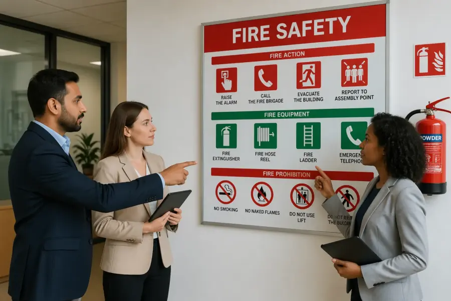
Core equipment pictograms and where each belongs
Equipment pictograms should point to physical objects that a person can touch and use right away. That includes extinguishers, hose reels, fire blankets, hydrants, and fixed suppression controls, each marked where the item actually sits.
The fire extinguisher symbol belongs at the extinguisher location, not on a door three steps away and not on a map that nobody checks. If the extinguisher is inside a cabinet, place the symbol on the outside face and keep it visible when the cabinet is closed.
A hose reel sign needs extra care because hose reels often live in recessed boxes and can disappear in a long corridor. Put the hose reel sign above the reel and, if the corridor is long or has turns, repeat a directional sign so people do not overshoot it.
Fire blanket pictograms work best near cooking risks, lab benches, or welding areas where small fires start fast. If you mount the blanket in a pouch, keep the pictogram at eye height and avoid placing it behind open doors or hanging PPE.
Hydrant and standpipe pictograms should be treated like critical infrastructure, not like back-of-house utilities. If the hydrant is outside, the sign needs to survive weather, UV exposure, and vehicle splash without fading into pink.
In warehouses, the biggest enemy is racking, pallets, and seasonal overflow that slowly blocks access. The pictogram should be paired with a clear zone on the floor so the sign does not point to equipment that is physically trapped.
Fire extinguisher locations also change over time when walls move, tenants change, or hazards shift. Every time you relocate an extinguisher, move the symbol with it instead of leaving a ghost sign that trains people to look in the wrong place.
Cabinet doors are another common failure point because people decorate them with notices, cleaning schedules, or clipboards. If you must post anything on a cabinet, keep the fire extinguisher symbol unobstructed and dominant.
Where multiple extinguisher types exist, the pictogram still needs to be the same basic extinguisher icon. The type information should be a secondary label so the first glance still lands on the correct category of equipment.
For fixed suppression controls, like sprinkler valves or kitchen hood systems, the pictogram should lead to the control point people are trained to use. Do not label a maintenance-only valve as if it is an operator action unless your procedure says otherwise.
Equipment pictograms also belong on approach routes, not just at the device, when sightlines are blocked. A simple arrowed repeat sign at the end of an aisle can save a lot of searching when shelves hide the actual cabinet.
In public buildings, equipment pictograms should consider crowd flow and furniture layouts that change. A sign that is perfect on an empty wall can become invisible once a vending machine or display stand appears in front of it.
Action-based symbols: alarms, call points, and shutoffs
Action symbols tell people what to trigger, what to press, and what to shut down, and they need to be unambiguous. The most common is the fire alarm pictogram, which should sit right above the manual call point so the hand motion matches the icon.
Shutoff pictograms matter in places with gas cylinders, kitchen lines, paint booths, or battery charging rooms where stopping fuel or power changes the outcome. If you label an emergency gas shutoff, place the sign at the shutoff and add a directional repeat only when the shutoff is not in direct view.
Action symbols also need to match the actual hardware, because people will copy what they see on the sign. If the pictogram suggests pushing but the device is a pull handle, you have created a hesitation point right when speed matters.
Manual call points are often mounted near exits, which is good, but they also get hidden by queue stanchions, seasonal decorations, or stacked supplies. The symbol should be paired with housekeeping rules so the area stays clear year-round.
Emergency power off buttons are notorious for being installed in places that make sense to electricians but not to operators. The pictogram should be visible from the entry path, not only when you are standing directly in front of the panel.
Fire door keep shut symbols are action-based too, because they tell people to stop doing the thing they want to do, which is wedge the door open. If the sign is small or placed too high, it becomes background noise and the wedge wins.
In kitchens and labs, staff may have multiple competing shutoffs for different systems. A clear pictogram and a clear label reduce the risk of shutting down the wrong utility and losing time while the fire grows.
Some sites add action symbols for fire suppression release stations, and those need extra control because accidental activation is expensive. The pictogram should still be clear, but the physical guard and procedure should match the risk of misuse.
Action symbols should also be supported by lighting, because people press what they can see. A call point in a dim stairwell is a predictable miss, even if the sign is technically correct.
When you use arrows with action symbols, keep the arrow logic consistent across the site. If one sign uses a down arrow to mean “here” and another uses it to mean “below,” you will watch people pause and look around.
| Action pictogram | What it tells people to do | Best placement |
|---|---|---|
| Fire alarm pictogram | Activate alarm at manual call point | Directly above call point, near exits and stair doors |
| Manual call point symbol (press/break glass) | Press or break to send alarm signal | On the call point face and on the wall above it |
| Emergency gas shutoff symbol | Turn off gas supply feeding the area | At shutoff valve, with arrow signs at corridor turns |
| Emergency power off symbol | Cut electrical power to equipment zone | At EPO button and at entry to high risk rooms |
| Fire door keep shut symbol | Keep door closed to stop smoke spread | On both sides of door at handle height |
Using consistent colors and backgrounds across a site
Color consistency is where many facilities quietly fail, because they treat safety signs like office decor. Fire safety pictograms need the same background color and contrast everywhere, so the eye learns what to look for in a split second.
Most international systems use red for fire equipment and fire action identifiers, with a white pictogram for the symbol itself. If you swap to a dark maroon in one wing and a bright red in another, the signs stop reading as one system.
Backgrounds should stay flat and high contrast, because gradients, textures, and “branded” patterns reduce legibility at distance. A fire extinguisher symbol printed over a busy wall graphic looks fine in a design review and then disappears in real lighting.
Consistency also means consistent arrow styles, border thickness, and symbol proportions, because people notice mismatch even if they cannot name it. When the hose reel sign and the fire alarm pictogram come from different icon sets, staff start second guessing which signs are official.
Think about color in the context of the wall behind it, because a sign is only as good as its contrast. Red on a red brick wall or red on a warm timber paneling is a common design mistake that looks tasteful and performs badly.
Lighting temperature also changes how colors read, especially under sodium lamps, warm LEDs, or mixed lighting in older buildings. If you test signs only under office lighting, you may miss how they look in a plant room or loading bay at night.
Some facilities use different sign vendors over time, which is where subtle shade drift starts. A procurement rule that specifies the standard, not just “red fire sign,” prevents a patchwork wall of almost-matching panels.
Background cleanliness matters too, because dust and grease flatten contrast. In kitchens and workshops, a good sign program includes cleaning the sign face so the white pictogram stays white.
Do not forget the difference between printed red and translucent red on illuminated boxes. If you mix them without thinking, one will glow and the other will look dull, and people will treat them as different priorities.
If you use photoluminescent signs, check the daytime appearance and the afterglow performance, because both affect trust. A sign that looks weak in daylight gets ignored, even if it technically glows later.
Consistency across a site also includes consistent placement relative to doors, corners, and equipment. When the visual system is predictable, people scan faster because they know where the sign should be.
Finally, keep the fire system visually separate from other safety colors like blue mandatory PPE or yellow hazard warnings. If every message is red, nothing is red, and the fire pictograms lose their special meaning.
Choosing symbol style: ISO, regional standards, and site-specific needs
Pick a standard and stick with it, because mixing symbol families is where confusion sneaks in. If your organization operates globally, ISO-style fire safety pictograms usually reduce retraining across sites and contractors.
Regional rules still matter, especially where building and fire codes specify sign formats, luminance, or language requirements. The practical move is to standardize the pictogram artwork while adapting text panels or mounting methods to local code.
Site-specific needs can fit inside the standard set if you stay disciplined about design. For example, you can add a small label like “CO2” under a fire extinguisher symbol without redrawing the icon into something unfamiliar.
When you truly need a custom sign, treat it like a controlled document with approvals and a style guide. If every department invents its own hose reel sign variant, you end up training people to ignore signs because none of them match.
ISO-style symbols are popular because they are tested for recognition and designed to be simple at distance. That simplicity is also why they survive poor lighting and quick glances better than detailed illustrations.
Regional standards sometimes include specific arrow conventions, text requirements, or mounting heights that differ from what your corporate template assumes. If you ignore those details, you can end up with signs that look right but fail compliance checks.
In multi-tenant buildings, you may inherit a mix of old and new sign styles across floors. A phased replacement plan is better than letting the mix persist for years, because people learn the building as a whole, not as isolated suites.
Site-specific hazards can also drive additional labels, like “foam,” “wet chemical,” or “clean agent,” but the base pictogram should remain familiar. The label is for trained staff, while the icon is for everyone.
If you operate in areas with frequent visitors, like retail, entertainment, or healthcare, prioritize the most widely recognized symbol set. The more you rely on niche icons, the more you rely on training that visitors never received.
When procurement chooses signs, request proof of the standard used and avoid generic clip-art interpretations. Two extinguisher icons can look similar on a screen and behave very differently at ten meters down a corridor.
Digital sign libraries can help if you manage multiple sites, because they prevent local teams from downloading random icons. A central library also makes it easier to keep arrows, borders, and proportions consistent.
Any time you update a symbol style, update training materials and site maps at the same time. If the map shows one fire alarm pictogram but the wall shows another, you have created a trust problem.
Common mistakes that make pictograms hard to read
The most common mistake is installing signs where they look tidy, not where they can be seen. A fire alarm pictogram placed behind a propped-open door might meet a drawing review, but it fails the moment the door swings.
Another mistake is shrinking signs to avoid “visual noise,” which usually means the sign becomes useless at any distance. If a person cannot identify the fire extinguisher symbol from across the room, the sign is decoration, not safety control.
Glare is a quiet killer of readability, especially with glossy laminates under LED panels. Matte finishes and proper angles matter more than people expect, because smoke and moisture already reduce contrast.
Facilities also forget about competing signage, like promotional posters, wayfinding, and temporary notices taped to walls. When a hose reel sign sits in a sea of paper, the brain treats it as one more message and moves on.
One mistake I see often is placing signs too high in spaces where ceilings are tall and the viewing angle is steep. The icon may be technically visible, but it becomes too small to recognize without stopping.
Another common failure is placing a sign near a bright window or reflective surface that washes out the red background. The sign is there, but the contrast collapses at the exact time of day when sunlight hits the corridor.
Signs also get blocked by operational reality, like parked carts, stacked linen, or seasonal inventory. If the business routinely stores items in front of the sign, the sign program needs enforcement, not just better printing.
People sometimes assume that a floor plan at the entrance replaces local pictograms, but maps are slow to use under stress. A map can support orientation, but it does not replace a clear fire extinguisher symbol at the point of need.
Another mistake is using too much text as a crutch, which makes the sign harder to scan. If the pictogram is doing its job, the text should be secondary and short.
Wear and tear creates its own readability problems, like scratches across the icon or paint overspray from quick renovations. If the pictogram is damaged, people subconsciously downgrade it as unreliable information.
Temporary signs can also cause long-term damage when they become permanent by accident. A taped paper arrow next to a hose reel sign might stay for months and teach people that official signage is optional.
Finally, inconsistency in arrow direction or placement can make people doubt the whole system. If one corridor uses left arrows and the next uses down arrows for the same concept, you have created a puzzle instead of a guide.
Placement rules for fast discovery in smoke or low visibility
Place fire safety pictograms where the eyes naturally scan, which is usually along travel paths and at decision points like corridor intersections. If you hide equipment signs inside rooms, people will keep moving and miss the gear they could have used.
Mounting height should match typical sightlines, but you also need redundancy because smoke stratifies and can obscure upper walls. Many sites use a high wall sign for distance viewing and a lower repeat near the equipment for close confirmation.
In low visibility, people follow edges, door frames, and corners, so signs near those reference points are easier to locate. A sign floating in the middle of a long blank wall is harder to find when you are moving quickly.
Directional signage should be treated like a breadcrumb trail, not a single hint. If you only place one arrow at the start of a corridor, people will lose confidence when they do not see the next confirmation.
At intersections, place signs early enough that a person can turn without overshooting. If the arrow is mounted after the turn, the person has to pass the decision point before receiving the instruction.
In stairwells, place fire alarm pictograms and call point identifiers where people pause naturally at landings. A sign that is only visible while moving between floors is easy to miss in a crowded evacuation.
For large open areas like production floors, use sign size and mounting that match the viewing distance. A small extinguisher symbol on a far wall is not a control, it is a guess.
When equipment is behind a pillar or inside a recess, use a projecting sign or a repeat sign that faces the approach direction. The best sign is the one people see before they need to stop and search.
Keep signs out of the line of impact where forklifts, carts, and doors regularly hit the wall. If a sign gets knocked off twice a year, the placement is wrong even if the location is convenient.
Photoluminescent and illuminated signs should be chosen based on how dark the space becomes during a fault. A corridor with emergency lighting may need less, while a windowless plant room may need more.
Placement rules should also consider human behavior, like people following the crowd and ignoring side alcoves. If the extinguisher is in an alcove, the sign must pull attention into that space with clear direction.
- Mount equipment symbols directly above the device
- Repeat directional arrows at every corridor turn
- Keep signs clear of door swing and stored materials
- Use photoluminescent or illuminated signs where required
- Match sign size to viewing distance, not wall space
- Place call point pictograms near exits and stair doors
After installation, test placement by walking the route at normal speed and only allowing yourself quick glances. If you have to stop and search, the sign is not doing its job.
It also helps to test from different heights and angles, because a tall person and a shorter person do not see the same obstructions. A sign blocked by a handrail or a cabinet corner is a predictable miss for someone else.
In areas where smoke risk is higher, consider low-level repeats that stay visible longer. The goal is not to cover every surface, but to ensure there is always a next cue when visibility drops.
Finally, treat temporary layout changes like construction hoarding as a trigger to review sign visibility. If the route changes, the pictogram trail needs to change with it.
Inspection and replacement: keeping signs readable year-round
Signs age in boring ways, sun fade near loading docks, scratches from carts, and grime in kitchens or shops. If you do not inspect fire safety pictograms on a schedule, you will discover the damage during an audit or after an incident.
Build sign checks into routine safety rounds, the same way you check extinguishers and emergency lights. A quick rule works well, if you cannot read the sign or identify the symbol from its normal approach path, replace it.
Pay attention to adhesives and mounting hardware, because peeling corners and curled panels create shadows that hide the icon. This is common on a hose reel sign near humid areas, where steam and cleaning chemicals attack the backing.
Keep spares for the high-damage zones, like warehouse aisles, dock doors, and mechanical rooms where contractors bump walls. When you replace a fire extinguisher symbol, match the old sign’s size and color standard so the system stays consistent.
Inspection should also include checking that the sign still points to the right thing. If equipment moved, the sign becomes misinformation, which is worse than having no sign at all.
Cleaning staff should know that safety signs are not just wall decor, because harsh chemicals can cloud plastics and remove print. A simple cleaning instruction can prevent slow damage that nobody notices until the sign is unreadable.
Look for paint overspray and patch jobs after maintenance work, because signs are often collateral damage during quick repairs. If a wall gets repainted, the sign should be removed and reinstalled properly, not painted around.
Check for fading by comparing signs in bright areas to signs in protected areas, because the difference can be subtle until it is severe. If the red has shifted toward orange or pink, recognition at distance drops quickly.
Also check that the sign face is not cracked or warped, because distortion makes icons harder to read. Warped signs can also reflect light in odd ways and create glare that was not present when they were flat.
Document replacements so you can see patterns, like one corridor that keeps losing signs due to impacts. That kind of data points to a placement problem or an operational issue that needs fixing.
If you use illuminated signs, include them in electrical checks and confirm the illumination level remains adequate. A dim box can look fine in daylight and fail completely at night.
For photoluminescent signs, verify charging light levels and afterglow performance in real conditions. A sign that is technically photoluminescent but never gets enough light to charge is not providing the benefit you expect.
Replacement should be immediate when a sign is missing, because gaps break the system logic. People notice the missing link and stop trusting the trail of cues.
Training and drills: making pictograms part of muscle memory
Fire safety pictograms work best when people have seen them in calm conditions and already know what they mean. If your first exposure is during a real alarm, you will still waste seconds interpreting the icon.
During onboarding, walk people to the nearest extinguisher, hose reel, and call point and point out the matching symbols. That simple loop ties the fire extinguisher symbol and the hose reel sign to real locations that employees can recall later.
Drills should include finding equipment, not just walking out, because evacuation is only one part of response. Ask wardens to confirm that the fire alarm pictogram locations match the call points they expect, and fix any surprises.
Contractors and short-term staff need the same quick orientation, especially in industrial sites where hot work happens. A two-minute briefing at the permit desk can prevent a lot of confusion when something starts smoking.
Training should also cover what not to do, like blocking cabinets or wedging fire doors. A pictogram can warn people, but a quick explanation helps them understand why the rule matters.
It helps to teach people the difference between equipment symbols and action symbols, because one tells you where gear is and the other tells you what to trigger. That distinction reduces panic behavior like running past an extinguisher while searching for a call point.
Use real routes during drills, including back corridors, storage areas, and secondary exits that people forget. Those are the places where pictograms do the most work because memory is weaker.
Supervisors can reinforce pictograms by referencing them in everyday talk, like “meet by the extinguisher sign” instead of “meet by that red thing.” Small habits turn the sign system into a shared language.
For sites with rotating staff, micro-refreshers help, like a quick monthly safety moment that points to one symbol and one location. The goal is repetition without turning training into a long classroom session.
After drills, ask people what they noticed and what they missed, because that feedback reveals blind spots. If multiple people missed a hose reel sign, assume the sign is the problem before assuming the people are.
Wardens should practice scanning for pictograms as they sweep areas, because they are the ones who guide others under pressure. If wardens trust the system, everyone else follows faster.
Training should also address visitors and public-facing areas, where staff may need to give quick directions. If staff can say “follow the red fire hose reel sign,” they can guide people without complicated explanations.
Finally, treat signage changes as a training trigger, because people rely on familiarity. If you replace a fire alarm pictogram style or relocate call points, tell people directly and show them the new cues.
Conclusion
Fire safety pictograms are one of the few safety controls that work instantly for almost anyone, but only if you treat them like a system. Consistent design, correct placement, and routine upkeep make the difference between a sign that guides action and one that blends into the wall.
If you standardize your fire extinguisher symbol, keep every hose reel sign easy to spot, and mount each fire alarm pictogram where the hand naturally reaches, people move faster with fewer questions. That is the whole point, because emergencies punish small delays.
The best sign programs feel invisible during normal operations because they do not demand attention. They only become obvious when something goes wrong and people suddenly realize they always knew where to look.
If you want a simple benchmark, walk your site like a first-time visitor and see whether the pictograms guide you without help. When they do, you have built a visual safety language that holds up under stress.


